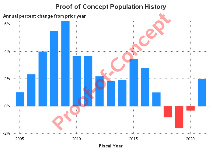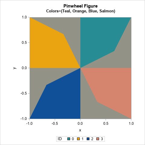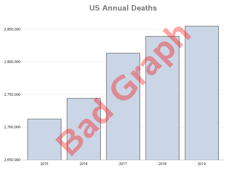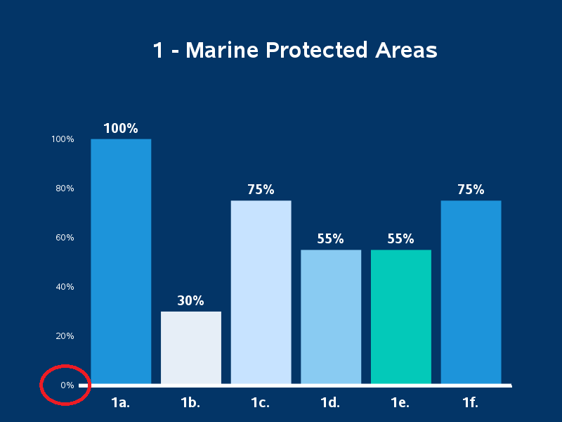
Remaking a panel of dynamite plots

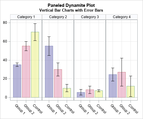
A colleague spent a lot of time creating a panel of graphs to summarize some data. She did not use SAS software to create the graph, but I used SAS to create a simplified version of her graph, which is shown to the right. (The colors are from her graph.)