Ever heard of Mandelbrot set? I learned about it recently from an article introducing a book translated from the ‘Le Grand Roman des Maths’ by Mickaël Launay. I was impressed and thought I would see if I could draw one in SAS Visual Analytics.
Here are the seven steps I took:
1. Generate the data set
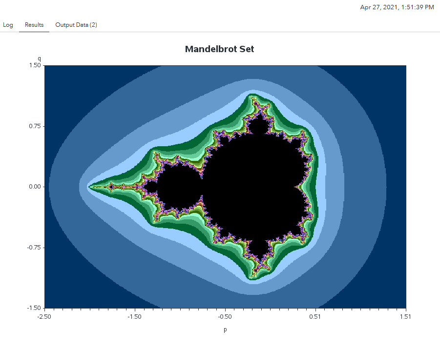
The first problem is where to get the data set. SAS documentation provides this sample using DS2 and HPDS2 to generate the data set. I changed the code to make it run with SAS data step. When I run my code in SAS Studio, and the PROC GCONTOUR renders the graph shown below.
2. Assign data to numeric series plot
Now I get the generated Mandelbrot data set, which has about 360K rows and three numeric columns: p, q and mesh. Now it’s ready to upload the Mandelbrot dataset in SAS Visual Analytics – and I’m ready to start my drawing 😊.
I am going to use a numeric series plot to draw the graph. Realizing that the system data limitation for numeric series plot is 3,000, I need to override it by checking the ‘Options’ -> ‘Object’ -> ‘Override system data limit’. I reset it to 500,000 based on my VA server capacity. (This value should be adjusted based on your VA environment capability.)
Now assign the p to ‘X axis’, the q to ‘Y axis’, the mesh to ‘Group’ (be sure to change the classification of mesh to ‘Category’), and happily wait for the rendering of the graph.
Unfortunately, I got the message: ‘No data appears because too many values were returned from the query. Filter your data to reduce the number of values.’
3. Filter the data
So I must compromise to break the data into several parts with filters, and then use Precision layout to put them together.
I am using the q value to create the filter. Try a couple of times and something like “( 'q'n BetweenInclusive(-1.5, -0.9) ) OR ( 'q'n Missing )” works for me. Thus, I decide to break the whole data set into five parts for the span of the q (from -1.5 to 1.5) and draw each part in one numeric series plot.
4. Use Precision layout
To put together all the parts with the filtered data in each numeric series plot, I need to have the Precision Container to hold all five plots. To put them together nicely, I need to adjust the options for the numeric series plots.
An easy way is to set for one and duplicate for others. Here are option settings I am using:
- In ‘Object’ -> ‘Title’, set to ‘No title’;
- Check the ‘Style’ -> ‘Padding’, and set the value to 0;
- Uncheck the ‘Graph Frame’ -> ‘Grid lines’;
- In ‘Series’ -> ‘Line thickness’: set to 1;
- In ‘Series’ -> ‘Markers’ -> ‘Marker size’: set to 3;
- Uncheck ‘X Axis Options -> ‘Axis label’, and uncheck ‘Tick values’;
- Uncheck ‘Y Axis Options -> ‘Axis label’, and uncheck ‘Tick values’;
- In ‘Legend’ -> ‘Visibility’, choose ‘Off’.
5. Duplicate and set layout for the five numeric series plots
Now, I have one numeric series plot that has options set up as described, and one filter on the q.
Next is to duplicate the numeric series plot four times and change the filter for each. What I want, is to have the five numeric series plots add up to the whole span of the q (from 1.5 to -1.5), from up to bottom.
For each of the numeric series plot, set the value in its ‘Options’ -> ‘Layout’ section as following. The Filter column is indicating the filter range of the q.
| Filter for q | Left | Top | Width | Height |
| 0.9 ~ 1.5 | 0% | 0% | 100% | 20% |
| 0.3 ~ 0.9 | 0% | 18% | 100% | 20% |
| -0.3 ~ 0.3 | 0% | 36% | 100% | 20% |
| -0.9 ~ -0.3 | 0% | 54% | 100% | 20% |
| -1.5 ~ -0.9 | 0% | 72% | 100% | 20% |
6. Set Display Rules
With above steps, now the graph is rendered using the default colors in VA.
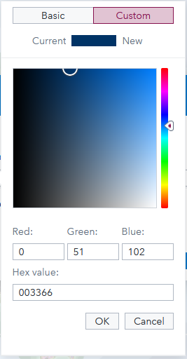
But I like the colors used by the codes, I want to change them using display rule. In the Display Rules tab, create a display rule with the mesh. And add each mesh value with the wanted color.
For example, if the mesh value is 3, look up the GOPTIONS segment in the codes and note that it uses the ‘CX003366’ color value. In SAS Visual Analytics, go to the Custom color tab of creating display rule. For the mesh value 3, enter ‘003366’ in the ‘Hex value’ box.
Of course, I need some patience to get all the mesh values colored with display rules.
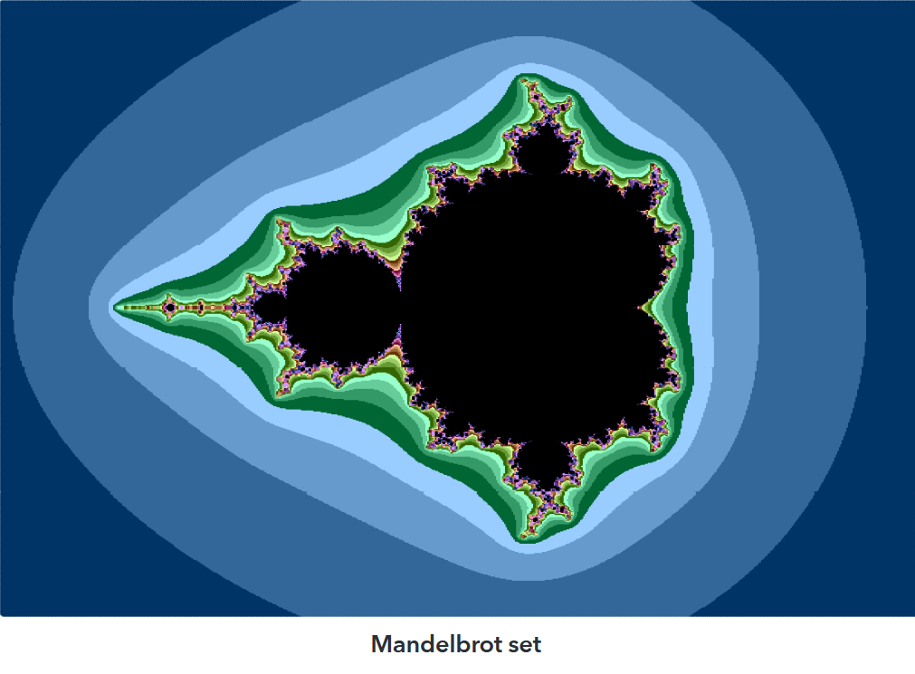
7. Render the Mandelbrot set
And now, I have drawn the Mandelbrot set in SAS Visual Analytics. I also put a Text Object (‘Mandelbrot set’) below the graph to show what is graphing.
How do you like it? Just give it a try and have fun!
To learn more about Mandelbrot sets in SAS, read these posts by my Cary-based colleagues:
READ NOW | VECTORIZE THE COMPUTATION OF THE MANDELBROT SET IN A MATRIX LANGUAGE by Rick Wicklin READ NOW | FUN WITH MANDELBROT SETS AND PROC SGPLOT by Robert Allison