I've got this buddy, Carter Johnson - he's a little bit crazy, but a lot of fun to follow... He holds/held several different long-distance paddling world records, and was one of the coaches for the group that paddled kayaks from Cuba to the US (see my blog post). A few days ago he won the SEVENTY48 race, and I thought I'd create a graph to help 'see' just how well he did.
The Race
In the SEVENTY48 race, you paddle, row, or pedal 70 miles on water ... within the 48 hour time limit. It's all human-powered - no motors or wind power/sails! There were many different kinds of boats in the race such as: rowing shells, canoes, rowboats, kayaks, surfskis, outrigger canoes, a custom catamaran with tandem recumbent bikes driving a propulsion system, and even a modified dragon boat.
My friend Carter paddled a Huki S1-X Special surfski, which I would describe as "a long, skinny, fast sit-on-top racing kayak ... that is very good at surfing rough water."
The race is in the Puget Sound, in the Seattle, WA area. This year, the race started on Friday, June 4, at 7pm. With the combination of winds, tides, and river currents, the water conditions were described as "gnarly" (which is the kind of water Carter excels in).
The Data
The race had GPS tracking devices in each boat, and they created the following animated map that shows the position of each boat during the race. This is very cool, and is probably a much better way of seeing what's going on in the race, than actually watching it in person. Go play with the interactive map - you know you want to! ... I'll meet you back here, in 15 minutes.
As many races do, this race provides a way to download the race results (see table at the bottom of their race results page). Their table indicates 92 teams signed up for the race. Of those, 43 teams finished, 43 teams did not finish (dnf), and 6 teams did not even start (dns).

Data Wrangling
I downloaded their csv spreadsheet, imported it into Excel (so I could add a few columns - more on that later), and then saved it as a .xlsx file. Here's the code I used to import the Excel spreadsheet into SAS:
proc import datafile="SEVENTY48_Results_Grid.xlsx" dbms=xlsx out=all_data;
getnames=yes;
run;
The finish time imported as a text variable, and I then used the following line of code to convert it to an official SAS date/time value.
finish_date_time=input(Finish_Time__PDT_,mdyampm.);
But wait! ... the time in their table says Carter finished at 7:54am (see screen-capture above). Whereas the tracking data on their interactive map says he finished at 4:54am (circled below). And the news article also said 4:54am. That's a difference of 3 hours!
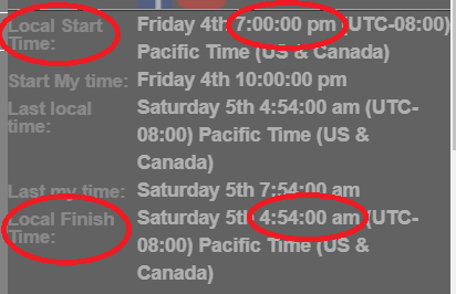
I also contacted Carter, and he confirmed that he's pretty sure it was 4:54am (not 7:54am). I assume that the person who created the table used Eastern time, rather than Pacific time (even though the column header in the table says it's Pacific time). Therefore I applied a 3 hour offset to the values, using the following code in a data step.
finish_date_time=finish_date_time-'03:00:00't;
Note that just because data looks official, that still doesn't mean you can blindly trust it! It's always good to double-check the data, and see if it "makes sense". Be sure to give your data a few sanity checks - who knows, you might find problems like the one I found (and fixed) above!
Plotting the Data
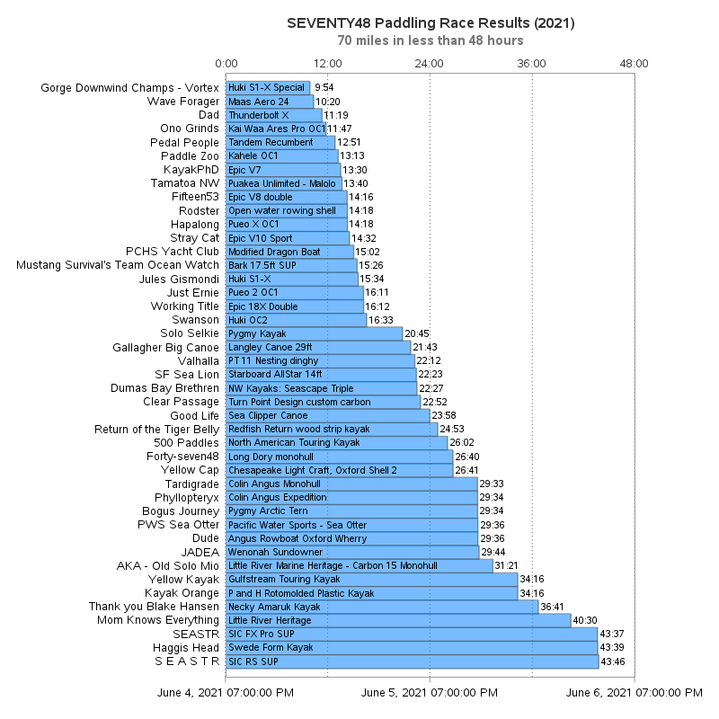
I decided to use a bar chart to visualize the data, with the length of the bars representing the amount of time each team needed to complete the 70 miles. I sorted the bars so that the shortest ones (ie, the fastest teams) were at the top. And I showed the date/time timestamps along the bottom for the 2 days (48 hours). I added reference lines every 12 hours, and made the bars slightly transparent so you can see the reference lines through the bars. I think the bar chart shows the spread of the times nicely.
proc sgplot data=finishers noautolegend;
hbarparm category=team_name response=finish_date_time /
barwidth=1.0 fillattrs=(color=dodgerblue) transparency=.4 outlineattrs=(color=gray55);
xaxis display=(nolabel)
values=('04jun2021:19:00:00'dt to '06jun2021:19:00:00'dt by 86400)
offsetmax=0 grid gridattrs=(pattern=dot color=gray66)
minorgrid minorgridattrs=(pattern=dot color=gray66);
yaxis display=(nolabel noticks) fitpolicy=none;
run;
My friend Carter is the organizer of the Gorge Downwind Champs race, and he named his team "Gorge Downwind Champs - Vortex". You'll notice that he is the top/shortest bar, and he completed the race in less than 1/4 of the 48 hour maximum time (you can tell that by the reference lines dividing the axis into 4 equal 12-hour time ranges).

Text Enhancements
The above graph shows the spread of the times nicely, but it doesn't tell much about the individual times. Therefore I enhanced the graph by adding some additional text. I used text statements to add the boat model inside the bar, and the total elapsed race time to the right of each bar. And I created an annotate dataset (anno_time) to add the elapsed time for each grid line along the top axis.
proc sgplot data=finishers noautolegend sganno=anno_time;
hbarparm category=team_name response=finish_date_time /
barwidth=1.0 fillattrs=(color=dodgerblue) transparency=.4
outlineattrs=(color=gray55);
text y=team_name x=finish_date_time text=total_time / position=right tip=none;
text y=team_name x=start_date_time_plus text=boat_model / position=right tip=none;
xaxis display=(nolabel)
values=('04jun2021:19:00:00'dt to '06jun2021:19:00:00'dt by 86400)
offsetmax=0 grid gridattrs=(pattern=dot color=gray66)
minorgrid minorgridattrs=(pattern=dot color=gray66);
yaxis display=(nolabel noticks) fitpolicy=none;
run;
Interactive Enhancements
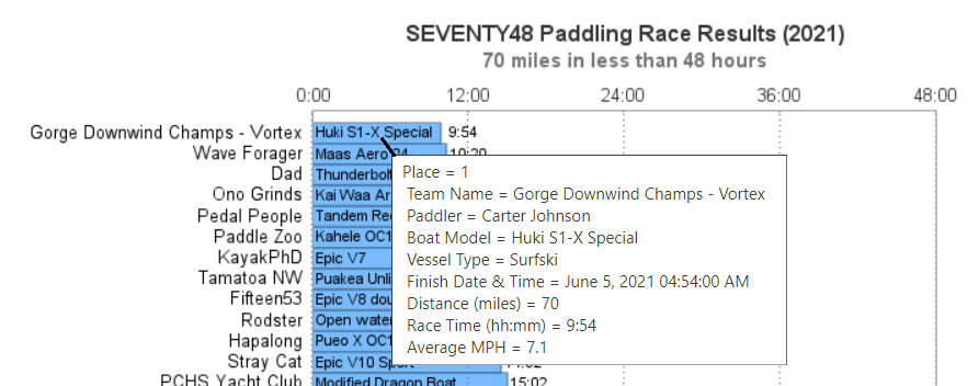
The text I added to the graph (above) helps relay a lot of extra information ... but there's actually quite a bit more that would not physically fit on the graph. Therefore I used the tip= option to add mouse-over text to the bars. The screen-capture below shows the mouse-over text for my buddy Carter.
tip=(Place Team_Name Paddler Boat_Model Vessel_Type finish_date_time distance_miles total_time avg_mph)
In addition to all the numeric/text data, you'd probably like to see what the boats/paddlers look light, eh? ... Well, I also used the url= option to specify drilldown URLs for each bar in the graph. I got the URLs for the pictures of each team/boat from the SEVENTY48.com website (such as this one of Team PCHS Yacht Club's modified dragon boat), and entered those links into the spreadsheet. And then specified the variable containing those URLs on the url= option in my SAS job:
url=photo_url
Here's a link to the final interactive graph. Note that in addition to the graph, there's also an interactive table under the graph, with interesting links on certain pieces of the text. Have fun examining the links and finding out more about the paddlers and the boats! (And for those of you who are SAS coders, here's a link to the full sas code, in case you'd like to see all the details.)

4 Comments
Hi Rob, nice work, I think that showing the elapsed time along the right y-axis would have made it a better graph. It became a bit to cluttered for me now. You do show some of the ease of use with text plots here. Maybe use an axis table for the right y-axis with the elapsed time would be even easier to read.
That would be another possible way to go. 🙂 One disadvantage to putting the elapsed time along the right axis (rather than at the end of each bar) is that the user would have to visually follow quite some distance, and match up the correct value with the correct bar. Placing the value at the end of the bar is a little more cluttered, but it's easier on the user and reduces the chance of user error!
Not a swim chart then?
You might be interested in the Devizes to Westminster International Canoe Marathon. The water is calm but the race is longer and there are 77 portages over locks: https://en.wikipedia.org/wiki/Devizes_to_Westminster_International_Canoe_Marathon . Some mad types from my school used to compete.
77 portages?!? - you might spend more time carrying your boat, than paddling it! 😉