Some claim that deaths in the US have been increasing, and some claim they have been decreasing. Which do you think is correct? Let's take a look at the data ...
The Data
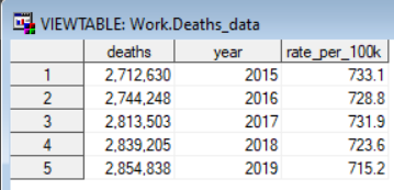
Here in the US, the Centers for Disease Control and Prevention is a good/official source of data about deaths. I did some web searching, and found several annual reports (here's a link to the 2019 report, for example). There's probably a better source where this data is already available with all years in a single table, but I went with what I could easily find, and copy-n-pasted the data from each of the annual reports. Here's the code I used to put the data into a SAS dataset.
data deaths_data;
format deaths comma10.0;
input year deaths rate_per_100k;
datalines;
2015 2712630 733.1
2016 2744248 728.8
2017 2813503 731.9
2018 2839205 723.6
2019 2854838 715.2
;
run;
Deaths are Skyrocketing!
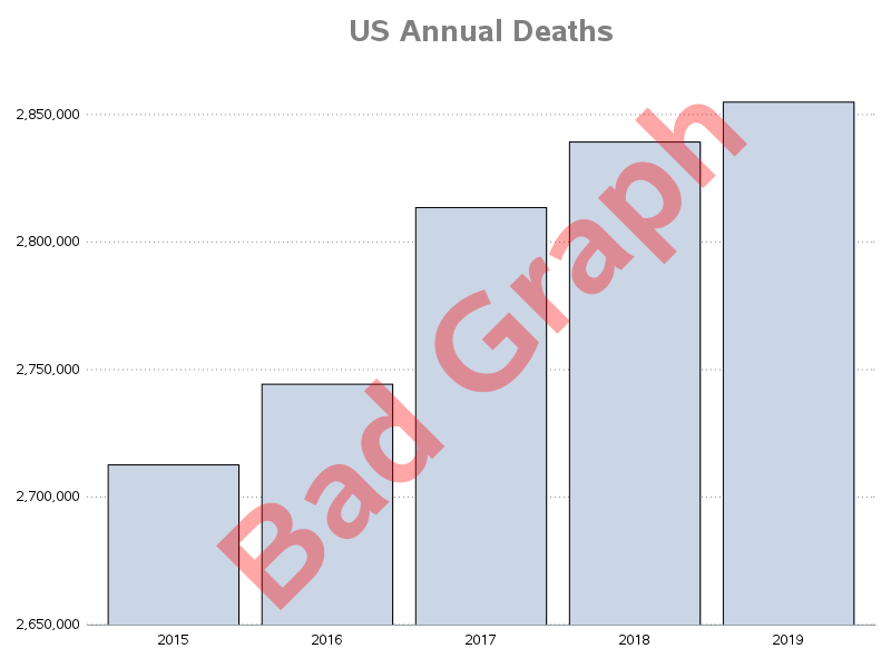
If we plot the deaths data in a bar chart, and scale the yaxis to only include the range of values in the data (similar to how a scatter plot usually scales the axis by default), we get the following graph.
Wow! - The number of deaths has been increasing in each of those 5 years! Look at that increase!
And if you look closely, you might also see the 'subtle' red label I placed across it, saying 'Bad Graph'. Why is it bad? In a bar chart, you should (almost) always start the yaxis at zero, rather than scaling from the minimum to maximum values. That way, the heights of the bars are proportional to the values.
Deaths are Increasing!
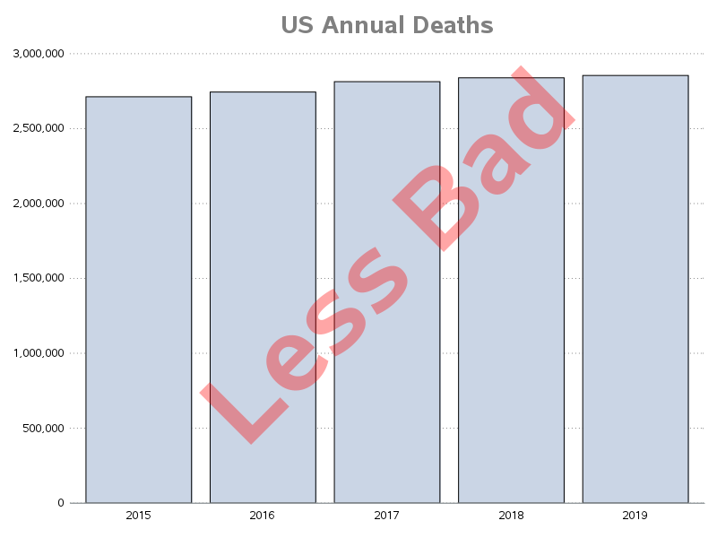
Ok - so let's fix the above bad graph, by having the yaxis start at zero. Now we can see that the number of deaths per year is increasing, but no longer 'skyrocketing' like the previous graph.
This graph is correct, right? So why did I still label it as 'Bad'? The yaxis starts at zero, and these are indeed the number of deaths in the US each year. What's not to like?!?
Well, it's not bad if you specifically want to see the number of deaths per year. But it doesn't really tell the complete story if you want to see if deaths are increasing/decreasing over time ... what if the number of deaths is increasing because the US population is increasing? Perhaps there's a different way to graph the data, that takes population into account ...
Deaths are Decreasing!
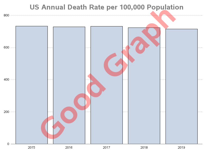
The above graph isn't necessarily 'bad' ... but it probably answers the wrong question. Rather than asking "Have the number of deaths increased?" the better question might be "Have deaths increased?" (just "deaths" in general, not specifically the number of deaths).
Since the population is increasing, it's not really fair to compare the number of deaths from year to year (in general, more people leads to more deaths). You need to compare something like the number of deaths per 100,000 people instead. And that brings us to our final graph...
And can you believe that!?! - The number of deaths per 100,000 people has visibly decreased in years 2018 and 2019! Would you have guessed that, just looking at the first two graphs?
Code
If you're a SAS programmer, here's a link to the SAS code that you can download and experiment with. It shows how to create the above three graphs, and also a couple of extras. And here's the code I used to create the final graph (directly above):
title1 c=gay33 h=18pt "US Annual Death Rate per 100,000 Population";
proc sgplot data=deaths_data noborder;
vbarparm category=year response=rate_per_100k;
yaxis display=(noline noticks nolabel) values=(0 to 800 by 200)
grid gridattrs=(pattern=dot color=gray55);
xaxis display=(noticks nolabel);
run;
Before You Go ...
Analyzing deaths data can be a bit of a 'downer' therefore I wanted end the blog with something more cheerful and happy! Here's some art work created by my friend Yana. What can be more cheerful than butterflies and flowers! Can you tell if it's a painting, or a photograph? (scroll down to see the answer...)
It's a photograph! - Can you believe it!?!? Creating photos like this is one of Yana's specialties, and you can see more photos in this style on her website yanaslutskaya.com



2 Comments
I hope you can redo this with the 2020 data added.
I included some extra graphs with the 2020 data, in the SAS code you can download. But the source CDC page I got it from said it was still 'provisional' data (not guaranteed to be the final numbers yet).