After my recent articles on simulating data by using copulas, many readers commented about the power of copulas. Yes, they are powerful, and the geometry of copulas is beautiful. However, it is important to be aware of the limitations of copulas. This article creates a bizarre example of bivariate data, then shows what happens when you fit copula models to the example.
You might think that if you match the correlation and marginal distributions of data, your model must look similar to the data. However, that statement is false. This article demonstrates that there are many bivariate distributions that have the same correlation and marginal distributions. Some might look like the data; others do not. To keep the discussion as simple as possible, I will discuss only bivariate data with marginal distributions that are normal.
Many ways to generate normally distributed variables
Before constructing the bizarre bivariate example, let's look at an interesting fact about symmetric univariate distributions. Let Z ~ N(0,1) be a standard normal random variable. Consider the following methods for generating a new random variable from Z:
- Y = Z: Clearly, Y is a standard normal random variable.
- Y = –Z: Since Z is symmetric, Y is a standard normal random variable.
- With probability p, Y = –Z; otherwise, Y = Z: This is a little harder to understand, but Y is still a normal random variable! Think about generating a large sample from Z. Some observations are negative, and some are positive. To get a sample from Y, you randomly change the sign of each observation with probability p. Because the distribution is symmetric, you change half the positives to negatives and half the negatives to positives. Thus, Y is normally distributed. Both previous methods are special cases of this one. If p=0, then Y = Z. If p=1, then Y = –Z.
To demonstrate the third method, the following SAS DATA step generates a normally distributed sample by generating Z~N(0,1), then randomly permuting the sign of 50% of the variates:
%let N = 2000; data Sim; call streaminit(1234); p = 0.5; do i = 1 to &N; z = rand("Normal"); /* flip the sign of Z with probability p */ if rand("Bernoulli", p) then y = z; else y = -z; output; end; run; proc univariate data=Sim; var y; histogram / normal; run; |
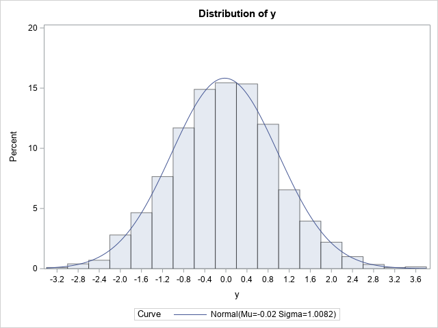
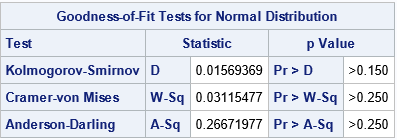
The graph indicates that Y is normally distributed. If you prefer statistical tests, the table shows several goodness-of-fit tests. The results indicate that a normal distribution fits the simulated data well.
This example shows that you can change the signs of 50% of the observations and still obtain a normal distribution. This fact is used in the next section to construct a bizarre bivariate distribution that has normal marginals. (Note: Actually, this example is valid for any value of p, 0 ≤ p ≤ 1. You always get normally distributed data.)
A bizarre example: Normal marginals do not imply bivariate normality
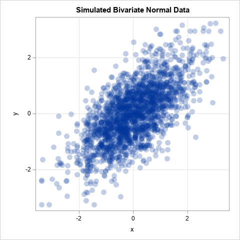
Let's play a game. I tell you that I have bivariate data where each variable is normally distributed and the correlation between the variables is 0.75. I ask you to sketch what you think a scatter plot of my data looks like. Probably most people would guess it looks like the graph below, which shows bivariate normal data:
If the joint distribution of X and Y is bivariate normal, then the univariate distributions of X and Y are indeed normal. However, the converse of that statement is not true! There are many bivariate distributions that are not bivariate normal, yet their marginal distributions are normal. Can't picture it? Study the following SAS DATA step, which simulates (X,Z) as bivariate data, but changes the sign for 50% of the Z variates:
/* Bivariate data whose marginals are normal. Idea from https://stats.stackexchange.com/questions/30159/is-it-possible-to-have-a-pair-of-gaussian-random-variables-for-which-the-joint-d */ %let N = 2000; data NotBinormal; call streaminit(123); do i = 1 to &N; x = rand("Normal"); z = rand("Normal"); in24 = (x< 0 & z>=0) | /* (x,z) in 2nd quadrant */ (x>=0 & z< 0); /* (x,z) in 4th quadrant */ /* If (x,z) is in 2nd quadrant, flip into 3rd quadrant. If (x,z) is in 4th quadrant, flip into 1st quadrant. */ if in24 then y = -z; else y = z; output; end; run; ods graphics / width=480px height=480px; proc corr data=NotBinormal noprob Spearman plots=matrix(hist); var x y; ods select SpearmanCorr MatrixPlot; run; |
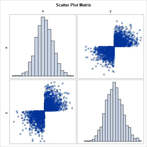
The scatter plot looks like a bow tie! I saw this example on StackExchange in an answer by 'cardinal'. I like it because the joint distribution is obviously NOT bivariate normal even though X and Y are both standard normal variables. Obviously, the variable X is univariate normal. For the variable Y, notice that the program generates Z as random normal but changes the sign for a random 50% of the Z values. In this case, the 50% is determined by looking at the location of the (X,Z) points. If (X,Z) is in the second or fourth quadrants, which occurs with probability p=0.5, flip the sign of Z. The result is bivariate data that lies in only two quadrants. Yet, both marginal variables are normal.
When asked to describe the scatter plot of correlated data with normal marginals, I think that few people would suggest this example! Fortunately, real data does not look like this pathological example. Nevertheless, it is instructive to ask, "what does a copula model look like if we fit it to the bow-tie data?"
Fit a copula to data
Let's fit a copula to the bizarre bow-tie distribution. We know from a previous article that a copula will have the same Spearman correlation (0.75) and the marginal distributions (normal) as the data. But if you simulate data from a Gaussian copula, a scatter plot of the simulated data looks nothing like the bow-tie scatter plot. Instead, you get bivariate normal data, as demonstrated by the following statements:
proc copula data=NotBinormal; var x y; /* original data vars */ fit normal; /* choose copula: Normal, Clayton, Frank,... */ simulate / seed=1234 ndraws=&N marginals=empirical /* transform from copula by using empirical CDF of data */ out=SimData; /* contains the simulated data */ run; title "Bivariate Normal Data"; proc sgplot data=SimData aspect=1; scatter x=x y=y / transparency=0.75 markerattrs=(symbol=CircleFilled size=12); xaxis grid; yaxis grid; run; |
The scatter plot is shown at the beginning of the previous section.
The COPULA procedure supports other types of copulas, such as the Clayton, Frank, and Gumbel copulas. These are useful in modeling data that have more (or less) weight in the tails, or that might be unsymmetric. For example, the Gumbel copula is an unsymmetric distribution that has more weight in the right tail than the normal distribution does. If you change the keyword NORMAL to GUMBEL in the previous call to PROC COPULA, you obtain the following scatter plot of simulated data from the Gumbel copula:
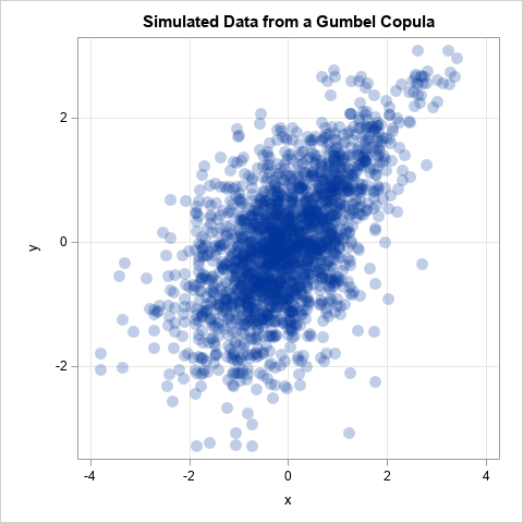
This is another example of a distribution that has the same Spearman correlation as the data and has normal marginals. It is not bivariate normal, but it still doesn't look like the pathological bow-tie example.
Summary
When you learn a new technique, it is important to know its limitations. This article demonstrates that there are many distributions that have the same correlation and the same marginal distributions. I showed a very dramatic example of a bizarre scatter plot that looks like a bow tie but, nevertheless, has normal marginals. When you fit a copula to the data, you preserve the Spearman correlation and the marginal distributions, but none of the copula models (Gaussian, Gumble, Frank, ....) look like the data.
I strongly encourage modelers to use the simulation capabilities of PROC COPULA to help visualize whether a copula model fits the data. You can make a scatter plot matrix of the marginal bivariate distributions to understand how the model might deviate from the data. As far as I know, PROC COPULA does not support any goodness-of-fit tests, so a visual comparison is currently the best you can do.
For more information about PROC COPULA in SAS, See the SAS/ETS documentation. (Or, for SAS Viya customers, see PROC CCOPULA in the SAS Econometrics product.)
For more information about different types of copulas and tail dependence, see
- Venter, Gary G. (2002) "Tails of copulas," in Proceedings of the Casualty Actuarial Society (Vol. 89, No. 171, pp. 68-113).
- Zivot, Eric (to appear), "Copulas" in Modeling Financial Time Series with R, Springer-Verlag.

1 Comment
I need SAS IML syntax for copula inference and their type of copula model