A previous article discusses how to interpret regression diagnostic plots that are produced by SAS regression procedures such as PROC REG. In that article, two of the plots indicate influential observations and outliers. Intuitively, an observation is influential if its presence changes the parameter estimates for the regression by "more than it should." Various researchers have developed statistics that give a precise meaning to "more than it should," and the formulas for several of the popular influence statistics are included in the PROC REG documentation.
This article discusses the Cook's D and leverage statistics. Specifically, how can you use the information in the diagnostic plots to identify which observations are influential? I show two techniques for identifying the observations. The first uses a DATA step and a formula to identify influential observations. The second technique uses the ODS OUTPUT statement to extract the same information directly from a regression diagnostic plot.
These are not the only regression diagnostic plots that can identify influential observations:
- The DFBETAS statistic estimates the effect that deleting each observation has on the estimates for the regression coefficients.
- The DFFITS statistic is a measure of how the predicted value changes when an observation is deleted. It is closely related to the Cook's D statistic.
The data and model
As in the previous article, let's use a model that does NOT fit the data very well, which makes the diagnostic plots more interesting. The following DATA step adds a quadratic effect to the Sashelp.Thick data and also adds a variable that is used in a subsequent section to merge the data with the Cook's D and leverage statistics.
data Thick2; set Sashelp.Thick; North2 = North**2; /* add quadratic effect */ Observation = _N_; /* for merging with other data sets */ run; |
Graphs and labels
Rather than create the entire panel of diagnostic plots, you can use the PLOTS(ONLY)= option to create only the graphs for Cook's D statistic and for the studentized residuals versus the leverage. In the following call to PROC REG, the LABEL suboption requests that the influential observations be labeled. By default, the labels are the observation numbers. You can use the ID statement in PROC REG to specify a variable to use for the labels.
proc reg data=Thick2 plots(only label) =(CooksD RStudentByLeverage); model Thick = North North2 East; /* can also use INFLUENCE option */ run; |
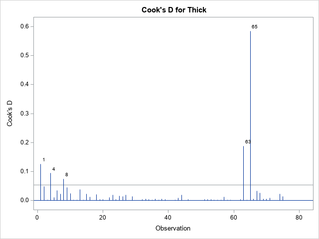
The graph of the Cook'd D statistic is shown above. The PROC REG documentation states that the horizontal line is the value 4/n, where n is the number of observations in the analysis. For these data, n = 75. According to this statistic, observations 1, 4, 8, 63, and 65 are influential.
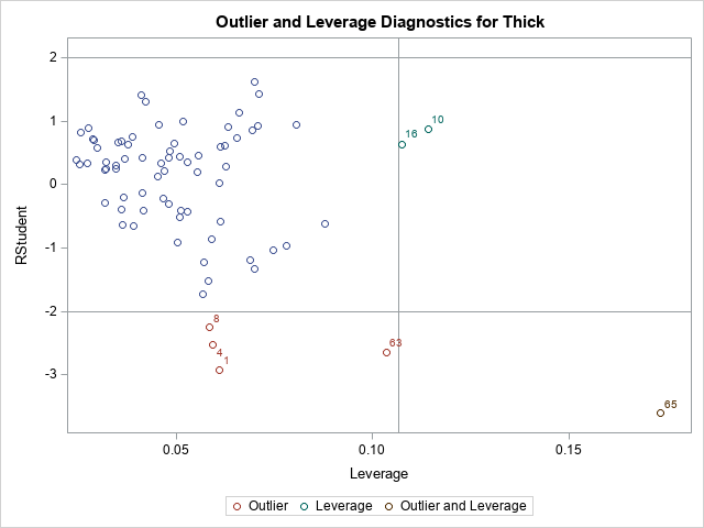
The second graph is a plot of the studentized residual versus the leverage statistic. The PROC REG documentation states that the horizontal lines are the values ±2 and the vertical line is at the value 2p/n, where p is the number of parameters, including the intercept. For this model, p = 4. The observations 1, 4, 8, 10, 16, 63, and 65 are shown in this graph as potential outliers or potential high-leverage points.
From the graphs, we know that certain observations are influential. But how can highlight those influential observations in plots, print them, or otherwise analyze them? And how can we automate the process so that it works for any model on any data set?
Manual computation of influential observations
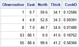
There are two ways to determine which observations have large residuals or are high-leverage or have a large value for the Cook's D statistic. The traditional way is to use the OUTPUT statement in PROC REG to output the statistics, then identify the observations by using the same cutoff values that are shown in the diagnostic plots. For example, the following DATA step lists the observations whose Cook's D statistic exceeds the cutoff value 4/n ≈ 0.053.
/* manual identification of influential observations */ proc reg data=Thick2 plots=none; model Thick = North North2 East; /* can also use INFLUENCE option */ output out=RegOut predicted=Pred student=RStudent cookd=CookD H=Leverage; quit; %let p = 4; /* number of parameter in model, including intercept */ %let n = 75; /* Number of Observations Used */ title "Influential (Cook's D)"; proc print data=RegOut; where CookD > 4/&n; var Observation East North Thick CookD; run; |
This technique works well. However, it assumes that you can easily write a formula to identify the influential observations. This is true for regression diagnostics. However, you can imagine a more complicated graph for which "special" observations are not so easy to identify. As shown in the next section, you can leverage (pun intended) the fact that SAS already identified the special observations for you.
Leveraging the power of the ODS OUTPUT statement
Did you know that you can create a data set from any SAS graphic? Many SAS programmers use ODS OUTPUT to save a table to a SAS data set, but the same technique enables you to save the data underlying any ODS graph. There is a big advantage of using ODS OUTPUT to get to the data in a graph: SAS has already done the work to identify and label the important points in the graph. You don't need to know any formulas!
Let's see how this works by extracting the observations whose Cook's D statistic exceeds the cutoff value. First, generate the graphs and use ODS OUTPUT to same the underlying data models, as follows:
/* Let PROC REG do the work. Use ODS OUTPUT to capture information */ ods exclude all; proc reg data=Thick2 plots(only label) =(CooksD RStudentByLeverage); model Thick = North North2 East; ods output CooksDPlot=CookOut /* output the data for the Cook's D graph */ RStudentByLeverage=RSOut; /* output the data for the outlier-leverage plot */ quit; ods exclude none; /* you need to look at the data! */ proc print data=CookOut(obs=12); where Observation > 0; run; |
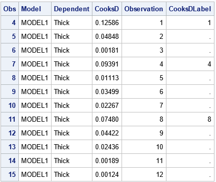
When you output the data from a graph, you have to look at how the data are structured. Sometimes the data set has strange variable names or extra observations. In this case, the data begins with three extra observations for which the Cook's D statistic is missing. For the curious, fake observations are often used to set axes ranges or to specify the order of groups in a plot.
Notice that the CookOut data set includes a variable named Observation, which you can use to merge the CookOut data and the original data.
From the structure of the CookOut data set, you can infer that the influential observations are those for which the CooksDLabel variable is nonmissing (excepting the fake observations at the top of the data). Therefore, the following DATA step merges the output data sets and the original data. In the same DATA step, you can create other useful variables, such as a binary variable that indicates which observations have a large Cook's D statistic:
data All; merge Thick2 CookOut RSOut; by Observation; /* create a variable that indicates whether the obs has a large Cook's D stat */ CooksDInf = (^missing(CooksD) & CooksDLabel^=.); label CooksDInf = "Influential (Cook's D)"; run; proc print data=All noobs; where CooksDInf > 0; var Observation East North Thick; run; proc sgplot data=All; scatter x=East y=North / group=CooksDInf datalabel=CooksDLabel markerattrs=(symbol=CircleFilled size=10); run; |
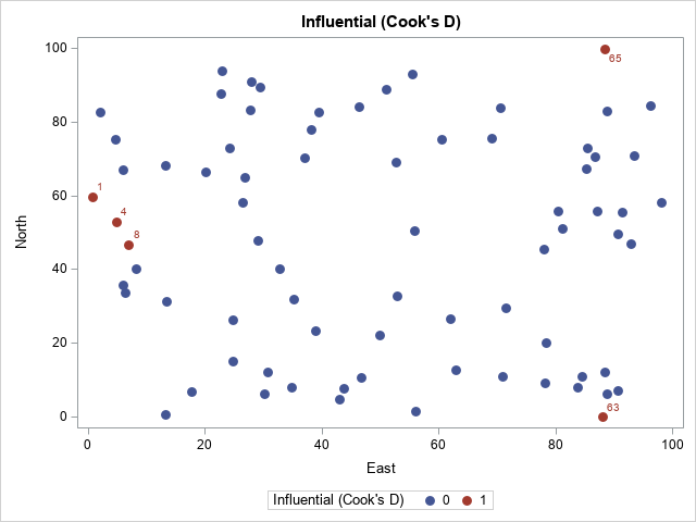
The output from PROC PRINT (not shown) confirms that observations 1, 4, 8, 63, and 65 have a large Cook's D statistic. The scatter plot shows that the influential observations are located at extreme values of the explanatory variables.
Outliers and high-leverage points
The process to extract or visualize the outliers and high-leverage points is similar. The RSOut data set contains the relevant information. You can do the following:
- Look at the names of the variables and the structure of the data set.
- Merge with the original data by using the Observation variable.
- Use one of more variables to identify the special observations.
The following call to PROC PRINT gives you an overview of the data and its structure:
/* you need to look at the data! */ proc print data=RSOut(obs=12) noobs; where Observation > 0; var Observation RStudent HatDiagonal RsByLevIndex outLevLabel RsByLevGroup; run; |
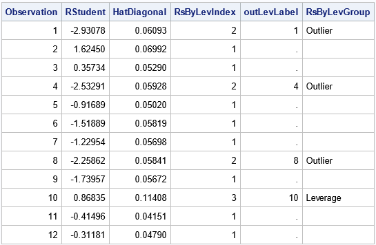
For the RSOut data set, the indicator variable is named RsByLevIndex, which has the value 1 for ordinary observations and the value 2, 3, or 4 for influential observations. The meaning of each index value is shown in the RsByLevGroup variable, which has the corresponding values "Outlier," "Leverage," and "Outlier and Leverage" (or a blank string for ordinary observations). You can use these values to identify the outliers and influential observations. For example, you can print all influential observations or you can graph them, as shown in the following statements:
proc print data=All noobs; where Observation > 0 & RsByLevIndex > 1; var Observation East North Thick RsByLevGroup; run; proc sgplot data=All; scatter x=East y=North / markerattrs=(size=9); /* ordinary points are not filled */ scatter x=East y=North / group=RsByLevGroup nomissinggroup /* special points are filled */ datalabel=OutLevLabel markerattrs=(symbol=CircleFilled size=10); run; |
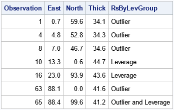
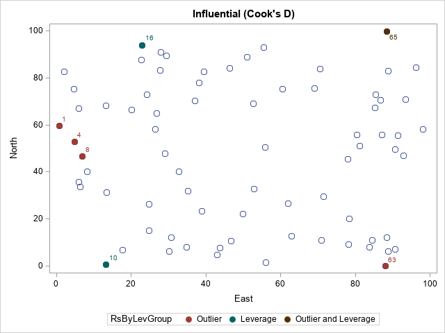
The PROC PRINT output confirms that we can select the noteworthy observations. In the scatter plot, the color of each marker indicates whether the observation is an outlier, a high-leverage point, both, or neither.
Summary
It is useful to identify and visualize outliers and influential observations in a regression model. One way to do this is to manually compute a cutoff value and create an indicator variable that indicates the status of each observation. This article demonstrates that technique for the Cook's D statistic. However, an alternative technique is to take advantage of the fact that SAS can create graphs that label the outliers and influential observations. You can use the ODS OUTPUT statement to capture the data underlying any ODS graph. To visualize the noteworthy observations, you can merge the original data and the statistics, indicator variables, and label variables.
Although it's not always easy to decipher the variable names and the structure of the data that comes from ODS graphics, this technique is very powerful. Its use goes far beyond the regression example in this article. The technique enables you to incorporate any SAS graph into a second analysis or visualization.

5 Comments
Let me put in a plug for the residual chart. Decades ago, before ODS Graphics, SAS produced "ASCII graphics" or "printer plots" composed of characters in a nonproportional font. Near the end of my career at SAS, I realized that PROC REG still had an ASCII graph. I replaced it with ODS Graphics. Bob Rodriguez provided a great deal of oversight.
PLOTS=RESIDUALCHART
PLOTS=RC
produces the residual chart and enables you to specify residual-chart-options. This chart displays studentized residuals and Cook’s D in side-by-side bar charts. This chart is also displayed when you specify the R option in the MODEL statement.
Unlike most graphs, the height of this chart can vary as a function of the number of observations that appear in the chart. You can specify the following residual-chart-options to control the height and other aspects of the chart:
COMPUTEHEIGHT=a b
CH=a b
specifies the constants for computing the height of the chart. For n dimensions, intercept a, slope b, and maximum height max, the height is min(a + b (n + 1), max). By default, COMPUTEHEIGHT=150 15 1650. Thus, the default height in pixels is min(150 + 15(n + 1), 1650). The default unit is pixels, and you can use the UNIT= residual-chart-option to change the unit to inches or centimeters.
MAX=max
species the maximum number of points to display in each chart. When the number of points exceeds max, charts of up to max observations are displayed until all observations are displayed.
SETHEIGHT=height
SH=height
specifies the height of the chart. By default, the height is based on the COMPUTEHEIGHT= option. The default unit is pixels, and you can use the UNIT= residual-chart-option to change the unit to inches or centimeters.
UNIT=PX | IN | CM
specifies the unit (pixels, inches, or centimeters) for the SETHEIGHT= and COMPUTEHEIGHT= residual-chart-options. Inches equals pixels divided by 96, and centimeters equals inches times 2.54. By default, UNIT=PX.
UNPACK
suppresses paneling. The studentized residuals and Cook’s D are displayed in separate charts. When you specify the UNPACK residual-chart-option, residuals, standard errors, and other values that go into the computations are added to each chart.
You can see an example of the ResidualChart in the Getting Started example for PROC REG. It is a graphical version of the OutputStatistics table that appear when you use the R option on the MODEL statement. It is most useful when your data set does not have very many observations.
I am using SAS on Demand for Academics and am unable to find the appropriate STATISTICS that produce both Cook's table of outliers and graph. Can you help? I have tried both linear and multiple regression and had no luck. Nothing under model and nothing under option
The best place to ask SAS questions is the SAS Support Communities.
Pingback: Top 10 posts from The DO Loop in 2021 - The DO Loop