Many cities have Open Data pages. But once you download the data, what can you do with it? This is my fourth in a series of blog posts where I download public data about Cary, NC, and demonstrate how you might analyze that type of data (for Cary, or any city!)
And what data did I choose this time?
The Data
If you guessed "population data" you are correct! Cary's population has been growing rapidly in the past few years - let's plot the data and see just how rapidly!
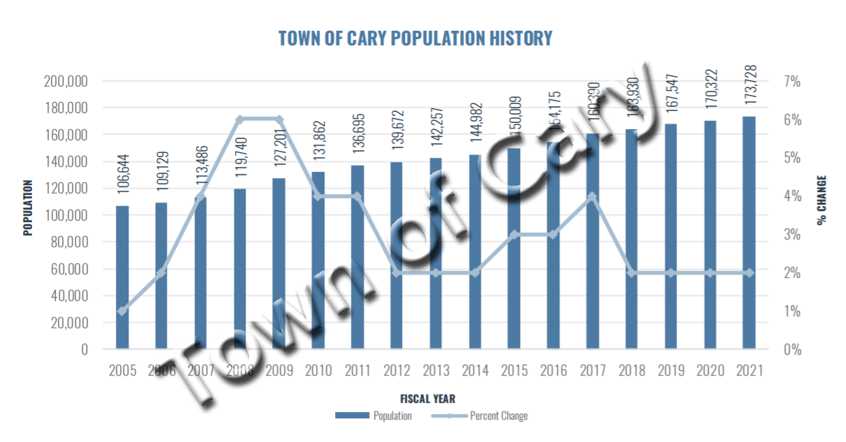
I found the historical population data in Cary's annual budget report (p. 402). Here is a screen-capture of their graph (I added the watermark):
I manually transcribed the population values from their graph into a datalines section in my SAS code, and then used a data step to calculate the percent change each year using the following code.
data pop_data; set pop_data;
percent_change=(population-lag(population))/lag(population);
run;
Improvements
Cary already has a graph of their population data (see above), therefore there's nothing left for me to do, eh? Well, not quite... there are a few potential areas for improvement.
Too Busy: In general, I think the graph is too busy, and tries to show too much 'stuff' (most of that stuff being extra text). Showing 11 values along the population axis is probably a bit overkill. Labeling every year along the bottom axis is probably unnecessary. Showing the population value at the top of each bar was useful to me (it let me know what value to type into my table) ... but the values are difficult to read (since they had to be turned vertical to squeeze into the space), and if people want to see the actual text values I think they would like that better in a separate table, and/or interactive mouse-over text.
Overlay Difficulty: This graph overlays two different things (population and percent change), which is usually a bad idea. You can't just glance at the graph and know what it's showing. You must read the legend, and compare that to the left and right axes, to know which thing (bars or line) is represented by which axis. The user has to really study the graph, and be conscious of what they're looking at, to make sense of it. And even then, the user gets confusing visual cues - for example, is it significant when the line is higher than the bars? ... Not really - but that will draw the user's attention as if it is significant.
Percent Change: I'm not sure that the percent change line provides the right visual message. Notice that the line is "flat" (ie, horizontal) during the last four years. But that doesn't mean the population increase is flat ... each of those years is 2% higher than the previous year. Percent change is useful to look at, but I think the annual changes need to also be shown another way, so people can 'see' the annual increases.
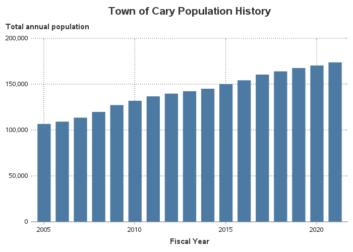
Population Graph
In my new (hopefully improved!) visualization of this data, I decided to use multiple graphs, with each graph only showing one thing. An extra graph or two in a ~450 page online document won't kill any more trees, and it will make the data easier to understand (which is the goal). Below is my version of the population bar chart, along with a list of features/improvements:
- No overlaid line graph.
- Values along left axis labeled at every 50k rather than every 20k.
- Labeled bars every 5 years, rather than every 1 year.
- Placed y-axis label at top of axis, rather than angled along the side.
- Made reference lines darker, and easier to see.
- No need for a legend, because I'm only showing one thing.
- The graph looks clean and uncluttered.
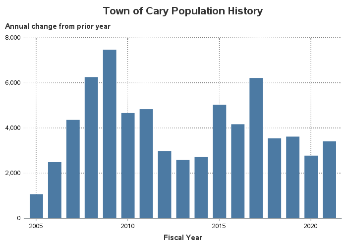
Population Change
In the graphs above, you can see that the population changed from year to year ... but it's difficult to see exactly how much it changed. So let's create an extra graph to show the population increase each year.
In the spirit of "there, I fixed it" let's just show the top part of each bar - that will let you see more detail, right?...
If you have read many of my previous blog posts, you probably know that you shouldn't go around just chopping off the bottom part of a bar chart. If the height axis doesn't start at zero, then you lose all those visual cues where the height of the bars is proportional to the values.
To fix this graph, you can calculate the actual change in population from year to year, and plot that. Below is the code to calculate those values. Now you can easily see how much the population grew each year. (Looks like the largest gains were around the 2008/2009 recession.)
data pop_data; set pop_data;
change_in_population=population-lag(population);
run;
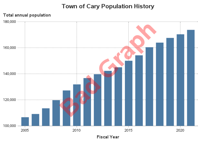
Population Percent Change
Now, let's get back to the percent change line that was in the original graph. Percent change is useful to graph ... but it can be a bit tricky. In order to get more insight into how they created their percent change line, I worked on creating my own version of their graph until it looked basically the same as theirs. Here's what I came up with:
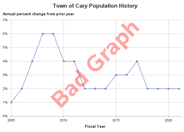
But why did I label it "Bad Graph"?!? ... Well, there are two reasons. The first/simplest is that the original graph rounded the values to the nearest percent, when there was more precision available in the data. Notice how the last 4 years show the rounded percent increase holding steady at 2%? Remember that, so you can compare it to the new/improved version of the graph.
Another problem, which is actually a much bigger "bad graph" thing, is the use of lines to connect the annual data points. When using lines to connect data points, it is implied that the line is an estimate of the value at each point in time along the line. That would be ok when plotting population values, but not when plotting the percent increase. For example, what would the % population increase be the very next day after the annual population value was taken? - it would be very near zero (because in just one day, the population for the next year has only increased very slightly since the previous year). But is the line in the above graph anywhere near zero? Nope!
If you were going to use lines to connect the data points in the percent change graph (not saying I would recommend it, but *if* you were), you should re-start the line at zero, right after each annual data point. And the graph would look something like the following (ugly, but more correct) graph:
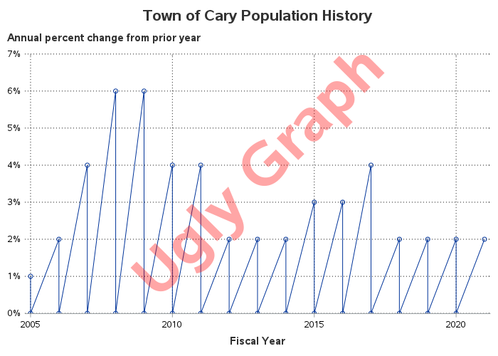
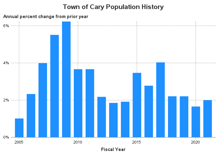
Although the above graph is 'correct' it's ugly and confusing. Rather than using lines, I recommend using simple bars. Also, notice that the last 4 bars are not all holding steady at 2% like in Cary's original graph. Since I don't round my values to the nearest percent, you can see the small/subtle fluctuations from year to year.
Bonus Points!
Another advantage of using a bar chart (instead of using a line chart) is that you can better represent negative values - (if the population decreases). The bars representing negative values will point in the downward/negative direction. Also, it's easy to have the positive and negative bars be a different color (using the bar chart's group= option).
Since Cary's population growth is positive for all the years in the above plot, there aren't any negative values to demonstrate what I'm talking about. Therefore I modified the data to include some negative values, and marked the graph as "Proof-of-Concept" (so nobody thinks it's the real Cary data). Notice how the negative values point down under/below the zero y-axis baseline, and are colored red. Looks pretty good, I think!
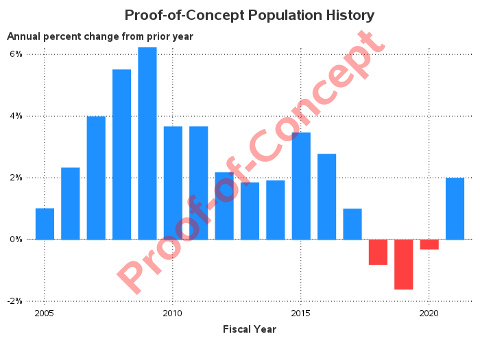
Assuming you have positive and negative values in your data, you can specify a group= variable for your bar chart, and then specify the red and blue colors using "styleattrs datacolors=(red blue)". But what if the data changes? If the order of the data changes, then the order the colors are assigned could change. Also, if your chart has only-positive or only-negative values, then the way the colors are assigned might change, and your positive population changes could show up in red (which you intended for negative values).
There's a solution to this problem! ... Use an attribute map to specify exactly which color to use with which group= value. This is a little extra work, but it provides a lot of extra "peace of mind" that your graph is going to look correct, even if you re-run it with new/different data.
Here's the code I used to create my Positive/Negative group= values in the data:
data negative_demo; set negative_demo;
if percent_change>=0 then change='Positive';
else change='Negative';
run;
Here's the code to create an attribute map dataset, which associates the desired colors with the above values:
data myattrs;
id="some_id";
fillcolor="dodgerblue"; value='Positive'; output;
fillcolor="cxFF4040"; value='Negative'; output;
run;
And here's how I tell the bar chart to use the attribute map, to determine which colors to use for the group= values:
proc sgplot data=negative_demo dattrmap=myattrs;
vbarparm category=year response=percent_change / group=change attrid=some_id;
Here's a link to the complete SAS code I used to create all of my graphs shown above, in case you want to experiment with it, or use it as a starting point to create similar graphs of your city's data.

4 Comments
This is great! Thanks for posting it - I will be sharing with Town Staff so we can improve what we do. This is exactly why we publish data on our Open Data Portal, and your insights are helpful.
Sounds good! 🙂
You probably already know this but you can also download tables of population estimates from the American Community Survey for most towns including Cary. For example: https://www2.census.gov/programs-surveys/popest/datasets/2010-2019/cities/totals/sub-est2019_37.csv or https://www2.census.gov/programs-surveys/popest/datasets/2010-2020/cities/SUB-EST2020_37.csv
Thanks for the links!