You've probably seen a population pyramid, such as this one I showed in a previous blog post. But let's scrutinize population pyramids a bit deeper, with an eye on special features that can make them even more useful!
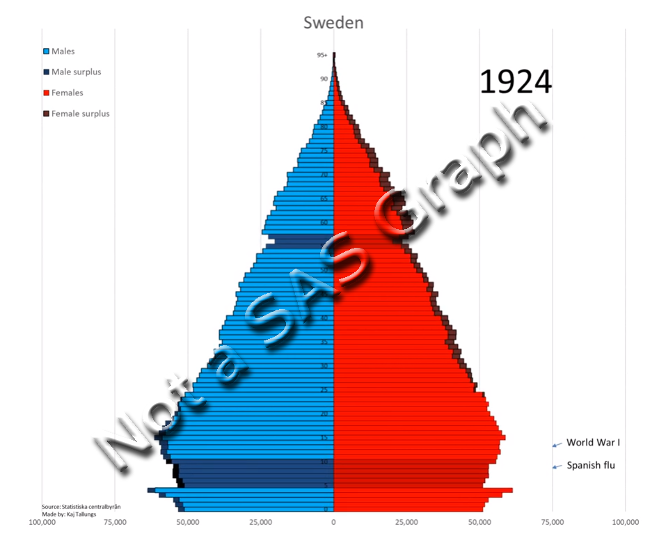
I was inspired to give population trees a second look by this example I saw on reddit. Below is a snapshot of one frame, out of their animation over several years. It had a few nice features I hadn't seen before, but it was a little "rough around the edges." I wondered if I could polish it up a bit!
The Data
I downloaded the raw data from the statistikdatabasen.scb.se website, as an Excel spreadsheet, and then imported it using the following code. In a highly customized/specific graph like this, that's about as far as the simple/standard coding goes! I had to use Proc Transpose twice, as well as manipulate the data using data steps and Proc SQL, to prepare the data to create this graph.
proc import file="sweden_population.xlsx" out=my_data dbms=xlsx replace;
getnames=yes;
range='Sheet 1$A3:FG226';
run;
My Graph (Spoiler Alert!)
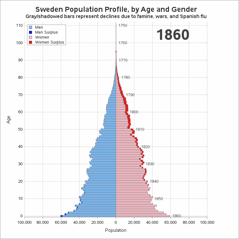
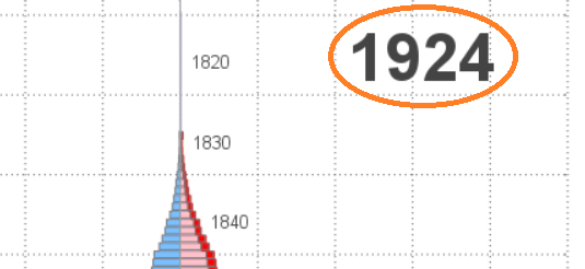
Here's my final graph (or at least the frame for year 1924). And in the sections that follow, I'll describe the customizations and special features.
Surplus
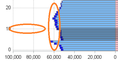
As I approach retirement age, I've become aware that there are more older women than men (which affects dating possibilities, by the way!) Another way of saying this is "there is a surplus of women in my age group."
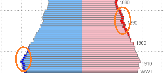
Most population pyramids have one bar segment to the left, and a corresponding one on the right, for each age. But this chart has (up to) two bar segments on each side. The second/darker bar segment shows the surplus of men (dark blue) or women (dark red) at that age. And I display the colored bar segments as a stacked bar chart.
To get these stacked bar segments, I had to split up my data just right, and then use SGplot hbarparm's group= and groupdisplay=stack options.
hbarparm category=age response=people /
group=gender groupdisplay=stack
outlineattrs=(color=gray77)
name='colors' tip=none;
"Born On" Labels
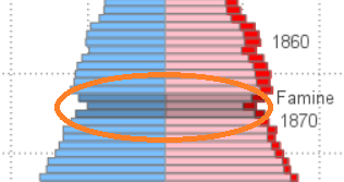
In the original graph, there were 'temporary' labels for certain things that could affect population (such as World War-I and the Spanish Flu). I liked these labels, because they helped put the data into context. But in the original graph animation, those labels go away after a few years. In my version, I make the labels permanent, and my labels move up the graph (following the the bar segment they were "born on") as the animation proceeds through the years.

There are several different ways to add text labels. I chose to use annotate, so that I would have total control.
data anno_year_born; set anno_year_born;
length label $100 anchor x1space y1space $50;
layer="front";
function="text"; textcolor="gray44"; textsize=9; textweight='normal';
width=100; widthunit='percent';
label=trim(left(year_born));
if label='1867' then label='Famine';
if label='1914' then label='WW-I';
if label='1918' then label='Spanish flu';
if label='1938' then label='WW-II'; /* fudged the year a little, to get label to fit better */
y1space='datavalue';
x1space='datavalue';
y1=age;
x1=people+2000;
anchor='left';
if mod(year_born,10)=0 or label^=trim(left(year_born)) then output;
run;
Shaded Areas
The shaded areas in the graph correspond to the "born on" labels. I think these shaded areas provide a good visual cue, and give your eyes something to follow in the animation. Note that I'm shading the same years as the original graph, but I'm not sure of the exact criteria they used to decide exactly which years to shade. I create these shaded areas by overlaying a second bar chart with partially transparent black fill color.
hbarparm category=age response=shadow_people /
group=gender groupdisplay=stack
outlineattrs=(color=gray77)
fillattrs=(color=black) transparency=.75
name='shadow' tip=none;
Reference Lines
The original graph had horizontal reference lines. But I also like to also have vertical reference lines - these help you easily see whether the bars are increasing or decreasing slightly, or whether they have crossed some threshold. Also, rather than making the reference lines solid, I made them dashes (this helps distinguish them from the bar segment outlines).
yaxis display=(noline noticks)
values=(0 to 110 by 10) reverse type=linear
grid gridattrs=(pattern=dot color=gray55)
offsetmin=0.006;
xaxis
values=(-100000 to 100000 by 20000)
grid gridattrs=(pattern=dot color=gray55)
offsetmin=0 offsetmax=0;
Vertical Axis
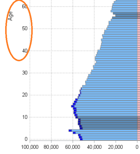
The original graph labeled the vertical (age) axis in the middle of the graph (somewhat between the male & female bars), where it is difficult to read the dark text against a somewhat dark background. I placed my age axis along the left side of the graph (in its traditional location). I think it's much cleaner, and easier to read there.
Year Label
I followed-suit with the original graph, and added a large 'year' label in the top/right of the graph. It would be programmatically easier to put the year in the title ... but I much prefer having it in the graph area like this. I again used annotation for this text.
Animation
Here are some of the options I used to create my gif animation. The animduration option controls the time delay between each yearly frame. I created my animation with a similar speed to the original, but with a longer delay/pause at the end, before it re-starts again. I created this pause by repeating the final frame 20 times. The pause on the final frame gives the user more time to see the final graph, and digest the information.
options dev=sasprtc printerpath=gif animation=start animduration=.20 animloop=yes;
There's a 1 MB file size limit here in the blogs, so I was only able to include a summarized version of the animation below (with one frame per every 10 years). But here's a link to see my full animation, with one frame per each individual year (it provides a much smoother visual experience). And also, here is a link to my full SAS code, if you'd like to see all the details!
Discussion
Does the animation show anything interesting (expected, or unexpected) about Sweden's population? Do you have insight/expertise to share, that might help interpret the animation?
- How did some of the bars actually grow longer in more recent years, rather than shrinking?
- Did the population shrink, or grow, during WW-I and WW-II?
- Did you notice how the age where the female surplus started has shifted over the years?
- What other labels/shadows would be interesting to add to the graph?


5 Comments
Hi Robert, nice graph and a nice way to show possibilities.
As for your discussion points, the population grew in both WW. Not that strange as Sweden managed to stay out and especially in WW2 there was an immigration/refuge influx.
I think that the growth in the 30 segment from 2010 to 2020 also might be due to immigration. There might be the same explanation for the male surplus becoming larger in the same time frame.
Yeah, that's immigration. I made a chart of that at the same time as the other: https://en.wikipedia.org/wiki/File:Swedish_population_pyramid_by_background.gif
Slick!
Is there a way to allow the viewer to pause the animation?
Since it's a gif animation, the ability to start/stop/control the animation is up to your gif animation viewer (I assume you're probably using the one that's built-in to your Web browser?) You could possibly save the animated gif, and then use a different gif viewer that provides more control.
Hey, I made the original Gif. I'm glad you liked my ideas. I only knew how to use excel when I made the chart, but you definitely improved on it in a way that I can't with excel. But I'll try and learn a few tools. My uni doesn't seem to have SAS though.