Having earned the Eagle Scout rank in Boy Scouts, I am of course very conservation-minded, and against polluting. I'm also an avid boat paddler and fisherman, and therefore I'm especially concerned about pollution in our rivers, lakes, and oceans. I even volunteered for a week to help survey coral reefs around San Salvador Island in the Bahamas. Therefore when I saw the following healthyreefs.org infographic, it caught my attention:

And of course I couldn't help but click their "dive in" button to find out more...

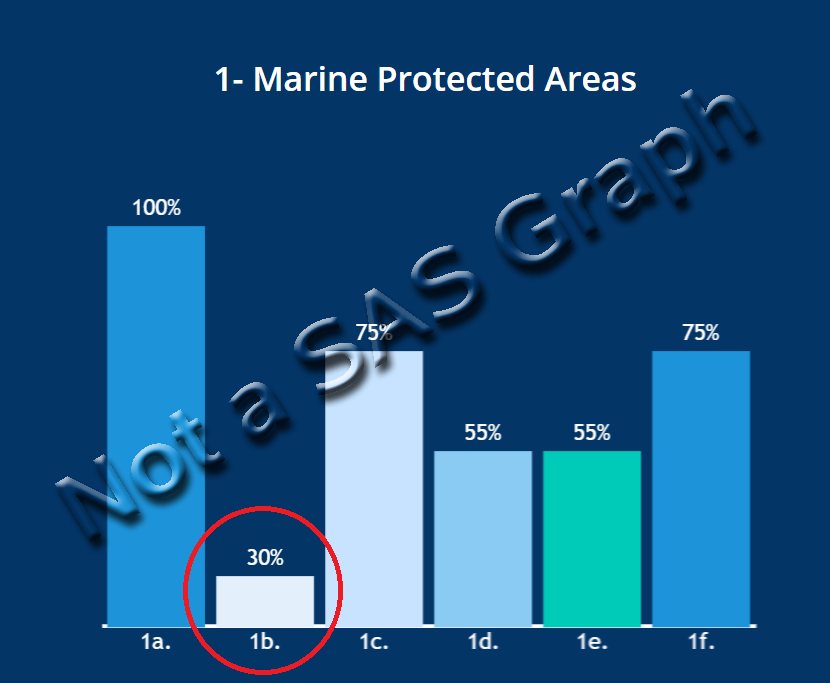
I clicked the button, and then selected item #1 - Marine Protected Areas...

I was presented with the bar chart below. And being a "Graph Guy" my attention was immediately drawn to the 30% bar (which I circled below). 30% is close to 1/3, and therefore I would expect the 30% bar to be approximately 1/3 the height of the 100% bar ... but it sure doesn't look that way. Is this my perceptual imagination? (unfortunately there's no way to determine that by looking at the graph, since the y-axis is not labeled) Is it a "bad graph"? Or are they perhaps trying to deceive me? Whatever the reason behind it - it has made me suspicious and reduced the graph's credibility to me (which I'm sure is not what the author intended).
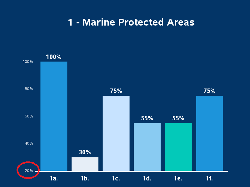
Reproducing the Bad Graph
Whenever I investigate a bad/suspect graph, I first try to reproduce it as-is to determine what the problem(s) were, and then try to fix it. After a bit of experimentation, I was able to reproduce the non-proportional heights, by having my y-axis start at 20% rather than the traditional 0%.
data my_data;
format amount percentn7.0;
input barname $ 1-3 amount;
datalines;
1a. 1.00
1b. 0.30
1c. 0.75
1d. 0.55
1e. 0.55
1f. 0.75
;
run;
proc sgplot data=my_data noautolegend noborder pad=(left=12pct right=12pct);
styleattrs datacolors=(cx1d94da cxe6eef7 cxc7e3ff cx89cbf2 cx03c9b9 cx1d94da);
styleattrs backcolor=cx033567 wallcolor=cx033567;
vbarparm category=barname response=amount / group=barname
groupdisplay=cluster nooutline
datalabel datalabelattrs=(color=white size=13pt weight=bold);
yaxis display=(nolabel noticks noline) valueattrs=(color=white) values=(.2 to 1 by .2);
xaxis display=(nolabel noticks) valueattrs=(color=white size=13pt weight=bold);
run;
Fixing the Graph
The fix for this problem is very simple - start the y-axis at zero, rather than 20%! And since that is SAS' default for bar charts, I can simply remove the values= option from the yaxis.
Note: starting the y-axis at zero is almost always the best practice for bar charts, and produces bar heights that are proportional to the values. If you choose to start your y-axis at a value other than zero, make sure you have a very good/meaningful reason to do so!
proc sgplot data=my_data noautolegend noborder pad=(left=12pct right=12pct);
styleattrs datacolors=(cx1d94da cxe6eef7 cxc7e3ff cx89cbf2 cx03c9b9 cx1d94da);
styleattrs backcolor=cx033567 wallcolor=cx033567;
vbarparm category=barname response=amount / group=barname
baselineattrs=(color=white thickness=5)
groupdisplay=cluster nooutline
datalabel datalabelattrs=(color=white size=13pt weight=bold);
yaxis display=(nolabel noticks noline) valueattrs=(color=white);
xaxis display=(nolabel noticks) valueattrs=(color=white size=13pt weight=bold);
run;
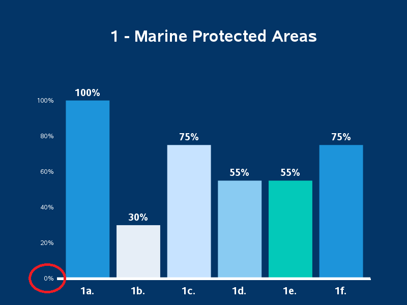
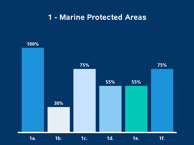
Now that we've verified the y-axis does start at zero in the new/fixed graph, we can turn off the values along the y-axis by adding the novalues option. My final graph is very similar to the original - but with the bar heights proportional to the values. "There, I fixed it!"
yaxis display=(nolabel noticks novalues noline);
Discussion
In this case, I don't see much reason the authors of the original bar chart would have intentionally tried to make the 30% bar look artificially short (ie, I don't think they're trying to deceive anyone). The 30% bar looks clearly shorter than the other bars, even using the correct/proportional heights. Therefore I suspect the bar chart was created like that unintentionally, by someone who didn't fully understand bar charts. Unfortunately, a mistake like that can make people 'suspicious' of the graph and reduce the credibility of the entire report.


4 Comments
Important information here, Robert. Why would anyone be interested in a graph if it seems like deception.
Surveying coral reefs in the Bahamas must have been quite the adventure. Especially on San Salvador!
Exactly! 🙂
And per San Salvador, it was a really neat experience. Such a sparsely populated island. The project I helped with was in 1998 and we stayed in an old military barracks (I think they have added a Sands Resort to the island since then.)
AHA! The importance of data literacy and not taking the visual at face value when it doesn't look right.
Exactly!