Plastic pollution in the oceans is becoming a huge problem. And, as with any problem, finding the solution starts with identifying the source of the problem. A recent study estimated that 95% of the plastic pollution in our oceans comes from 10 rivers - let's put some visual analytics to work, and show this data on a map...
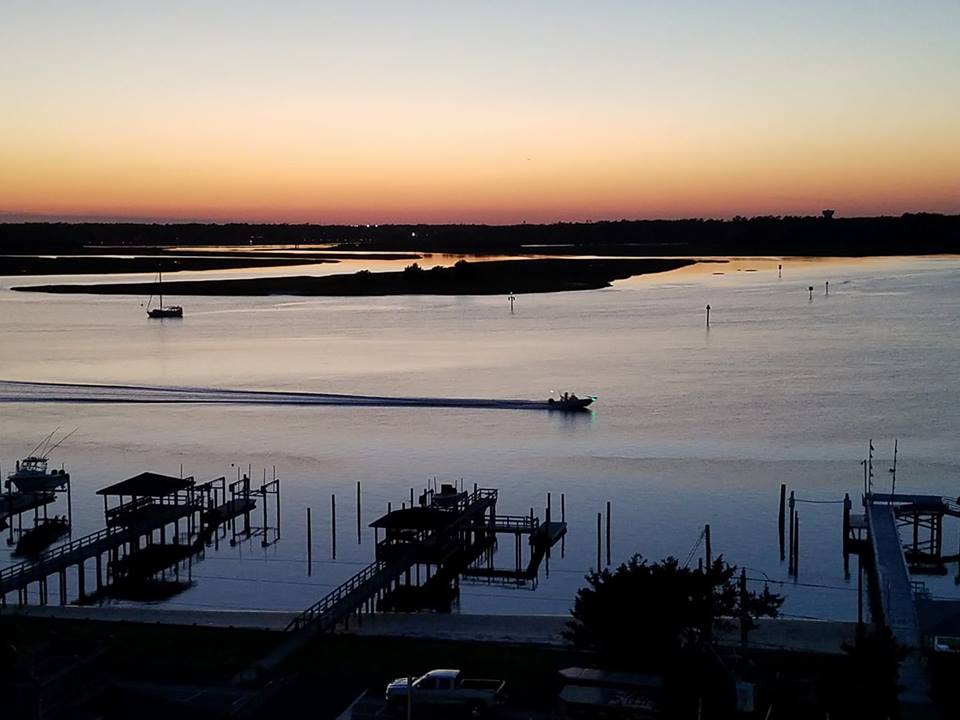
This past weekend, I paddled my outrigger canoe in the 13 mile Graveyard race (short for "Graveyard of the Atlantic") at the Carolina Cup. I was so focused on not capsizing in the waves that I didn't even have time to think about the sharks, lol. But I do remember that I didn't see a single piece of plastic floating in the water - yay for the clean coast here in North Carolina! :)

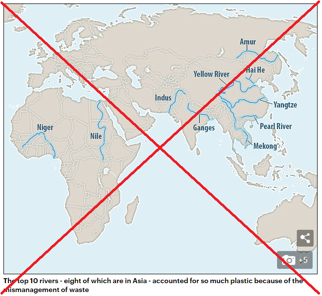
But plastic pollution in the oceans is a big problem in many parts of the world, and there's bound to be more than the occasional litterbug contributing. A recent article caught my attention, with a claim that "95% of plastic polluting the world's oceans comes from just TEN rivers" - wow! And while we should of course all do our part in not littering/polluting, it seems like focusing on these 10 rivers would give the most "bang for the buck," eh? Here's the map of the 10 rivers, from the article:
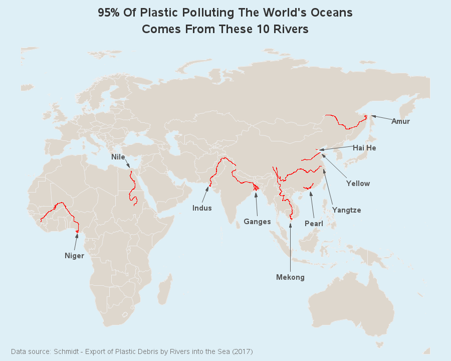
It's a decent map, and gets the job done - but I decided to see if I could create my own version, and make a few enhancements. First I wanted to track down the research paper, and verify the data (since the article I was reading was more of a 'tabloid' than a reputable news source). I found that the research was performed by Christian Schmidt, and published in the paper "Export of Plastic Debris by Rivers into the Sea." And with a little more searching, I also found the numeric data for the 10 rivers!
I then set about creating my new/improved map. I located shapefiles for the rivers & lakes centerlines, and imported them into SAS using Proc Mapimport. I projected the river data using the same projection parameters as my map, and then used annotate functions to draw the x/y values as lines. I colored the rivers red (instead of blue) to emphasize these are problem rivers. And I added labels with arrows pointing to the mouth of the rivers, so it's easy to see where they empty into the oceans. I then added a title, and a footnote indicating the data source. And if you click the image below, you can view the interactive version with mouse-over text with the country names, and if you click the river name labels that will launch a Google search for plastic pollution in that river.
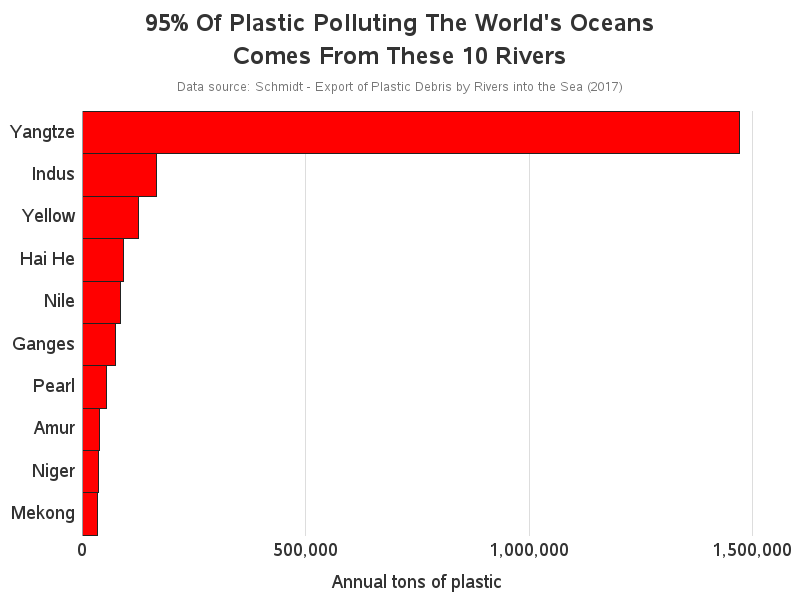
It's good to have a map, but in looking at the data, I noticed that the map doesn't show one of the most significant things ... one of the rivers has has so much plastic plastic that it dwarfs the other top-10 rivers. What's the best way to show that? I decided to use a bar chart:
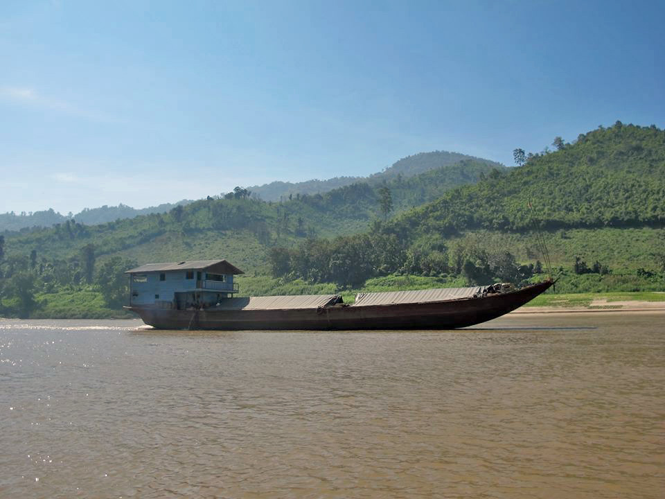
And now a little something just for fun - my usual semi-related photo album. I asked my world-traveling friends if they have any pictures of rivers in Asia, and here are a few they provided...
This one's from Joy:
This one's from John:
This one's from Simone (who taught me how to paddle!)

And this next one's not actually from Asia - it's from my hotel window, on the sound-side of Wrightsville Beach, NC (location of the Graveyard race I paddled in this past weekend):


6 Comments
That info was an eye opener. I hear about the Great Pacific Garbage Patch in the pacific. "Three times the size of France." I think this explains a large source.
https://www.nbcnews.com/mach/science/pacific-ocean-has-plastic-problem-here-s-bold-plan-fix-ncna867456
Thank you Robert for this research you have undertaken.
With the current administration’s policy, how long will it be before the Mississippi River finds its way into this chart?
Hi Rob, an idea would be to use a size parameter or a range attribute on the river name to try to display the amount of plastic from the river. Font size might make only Yangtze visible though. Inserting the bar chart might als be viable.
Thanks for Your ideas.
It would be interesting to see a map of N&S America and how bad our rivers are!
Hello.
Thanks for the work you put into this blog.
I have a couple photos from the Ganges if you like would like to add.
One is from the Baghirati about 20km from Gangotri, the Ganges source glacier, and another is from Kolkata about 50 km from the Ocean.
A little shocking, but quite revealing.