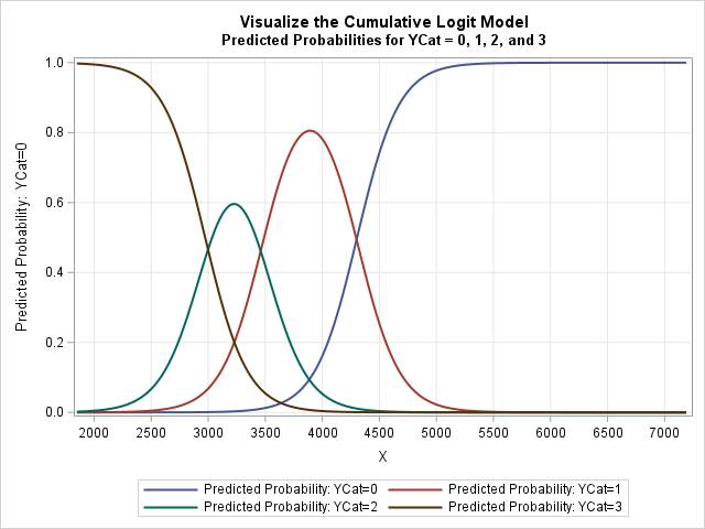
A 2-D "bin plot" counts the number of observations in each cell in a regular 2-D grid. The 2-D bin plot is essentially a 2-D version of a histogram: it provides an estimate for the density of a 2-D distribution. As I discuss in the article, "The essential guide to
Tag: Data Analysis
![](https://blogs.sas.com/content/iml/files/2019/12/binarymat3.png)
Binary matrices are used for many purposes. I have previously written about how to use binary matrices to visualize missing values in a data matrix. They are also used to indicate the co-occurrence of two events. In ecology, binary matrices are used to indicate which species of an animal are
![](https://blogs.sas.com/content/iml/files/2019/12/longitud5.png)
This is a second article about analyzing longitudinal data, which features measurements that are repeatedly taken on subjects at several points in time. The previous article discusses a response-profile analysis, which uses an ANOVA method to determine differences between the means of an experimental group and a placebo group. The
![](https://blogs.sas.com/content/iml/files/2019/11/longitud4.png)
Longitudinal data are used in many health-related studies in which individuals are measured at multiple points in time to monitor changes in a response variable, such as weight, cholesterol, or blood pressure. There are many excellent articles and books that describe the advantages of a mixed model for analyzing longitudinal
![](https://blogs.sas.com/content/iml/files/2019/11/Ilink4.png)
In a linear regression model, the predicted values are on the same scale as the response variable. You can plot the observed and predicted responses to visualize how well the model agrees with the data, However, for generalized linear models, there is a potential source of confusion. Recall that a
![](https://blogs.sas.com/content/iml/files/2019/11/BiplotSAS3.png)
Biplots are two-dimensional plots that help to visualize relationships in high dimensional data. A previous article discusses how to interpret biplots for continuous variables. The biplot projects observations and variables onto the span of the first two principal components. The observations are plotted as markers; the variables are plotted as
![](https://blogs.sas.com/content/iml/files/2019/11/rounde2.png)
In grade school, students learn how to round numbers to the nearest integer. In later years, students learn variations, such as rounding up and rounding down by using the greatest integer function and least integer function, respectively. My sister, who is an engineer, learned a rounding method that rounds half-integers
![](https://blogs.sas.com/content/iml/files/2019/11/biplotCOV.png)
Principal component analysis (PCA) is an important tool for understanding relationships in continuous multivariate data. When the first two principal components (PCs) explain a significant portion of the variance in the data, you can visualize the data by projecting the observations onto the span of the first two PCs. In
![](https://blogs.sas.com/content/iml/files/2019/11/PCA_profile.png)
Understanding multivariate statistics requires mastery of high-dimensional geometry and concepts in linear algebra such as matrix factorizations, basis vectors, and linear subspaces. Graphs can help to summarize what a multivariate analysis is telling us about the data. This article looks at four graphs that are often part of a principal
![](https://blogs.sas.com/content/iml/files/2019/10/BinomPropViz2.png)
Computing rates and proportions is a common task in data analysis. When you are computing several proportions, it is helpful to visualize how the rates vary among subgroups of the population. Examples of proportions that depend on subgroups include: Mortality rates for various types of cancers Incarceration rates by race
![](https://blogs.sas.com/content/iml/files/2019/10/splineEffects2.png)
The EFFECT statement is supported by more than a dozen SAS/STAT regression procedures. Among other things, it enables you to generate spline effects that you can use to fit nonlinear relationships in data. Recently there was a discussion on the SAS Support Communities about how to interpret the parameter estimates
![](https://blogs.sas.com/content/iml/files/2019/09/geomean3.png)
I recently wrote about how to use PROC TTEST in SAS/STAT software to compute the geometric mean and related statistics. This prompted a SAS programmer to ask a related question. Suppose you have dozens (or hundreds) of variables and you want to compute the geometric mean of each. What is
![](https://blogs.sas.com/content/hiddeninsights/files/2019/09/carlos-muza-hpjSkU2UYSU-unsplash.jpg)
In a recent video blog, I discuss forecast accuracy as a parameter for measuring the ability to forecast and plan demand. I further argue for the use of causal data as a key input to understanding historical demand and forecasting/planning future demand. Forecast accuracy is often claimed NOT to be
![](https://blogs.sas.com/content/iml/files/2019/10/meanerrorbars5.png)
In a previous article, I mentioned that the VLINE statement in PROC SGPLOT is an easy way to graph the mean response at a set of discrete time points. I mentioned that you can choose three options for the length of the "error bars": the standard deviation of the data,
![](https://blogs.sas.com/content/iml/files/2019/09/geomean3.png)
I frequently see questions on SAS discussion forums about how to compute the geometric mean and related quantities in SAS. Unfortunately, the answers to these questions are sometimes confusing or even wrong. In addition, some published papers and web sites that claim to show how to calculate the geometric mean
![](https://blogs.sas.com/content/iml/files/2019/10/HullMovingAvg3.png)
A moving average is a statistical technique that is used to smooth a time series. My colleague, Cindy Wang, wrote an article about the Hull moving average (HMA), which is a time series smoother that is sometimes used as a technical indicator by stock market traders. Cindy showed how to
![](https://blogs.sas.com/content/iml/files/2019/09/cosSim6.png)
When you order an item online, the website often recommends other items based on your purchase. In fact, these kinds of "recommendation engines" contributed to the early success of companies like Amazon and Netflix. SAS uses a recommender engine to suggest articles on the SAS Support Communities. Although recommender engines
![](https://blogs.sas.com/content/iml/files/2019/08/cosSim4.png)
An important application of the dot product (inner product) of two vectors is to determine the angle between the vectors. If u and v are two vectors, then cos(θ) = (u ⋅ v) / (|u| |v|) You could apply the inverse cosine function if you wanted to find θ in
![](https://blogs.sas.com/content/iml/files/2019/08/dataappend1.png)
Most SAS programmers know how to use PROC APPEND or the SET statement in DATA step to unconditionally append new observations to an existing data set. However, sometimes you need to scan the data to determine whether or not to append observations. In this situation, many SAS programmers choose one
![](https://blogs.sas.com/content/iml/files/2019/08/fitparamdata1.png)
An important application of nonlinear optimization is finding parameters of a model that fit data. For some models, the parameters are constrained by the data. A canonical example is the maximum likelihood estimation of a so-called "threshold parameter" for the three-parameter lognormal distribution. For this distribution, the objective function is
![](https://blogs.sas.com/content/iml/files/2019/08/timeMissing.png)
One of my friends likes to remind me that "there is no such thing as a free lunch," which he abbreviates by "TINSTAAFL" (or TANSTAAFL). The TINSTAAFL principle applies to computer programming because you often end up paying a cost (in performance) when you call a convenience function that simplifies
![](https://blogs.sas.com/content/iml/files/2019/08/binheatmap.png)
Do you want to bin a numeric variable into a small number of discrete groups? This article compiles a dozen resources and examples related to binning a continuous variable. The examples show both equal-width binning and quantile binning. In addition to standard one-dimensional techniques, this article also discusses various techniques
![](https://blogs.sas.com/content/iml/files/2017/01/ProgrammingTips-2.png)
Binning transforms a continuous numerical variable into a discrete variable with a small number of values. When you bin univariate data, you define cut point that define discrete groups. I've previously shown how to use PROC FORMAT in SAS to bin numerical variables and give each group a meaningful name
![](https://blogs.sas.com/content/iml/files/2019/07/mosaicanno3.png)
I recently showed how to create an annotation data set that will overlay cell counts or percentages on a mosaic plot. A mosaic plot is a visual representation of a cross-tabulation of observed frequencies for two categorical variables. The mosaic plot with cell counts is shown to the right. The
![](https://blogs.sas.com/content/iml/files/2019/06/hplogistic1.png)
SAS/STAT software contains a number of so-called HP procedures for training and evaluating predictive models. ("HP" stands for "high performance.") A popular HP procedure is HPLOGISTIC, which enables you to fit logistic models on Big Data. A goal of the HP procedures is to fit models quickly. Inferential statistics such
![](https://blogs.sas.com/content/iml/files/2019/06/residsmooth1.png)
When fitting a least squares regression model to data, it is often useful to create diagnostic plots of the residuals versus the explanatory variables. If the model fits the data well, the plots of the residuals should not display any patterns. Systematic patterns can indicate that you need to include
![](https://blogs.sas.com/content/iml/files/2019/06/influencecooksd1.png)
A previous article describes the DFBETAS statistics for detecting influential observations, where "influential" means that if you delete the observation and refit the model, the estimates for the regression coefficients change substantially. Of course, there are other statistics that you could use to measure influence. Two popular ones are the
![](https://blogs.sas.com/content/iml/files/2019/06/influencedfbetas3.png)
My article about deletion diagnostics investigated how influential an observation is to a least squares regression model. In other words, if you delete the i_th observation and refit the model, what happens to the statistics for the model? SAS regression procedures provide many tables and graphs that enable you to
![](https://blogs.sas.com/content/iml/files/2019/06/ShermanMorrison2-150x142.png)
For linear regression models, there is a class of statistics that I call deletion diagnostics or leave-one-out statistics. These observation-wise statistics address the question, "If I delete the i_th observation and refit the model, what happens to the statistics for the model?" For example: The PRESS statistic is similar to
![](https://blogs.sas.com/content/iml/files/2019/06/FormatRecode4.png)
Recoding variables can be tedious, but it is often a necessary part of data analysis. Almost every SAS programmer has written a DATA step that uses IF-THEN/ELSE logic or the SELECT-WHEN statements to recode variables. Although creating a new variable is effective, it is also inefficient because you have to