A 2-D "bin plot" counts the number of observations in each cell in a regular 2-D grid. The 2-D bin plot is essentially a 2-D version of a histogram: it provides an estimate for the density of a 2-D distribution. As I discuss in the article, "The essential guide to binning in SAS," sometimes you are more interested in displaying bins that contain (approximately) an equal number of observations. This leads to a quantile bin plot.
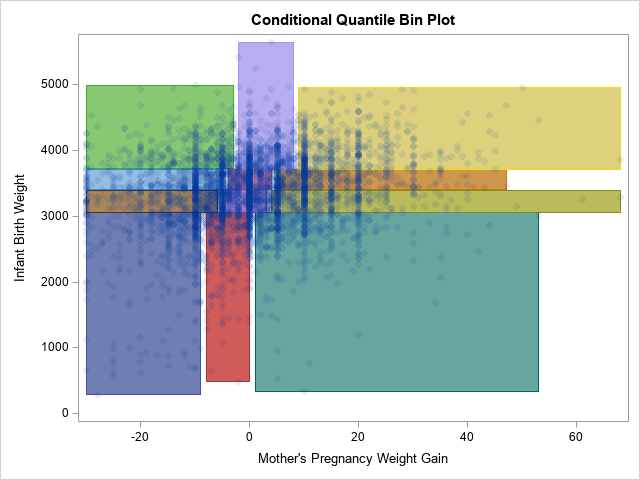
A SAS programmer on the SAS Support Communities recently requested a variation of the quantile bin plot. In the variation, the bins for the Y variable are computed as usual, but the bins for the X variable are conditional on the Y quantiles. This leads to a situation where the bins do not form a regular grid, but rather vary in both weight and width, as shown to the right. I call this a conditional quantile bin plot. In the graph, there are 12 rectangles. Each contains approximately the same number of observations. The three rectangles across each row contain a quartile of Y values.
This article shows how to construct a conditional quantile bin plot in SAS by first finding the quantiles for the Y variable and then finding the quantiles for the X variable (conditioned on the Y) for each Y quantile. You can solve this problem by using the SAS/IML language (as shown in the Support Community post) or by using PROC RANK and the DATA step, as shown in this article.
Although it is straightforward to compute conditional quantiles, it is less clear how to display the rectangles that represent the cells in the graph. On the Support Community, one solution uses the VECTOR statement in PROC SGPLOT, whereas another solution uses the POLYLINE command in an annotate data set. In this article, I present a third alternative, which is to use a POLYGON statement in PROC SGPLOT. I think that the POLYGON statement is the most powerful option because you can easily display the rectangles as filled, unfilled, in the foreground, in the background, and you can color the polygons in many informative ways.
Compute the unconditional and conditional quantiles
To compute quantiles, you can use the QNTL function in PROC IML or you can call PROC RANK and use the GROUPS= option. The following statements use PROC RANK. ("KSharp" used this method for his answer on the Support Community.) One noteworthy idea in the following program is to use the CATX or CATT function to form a grouping variable that combines the group names for the X and Y variables.
%let XVar = MomWtGain; /* name of X variable */ %let YVar = Weight; /* name of Y variable */ %let NumXDiv = 3; /* number of subdivisions (quantiles) for the X variable */ %let NumYDiv = 4; /* number of subdivisions (quantiles) for the Y variable */ /* create the example data */ data Have; set sashelp.bweight(obs=5000 keep=&XVar &YVar); if ^cmiss(&XVar, &YVar); /* only use complete cases */ run; /* group the Y values into quantiles */ proc rank data=Have out=RankY groups=&NumYDiv ties=high; var &YVar; ranks rank_&YVar; run; proc sort data=RankY; by rank_&YVar; run; /* Conditioned on each Y quantile, group the X values into quantiles */ proc rank data=RankY out=RankBoth groups=&NumXDiv ties=high; by rank_&YVar; var &XVar; ranks rank_&XVar; run; proc sort data=RankBoth; by rank_&YVar rank_&XVar; run; /* Trick: Use the CATT fuction to create a group for each unique (RankY, RankX) combination */ data Points; set RankBoth; Group = catt(rank_&YVar, rank_&XVar); run; proc sgplot data=Points; scatter x=&XVar y=&YVar / group=Group markerattrs=(symbol=CircleFilled) transparency=0.75; /* These REFLINESs are hard-coded for these data. They are the unconditional Y quantiles. */ refline 3061 3402 3716 / axis=Y; run; |
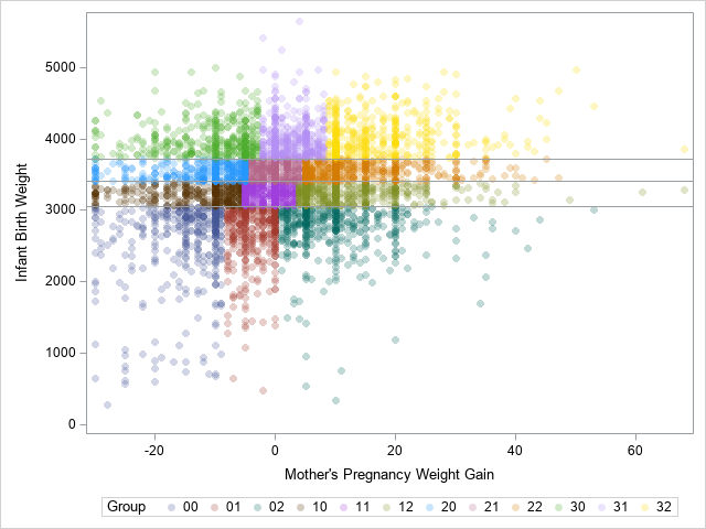
The SCATTER statement uses the GROUP= option to color each observation according to the quantile bin to which it belongs. The horizontal reference lines are the 25th, 50th, and 75th percentiles of the Y variable. These lines separate the Y variable into four groups. Within each group, the X variable is divided into three groups. The remainder of the program shows how to construct and plot the 12 rectangles that bound the groups.
Create polygons for the quantile bins
You can use PROC MEANS and a BY statement to find the minimum and maximum values of the X and Y variables for each cell. As a bonus, PROC MEANS also tells you how many observations are in each cell. If the data are unique values, each cell will have approximately N / 12 observations, where N=5000 is the total number of observations in the data set. If the data have duplicate values, remember that some quantile groups might have more observations than others.
/* Create polygons from ranks. Each polygon is a rectangle of the form [min(X), max(X)] x [min(Y), max(Y)] */ /* generate min/max for each group. Results are in wide form. */ proc means data=Points noprint; by Group; var &XVar &YVar; output out=Limits(drop=_Type_) min= max= / autoname; run; proc print data=Limits noobs; run; |
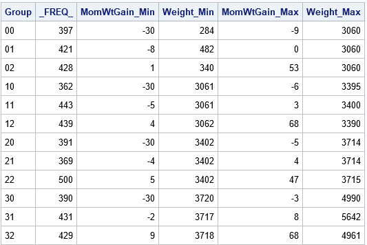
For these data, there are between 362 and 500 observations in each cell. If there were no tied values, you would expect 5000/12 ≈ 417 observations in each cell.
The Limits data set contains all the information that you need to construct the cells of the conditional quantile bin plot. PROC MEANS writes the ranges of the variables in a wide format. In order to use the POLYGON statement in PROC SGPLOT, you need to convert the data to long form and use the GROUP variable as an ID variable for the polygon plot:
/* generate polygons from min/max of groups. Write data in long form. */ data Rectangles; set Limits; xx = &XVar._min; yy = &YVar._min; output; xx = &XVar._max; yy = &YVar._min; output; xx = &XVar._max; yy = &YVar._max; output; xx = &XVar._min; yy = &YVar._max; output; xx = &XVar._min; yy = &YVar._min; output; /* repeat the first obs to close the polygon */ drop &XVar._min &XVar._max &YVar._min &YVar._max; run; /* combine the data and the polygons. Plot the results */ data All; set Points Rectangles; label _FREQ_ = "Frequency"; run; |
Create polygons for the quantile bins
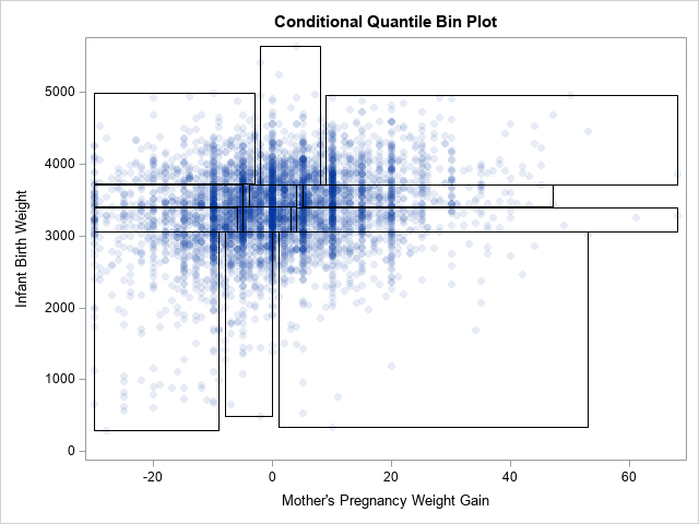
The advantage of creating polygons is that you can experiment with many ways to visualize the conditional quantile plot. For example, the simplest quantile plot merely overlays rectangles on a scatter plot of the bivariate data, as follows:
title "Conditional Quantile Bin Plot"; proc sgplot data=All noautolegend; scatter x=&XVar y=&YVar / markerattrs=(symbol=CircleFilled) transparency=0.9; polygon x=xx y=yy ID=Group; /* plot in the foreground, no fill */ run; |
On the other hand, you can also display the rectangles in the background and use the GROUP= option to display the rectangles in different colors.
proc sgplot data=All noautolegend; polygon x=xx y=yy ID=Group / fill outline group=Group; /* background, filled */ scatter x=&XVar y=&YVar / markerattrs=(symbol=CircleFilled) transparency=0.9; run; |
The graph that results from these statements is shown at the top of this article.
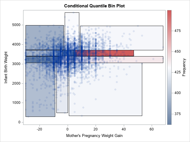
To give a third example, you can plot the rectangles in the background and use the COLORRESPONSE= option to color the rectangles according to the number of observations inside each bin. This is shown in the following graph, which uses the default three-color color ramp to assign colors to rectangles.
proc sgplot data=All; polygon x=xx y=yy ID=Group / fill outline colorresponse=_FREQ_; /* background, filled */ scatter x=&XVar y=&YVar / markerattrs=(symbol=CircleFilled) transparency=0.9; gradlegend; run; |
Summary
In summary, this article shows how to construct a 2-D quantile bin plot where the quantiles in the horizontal direction are conditional on the quantiles in the vertical direction. In such a plot, the cells are irregularly spaced but have approximately the same number of observations in each cell. You can use polygons to create the rectangles. The polygons give you a lot of flexibility about how to display the conditional quantile plot.
You can download the complete SAS program that creates the conditional quantile bin plot.
