The EFFECT statement is supported by more than a dozen SAS/STAT regression procedures. Among other things, it enables you to generate spline effects that you can use to fit nonlinear relationships in data. Recently there was a discussion on the SAS Support Communities about how to interpret the parameter estimates of spline effects. This article answers that question by visualizing the spline effects.
An overview of generated effects
Spline effects are powerful because they enable you to use parametric models to fit nonlinear relationships between an independent variable and a response. Using spline effects is not much different than use polynomial effects to fit nonlinear relationships. Suppose that a response variable, Y, appears to depend on an explanatory variable, X, in a complicated nonlinear fashion. If the relationship looks quadratic or cubic, you might try to capture the relationship by introducing polynomial effects. Instead of trying to model Y by X, you might try to use X, X2, and X3.
Strictly speaking, polynomial effects do not need to be centered at the origin. You could translate the polynomial by some amount, k, and use shifted polynomial effects such as (X-k), (X-k)2, and (X-k)3. Or you could combine these shifted polynomials with polynomials at the origin. Or use shifted polynomials that are shifted by different amounts, such as by the constants k1, k2, and k3.
Spline effects are similar to (shifted) polynomial effects. The constants (such as k1, k2, k3) that are used to shift the polynomials are called knots. Knots that are within the range of the data are called interior knots. Knots that are outside the range of the data are called exterior knots or boundary knots. You can read about the various kinds of spline effects that are supported by the EFFECT statement in SAS. Rather than rehash the mathematics, this article shows how you can use SAS to visualize a regression that uses splines. The visualization clarifies the meaning of the parameter estimates for the spline effects.
Output and visualize spline effects
This section shows how to output the spline effects into a SAS data set and plot the spline effects. Suppose you want to predict the MPG_City variable (miles per gallon in the city) based on the engine size. Because we will be plotting curves, the following statements sort the data by the EngineSize variable. Then the OUTDESIGN= option on the PROC GLMSELECT statement writes the spline effects to the Splines data set. For this example, I am using restricted cubic splines and four evenly spaced internal knots, but the same ideas apply to any choice of spline effects.
proc sort data=sashelp.cars out=cars(keep=mpg_city EngineSize model); by EngineSize; run; /* Fit data by using restricted cubic splines. The EFFECT statement is supported by many procedures: GLIMMIX, GLMSELECT, LOGISTIC, PHREG, ... */ title "Restricted TPF Splines"; title2 "Four Internal Knots"; proc glmselect data=cars outdesign(addinputvars fullmodel)=Splines; /* data set contains spline effects */ effect spl = spline(EngineSize / details /* define spline effects */ naturalcubic basis=tpf(noint) /* natural cubic splines, omit constant effect */ knotmethod=equal(4)); /* 4 evenly spaced interior knots */ model mpg_city = spl / selection=none; /* fit model by using spline effects */ ods select ParameterEstimates SplineKnots; ods output ParameterEstimates=PE; quit; |
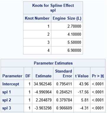
The SplineKnots table shows the locations of the internal knots. There are four equally spaced knots because the procedure used the KNOTMETHOD=EQUAL(4) option. The ParameterEstimates table shows estimates for the regression coefficients for the spline effects, which are named "Spl 1", "Spl 2", and so forth. In the Splines data set, the corresponding variables are named Spl_1, Spl_2, and so forth.
But what do these spline effects look like? The following statements plot the spline effects versus the EngineSize variable, which is the variable from which the effects are generated:
proc sgplot data=Splines; series x=EngineSize y=Intercept / curvelabel; series x=EngineSize y=spl_1 / curvelabel; series x=EngineSize y=spl_2 / curvelabel; series x=EngineSize y=spl_3 / curvelabel; refline 2.7 4.1 5.5 / axis=x lineattrs=(color="lightgray"); refline 6.9 / axis=x label="upper knot" labelloc=inside lineattrs=(color="lightgray"); yaxis label="Spline Effect"; run; |
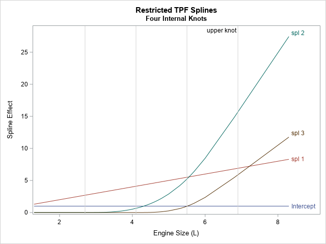
As stated in the documentation for the NATURALCUBIC option, these spline effects include "an intercept, the polynomial X, and n – 2 functions that are all linear beyond the largest knot," where n is the number of knots. This example uses n=4 knots, so Spl_2 and Spl_3 are the cubic splines. You will also see different spline effects if you change to one of the other supported spline methods, such as B-splines or the truncated power functions. Try it!
The graph shows that the natural cubic splines are reminiscent of polynomial effects, but there are a few differences:
- The spline effects (spl_2 and spl_3) are shifted away from the origin. The spl_2 effect is shifted by 2.7 units, which is the location of the first internal knot. The spl_3 effect is shifted by 4.1 units, which is the location of the second internal knot.
- The spline effects are 0 when EngineSize is less than the first knot position (2.7). Not all splines look like this, but these effects are based on truncated power functions (the TPF option).
- The spline effects are linear when EngineSize is greater than the last knot position (6.9). Not all splines look like this, but these effects are restricted splines.
Predicted values are linear combinations of the spline effects
Visualizing the shapes of the spline effects enable you to make sense of the ParameterEstimates table.
As in all linear regression, the predicted value is a linear combination of the design variables. In this case,
the predicted values are formed by
Pred = 34.96 – 5*Spl_1 + 2.2*Spl_2 – 3.9*Spl_3
You can use the SAS DATA set or PROC IML to compute that linear combination of the spline effects. The following graph shows the predicted curve and overlays the locations of the knots:
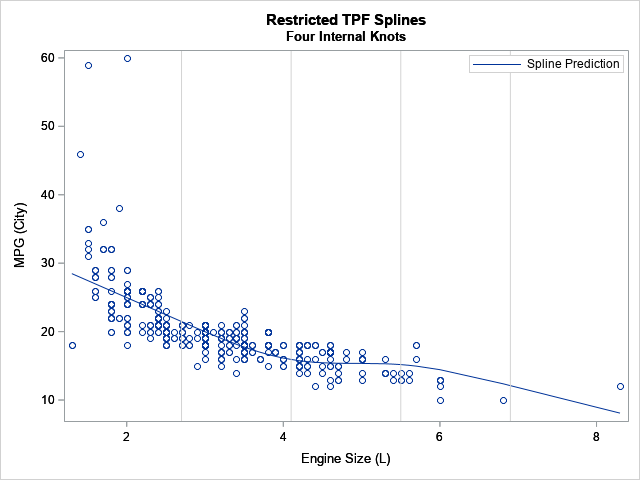
The coefficient for Spl_1 is the largest effect (after the intercept). In the graph, you can see the general trend has an approximate slope of -5. The coefficient for the Spl_2 effect is 2.2, and you can see that the predicted values change slope between the second and third knots due to adding the Spl_2 effect. Without the Spl_3 effect, the predicted values would continue to rise after the third knot, but by adding in a negative multiple of Spl_3, the predicted values turn down again after the third knot.
Notice that the prediction function for the restricted cubic spline regression is linear before the first knot and after the last knot. The prediction function models nonlinear relationships between the interior knots.
Summary
In summary, the EFFECT statement in SAS regression procedures can generate spline effects for a continuous explanatory variable. The EFFECT statement supports many different types of splines. This article gives an example of using natural cubic splines (also called restricted cubic splines), which are based on the truncated power function (TPF) splines of degree 3. By outputting the spline effects to a data set and graphing them, you can get a better understanding of the meaning of the estimates of the regression coefficients. The predicted values are a linear combination of the spline effects, so the magnitude and sign of the regression coefficients indicate how the spline effects combine to predict the response.

25 Comments
Thanks for this very interesting article! The relationships you suggest between splines and some transformations of the basic classical polynomials is especially suggestive.
Trying to replicate the SAS code you kindly offer to us, I have a problem and a request.
1) Running your first piece of SAS code (PROC GLMSELECT) on SASHELP.cars, I get the same results as those you provide in your article.
But running the PROC SGPLOT code as it is, results, on my computer, in a graph including not only four coloured curves but many and many.
Could you tell me, please, where my likely mistake or omission lies?
2) If, by the way, you might offer the SAS code allowing to display the third graph, it would be very nice.
Thanks a lot in advance.
1. I forgot to include a PROC SORT call in the article. I have updated the article.
2. You can score the model in a number of ways. The following uses PROC IML:
Dr Rick,
Could you share the SAS code to add the 95% confidence band for the spline effects? TIA
First, run PROC GLMSELECT to obtain the spline columns. Then use them in your favorite regression procedure:
Thanks Dr Rick. I am using Proc Surveylogistic, which doesn't support the outdesign= option. Could you help me how to get access / retrieve the spline design variables constructed through the effect statement?
This article answers your question: Use PROC GLMSELECT to get the design matrix. If your model includes CLASS variables, be aware that PROC SURVEYSELECT uses the PARAM=EFFECT parameterization by default.
Dr Rick,
Thanks for the pingback you posted on the original blog (https://blogs.sas.com/content/iml/2017/04/19/restricted-cubic-splines-sas.html). I only caught it yesterday (https://blogs.sas.com/content/iml/2019/10/16/visualize-regression-splines.html). Thanks for the update.
So, if I am understanding correctly, the results here are not centered as is done with the macro RCSPLINE. Collinearity diagnostics using the COLLIN option is PROC REG is a requirement in many banking companies to have all Condition Index values to be less than 30, even though Belsley does NOT believe that should be is a fixed rule (David A. Besley. A Guide to Using the Collinearity Diagnostics. Computer Science in Economics and Management 4: 33-50, 1991 33© 1991 Kluwer Academic Publishers. Printed in the Netherlands). So do I and I typically, in consumer banking models use 100 but sometimes have difficulty explaining it to convince Controls and Internal Independent Validation Departments. But I do get often my centered splines following the RSCSPLINE macro to have condition index values under 30 using the scaling method that scales the spline terms to have the same distributions as the distribution of the non transformed independent variable.
Will the COLLIN results change if you use the original RSCPLINE macro, which is centered and uses cube terms for all 3 knots compared to the new output you showed here, not centered?
Belsley, in the 1991 paper was reluctant to use centering of variables since he said that the variables are standardized before calculating the Singular Values. I believe his method of standardizing is what I learned in 1981; standardizing results in the sum of squares of the variable are all set to 1. Many statisticians do use the centering approach to include a variable that would lower the condition index for those variables that are important in the model and make sense with additional analysis. Belsley was not keen on the idea (Belsley, D.A., 1984a, Demeaning conditioning diagnostics through centering, with accompanying comments and author's reply, The American Statistician 38, 73-93).
Not sure if the centering method I and other SASaticians use is more acceptable today but needs to be endorsed by internal Controls.
I haven't tried this yet but will give it a shot in the near future.
Thanks
Jonas V. Bilenas
Your question is not really about splines, it is about the relationship between regression diagnostics when you standardize the variables versus when you do not. In your question, you are asking about how the collinearity analysis for centered variables (splines basis from the RCSPLINE macro) will compare with the collinearity analysis for uncentered variables (splines from the EFFECT statement). The answer (which you cite from Belsley (1991)) is that the centered variables will differ and, according to your experience, will often have a lower condition index. If you want to center the spline variables that are created by using the EFFECT statement, use the OUTDESIGN= option to write them to a data set, then use PROC STDIZE to center them:
From your comment, it sounds like Belsley would advocate using the uncentered splines that come from the EFFECT statement, but I have not read the paper.
Dr. Rick,
thank you so much for the code.
I'm confused with my model. I did splines regression with three knot. I ended up with this equation:
Pred = 36.72 – 0.1692*Spl_1 + 0.002627*Spl_2
I only used one independent variable, if I set it as x=24 does that mean that both spl_1 and spl_2 will be set to be 24 in the equation? like, 36.72 – 0.1692*(24)+ 0.002627*(24).
thank you
No, not in general. As you can see from the first graph in this article, the splines are functions of x. The splines in this article are truncated power functions, so they are of the form (x - k)^d, where k is a knot location and d is the power. If you know the values of k and d, you can plug in x=x0 to evaluate the spline.
Dr. Wicklin, thank-you for such great descriptions of applying RCS in SAS. Having said so how does that look like with logistic regression especially when I want to graph a plot with OR (or lnOR) on the y-axis along with the 95% CI limits?
Would you kindly advise?
You can use the ODDSRATIO statement to compute and plot ORs in PROC LOGISTIC. For example, see the last example in this article, "Estimating the odds ratio for X in a logistic model containing a polynomial or spline of X."
Hi Dr Wicklin, I'm wondering if there's similar code you could suggest for PROC PHREG when trying to graph a plot of HR vs a spline of a continuous variable. Thanks in advance!
The ideas are the same for any regression model: PHREG, logistic, etc. You can probably figure it out if you try.
Thanks very much, Dr. Wicklin.
Hi Dr wicklin
I was wondering of there is a code through which I can exactly know the data point at which the knot was taken
thank you for your help
The DETAILS option produces the table that you want. It is shown in the output on this page. For this example, the knots are at 2.7, 4.1, 5.5, and 6.9.
What about the coefficients of the two polynomials before and after each knot? is there a way to know them ?
You can ask for programming help by posting your program and data to the SAS Support Communities. For spline-related questions, I suggest the Statistical Community.
Dear Dr. Rick Wicklin,
For the model of restricted cubic spline, in Frank E. Harrell's (2015) book, he mentioned that the reduced form of restricted cubic spline formula is
f(x) = intercept + linear *x + B2 (x-t1)^3 + B3 (x-t2)^3...
However, in your predicted value: Pred = 34.96 – 5*Spl_1 + 2.2*Spl_2 – 3.9*Spl_3
I did not see any cubic polynomial in this predicted value.
Is SAS using a different method to calculate the restricted cubic spline?
Furthermore, for Pred = 34.96 – 5*Spl_1 + 2.2*Spl_2 – 3.9*Spl_3,
Should this be Pred = 34.96 – 5*x + 2.2*x – 3.9*x ?
Look at the first graph in this article and re-read the section "Output and visualize spline effects." The graph shows that the spline effects consist of an intercept, a linear term, and (restricted) cubic polynomials. The Spl_1 term is linear. The Spl_2 and Spl_3 terms are cubic. Thus, the model is the same as you present. The article's formula for the predicted values is correct. The predicted values are linear combinations of the effects in the model.
Dear Dr. Rick Wicklin, thank you for great descriptions of applying RCS in SAS.How shoud I use logistic or log-binomial model when I want to graph a plot with predicted probability on the y-axis along with the 95% CI limits with RCS?
You can ask questions like this at the SAS Support Communities. You can provide sample data, upload images that show what you want, and more.
Pingback: Visualize a multivariate regression model when using spline effects - The DO Loop
Pingback: Visualize the placement of knots for regression splines - The DO Loop