In a previous article, I discussed the binormal model for a binary classification problem. This model assumes a set of scores that are normally distributed for each population, and the mean of the scores for the Negative population is less than the mean of scores for the Positive population. I showed how you can construct an exact ROC curve for the population.
Of course, in the real world, you do not know the distribution of the population, so you cannot obtain an exact ROC curve. However, you can estimate the ROC curve by using a random sample from the population.
This article draws a random sample from the binormal model and constructs the empirical ROC curve by using PROC LOGISTIC in SAS. The example shows an important truth that is sometimes overlooked: a sample ROC curve is a statistical estimate. Like all estimates, it is subject to sampling variation. You can visualize the variation by simulating multiple random samples from the population and overlaying the true ROC curve on the sample estimates.
Simulate data from a binormal model
The easiest way to simulate data from a binormal model is to simulate the scores. Recall the assumptions of the binormal model: all variables are continuous and there is a function that associates a score with each individual. The distribution of scores is assumed to be normal for the positive and negative populations. Thus, you can simulate the scores themselves, rather than the underlying data.
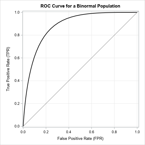
For this article, the scores for the Negative population (those who do not have a disease or condition) is N(0, 1). The scores for the Positive population (those who do have the disease or condition) is N(1.5, 0.75). The ROC curve for the population is shown to the right. It was computed by using the techniques from a previous article about binormal ROC curves.
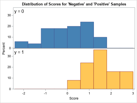
The following SAS DATA step simulates a sample from this model. It samples nN = 50 scores from the Negative population and nP = 25 scores from the Positive population. The distribution of the scores in the sample are graphed below:
%let mu_N = 0; /* mean of Negative population */ %let sigma_N = 1; /* std dev of Negative population */ %let mu_P = 1.5; /* mean of Positive population */ %let sigma_P = 0.75; /* std dev of Positive population */ %let n_N = 50; /* number of individuals from the Negative population */ %let n_P = 25; /* number of individuals from the Positive population */ /* simulate one sample from the binormal model */ data BinormalSample; call streaminit(12345); y = 1; /* positive population */ do i = 1 to &n_P; x = rand("Normal", &mu_P, &sigma_P); output; end; y = 0; /* negative population */ do i = 1 to &n_N; x = rand("Normal", &mu_N, &sigma_N); output; end; drop i; run; title "Distribution of Scores for 'Negative' and 'Positive' Samples"; ods graphics / width=480px height=360px subpixel; proc sgpanel data=BinormalSample noautolegend; styleattrs datacolors=(SteelBlue LightBrown); panelby y / layout=rowlattice onepanel noheader; inset y / position=topleft textattrs=(size=14) separator="="; histogram x / group=y; rowaxis offsetmin=0; colaxis label="Score"; run; |
Create an ROC plot for a sample
You can create an ROC curve by first creating a statistical model that classifies each observation into one of the two classes. You can then call PROC LOGISTIC in SAS to create the ROC curve, which summarizes the misclassification matrix (also called the confusion matrix) at various cutoff values for a threshold parameter. Although you can create an ROC curve for any predictive model, the following statements fit a logistic regression model. You can use the OUTROC= option on the MODEL statement to write the values of the sample ROC curve to a SAS data set. You can then overlay the ROC curves for the sample and for the population to see how they compare:
/* use logistic regression to classify individuals */ proc logistic data=BinormalSample noprint; model y(event='1') = x / outroc=ROC1; run; /* The ROC curve for the binormal population */ data PopROC; do t = -3 to 4 by 0.1; /* cutoff values */ FPR = 1 - cdf("Normal", t, &mu_N, &sigma_N); TPR = 1 - cdf("Normal", t, &mu_P, &sigma_P); output; end; run; /* merge in the population ROC curve */ data ROC2; set ROC1 PopROC; run; title "Population ROC Curve vs. Estimate"; ods graphics / width=480px height=480px; proc sgplot data=ROC2 aspect=1 noautolegend; step x=_1MSPEC_ y=_SENSIT_ / lineattrs=(color=blue) name="est" legendlabel="Estimate"; series x=FPR y=TPR / lineattrs=(color=black) name="pop" legendlabel="Population"; lineparm x=0 y=0 slope=1 / lineattrs=(color=gray); xaxis grid; yaxis grid; keylegend "est" "pop" / location=inside position=bottomright across=1 opaque; label _1MSPEC_ ="False Positive Rate (FPR)" _SENSIT_ ="True Positive Rate (TPR)"; run; |
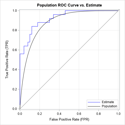
The graph shows the sample ROC curve (the blue, piecewise-constant curve) and the population ROC curve (the black, smooth curve). The sample ROC curve is an estimate of the population curve. For this random sample, you can see that most estimates of the true population rate are too large (given a value for the threshold parameter) and most estimates of the false positive rate are too low. In summary, the ROC estimate for this sample is overly optimistic about the ability of the classifier to discriminate between the positive and negative populations.
The beauty of the binormal model is that we know the true ROC curve. We can compare estimates to the truth. This can be useful when evaluating competing models: Instead of comparing sample ROC curves with each other, we can compare them to the ROC curve for the population.
Variation in the ROC estimates
If we simulate many samples from the binormal model and plot many ROC estimates, we can get a feel for the variation in the ROC estimates in random samples that have nN = 50 and nP = 25 observations. The following DATA step simulates B = 100 samples. The subsequent call to PROC LOGISTIC uses BY-group analysis to fit all B samples and generate the ROC curves. The ROC curves for five samples are shown below:
/* 100 samples from the binormal model */ %let NumSamples = 100; data BinormalSim; call streaminit(12345); do SampleID = 1 to &NumSamples; y = 1; /* sample from positive population */ do i = 1 to &n_P; x = rand("Normal", &mu_P, &sigma_P); output; end; y = 0; /* sample from negative population */ do i = 1 to &n_N; x = rand("Normal", &mu_N, &sigma_N); output; end; end; drop i; run; proc logistic data=BinormalSim noprint; by SampleID; model y(event='1') = x / outroc=ROCs; run; title "5 Sample ROC Curves"; proc sgplot data=ROCs aspect=1 noautolegend; where SampleID <= 5; step x=_1MSPEC_ y=_SENSIT_ / group=SampleID; lineparm x=0 y=0 slope=1 / lineattrs=(color=gray); xaxis grid; yaxis grid; label _1MSPEC_ ="False Positive Rate (FPR)" _SENSIT_ ="True Positive Rate (TPR)"; run; |
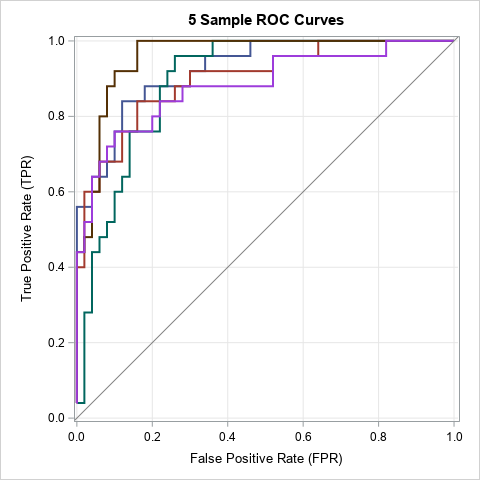
There is a moderate amount of variation between these curves. The brown curve looks different from the magenta curve, even though each curve results from fitting the same model to a random sample from the same population. The difference between the curves are only due to random variation in the data (scores).
You can use partial transparency to overlay all 100 ROC curves on the same graph. The following DATA step overlays the empirical estimates and the ROC curve for the population:
/* merge in the population ROC curve */ data AllROC; set ROCs PopROC; run; title "ROC Curve for Binormal Model"; title2 "and Empirical ROC Curves for &NumSamples Random Samples"; proc sgplot data=AllROC aspect=1 noautolegend; step x=_1MSPEC_ y=_SENSIT_ / group=SampleID transparency=0.9 lineattrs=(color=blue pattern=solid thickness=2); series x=FPR y=TPR / lineattrs=(color=black thickness=2); lineparm x=0 y=0 slope=1 / lineattrs=(color=gray); xaxis grid; yaxis grid; label _1MSPEC_ ="False Positive Rate (FPR)" _SENSIT_ ="True Positive Rate (TPR)"; run; |
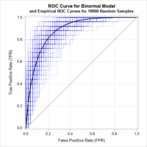
The graph shows 100 sample ROC curves in the background (blue) and the population ROC curve in the foreground (black). The ROC estimates show considerable variability.
Summary
In summary, this article shows how to simulate samples from a binormal model. You can use PROC LOGISTIC to generate ROC curves for each sample. By looking at the variation in the ROC curves, you can get a sense for how these estimates can vary due to random variation in the data.

2 Comments
Dr Wicklin,
This is a stupendous article! Could you post the entire code? I can't find the data set named "PopROC" to create ROC for the population.
Thanks,
Ethan
Sorry for the confusion. I have added the missing DATA step.