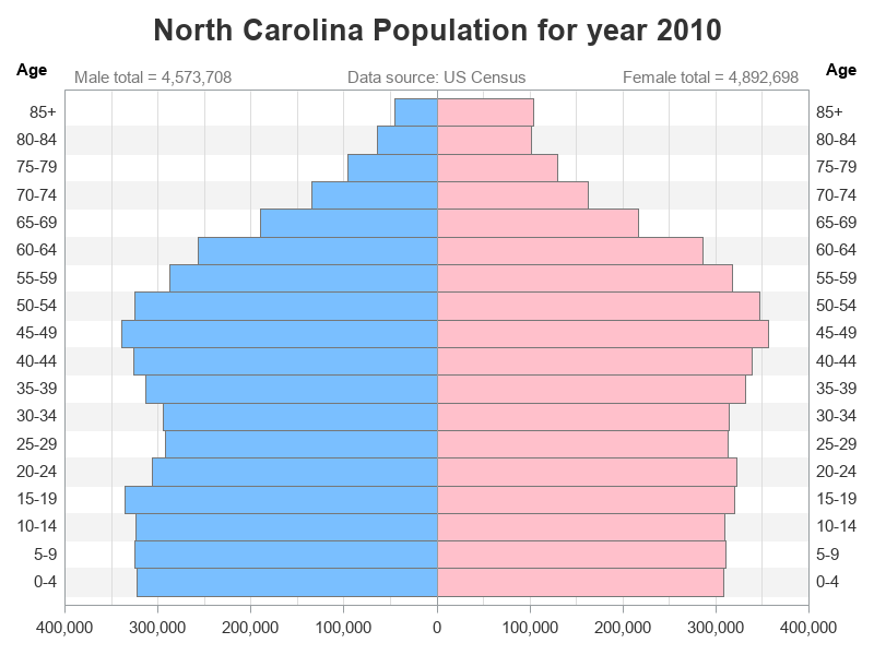
Analyzing age and gender distribution, with a pyramid chart

With the US census coming in 2020, I've decided to sharpen my skills at graphing census data. And today I'm working on creating a population pyramid chart to analyze the age and gender distribution. Follow along if you'd like to see how to create such a chart ... or jump