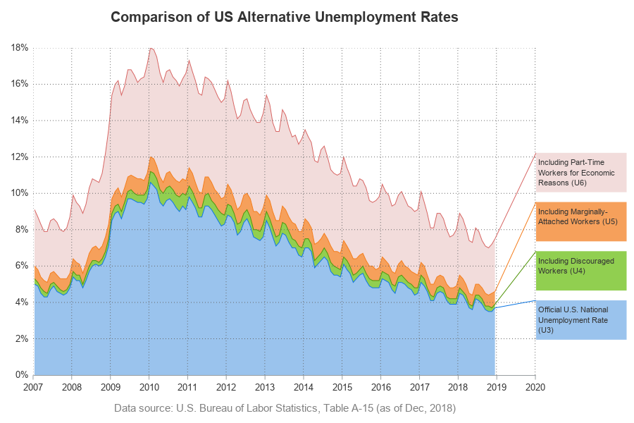
Many areas of the US are experiencing record low unemployment. This is great at the national level, and also great at a personal level (for example, I now have fewer unemployed friends asking to borrow money!) But just how low is the US unemployment rate, and how does it compare with the historical data? This seemed like a great challenge for a GraphGuy like me!
After much thought, I decided to use a band plot, so I could show the standard unemployment rate, and also three other unemployment rates that include various extra categories of unemployed. My plot is somewhat based on one I saw in a mercatus.org article, but with several changes and improvements. Here's my final graph (read on below, if you'd like to learn more details about how I created it).
The Data
The US Bureau of Labor Statistics has a web page where you can download unemployment data. I chose to download not only the data for the standard/official unemployment rate, but also three other variations that include a few additional categories of unemployed. Here is a screen capture of my data selection in the BLS interface:
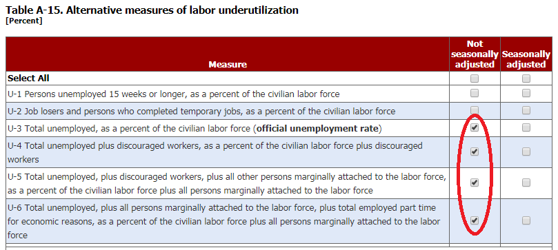
I selected the desired years (2007 and onward), and then downloaded the data. Their interface downloads each of the four series into a separate spreadsheet. Here's the code I used to import and transpose one of the spreadsheets (the code for the others is very similar):
PROC IMPORT DATAFILE="SeriesReport-20190129125513_9c8d7c.xlsx" OUT=u3 DBMS=XLSX REPLACE;
RANGE="BLS Data Series$A12:M24";
GETNAMES=YES;
RUN;
proc transpose data=u3 out=u3 (rename=(col1=u3_unemployment _name_=month) drop=_label_);
by year;
run;
After importing all four spreadsheets, I merged them into a single dataset using the following data step:
data my_data; merge u3 u4 u5 u6;
run;
BLS Basic Graph
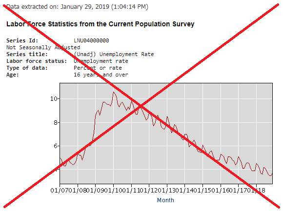
The BLS interface lets you graph the data for each series separately. Here's what one of their graphs looks like. They're decent simple graphs (aside from the crowded xaxis, which is a bit difficult to read), but I was more interested in a combined plot showing all 4 series together.
My Band Plot Graph
Since each of the four series of unemployment consists of the previous series, plus some extra unemployed, I decided to use a band plot, where the bottom band is the standard unemployment rate, and then each band stacked on top of it shows the additional unemployed workers that the next series adds.
In SAS' Proc SGplot, you create a band by specifying a lower and upper value for each band, at each point along the xaxis. This required a little manipulation of the data, which was easy to accomplish in a data step:
data my_data; set my_data;
band1_min=0; band1_max=u3_unemployment;
band2_min=band1_max; band2_max=u4_unemployment;
band3_min=band2_max; band3_max=u5_unemployment;
band4_min=band3_max; band4_max=u6_unemployment;
run;
I can now specify the bands in Proc SGplot using the following:
band x=date lower=band4_min upper=band4_max / fillattrs=(color=&lred);
band x=date lower=band3_min upper=band3_max / fillattrs=(color=&lorange);
band x=date lower=band2_min upper=band2_max / fillattrs=(color=&lgreen);
band x=date lower=band1_min upper=band1_max / fillattrs=(color=&lblue);
I liked the band plot, but some of the colors (such as blue and green) tended to visually blend in together. Therefore, I added a line at the top of each band, using a series statement. These lines are a darker shade of the fill color:
series x=date y=band4_max / lineattrs=(color=&dred);
series x=date y=band3_max / lineattrs=(color=&dorange);
series x=date y=band2_max / lineattrs=(color=&dgreen);
series x=date y=band1_max / lineattrs=(color=&dblue);
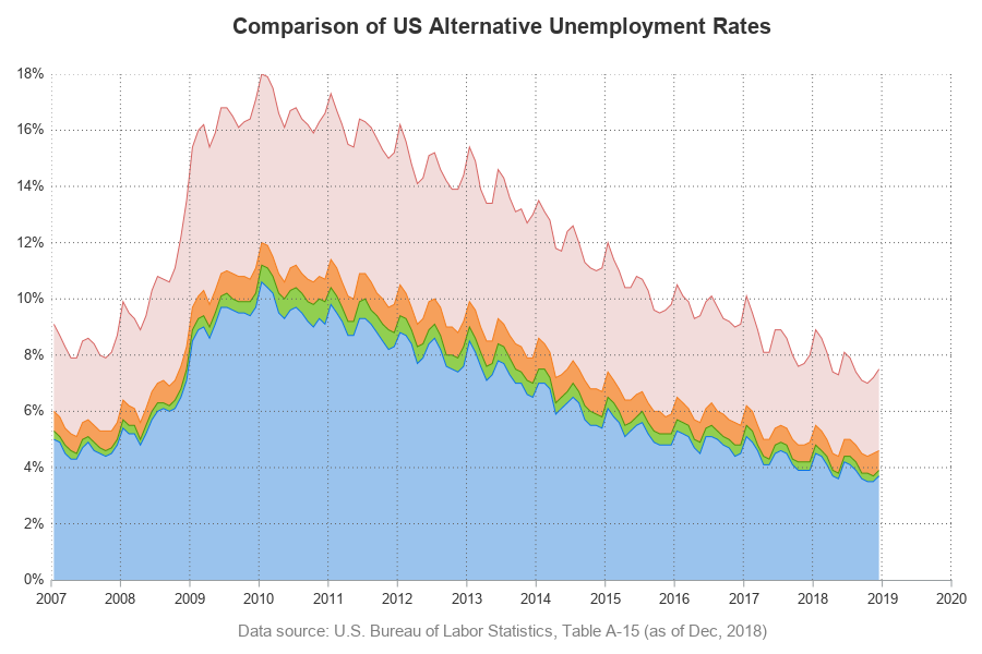
I was now happy with the graphical part of the graph, but I also needed to finish the explaining part. What do each of the colors represent? I would normally use a color legend, but in this case the explanations are a bit long/wordy, therefore I wanted to try something a little different. I decided to use annotate, and draw a line from the top edge of each color, and attach it to a text box that explains what the color represents. I used SGplot's pad option to add some white-space to the right of the graph, to make room for these annotated text boxes.
proc sgplot data=my_data noautolegend noborder pad=(right=21pct) sganno=my_anno;
And that's how I got the final graph!
Now it's your turn - what other changes/improvements would you make to this graph? Are there other (completely different) ways you would recommend plotting this data? Feel free to discuss in the comments section!


8 Comments
The stacked band plot in this article in this article assumes that the data are in "wide form" (4 variables). If your data are in "long form" you can use a similar technique to create a stacked band plot.. An advantage of long form is that the SGPLOT code is the same no matter how many categories you are stacking.
If doing a band plot, in principle I like the idea of the lines at the top of each band. (But see, also, my comment about band plots at Rick Wicklin's blog posting cited above.)
Even when I use my magnifying glass, I cannot see any line at the top of the orange band. For the green band, the line thickness varies. On the up slopes, I can see a line. On the down slopes, any line is so thin as to be invisible, if it has indeed actually been drawn. I have no suggestion on how to fix this. When I reduce the resolution of my laptop monitor, the line for the orange band is still invisible, and it does look like there might be a very thin line on the down slopes of the green band.
There is sufficient room to the right of the plot body to provide bigger text for the band descriptions. This information is no less important than the title of the plot. The contrast between text and background is good for the top band. For the others, white text might be better. See, e.g., the use of white on grey in the grey section bands in this blog. In any case, there is no reason to not make the text bigger. And bold face might help, if you do not want to experiment with white text instead.
LeRoy Bessler PhD
Visual Data Insights™
Strong Smart Systems™
Good points. I had tried to somewhat stick with the same colors as the original mercatus.org graph, but I might try tweaking them a little (to get more contrast).
This is great and ran with no issues on 9.4 M2!! Really like the annotation on the side rather than a legend and will likely start using that immediately.
Where does the -3 and -3.1 come from? Just a visual estimate?
Thanks Jaime! I came up with the y=y-3 and y=y-3.1 to position/space the lines of annotated text 'legend' by trial-and-error. 🙂
When I saw Jaime Pena's posting, I decided to look at the code, for the possibility of seeing what I could do to make the text in the legend easier to read. I noticed that you used the HTML destination, which motivated me to click on the graph.
When I do that, the legend is definitely easier to read, without any code changes, but the odd look of the green line remains the same. Use of my magnifying glass DOES reveal an orange line at some points, but when visible it's more apparent on the up slope, as in the case of the green line. If it were simply a matter of color choice for the line, I can't understand why the slope of the line matters.
LeRoy Bessler PhD
Visual Data Insights™
Strong Smart Systems™
With sloped lines, anti-aliasing tends to change the color a bit.
Pingback: Does low unemployment mean there are job openings? - Graphically Speaking