A previous article shows how to construct an empirical cumulative distribution function (ECDF) in SAS. The most common way is by using PROC UNIVARIATE, but you can also call the ECDF function in the SAS IML language. The ECDF is a tool for visualizing the distribution of a univariate sample and is helpful for estimating quantiles in the data.
In statistics, we assume that a sample is a random draw from an underlying distribution. Each random sample has a different ECDF. Therefore, you can think of an ECDF as a "point estimate" of the underlying cumulative distribution. If you were to draw a different sample of the same size, you would obtain a different ECDF function. Assuming that the data came from the same data-generating process (that is, the same probability distribution) an interesting question is: How much variability should you expect in a random ECDF?
I like to answer questions like this by using a simulation approach. A simulation builds intuition with a minimal amount of math. After understanding the main ideas and concepts, the math usually becomes easier to understand.
This article creates a simulation in SAS that enables you to visualize the variability for the ECDF of a random normal sample.
How much should you expect an ECDF to vary?
This section uses simulation to generate many normal samples. For each sample, you can compute the ECDF plot and display them in a single graph. This visualizes the concept of variability of the ECDF for a random sample. To see variability in histograms and Q-Q plots, you can read a previous article.
A previous article showed how to compute the ECDF of a real data set containing the breaking strength of fiber-optic cords. That data appears to be approximately normally distributed with mean μ = 7 and standard deviation σ = 0.13.
Let's simulate 1,000 random samples from N(7, 0.13) and compute the ECDF for each. Let's then plot the ECDFs and overlay two curves: the true normal CDF and the ECDF for the real data. To do this, you can use the ECDF function in SAS IML. The ECDF function is natively supported in SAS Viya, or you can load the SAS 9.4 function that I created in the last article:
/* Before running this program in SAS 9.4, define and STORE the ECDF function from https://blogs.sas.com/content/iml/2026/05/26/create-ecdf.html */ proc iml; load module=(ECDF); /* One way to visualize the variability in the ECDF estimate is to run a simulation. Repeat B times: Generate a random sample of size 50 from N(mu, sigma) Compute the ECDF Then plot the B ECDFs from the simulated samples and overlay the ECDF for the data. The following carries out that plan. */ mu = 7; sigma = 0.13; NSamples = 1000; NObs = 50; X = j(NObs, NSamples, .); /* each column of X is a random sample */ call randseed(1234); call randgen(X, "Normal", mu, sigma); ECDF = j(NObs, NSamples, .); do i = 1 to NSamples; ECDF[,i] = ecdf( X[,i] ); /* the i_th column is an ECDF of X[,i] */ end; /* the CREATE/APPEND statement outputs data row-wise, so transpose. Now the i_th row X[i,] is a sample and ECDF[i,] is the ECDF. */ X = X`; ECDF = ECDF`; create ECDF_Sim var {"X" "ECDF"}; append; close; /* create some overlays */ /* First, overlay the parent probability distribution */ t = do(mu - 3.5*sigma, mu + 3.5*sigma, sigma/100); CDF = cdf("Normal", t, mu, sigma); create CDF var {"t" "CDF"}; append; close; /* Next, read data, compute ECDF, write to data set */ use Cord; read all var "Strength"; close; call sort(Strength); ecdf_data = ECDF(Strength); create ECDF_Data var {"Strength" "ECDF_Data"}; append; close; QUIT; /* merge the ECDF, the simulated ECDFs, and the CDF from N(mu, sigma) */ data ECDF_All; set ECDF_Sim CDF ECDF_Data; run; /* overlay the 1,000 simulated ECDFs and the real ECDF */ title "1,000 Random Normal ECDFs"; proc sgplot data=ECDF_All noautolegend; label x="Breaking Strength (psi)" ECDF="Cumulative Proportion"; scatter x=X y=ECDF / transparency=0.98; series x=t y=CDF / lineattrs=(color=black thickness=2); step x=Strength y=ECDF_Data / lineattrs=(color=DarkRed thickness=3); xaxis grid label="x"; yaxis grid; run; |
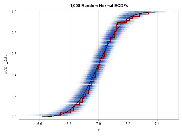
Let's understand this graph. The blue point cloud contains points for 1,000 ECDFs from random samples of size N=50 from a normal distribution. (Technically, I should have overlaid 1,000 step functions, but plotting the points with high transparency creates a cleaner "density cloud" effect.) On top of the cloud, I overlaid a black curve, which is the true CDF of the population distribution. I also overlaid a dark red step function, which is the ECDF of the Strength variable in the Cord data set. This ECDF seems to fit inside the blue cloud, which indicates that you cannot rule out that the Strength data came from an N(7, 0.13) distribution.
You can use this visual cloud to answer two related questions about sampling variability:
- Given a specific value X, what is its likely percentile? You can estimate the answer by drawing a vertical line on the graph. The intersection of that line with the vertical spread of the blue cloud indicates the variability of the quantiles. For example, if you draw a vertical line at the mean X=7, the quantile range spans approximately [0.35, 0.65]. This indicates that the value 7 in any given random sample of size 50 could reasonably fall anywhere between the 35th and 65th percentiles.
- Given a specific percentile, what is the likely range of X values? You can estimate this by drawing a horizontal line. The intersection of the horizontal line and the horizontal width of the blue cloud indicates the variability of the X values for that exact quantile. For example, if you draw a line for the median (q=0.5), the intersection with the cloud appears to span X values roughly in the range [6.95, 7.05]. This indicates where the sample median is likely to fall.
Notice that the dark red ECDF from the Cord data fits almost entirely inside the densest part of the blue cloud. This suggests that it is reasonable to hypothesize that the Strength data came from an N(7, 0.13) distribution. You might want to run a formal statistical test for this hypothesis. You can use PROC UNIVARIATE to run several ECDF-based goodness-of-fit tests, as follows:
proc univariate data=Cord normal; cdfplot Strength / normal(mu=7 sigma=0.13); ods select TestsForNormality CDFPlot; run; |
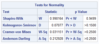
The output includes the TestsForNormality table, which shows tests statistics and p-values for several tests for normality. All tests fail to reject the null hypothesis, which tells us that the data are consistent with N(7, 0.13).
Summary
Statistics on small random samples have large variability. Graphical plots of the data (such as histograms, Q-Q plots, and ECDF plots) will naturally vary from sample to sample. The simulation approach in this article visualizes a region where an ECDF is likely to be for a random sample. If your observed data falls within this region, it is plausible the data came from the hypothetical distribution. This intuitive idea motivates looking at adding confidence intervals to Q-Q plots and ECDF plots, which is a topic for a future article.

1 Comment
Rick,
PROC UNIVARIATE has an option CIPCTLDF= which (and I quoted)
"requests confidence limits for quantiles based on a method that is distribution-free."
That could plot the graph you drew in another way ,right ?