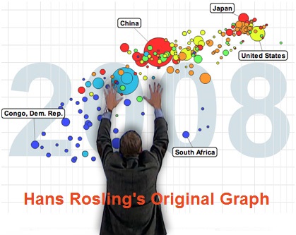
As we're approaching the anniversary of Hans Rosling's passing, I fondly remember his spectacular graphical presentations comparing the wealth and health of nations around the world. He certainly raised the bar for data visualization, and his animated charts inspired me to work even harder to create similar visualizations!
What better way to honor his legacy, than to try and re-create one of his animated graphs! ... So let's get started!
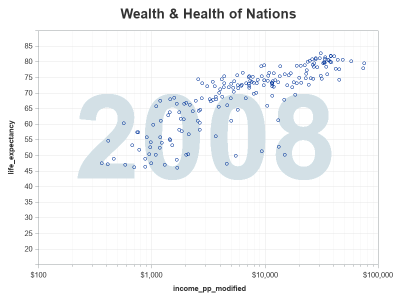
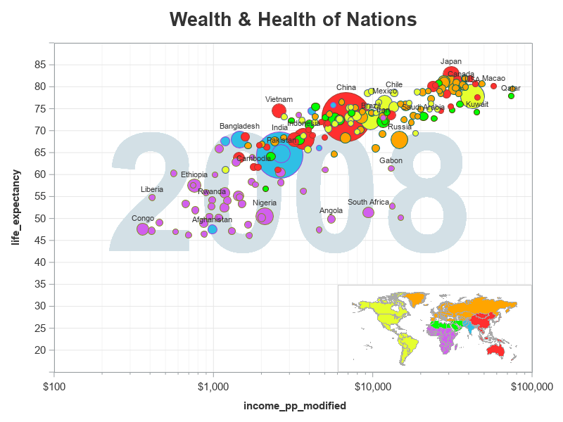
Gapminder has created many versions and updates of the graphs Hans used, but here is a snapshot of the version I designed my imitation after:
Data:
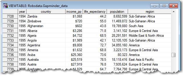
I downloaded several spreadsheets from the Gapminder data page, and used Proc Import to bring the data into SAS. Next, I used Proc Transpose to restructure the data a bit, to make it easier to work with. And finally, I used a data step to assign each country to one of five regions. Here's a link to the complete sas code I used to import and prepare the data, in case you'd like to see all the nitty-gritty details. And below is a sample of what the data looks like in the SAS dataset:
Basic Plot:
With the data in the format above, I can easily plot the data, using Proc SGplot:
title1 h=18pt "Wealth & Health of Nations";
proc sgplot data=bubble_data;
by year;
format income_pp_modified dollar20.0;
scatter x=income_pp_modified y=life_expectancy;
run;
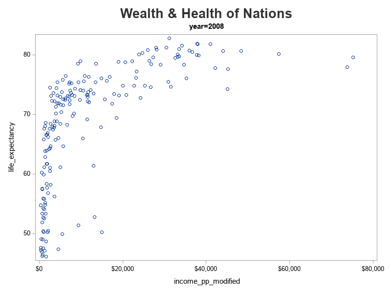
Logarithmic Axis Scale:
But my data points don't appear to be spread out like they are in Hans' graph. Most of my data points are squished against the left side of the graph (very low income), whereas Hans' data points visually fall along a diagonal across the graph. Upon closer examination of Hans' plot, I notice that he used a logarithmic axis scale. The log scale spreads the data out more, so you can see more detail. This can be useful, but people viewing the graph need to know that a log scale is being used, therefore it is important to show minor tick marks or minor grid lines with a log axis.
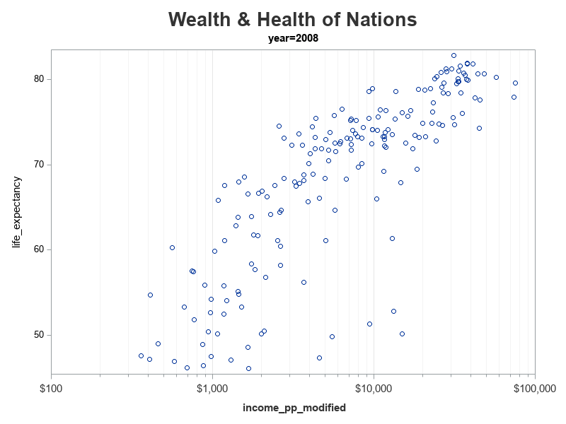
I added an xaxis statement, and specified the following options to get a log axis scale, with minor tick marks and grid lines. Now my data points are laid out more like Hans' graph.
xaxis
type=log logstyle=logexpand logbase=10
minor minorcount=8
min=100 max=100000
Year Label in Graph:
Next, let's tackle the big year label in the middle of the graph. When I create a plot 'by year', SAS automatically adds a title above the graph, to indicate the year. But I want the year to be really big, and behind the plot markers. Therefore I use 'options nobyline' to suppress the default year in the title, and I add the following 'text' statement to have sgplot add the year in the graph itself. I specify the size as 160pt (so the text is very big), and I add this text statement before the scatter statement so it is drawn first, and layered 'behind' the plot markers.
text x=x_center_year y=y_center_year text=year /
textattrs=(size=160pt weight=bold color=cxd3e0e6);
Bubble Markers:
For my simple graphs above, all the plot markers are the same size because I used the 'scatter' statement. But I want the size of the markers to represent the population of each country, therefore I need to use a 'bubble' statement instead. I replaced the scatter statement with the following bubble statement, and now I have bubble markers (where the size represents the population, and the color represents the region):
bubble x=income_pp_modified y=life_expectancy size=population /
group=region bradiusmin=3pt bradiusmax=25pt;
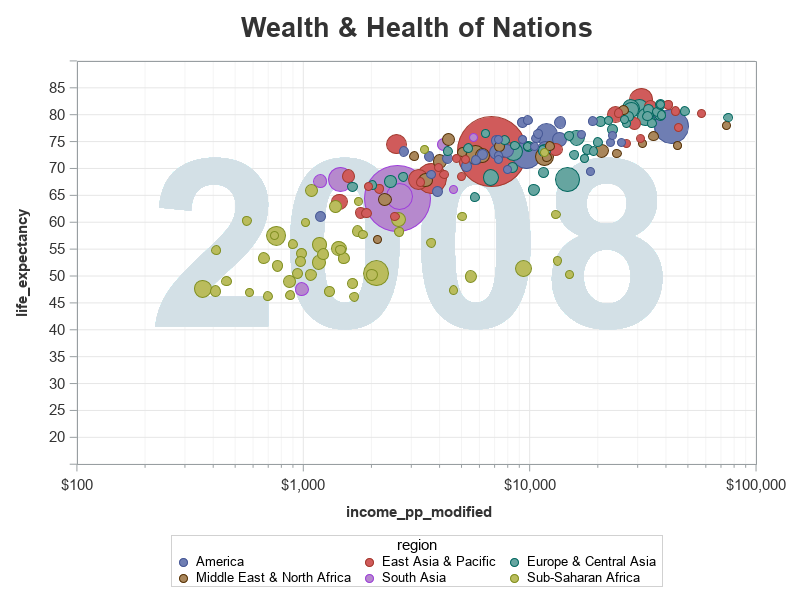
Bubble Colors:
Now, how do I get the same colors as the ones Hans used? I can specify those with the 'styleattrs datacolors=' option:
styleattrs datacolors=(cxe5ff2f cxff2f2f orange cx00ff00 cx2fbfe5 cxD15FEE);
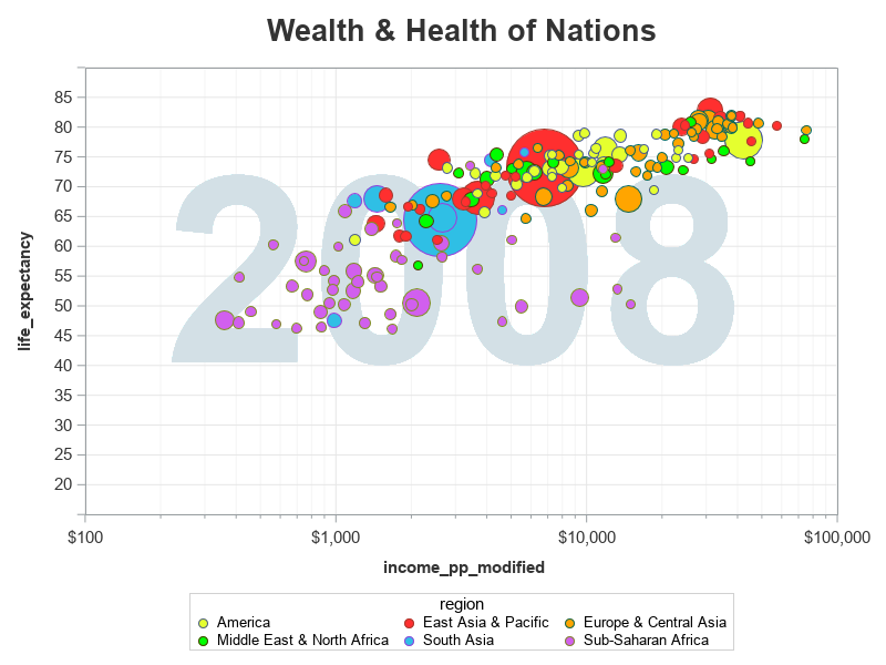
Legend Map:
The legend is a bit 'wordy' (which makes it time-consuming to read, and it takes up a lot of space), therefore I decided to use a color-coded world map as the legend instead. I used the 'noautolegend' option to turn off the default legend, and then I created the map using Proc SGMap, and annotated it into the bottom/right corner of the graph (using the 'sganno=' option to point to the annotate dataset).
data anno_map;
length function $10 anchor $20 drawspace $20;
function='image';
drawspace='datapercent';
anchor='bottomright';
x1=99.8; y1=0.3;
widthunit='percent'; width=40.5;
heightunit='percent'; height=26.3;
layer='front';
image='wealth_and_health_map.png';
run;
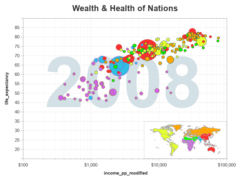
Bubble Labels:
Hans had labels on the bubbles for certain countries. To accomplish that in my graph, I added a variable called 'labeled_countries' to my dataset, and only assigned the country name to that variable for the countries I wanted to be labeled (the variable has a 'blank' value for all the other countries). Then I used the datalabel= option to turn on those labels in the graph.
datalabel=labeled_countries datalabelpos=top
datalabelattrs=(color=gray33 size=8pt)
Finishing Touches:
We're almost there! - Now for just a few little enhancements to the text outside of the graph. I use label statements to add more descriptive text along the bottom & left axes. I annotate a footnote in the bottom/left (so it will occupy a little less space than using a footnote statement). And I used styleattrs backcolor=cxcedce3 to set the background color.
Then there's one slight data deception I need to take care of. In certain years, the income per person was actually higher than $100,000 ... but my graph axis only goes to $100,000. I still wanted to somehow show those few values that are past $100k, but I didn't want to increase my axis to the next log increment. Therefore I set the >$100k values to $100k, and I modified the axis to say "$100,000+". How did I change the value displayed in the axis? - By using a user-defined-format!
proc format;
picture my_dollar
low - 99999 = '00,000' (prefix='$')
100000 = '100,000+' (prefix='$')
100001 - high = '000,000,000' (prefix='$');
run;
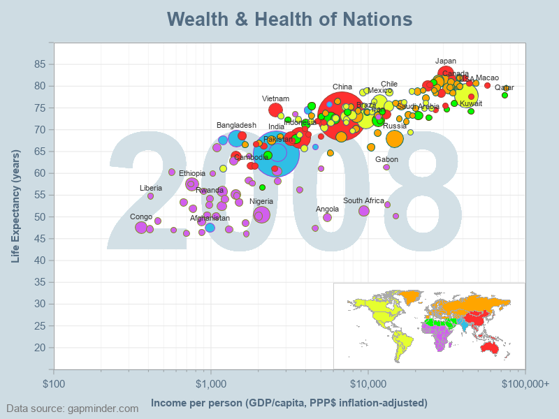
Animation:
What about animating the graph over several years? All I had to do was add a few more SAS commands, and instead of the 'by year' creating a separate graph for each year, it combines them into a gif animation! Here's a link to the complete code, if you'd like to see all the details.
options papersize=('8 in', '6 in') printerpath=gif animation=start
animduration=.4 animloop=yes noanimoverlay;
ods printer file="&name..gif";
ods graphics / width=8in height=6in imagefmt=gif;
options nodate nonumber nobyline;
The animation file is too large to upload into the blog (3MB), but here's a link to see it separately.


13 Comments
Hi Robert,
Great post. I created a data set that includes the years (2015 to 2017), real personal income growth, real disposable income, and population. I am trying to recreate the graph you made above, but I cannot get the year 2015 to be in the center, and it is attached to every point on the graph, below is my code, can you please let me know what happened? Thanks.
title1 h=18pt "Disposable Income and Income Growth";
proc sgplot data=psam.ypop;
by year;
scatter x=Real_Personal_Income_Growth y=Real_Disposable_Personal_Income;
xaxis
type=log logstyle=logexpand logbase=10
minor
minorcount=8
min=-0.03 max=8;
text x=real_personal_Income_Growth y=Real_Disposable_Personal_Income text=year /
textattrs=(size=80pt weight=bold color=cxd3e0e6);
run;
It's difficult to say, without seeing the data, and seeing the output, etc.
Is your data sorted in a logical order?
Perhaps try it with just 2 or 3 data points, and build up from there.
Hi Robert,
Appreciate your sharing the SAS code to reproduce the world population growth animation. Fantastic work.
I am wondering if using only base sas and graph this chart can be reproduced:
https://www.visualcapitalist.com/population-every-country-bubble/
also the chart for each county in the USA.
thanks
Qui
We could of course draw bubbles, color them, and place labels on them ... but I don't think we have a way to calculate the positions in this "wordcloud" like arrangement. The question I would ask - although this type of graph is eye-catching, is it a good way to visualize and analyze data? What questions does this type of chart answer? Tough questions! :)
This article was posted in 2013 using SGPLOT procedure. With SAS 9.4M5, program can be improved.
https://blogs.sas.com/content/graphicallyspeaking/2013/05/23/animation-using-sgplot/
Looks wonderfull!.....
Could be possible to upload the data robsdata.gapminder_data ?
Kind regards
http://robslink.com/SAS/democd27/gapminder_data.sas7bdat
Wow, this is great. Which spreadsheets did you download from Gapminder? I’m trying to recreate this for our internal users group.
Thanks for the compliment! Here are the specific xls data files I used:
http://robslink.com/SAS/democd27/gapminder_gdp_per_capita_ppp.xlsx
http://robslink.com/SAS/democd27/gapminder_life_expectancy_at_birth.xlsx
http://robslink.com/SAS/democd27/gapminder_population.xlsx
Thanks.
I had to comment out the line below from the proc sgplot.
*styleattrs backcolor=cxcedce3;
Is there a link to the wealth_and_health_map.sas script?
Here's a link to the code I used to draw the color-coded world map I used as the legend: https://blogs.sas.com/content/sastraining/files/2019/01/wealth_and_health_map.txt
Thanks. We don’t have sgmap yet (vM6) but I think I can do this with gmap.
Here's a sas job that draws the map using Proc Gmap, that I just happened to have... http://robslink.com/SAS/democd27/gapminder_map.sas