Here's a challenge. You're a passenger in an automobile, and you've been asked to evaluate whether the driver's habits behind the wheel are "safe" or "risky." But there's a catch: you have to collect all of your information with your eyes closed.
Think about it -- with your eyes shut, you're denied important information such as your location, traffic conditions, speed limits and traffic signals, and weather conditions. Sightless, your only source of data comes from your sense of motion as the vehicle accelerates, slows down, and turns.
Sunish Menon, a PhD. researcher at State Farm Insurance, faced this challenge with his team as they designed the data collection scheme for State Farm's Drive Safe and Save program. Sunish shared his experience and ideas with attendees at the Analytics Experience 2018 conference in San Diego.
Accelerometer: simple measurements with rich results
Sunish's team knew that they were going to build a smartphone app to support the Drive Safe and Save program. After all, a smartphone can collect a ton of information: location with GPS, phone use during a trip, traffic conditions, trip duration and speed, and more. But accessing these details has a cost. Every sensor on a phone consumes precious battery life, and potential users might not be comfortable sharing their location constantly with an insurance company -- even if there is a premium discount at stake. So what's the minimum amount of information you can collect and still assemble a meaningful profile? Maybe capturing the changes in speed and direction is enough.
Like people, your smartphone also has a "sense of motion" -- it's called an accelerometer. As you might guess from its name, an accelerometer is a small electrical sensor that measures acceleration. For a quick physics refresher, let's review the difference between speed, velocity, and acceleration:
| Speed | How fast an object is moving, usually expressed as distance over time (example: 10 meters per second) |
| Velocity | How fast an object is moving and in which direction (example: 10 meters per second, to the east) |
| Acceleration | The rate of change in the velocity of an object. Since it’s a rate of change, it’s expressed as distance over time (speed), per unit of time. For example, to change speed from 0 to 60 miles-per-hour in 10 seconds, an object must accelerate at 2.682 meters per second per second, or 2.682 m/s2. |
 Your smartphone measures acceleration across three axes, traditionally labeled as x, y, and z. The measurements are sampled multiple times per second. Each measurement reflects acceleration across one of the axes. Taken together, you can get a sense for the phone's overall direction.
I've included Sunish's diagram of how these axes are oriented on a smartphone. The x axis is horizontal along the face of the phone, and the y axis is vertical along the face. The z axis is along the perpendicular plane passing through the center of the phone. Depending on the direction of the phone's movement, acceleration values might have a positive or negative value.
Capturing my commute data
Inspired by Sunish's presentation, I decided to get a bit of hands-on practice with accelerometer data. I installed a free app on my phone to capture the raw data from the accelerometer, Here's what the data values look like, as measured from the start of my driving commute from work to home.
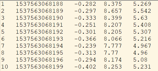
In these data, the first value is a record counter. The second "big number" value is a timestamp value in Unix epoch format. That's the number of milliseconds since midnight on January 1, 1970. And the next three values are the acceleration measurements for the x, y, and z axis respectively. Acceleration is measured in meters-per-second squared, or m/s2. For reference, keep in mind that Earth's gravity -- the force that keeps us grounded (literally) -- is about 9.8 m/s2 (1g).
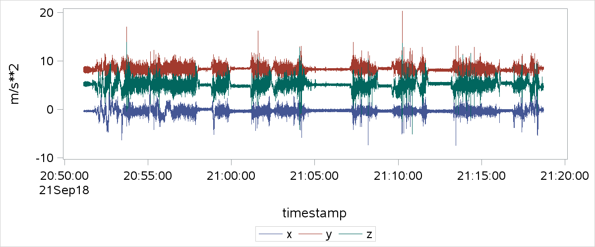
The data from my commute contains over 85,000 measurements, captured over about 30 minutes (it was a busy Friday afternoon). I used the SERIES plot in PROC SGPLOT to create a simple visualization. Can you tell where the longest stoplight occurs? (It's right near the shopping mall -- I really don't like that intersection.)
Teasing out "events" from the data
In my commute as represented in the above chart, it seems simple enough to locate the mundane events of accelerating, braking, and waiting in traffic. There are a few spikes and dips that might represent more dramatic braking events, or perhaps a fast start from a traffic light (my car has some pep!). Let's use some histograms to look at these measurements another way.
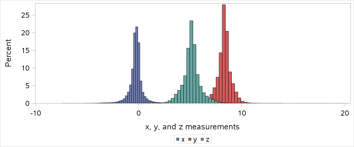
Most of my commute is uninteresting, as I'm driving at a steady speed or waiting in traffic. The histogram shows the x axis measurements are centered around 0. But why don't the y and z axes behave the same? During my drive, my phone is positioned nearly vertical in a dashboard holder, with perhaps a 30-degree forward tilt. Gravity works on all of us at about 9.8m/s2. With my phone at the vertical-ish tilt, you can see most of that force applied to the y axis, with some shared with the z axis.
Since the data collected represents a time series, it makes sense to apply a time series analysis to see if we can decompose its components and make the interesting events more obvious. In Sunish's case, his team used PROC SPECTRA (part of SAS/ETS) to explore this. He was able to use Fishers Kappa test (the WHITENOISE option on PROC SPECTRA) to help discern discrete events. PROC TIMESERIES also offers a SPECTRA statement for spectrum analysis for similar options.
Here's a tip: if you are trying this on your own and you get stuck, post a question to the SAS forecasting/time series community. Experts are eager to answer!
Confounding factors when analyzing a drive
During a drive, the measurements from the accelerometer "start at zero" (or their natural baseline) only when the phone is lying flat, with the top of the phone pointed toward the front of the car. But who keeps their phone stationed like that? When I'm driving alone in my car, my phone is usually in a holder mounted on the dash, positioned nearly vertical, tilted slightly. Or it's in my pants pocket.
Sunish presented a series of techniques to help control for this -- all of them applying more math than I am qualified to describe. The smartphone also has a gyroscope sensor, which can measure the phone's "tilt" along any of its axes (labeled as pitch, roll, and yaw). Combining these measurements with the acceleration readings, as well as controlling for the force of gravity, can help create a more accurate picture of your driving experience.
When I'm not alone in the car, the phone might not stay in one place. A passenger might pick it up to find directions, or to reference IMDB to settle a bet. All of those movements will also register on the accelerometer, and how will a "safe driving app" judge these actions? That's a challenge for analytics.
Safe driver versus risky driver: more than just measurement
Please do not rush to judgement about my driving behavior from this one sample. In fact, even if you had hundreds of samples of my driving, it would probably be difficult to fairly judge whether I am a high-risk driver.
For insurance companies, assessment of risk is influenced more by how similar you are to known risky populations. That's why young drivers tend to command higher premiums. It's not just because they are young, exactly, but it's because insurance companies have to pay out more claims due to accidents caused by young drivers. The cause might be due to their inexperience and immaturity, but that's almost beside the point. It's a numbers game.
By collecting data from millions of car trips across a wide range of customers, an insurance company can apply machine learning to discern the patterns of drivers who make claims versus those who don't. If your driving patterns are scored as too similar to those of other drivers who cause accidents...well, don't expect to receive a discount when you share your driving data.
Programs like State Farm's Drive Safe and Save accomplish more than just "proving" that you're a good driver. The program incents you to be more conscious of your driving behavior, especially while you have that app running and collecting data. State Farm provides periodic reports to program subscribers that show how your driving behavior compares (favorably or not) to other drivers in the pool. The gamification and feedback aspect of the program might do just as much to improve driving as the promise of a discount.

4 Comments
Hi ,
Thanks for posting this had a great insight about usage of accelerometer from mobile device. I have a question about the missing data from the time stamp. When ever there is a missing data can you tell me how to replace it by utilising previous and future data. It would be helpful if you could help me with the algorithm.
There are a couple of methods. In general, statisticians can use PROC MI to impute missing values by using a variety of methods. For time series data in particular, you can use PROC EXPAND to convert the series of data you have to a different regular interval, and you can decide how those values are interpolated.
I'm so impressed with the analysis that can be done in SAS/ETS. Could you please post your entire SAS code for the analysis?
Hi Ethan, thanks for the comment. The presenter (Sunish) didn't share the complete code, and the presentation materials are exclusive to the Analytics Experience conference (one of the perks for attending). However, I am planning a follow-up post with more step-by-step examples of acquiring this type of data and performing some analyses. I'll share the code for that.
In the meantime, you can post SAS/ETS questions to the SAS Support Communities.