They say "The Sun never sets on the SAS Empire" ... and it's true! There are SAS users all over the world, and SAS output & results could be in any language. Therefore, if you're a SAS programmer, you might need to know how to create SAS graphs with international characters.
This example demonstrates one way to put Korean characters into a SAS graph (specifically, a graph created using Proc SGplot, in ODS Graphics). You can probably extend this concept into other languages as well. I chose Korean because I'm a bit fascinated by the characters in that language (and I had a lot of Korean friends in grad school).
I used a bar chart of the population in South Korea for this example. Here's the version of the bar chart, with English text, created using Proc SGplot's vbar statement.
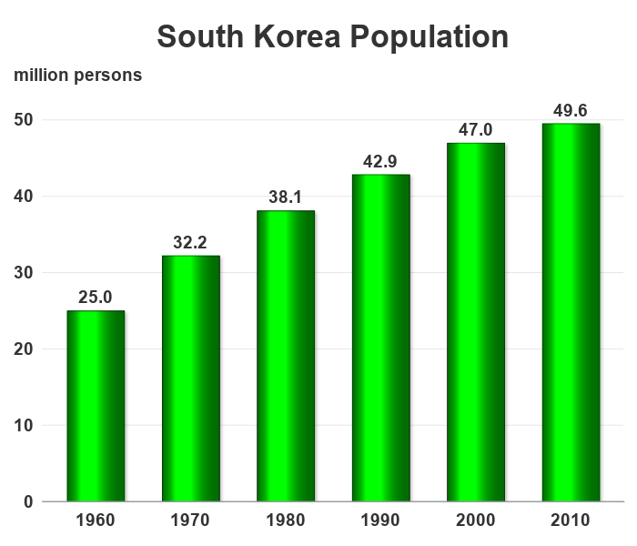
It's not a bad looking chart, but what if someone from Korea was reading it, and what if they prefer reading Korean rather than English? SAS can do that! ...
First I went to the Google translator page, and translated the title text from English to Korean:
![]()
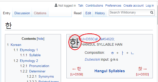
Then I did some Google searching, and found a page that tells more information about Korean characters. Here's the URL for the first character:
![]()
I went to the page (such as the URL above) for each of the characters, by copy-n-pasting the characters from the translator onto the end of the URL (one at a time), and determined the Unicode number for each character. Here's the page for the first character, with the Unicode number circled in red:
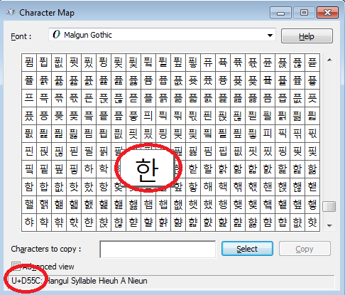
I then needed to find a font for the Korean characters. After a bit of Google searching, I found that Windows systems typically have a font called Malgun Gothic I might could use. I brought up the Windows Character Map program, selected the Malgun Gothic font, selected the D55C character, and confirmed that it looked like the character I wanted - Success! I now have all the pieces to make the desired graph happen!
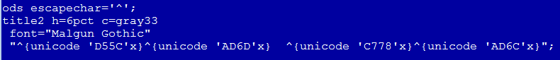
In my title translation, there are 4 Korean characters. The Unicode numbers are D55C, AD6D, C778, and AD6C. But how do I get those into the title, and tell SAS that I want the Unicode characters from the Malgun Gothic (Korean) font? First I tell SAS to use the caret (shift+6) character as the escape character, and then I specify the codes as follows in a title2 statement, to add a second (translated) title:
To add a second (translated) y-axis label, I used the following annotated text.
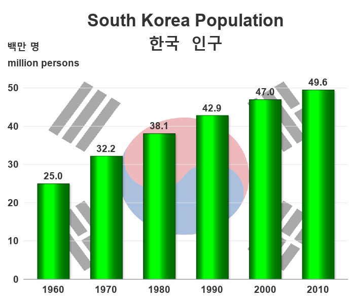
Now the graph includes a nicely translated version of the text, which should make my Korean friends happy! :)
![]()
I should probably stop here ... but let's make one more enhancement. Let's add a Korean flag behind the bars, so anyone will know (at a glance) that this graph is about South Korea. (The decision on whether or not to make a graph fancy really depends on who you anticipate your audience to be.)
And here's the final graph:
Here's a link to the complete SAS program, if you'd like to download it and experiment.

2 Comments
At SEUIGI 1984 in Amsterdam I told Jim Goodnight that I had to use Displa to get my name, on the name tag, plotted in the correct way. He was very kind, and said "we have to fix that". That was also done one or two years later. Best Regards Anders Sköllermo
Interesting story! ... It's great that SAS is truly an international software (more-so than in those early days), eh!?! :)