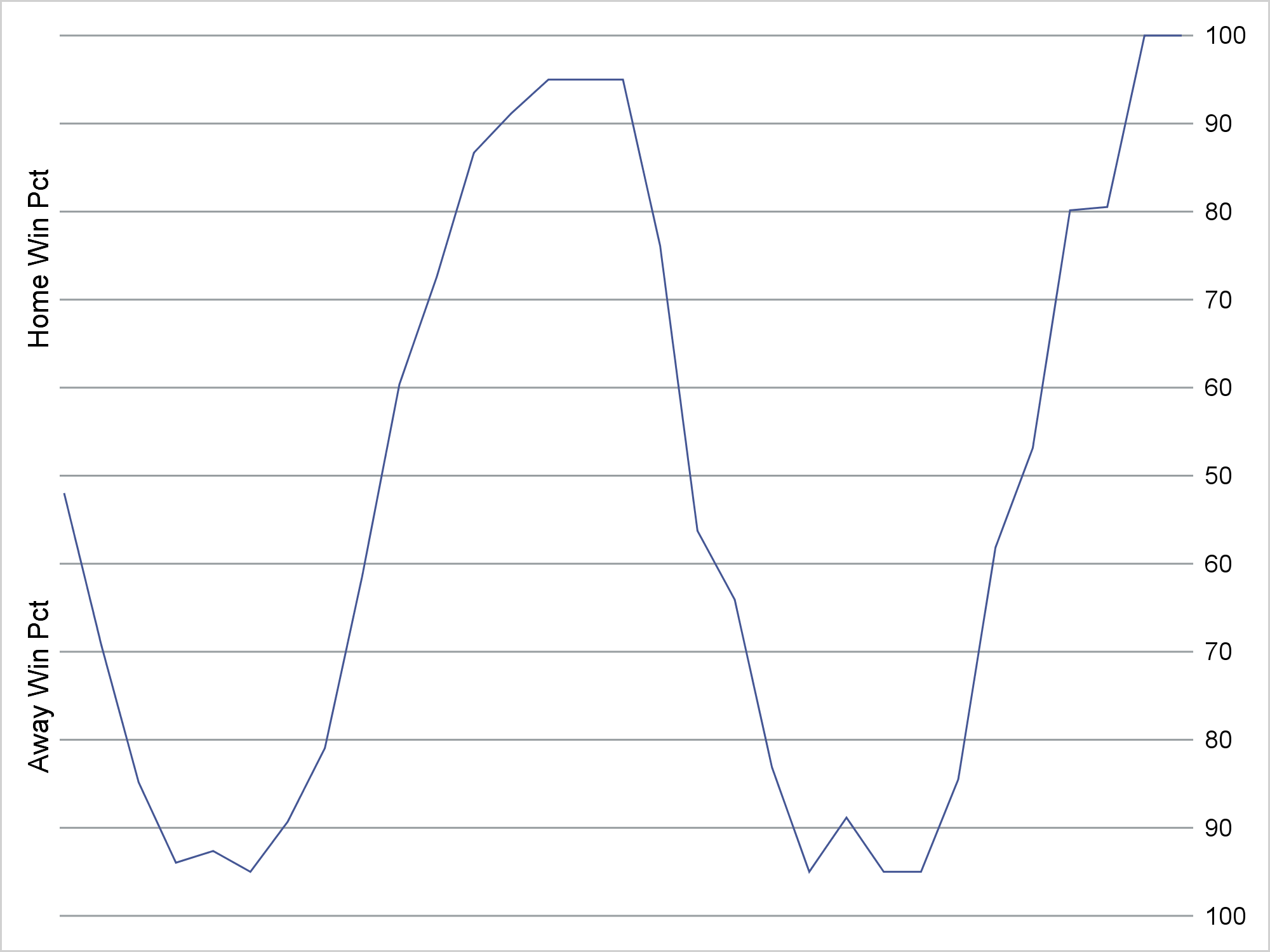
I was following games for my two favorite NFL teams on the web on Sunday. I am happy to report that both teams won! I have seen before graphs that display the projected win percentage for each team as the game progresses. Sunday was the first time though that I really noticed them. They use a simulation to compute how likely each team is to win given the current score, time left, who is on offense, and other factors. For more information, see this story from USA Today Sports. The graphs look something like this.
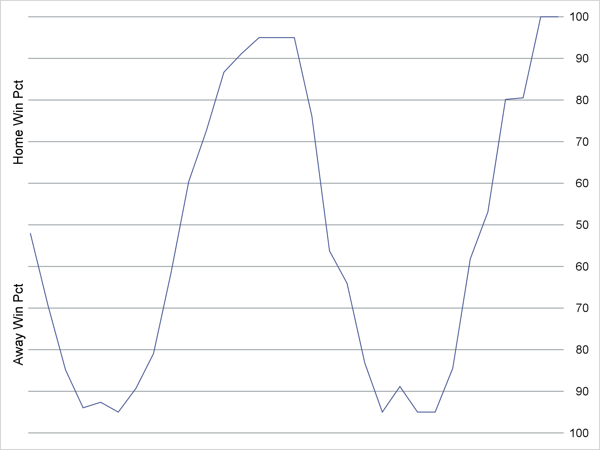
The X axis is time and the Y axis is the simulated percent chance of winning for each team. I used artificial data throughout this post. The actual graph I saw had the names of each team on the Y axis (on the left) and the simulated percentages on the Y2 axis (on the right). Usually, when you use a Y and Y2 axis, you have different variables for each. That is not the case in this example.
Several questions come to mind when I see a graph like this. Was the original made using ODS Graphics? Probably not. Does this graph look anything like our default graphs? No. How did they make an axis that ranges from 100 to 50 and then back up to 100? I used a format. Is this two axes or one? I approached it as a single axis problem. Can it be made using ODS Graphics? Yes! Along the way, you will see an example of making artificial data to test out plotting code, creating a format by using a DATA step and a CNTLIN= data set in PROC FORMAT, using a Y and Y2 axis, invisible plots, reference lines, axis suppression, and strategically placing blanks and nonbreaking spaces into strings to control the appearance of the output.
I needed some data to play with. So I made a sine curve with normal error that I constrained to the desired range. I chose a sine curve because it seemed more interesting if the win percentage flipped a few times.
data p(drop=pi);
   pi = constant('pi');
   p = 50;
   do t = 0 to 60 by 2;
      p = 50 * (1 - sin(3.5 * pi * t / 60) - .1 * normal(7));
      p = ifn(5 le t le 55, max(min(p, 95), 5), max(min(p, 100), 0));
      output;
   end;
run; |
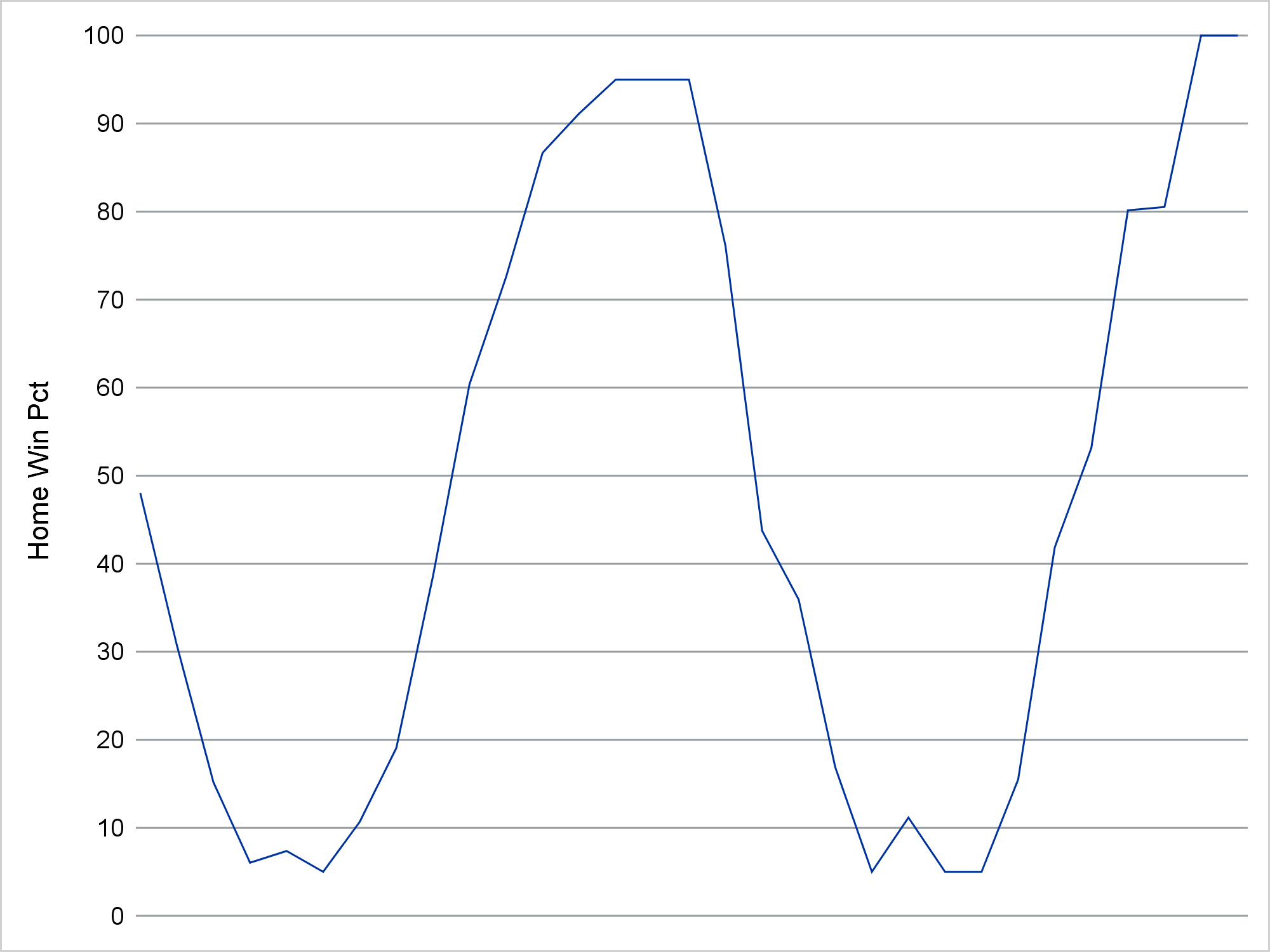
I began by making a basic plot that shows the percent chance of the home team winning for my artificial data.
proc sgplot data=p noborder;
   refline 0 to 100 by 10;
   series y=p x=t;
   xaxis display=none;
   yaxis offsetmin=0 values=(0 to 100 by 10)
         display=(noticks noline)
         label="Home Win Pct";
run; |
I suppressed the border and instead displayed a series of reference lines. Other than that, this is a pretty straight-forward use of PROC SGPLOT.
Next I wanted to change the Y axis so instead of ranging from 0 to 100 it ranges from 100 to 50 to 100. All you need is a format. You can assign a format to the Y-axis variable, and all of the rules for a continuous and numeric axis apply. However, alternative values are displayed. When the values follow a regular numeric pattern, as these do, it is easiest to make the format by using a DATA step and PROC FORMAT rather than using a VALUE statement.
data cntlin;
   retain Type 'n' FmtName 'pfmt';
   do Start = 0 to 100 by 10;
      Label = put(ifn(start le 50, 100 - start, start), 3.);
      output;
   end;
run;

proc print; run;

proc format cntlin=cntlin; quit; |
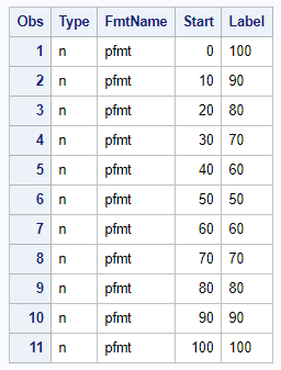
For more information, see Input Control Data Set.
The CNTLIN= data set has a type variable, which shows that the format type is numeric; a format name variable; a numeric variable that contains the raw or starting values; and a character variable that contains the values that are displayed.
The following step uses the format. It also changes the Y-axis label so that each percentage range appears to have a separate axis label.
proc sgplot data=p noborder;
   refline 0 to 100 by 10;
   series y=p x=t;
   xaxis display=none;
   yaxis offsetmin=0 values=(0 to 100 by 10)
         display=(noticks noline)
         label="Away Win Pct %sysfunc(repeat(%str( ), 30)) Home Win Pct";
   format p pfmt3.;
run; |
Notice that I placed the REFLINE statement ahead of the SERIES statement. When the series plot and reference lines intersect, I want the series plot to be displayed over top of the reference line.
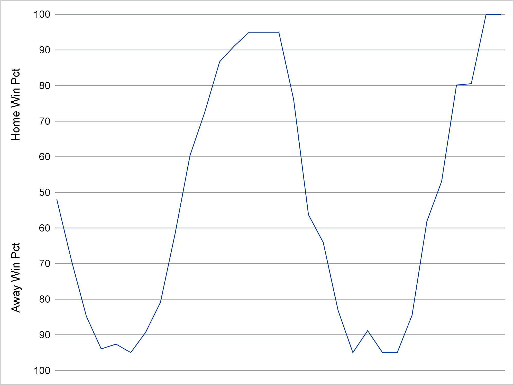
The REPEAT function puts 31 blanks between each part (in addition to the one on each side), so that the 100 to 50 and the 50 to 100 parts of the Y axis appear to have separate labels. When you call a DATA step function outside a DATA step by embedding it in the %SYSFUNC macro function, you do not quote values in the normal way. I used %STR( ) rather than ' ' to repeat the blank (30 times in additional to the original blank for a total of 31).
proc sgplot data=p noborder noautolegend;
   refline 0 to 100 by 10 / axis=y2;
   series y=p x=t;
   series y=p x=t / y2axis lineattrs=(thickness=0);
   xaxis  display=none;
   yaxis  offsetmin=0 values=(0 to 100 by 10)
          display=(noticks noline novalues)
          label="Away Win Pct %sysfunc(repeat(%str( ), 30)) Home Win Pct";
   y2axis offsetmin=0 values=(0 to 100 by 10)
          display=(noticks noline nolabel);
   format p pfmt3.;
run; |
I used an invisible series plot (LINEATTRS=(THICKNESS=0)) that I associate with the Y2 axis and an ordinary series plot for the Y axis. This is how I got a label on one axis and tick values on the other. I used the NOAUTOLEGEND option to suppress the legend.
Compulsive person that I am, I really don't like left-justified numbers. (I dislike centered numbers too.) So I created a new format where I replaced each leading blank by two nonbreaking spaces. Nonbreaking spaces are half as wide as numerals. Blanks are often ignored in ODS; nonbreaking spaces are not. For example, if you printed the original CNTLIN= data set using the LISTING destination, you would see the leading blanks that are in the Label variable. You do not see them in the HTML output.
data cntlin2; length Label $ 4; set cntlin; fmtname = 'qfmt'; label = tranwrd(trim(label), ' ', 'A0A0'x); run; proc format cntlin=cntlin2; quit; |
Using the new format, I get the desired plot.
proc sgplot data=p noborder noautolegend;
   refline 0 to 100 by 10 / axis=y2;
   series y=p x=t;
   series y=p x=t / y2axis lineattrs=(thickness=0);
   xaxis  display=none;
   yaxis  offsetmin=0 values=(0 to 100 by 10)
          display=(noticks noline novalues)
          label="Away Win Pct %sysfunc(repeat(%str( ), 30)) Home Win Pct";
   y2axis offsetmin=0 values=(0 to 100 by 10)
          display=(noticks noline nolabel);
   format p qfmt4.;
run; |
I use several techniques, which for me have become common place and indispensable. I start by making a plot using minimal options. This plot is not what I want, but it gets me close. (My first plot, which I did not show, did not have reference lines or the NOBORDER option.) Then I start tweaking it. I suppressed the border and added reference lines. I ensured that I specified the statements in the order in which I wanted them drawn. I made a format to display the values and later remade the format to right justify them. Finally, I used an invisible plot to get all of the right values in both axes. It constantly amazes me how often I use the invisible plot trick. It helps in many circumstances.
I like the fact that we can achieve so many different looks by specifying a few options. By omitting the border and adding reference lines, I can create a graph that looks quite different from our usual default. Furthermore, I can create a nonstandard Y axis by using formats. I would never do this for a scientific display of information, but I like it in this context.


1 Comment
Thanks for the reminder that the CNTLIN= option can be used to define formats from a SAS data set. A slightly different scenario in which axis values repeat is the back-to-back or "butterfly" plot, which is often used to compare two distributions. For that plot, you can use s simple "absolute value" format by using the PICTURE statement in PROC FORMAT.