Recently, I was asked about a formatting situation where the DOLLAR8.2 format was specified on the data column, but the cents on the axis showed showed just one digit instead of the two requested by the format.
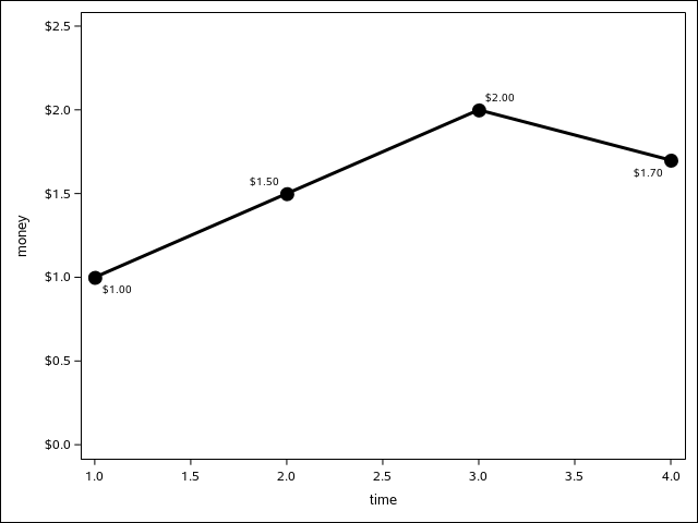
data example; input time money; datalines; 1 1 2 1.5 3 2 4 1.7 ; run; proc sgplot data=example; format money dollar8.2; series y=money x=time / datalabel markerattrs=(symbol=circlefilled size=13px) lineattrs=(thickness=3px) markers; yaxis values=(0 to 2.5 by .5); run; |
For linear axes, the algorithm used to determine good tick values also determines the number of decimal places, using the tick value with the most significant digits as the basis for all tick values. In this case, there was only one significant decimal place, so the second zero does no appear in any tick value.
Fortunately, there is a solution. On the axis statements of the SG procedures, there is an option called VALUESFORMAT that gives you the ability to assign a SAS format directly to the axis (for GTL users, see the TICKVALUEFORMAT option).
data example; input time money; datalines; 1 1 2 1.5 3 2 4 1.7 ; run; proc sgplot data=example; format money dollar8.2; series y=money x=time / datalabel markerattrs=(symbol=circlefilled size=13px) lineattrs=(thickness=3px) markers; yaxis values=(0 to 2.5 by .5) valuesformat=dollar8.2; run; |
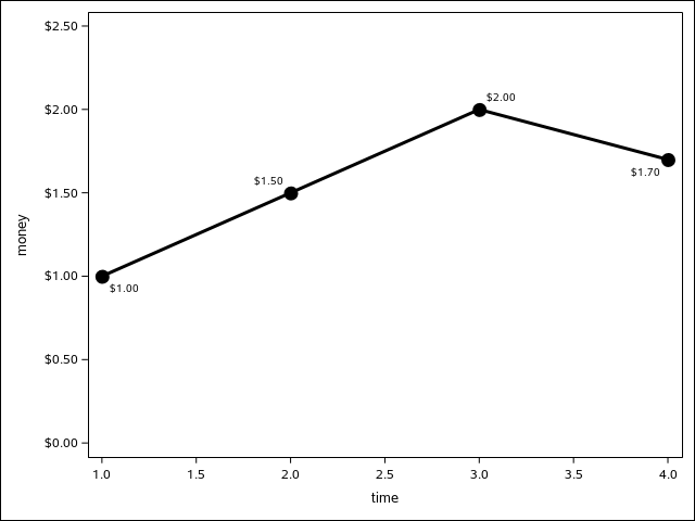
The FORMAT statement is still needed in this example to correctly format other features in this plot, such data labels and data tips. The VALUESFORMAT option affects only the axis tick values.
The VALUESFORMAT option must be used carefully. The option only affects the formatting of resulting tick values -- it cannot be used to create ranges for aggregations like you can with normal format usage. For that situation, you must specify the format in the data step or the FORMAT statement. That being said, you can use a custom character format to modify the tick value string displayed for a range. For example, suppose you create a custom range format for your data, and you want the table to show the ranges but the graph to show alternate terms. You can use VALUESFORMAT to modify the strings from the range format.
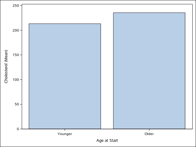
proc format; value agefmt 0-39 = "0-39" 40-100 = "40-100" ; value $agelabel "0-39"="Younger" "40-100"="Older" ; run; proc sgplot data=sashelp.heart; format ageatstart agefmt.; xaxis valuesformat=$agelabel.; vbar ageatstart / response=cholesterol stat=mean; run; |
The main thing to remember here is that you should use only non-aggregating formats with the VALUESFORMAT option, i.e. formats that have one value to one label associations. Otherwise, you could get unpredictable results.


1 Comment
Nice solution to a pesky problem. Thanks for sharing.