
This blog shows a few samples of graphs and explains how you can use new functionality to make the old graphs look new again. Over the past several releases, SAS has added more options and procedures for ODS Graphics. While your tried-and-true SAS/GRAPH programs still work, ODS Graphics can create modern-looking graphs with less code, while providing more output options.
Note: All the graphs in this blog are created using the fifth maintenance release of SAS® 9.4M5 (TS1M5). Not all options are available in prior releases of SAS.
Adding special symbols on a graph
The following graph is created with the DATA Step Graphics Interface (DSGI), which draws the horizontal bars and airplanes as well as places the text.
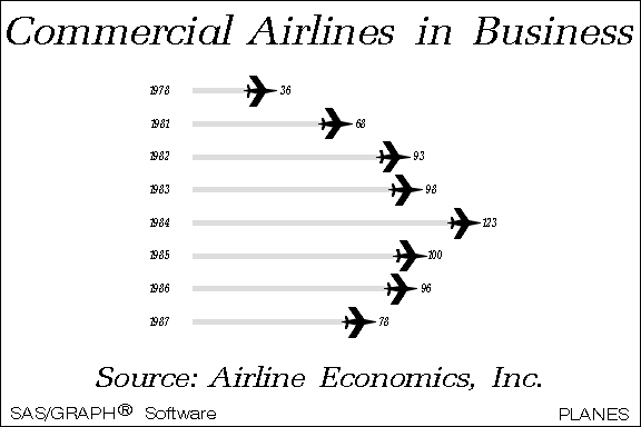
However, the DSGI is not supported in releases after SAS® 9.3. In SAS 9.4 and later, you can create a similar graph using the SYMBOLCHAR statement in the SGPLOT procedure. Using this statement in PROC SGPLOT references the hexadecimal value for the airplane symbol, as shown below:
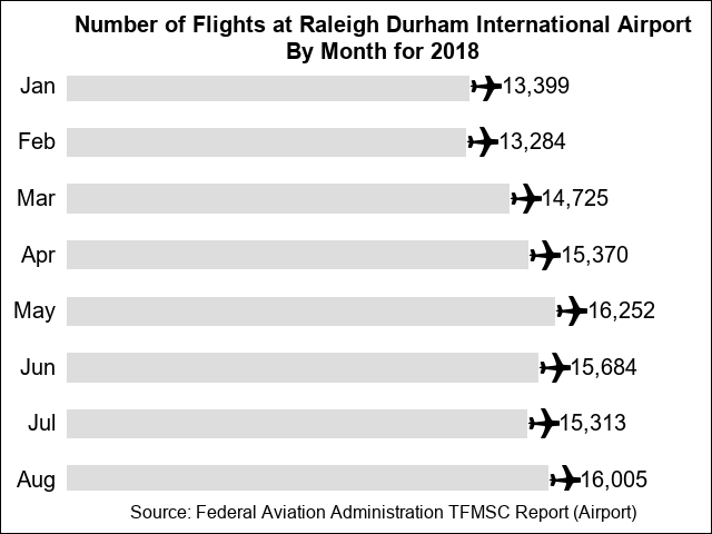
To create this graph with PROC SGPLOT, submit the following code:
data planes; input month $ number; xval2=number + 2000; low=0; format number comma8.; cards; Jan 13399 Feb 13284 Mar 14725 Apr 15370 May 16252 Jun 15684 Jul 15313 Aug 16005 ; title1 height=14pt 'Number of Flights at Raleigh Durham International Airport'; title2 height=14pt 'By Month for 2018'; footnote1 height=12pt 'Source: Federal Aviation Administration TFMSC Report (Airport)'; proc sgplot data=planes noautolegend noborder; hbarbasic month / response=number fillattrs=(color=graydd) nooutline barwidth=0.5 baselineattrs=(thickness=0px); symbolchar name=airplane char='2708'x / hoffset=0.3 voffset=0.05; scatter x=number y=month /markerattrs=(symbol=airplane size=60px color=black); scatter x=xval2 y=month / markerchar=number markercharattrs=(size=14pt); xaxis offsetmin=0 display=none; yaxis display=(noline noticks nolabel) valueattrs=(size=14pt) offsetmin=0.025 offsetmax=0.025; run; |
For information about PROC SGPLOT, see SGPLOT Procedure in SAS® 9.4 ODS Graphics: Procedures Guide, Sixth Edition.
For more information about the SYMBOLCHAR statement, see the section "SYMBOLCHAR Statement" in the "SGPLOT Procedure" chapter of SAS® 9.4 ODS Graphics: Procedures Guide, Sixth Edition.
Assigning colors to data values
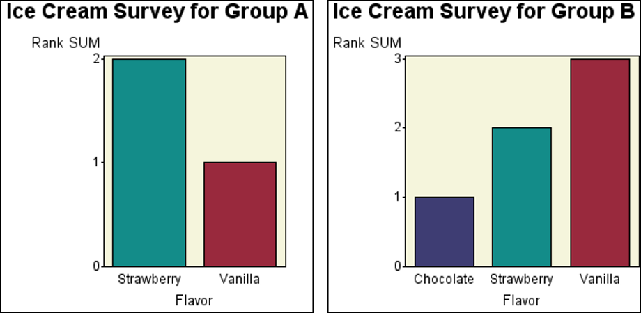
The next example graphs show the results for a fictitious ice-cream flavor survey. Because not all the ice cream flavors are present in each survey group, macro code is used to conditionally define the PATTERN statements based on the values in the data.
You can achieve the same more easily by using attribute maps in PROC SGPLOT to associate the attributes, such as color, with data values so that the same color is always associated with the same data value. The following graph, which is similar to the one above, is created using this method:
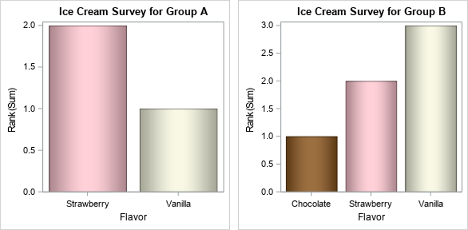
To create this graph, submit the following code:
/* Create the input data set ICECREAM */ data icecream; input @1 Flavor $10. @12 Rank 1. @14 GRP $1.; datalines; Strawberry 2 B Chocolate 1 B Vanilla 3 B Strawberry 2 A Vanilla 1 A ; run; proc sort; by grp; run; data attrmap; id='barcolors'; length value fillcolor linecolor $10; input value $ fillcolor $; linecolor=fillcolor; datalines; Strawberry pink Chocolate CX7B3F00 Vanilla beige ; run; options nobyline; title "Ice Cream Survey for Group #byval(grp)"; proc sgplot data=icecream dattrmap=attrmap noautolegend; by grp; vbar flavor / response=rank group=flavor attrid=barcolors dataskin=pressed; run; |
I changed the colors for the bars in the PROC SGPLOT code so that the bar colors look more like the ice cream that they represent. I also added the DATASKIN= option for the bars to enhance the visual appeal of the bars in the graph.
For more information about attribute maps, see the section Using Attribute Maps to Control Visual Attributes in the SAS® 9.4 ODS Graphics: Procedures Guide, Sixth Edition.
Combining BY-group graphs into a single page
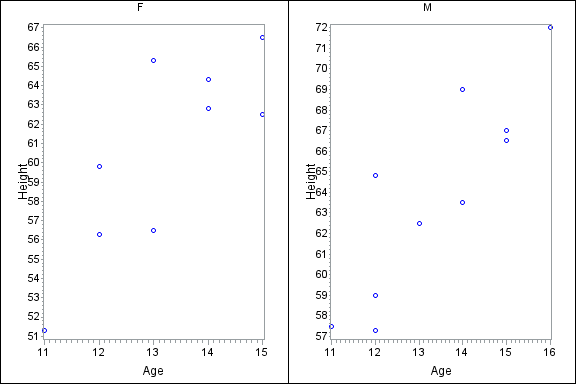
The following graph shows two plots that are created by using PROC GPLOT with a BY statement. The graphs are then paneled side-by-side with the GREPLAY procedure.
You can use the SGPANEL procedure to create the same plots in side-by-side panels. The benefit to this method is that you need only one procedure both to create the plots and to panel them, as shown below:
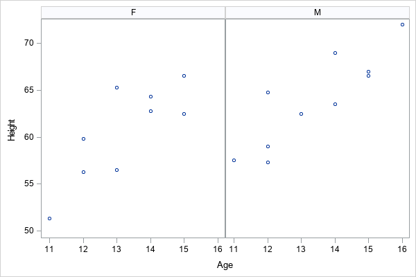
To create these paneled plots, submit the following code:
proc sgpanel data=sashelp.class; panelby sex / novarname rows=1 columns=2; scatter x=age y=height; run; |
Placing symbols and labels on a map
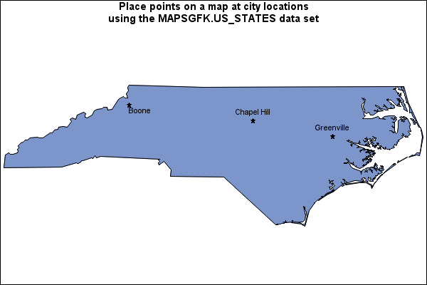
The next graph uses the Annotate facility with the SAS/GRAPH GMAP and GPROJECT procedures to place a symbol and city name at the location of select cities in North Carolina.
Beginning with the fifth maintenance release of SAS 9.4M5 (TS1M5) in 64-bit Windows and 64-bit Linux operating environments, you can use the SGMAP procedure to create such maps. Using this method, you can create maps that show much more detail.
You can use PROC SGMAP with the OPENSTREETMAP, SCATTER, and TEXT statements to create a similar graph, as shown below:
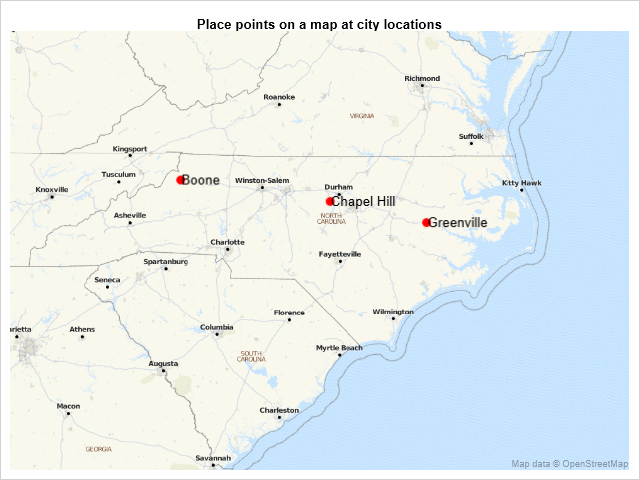
To create this map, submit the following code:
data cities; input y x city $20.; cards; 35.6125 -77.36667 Greenville 36.21667 -81.67472 Boone 35.913064 -79.056112 Chapel Hill ; run; data dummy; input y2 x2; datalines; 33.857977 -84.321869 36.548759 -75.460423 ; data cities; set cities dummy; run; title1 h=10pt 'Place points on a map at city locations'; proc sgmap plotdata=cities; openstreetmap; scatter x=x y=y / markerattrs=(color=red size=10px symbol=circlefilled); scatter x=x2 y=y2 / markerattrs=(size=0px); text x=x y=y text=city / textattrs=(size=10pt) position=right; run; |
Because the OPENSTREETMAP statement is used in PROC SGMAP, more detail (for example, cities and roads) is included in the map.
The DUMMY data set adds coordinates to the points that are plotted to modify the display area of the map.
For more information about controlling the display area of the map, see the article How to Control Map Display Area with PROC SGMAP.
For more information about PROC SGMAP, see the SGMAP Procedure chapter in SAS/GRAPH® and Base SAS® 9.4: Mapping Reference.
See also
Many of these features have been covered in more depth within other blog articles. Visit these articles to learn more!
• Examples of adding special symbols in your charts using the SYMBOLCHAR statement
• Using the new SGMAP procedure to create maps in Base SAS
• Adding data-driven features to your charts with ATTRS options
• Controlling your graph appearance with DATASKIN and FILLTYPE options

4 Comments
ma'am, please suggest how to reset the discretemax=option in graphs in SAS, as my observations are 46700.
Hi,
You can reference the DISCRETEMAX= option on the ODS GRAPHICS statement, such as:
ods graphics / discretemax=46700;
For more options available on the ODS GRAPHICS statement, you can refer to the following documentation link:
https://go.documentation.sas.com/doc/en/pgmsascdc/9.4_3.5/grstatgraph/p0kroq43yu0lspn16hk1u4c65lti.htm#n0bw6yosak5kxzn1qu3du5esrvex
This is great! A lot of people aren't yet aware of how to take advantage of SAS's newer graphing capabilities and I love the simplicity that this blog uses to show how things have improved and become easier over the years. Is it weird that I laughed out loud when I realized that the ice cream bars matched the color of the flavor, before I read that detail below the images? 🙂
Very informative post Marcia, thank you