A quantile-quantile plot (Q-Q plot) is a graphical tool that compares a data distribution and a specified probability distribution. If the points in a Q-Q plot appear to fall on a straight line, that is evidence that the data can be approximately modeled by the target distribution. Although it is not necessary, some data analysts like to overlay a reference line to help "guide their eyes" as to whether the values in the plot fall on a straight line. This article describes three ways to overlay a reference line on a Q-Q plot. The first two lines are useful during the exploratory phase of data analysis; the third line visually represents the estimates of the location and scale parameters in the fitted model distribution. The three lines are:
- A line that connect the 25th and 75th percentiles of the data and reference distributions
- A least squares regression line
- A line whose intercept and slope are determined by maximum likelihood estimates of the location and scale parameters of the target distribution.
If you need to review Q-Q plots, see my previous article that describes what a Q-Q plot is, how to construct a Q-Q plot in SAS, and how to interpret a Q-Q plot.
Create a basic Q-Q plot in SAS
Let me be clear: It is not necessary to overlay a line on a Q-Q plot. You can display only the points on a Q-Q plot and, in fact, that is the default behavior in SAS when you create a Q-Q plot by using the QQPLOT statement in PROC UNIVARIATE.
The following DATA step generates 97 random values from an exponential distribution with shape parameter σ = 2 and three artificial "outliers." The call to PROC UNIVARIATE creates a Q-Q plot, which is shown:
data Q(keep=y); call streaminit(321); do i = 1 to 97; y = round( rand("Expon", 2), 0.001); /* Y ~ Exp(2), rounded to nearest 0.001 */ output; end; do y = 10,11,15; output; end; /* add outliers */ run; proc univariate data=Q; qqplot y / exp grid; /* plot data quantiles against Exp(1) */ ods select QQPlot; ods output QQPlot=QQPlot; /* for later use: save quantiles to a data set */ run; |
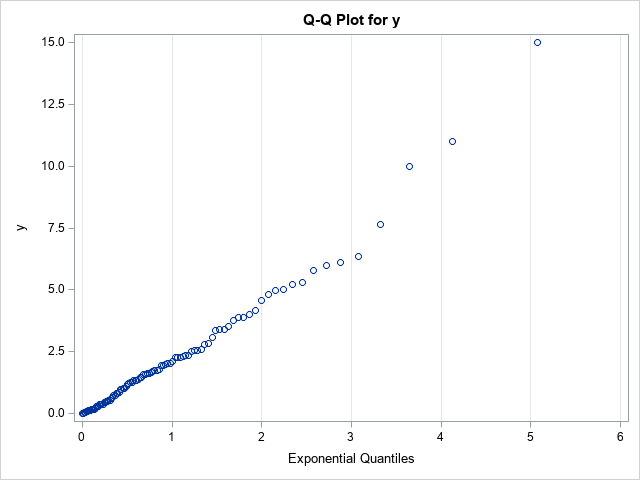
The vertical axis of the Q-Q plot displays the sorted values of the data; the horizontal axis displays evenly spaced quantiles of the standardized target distribution, which in this case is the exponential distribution with scale parameter σ = 1. Most of the points appear to fall on a straight line, which indicates that these (simulated) data might be reasonably modeled by using an exponential distribution. The slope of the line appears to be approximately 2, which is a crude estimate of the scale parameter (σ). The Y-intercept of the line appears to be approximately 0, which is a crude estimate of the location parameter (the threshold parameter, θ).
Although the basic Q-Q plot provides all the information you need to decide that these data can be modeled by an exponential distribution, some data sets are less clear. The Q-Q plot might show a slight bend or wiggle, and you might want to overlay a reference line to assess how severely the pattern deviates from a straight line. The problem is, what line should you use?
A reference line for the Q-Q plot
Cleveland (Visualiizing Data, 1993, p. 31) recommends overlaying a line that connects the first and third quartiles. That is, let p25 and p75 be the 25th and 75th percentiles of the target distribution, respectively, and let y25 and y75 be the 25th and 75th percentiles of the ordered data values. Then Cleveland recommends plotting the line through the ordered pairs (p25, y25) and (p75, yy5).
In SAS, you can use PROC MEANS to compute the 25th and 75th percentiles for the X and Y variables in the Q-Q plot. You can then use the DATA step or PROC SQL to compute the slope of the line that passes between the percentiles. The following statements analyze the Q-Q plot data that was created by using the ODS OUTPUT statement in the previous section:
proc means data=QQPlot P25 P75; var Quantile Data; /* ODS OUTPUT created the variables Quantile (X) and Data (Y) */ output out=Pctl P25= P75= / autoname; run; data _null_; set Pctl; slope = (Data_P75 - Data_P25) / (Quantile_P75 - Quantile_P25); /* dy / dx */ /* if desired, put point-slope values into macro variables to help plot the line */ call symputx("x1", Quantile_P25); call symputx("y1", Data_P25); call symput("Slope", putn(slope,"BEST5.")); run; title "Q-Q Plot with Reference Line"; title2 "Reference Line through First and Third Quartiles"; title3 "Slope = &slope"; proc sgplot data=QQPlot; scatter x=Quantile y=Data; lineparm x=&x1 y=&y1 slope=&slope / lineattrs=(color=Green) legendlabel="Percentile Estimate"; xaxis grid label="Exponential Quantiles"; yaxis grid; run; |
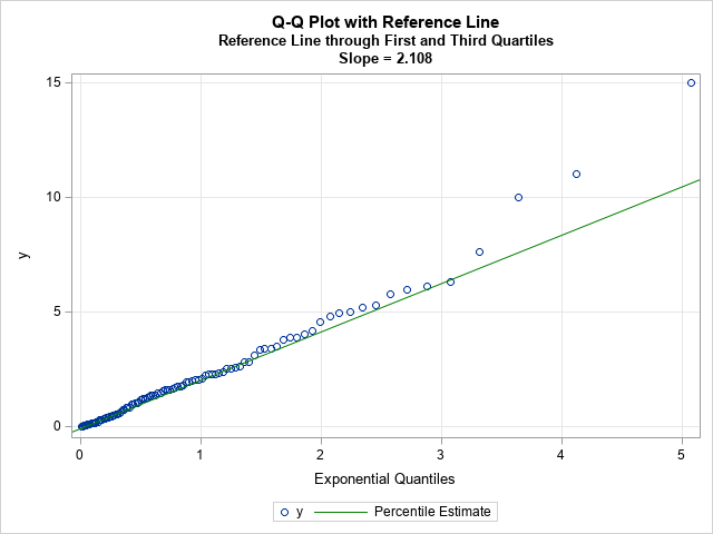
Because the line passes through the first and third quartiles, the slope of the line is robust to outliers in the tails of the data. The line often provides a simple visual guide to help you determine whether the central portion of the data matches the quantiles of the specified probability distribution.
Keep in mind that this is a visual guide. The slope and intercept for this line should not be used as parameter estimates for the location and scale parameters of the probability distribution, although they could be used as an initial guess for an optimization that estimates the location and scale parameters for the model distribution.
Regression lines as visual guides for a Q-Q plot
Let's be honest, when a statistician sees a scatter plot for which the points appear to be linearly related, there is a Pavlovian reflex to fit a regression line to the values in the plot. However, I can think of several reasons to avoid adding a regression line to a Q-Q plot:
- The values in the Q-Q plot do not satisfy the assumptions of ordinary least squares (OLS) regression. For example, the points are not a random sample and there is no reason to assume that the errors in the Y direction are normally distributed.
- In practice, the tails of the probability distribution rarely match the tails of the data distribution. In fact, the points to the extreme left and right of a Q-Q plot often exhibit a systematic bend away from a straight line. In an OLS regression, these extreme points will be high-leverage points that will unduly affect the OLS fit.
If you choose to ignore these problems, you can use the REG statement in PROC SGPLOT to add a reference line. Alternatively, you can use PROC REG in SAS (perhaps with the NOINT option if the location parameter is zero) to obtain an estimate of the slope:
proc reg data=QQPlot plots=NONE; model Data = Quantile / NOINT; /* use NOINT when location parameter is 0 */ ods select ParameterEstimates; quit; title2 "Least Squares Reference Line"; proc sgplot data=QQPlot; scatter x=Quantile y=Data; lineparm x=0 y=0 slope=2.36558 / lineattrs=(color=Red) legendlabel="OLS Estimate"; xaxis grid label="Exponential Quantiles"; yaxis grid; run; |
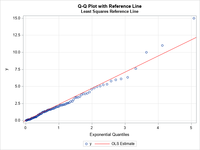
For these data, I used the NOINT option to set the threshold parameter to 0. The zero-intercept line with slope 2.36558 is overlaid on the Q-Q plot. As expected, the outliers in the upper-right corner of the Q-Q plot have pulled the regression line upward, so the regression line has a steeper slope than the reference line based on the first and third quartiles. Because the tails of an empirical distribution often differ from the tails of the target distribution, the regression-based reference line can be misleading. I do not recommend its use.
Maximum likelihood estimates
The previous sections describe two ways to overlay a reference line during the exploratory phase of the data analysis. The purpose of the reference line is to guide your eye and help you determine whether the points in the Q-Q plot appear to fall on a straight line. If so, you can move to the modeling phase.
In the modeling phase, you use a parameter estimation method to fit the parameters in the target distribution. Maximum likelihood estimation (MLE) is often the method-of-choice for estimating parameters from data. You can use the HISTOGRAM statement in PROC UNIVARIATE to obtain a maximum likelihood estimate of the shape parameter for the exponential distribution, which turns out to be 2.21387. If you specify the location and scale parameters in the QQPLOT statement, PROC UNIVARIATE will automatically overlay a line that represents that fitted values:
proc univariate data=Q; histogram y / exp; qqplot y / exp(threshold=0 scale=est) odstitle="Q-Q Plot with MLE Estimate" grid; ods select ParameterEstimates GoodnessOfFit QQPlot; run; |
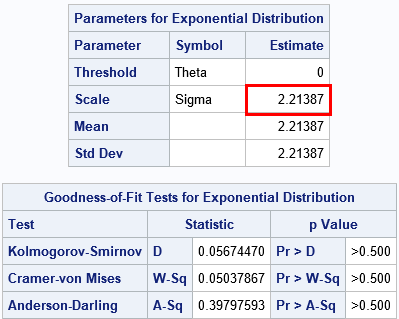
The ParameterEstimates table shows the maximum likelihood estimate. The GoodnessOfFit table shows that there is no evidence to reject the hypothesis that these data came from an Exp(σ=2.21) distribution.
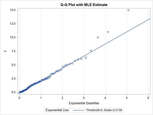
Notice the distinction between this line and the previous lines. This line is the result of fitting the target distribution to the data (MLE) whereas the previous lines were visual guides. When you display a Q-Q plot that has a diagonal line, you should state how the line was computed.
In conclusion, you can display a Q-Q plot without adding any reference line. If you choose to overlay a line, there are three common methods. During the exploratory phase of analysis, you can display a line that connects the 25th and 75th percentiles of the data and target distributions. (Some practitioners use an OLS regression line, but I do not recommend it.) During the modeling phase, you can use maximum likelihood estimation or some other fitting method to estimate the location and scale of the target distribution. Those estimates can be used as the intercept and slope, respectively, of a line on the Q-Q plot. PROC UNIVARIATE in SAS displays this line automatically when you fit a distribution.

10 Comments
Thanks for these insights. I very often examine the diagnostic plots produced by PROC MIXED and such like. As you write, I frequently observe "In fact, the points to the extreme left and right of a Q-Q plot often exhibit a systematic bend away from a straight line". Would you like to expand on this? How many points and how far away can we tolerate before rejecting the distribution?
Like you, I struggle with this issue. I don't know that I (or anyone) can definitively answer your question. Deviation from a straight line indicates that the data have excessive skewness or are heavier in the tails than the reference distribution. Sometimes the deviations are important, sometimes they are not. For example, if you are examining a normal Q-Q plot of residuals to check the assumptions for OLS regression, then moderate deviations from normality are usually ignorable because the inferences in OLS are moderately robust to normality.
Rather than talking about "rejecting" the model, I like to think that the Q-Q plot gives insight into the applicability of the model. The Q-Q plot might indicate that the model is applicable for the "typical" customers (the center of the distribution) but less effective at modeling the "extreme" customers (very active or very rich or very young...).
Thank you very much for this blog on QQ plots. In the MIXED procedure, which approach is used to create the plots, last one?
Just turn on ODS graphics and use
PROC MIXED plots=(residualpanel);
or
PROC MIXED plots(unpack)=(residualpanel);
Be aware that PROC MIXED supports three different kinds of residuals, so you can also use (studentpanel) or (pearsonpanel).
Thanks for this post. I've noticed that you did not even mention having an actual diagonal (y = 1x) as the reference line for a Q-Q plot. Is this really not a viable option - especially for (studentized) residual plots? Also: Did I understand correctly, that PROC MIXED plots=...panel; will use the first method you mentioned (=A line that connect the 25th and 75th percentiles of the data and reference distributions)?
P.S. I came across this post because I was confused how different the diagonals in PROC MIXED (SAS) and lmer (R) looked: https://i.imgur.com/7y2jOma.png
Yes, you can specify the identity line.
In the section "A reference line for the Q-Q plot," the line is added by using the REFLINE statement in PROC SGPLOT. An identity line is
refline x=0 y=0 slope=1;
In the section, "Maximum likelihood estimates," the line is added by using the QQPLOT statement. In the case of studentized residuals, you would create a normal Q-Q and draw the reference line for N(0,1):
qqplot RStudent / normal(mu=0 sigma=1);
Thanks, but I'm afraid I need to work on my phrasing. I am wondering *why* you did not mention this in the post. Would you say the identity line is less informative/helpful in this context?
The primary reason is that the data in this article are distributed as Y~Exp(2), so the identity line is not relevant for this example. If I were looking at N(0,1) data, the identity line would be relevant.
A secondary reason is that the article shows how to overlay arbitrary lines of the form y = m*x + b. I did not feel the need to mention that the methods also work when m=1 and b=0.
Can you please further explain this part:
"For example, the points are not a random sample and there is no reason to assume that the errors in the Y direction are normally distributed."
because the samples are sorted?
Two assumptions for ordinary least squares regression are:
1. The X values are design points and are measured without error.
Clearly, that is not true here. If you draw a new sample, both the X and Y values will change, so there is uncertainty in the X direction.
2. The Y values are a function of the X variables plus independent (iid) normally distributed errors.
This is also not true for a Q-Q plot. The Y values are the empirical quantiles. The X values are the corresponding quantiles of some theoretical distribution. It is not true that Y = b0 + b1*X + eps, where eps ~ N(0,sigma) is a normal random variable. In fact, if you misspecify the distribution, the markers will not lie along a straight line.