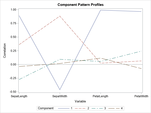
I often use axis tables in PROC SGPLOT in SAS to add a table of text to a graph so that the table values are aligned with the data. But axis tables are not the only way to display tabular data in a graph. You can also use the TEXT
Search Results: sgplot (958)
As we're in the thick of hurricane season, I'm sure some of my fellow map-makers are wanting to create their own custom hurricane maps. In this blog post, I step you through the process, so you'll know where to find all the pieces, and how to put them together. I
An important application of the dot product (inner product) of two vectors is to determine the angle between the vectors. If u and v are two vectors, then cos(θ) = (u ⋅ v) / (|u| |v|) You could apply the inverse cosine function if you wanted to find θ in
A few examples to demonstrate some of the common output-related problems with ODS Graphics Procedures. If your graphical output does not appear as you wanted, consider the options that you are using and make sure that you are using the correct option.
What is this math good for, anyway? –Every student, everywhere I am a professional applied mathematician, yet many of the mathematical and statistical techniques that I use every day are not from advanced university courses but are based on simple ideas taught in high school or even in grade school.
Flying drones was a new & exciting hobby, and very cool fad a few years ago. In recent years, the drone manufacturers have added some really nice features to make the drones easier to fly and more capable ... but the government also added some new rules that have curbed
Do you want to bin a numeric variable into a small number of discrete groups? This article compiles a dozen resources and examples related to binning a continuous variable. The examples show both equal-width binning and quantile binning. In addition to standard one-dimensional techniques, this article also discusses various techniques
When my colleague, Robert Allison, blogged about visualizing the Mandelbrot set, I was reminded of a story from the 1980s, which was the height of the fractal craze. A research group in computational mathematics had been awarded a multimillion-dollar grant to purchase a supercomputer. When the supercomputer arrived and got
SAS supports more than 25 common probability distributions for the PDF, CDF, QUANTILE, and RAND functions. Of course, there are infinitely many distributions, so not every possible distribution is supported. If you need a less-common distribution, I've shown how to extend the functionality of Base SAS (by using PROC FCMP)
The mosaic plot is a graphical visualization of a frequency table. In previous articles, I showed how to create a mosaic plot in SAS by using PROC FREQ and how to define a template in the Graph Template Language (GTL) by using the MOSAICPARM statement. This article shows how to
I think it's time to replace my 2008 Prius. It has served me well, been basically maintenance-free, and gotten good gas mileage ... so, why not just get a newer Prius? Well, I've got the itch to get back into an SUV for my daily driver (I had a Bronco
When fitting a least squares regression model to data, it is often useful to create diagnostic plots of the residuals versus the explanatory variables. If the model fits the data well, the plots of the residuals should not display any patterns. Systematic patterns can indicate that you need to include
My article about deletion diagnostics investigated how influential an observation is to a least squares regression model. In other words, if you delete the i_th observation and refit the model, what happens to the statistics for the model? SAS regression procedures provide many tables and graphs that enable you to
In these modern times, my utility bill has a bar chart so I can see how my current consumption compares to my historical usage. I decided to create my own version of this utility bill bar chart, and make a few improvements along the way. If you're into SGplot bar
In this 'Rosetta Graph' example, I demonstrate how to control bar chart colors in Gchart and SGplot. But first, here's a little diversion... some artwork in my office here at SAS. There's a *lot* of artwork hanging around at SAS, but this particular painting wasn't created by the SAS artists
A family of curves is generated by an equation that has one or more parameters. To visualize the family, you might want to display a graph that overlays four of five curves that have different parameter values, as shown to the right. The graph shows members of a family of
Statistical programmers and analysts often use two kinds of rectangular data sets, popularly known as wide data and long data. Some analytical procedures require that the data be in wide form; others require long form. (The "long format" is sometimes called "narrow" or "tall" data.) Fortunately, the statistical graphics procedures
Marathons seem to be popular these days, therefore I decided to dive into some data and find a way to apply analytics. You might find this interesting if you're a fan of marathons - or if you like seeing the details behind cool graphing techniques! Before we get started, here's
Have you ever run a statistical test to determine whether data are normally distributed? If so, you have probably used Kolmogorov's D statistic. Kolmogorov's D statistic (also called the Kolmogorov-Smirnov statistic) enables you to test whether the empirical distribution of data is different than a reference distribution. The reference distribution
You might have seen in the news that US exports of natural gas to Europe are up 300%. And we recently crossed the threshold where we export more natural gas than we import. This seems like a momentous occasion, and worthy of a graph! But first, let me make sure
I always recommend looking at data in several different ways to get a more complete mental picture. And when the data is changing over time, one great way to view it is using an animation. Follow along for some tips & tricks to animate your own data over time. I'll
Did you know that SAS provides built-in support for working with probability distributions that are finite mixtures of normal distributions? This article shows examples of using the "NormalMix" distribution in SAS and describes a trick that enables you to easily work with distributions that have many components. As with all
The CUSUM test has many incarnations. Different areas of statistics use different assumption and test for different hypotheses. This article presents a brief overview of CUSUM tests and gives an example of using the CUSUM test in PROC AUTOREG for autoregressive models in SAS. A CUSUM test uses the cumulative
This article demonstrates the ODS Excel destination’s flexibility and how you can modify its default behavior by using the SHEET_INTERVAL= option.
While we're on the topic of mortgage rates, let's explore another technique for plotting and comparing the rate data over several years. Last time, we plotted each year's data in a separate graph, and paneled them across the page. This time, let's overlay multiple years together in the same graph.
By using data provided by a Game of Thrones fan, we use SAS to look at screen time for scene locations and characters in this crazy popular show.
I think every course in exploratory data analysis should begin by studying Anscombe's quartet. Anscombe's quartet is a set of four data sets (N=11) that have nearly identical descriptive statistics but different graphical properties. They are a great reminder of why you should graph your data. You can read about
SAS Global Forum 2019 (SGF) is rapidly approaching - and which of the hundreds of presentations are you planning to attend? Well, no matter what types of analyses you perform with SAS software, you'll most likely want to present your findings in a really nice/informative graph! Therefore I highly recommend
I recently saw an interesting graph that showed the number of motor vehicle crash deaths has been going down. The graph showed deaths per mile. That's a good statistic, but I wondered whether there were other ways to look at the data? An Interesting Graph Here's the graph, from an
During the year 2020, many countries and areas will be conducting their decennial census, and making projections to estimate what their population will be in the future. Therefore I decided to dust off one of my old SAS/Graph samples based on the 2010 census, and rewrite it using more modern