The SAS Championship golf tournament is happening this week, here in Cary, North Carolina! If you're following along and watching the scores, you might wonder how they're doing compared to past years, and what kind of scores it generally takes to win. Follow along as I plot the data from previous years, and try to come up with "the perfect graph"!
Data
I don't know a lot about golf, so I had to turn to my co-workers for some help in finding the data for past tournaments. Scott came through in grand form, and pointed me towards a PGA web page where you could select the desired year, and see the past data. Here's an example of what the data looks like on their page:
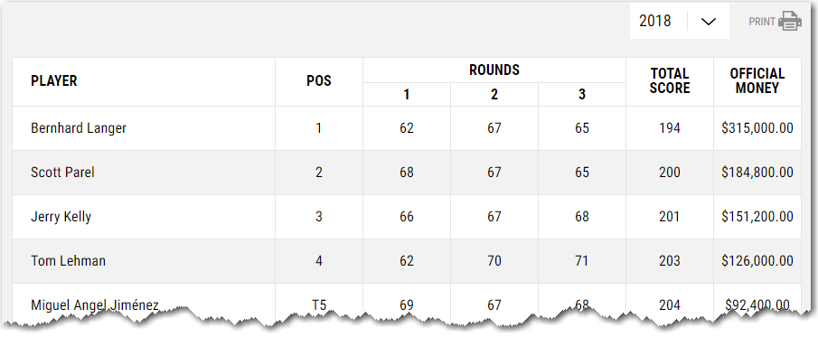
I didn't see a 'download' button, so I copy-n-pasted the data for each year into text files, and wrote some code to import the tab-delimited text into SAS.
Default Plot
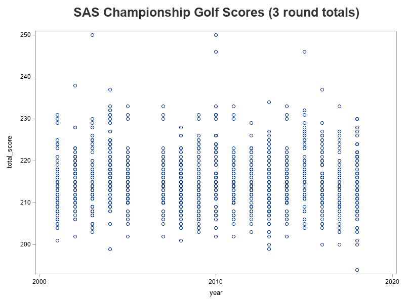
And with the following minimal code, I had a plot of the data!
proc sgplot data=my_data;
scatter x=year y=total_score;
run;
Refining Plot Layout
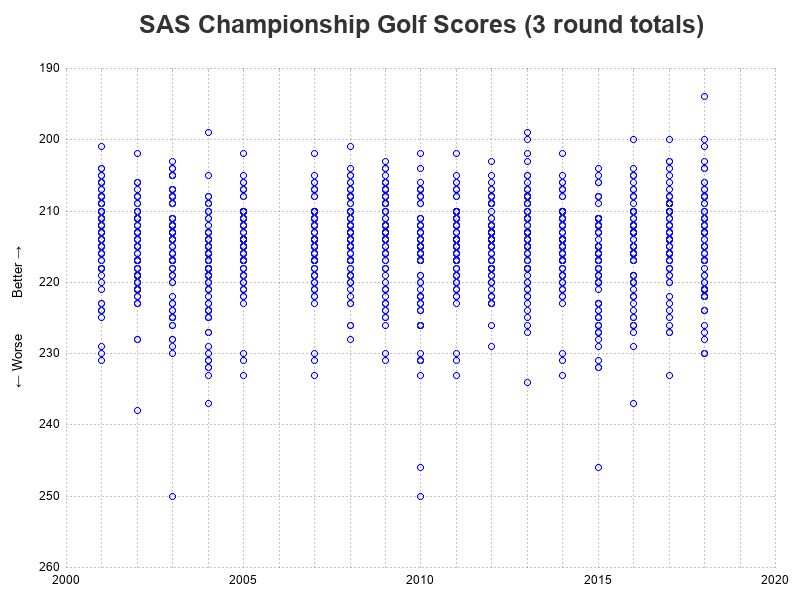
The default plot (above) was a decent plot. I could see the basic character of the data. I could see that I had left out the 2006 data (because they only had 2 rounds, rather than 3, that year). But I could see opportunities for improvement. For example, in most sports graphs people look at the top for the 'best' outliers - but in this case a high score (how many strokes it took to get the ball in the holes) is bad! Therefore I needed to reverse the y-axis, so the lowest (best) scores show at the top. I also wanted to show more year labels along the bottom axis, and add reference lines at each year, to make the data more easily readable. And maybe add a label for the y-axis, indicating which scores were better and worse.
ods escapechar='^';
proc sgplot data=my_data noborder;
scatter x=year y=total_score / markerattrs=(color=blue);
yaxis display=(noline noticks)
label="^{unicode '2190'x} Worse Better ^{unicode '2192'x}"
offsetmin=0 offsetmax=0
grid gridattrs=(pattern=dot color=gray88)
values=(190 to 260 by 10) reverse;
xaxis display=(nolabel noline noticks)
offsetmin=0 offsetmax=0
values=(2000 to 2020 by 5);
refline 2000 to 2020 by 1 /
axis=x lineattrs=(color=gray88 thickness=1px pattern=dot);
run;
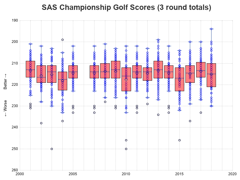
Box Plot
I was happy with the layout of the plot (above), and at first glance the data looks to be represented well as markers. But after I scrutinized it a bit, I realized I wasn't seeing the whole story. Many of the golfers actually had identical scores, but my graph just shows a single blue circle marker for each score ... well, the graph actually contains all the markers, but when the score is the same, the markers are all printed in the exact same location (so you only see one marker).
One way to better visually represent the values of all the data points, is to use a box plot, so I tried overlaying a vertical box plot on the graph, by adding the following line of code:
vbox total_score / category=year fillattrs=(color=red transparency=.5);
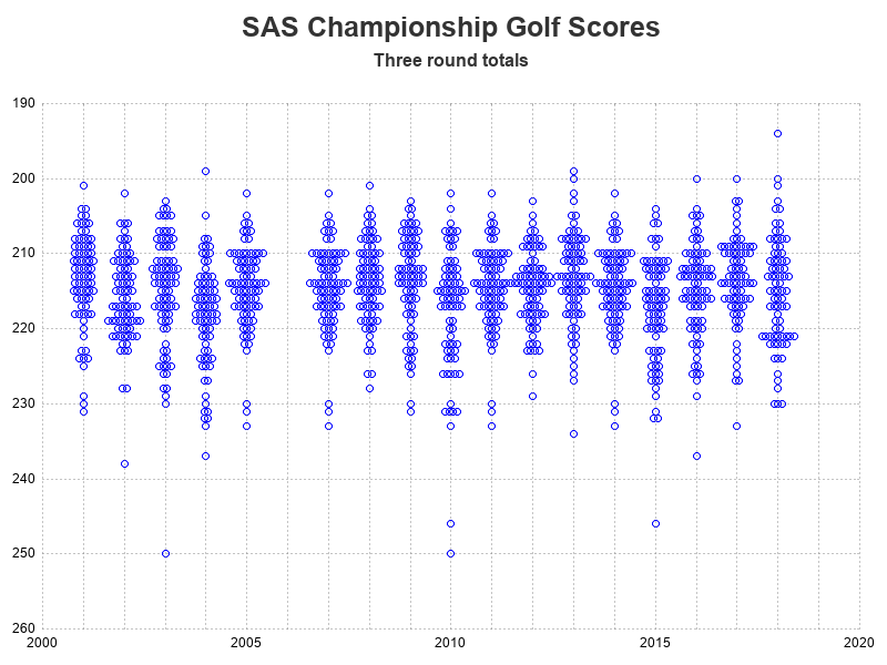
'Jittering' the Plot Markers
The box plot (above), showing the median, quartiles, etc might make a statistician happy ... but probably doesn't do much for a golf fan. Therefore I decided to try a non-statistical method of showing all the individual markers - I used the 'jitter' option to add a bit of random offset to each marker.
scatter x=year y=total_score / markerattrs=(color=blue) jitter;
Non-random Jittering
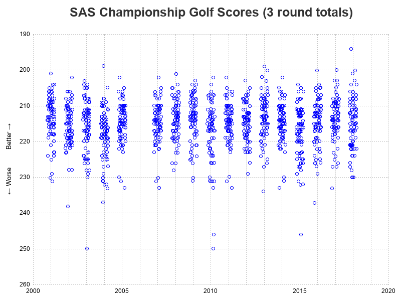
The plot above now shows all(?) of the markers, instead of stacking them in the same location ... or maybe all (you never really know, with random offsets). But it still doesn't quite show what I'm looking for. I was wanting something more like the 'turnip plot' jittering I had seen in one of Sanjay's blog posts. But since I'm technically doing a scatter plot with continuous axes in both the x and y direction, jittering uses random offsets. To get the more stacked/systematic-looking jittering, I must have a non-continuous axis. I first thought I might need to convert my year axis from numeric to character, but then I remembered that the sgplot xaxis statement had a type=discrete option I could use instead!
With the type=discrete option, I had to also make a few other changes, to keep the graph layout the way I wanted. It takes a bit more code, but that's the cost of creating a custom plot, and getting it to look exactly the way you want. Below is the code I used to create my final graph. (Here's a link to the full SAS code, in case you'd like to experiment with it.)
proc sgplot data=my_data noborder;
scatter x=year y=total_score / markerattrs=(color=blue) jitter=uniform;
yaxis display=(noline noticks)
label="^{unicode '2190'x} Worse Better ^{unicode '2192'x}"
offsetmin=0 offsetmax=0
grid gridattrs=(pattern=dot color=gray88)
values=(190 to 260 by 10) reverse;
xaxis display=(nolabel noline noticks) type=discrete
offsetmin=0 offsetmax=0
values=(2000 to 2020 by 1)
valuesdisplay=(
'2000' ' ' ' ' ' ' ' '
'2005' ' ' ' ' ' ' ' '
'2010' ' ' ' ' ' ' ' '
'2015' ' ' ' ' ' ' ' '
'2020');
refline 2000 to 2020 by 1 /
axis=x lineattrs=(color=gray88 thickness=1px pattern=dot);
run;
Eureka Moment!
With the final chart (above), you can much better see the distribution of scores among the players, from year to year. And with the stacked jittering (as opposed to all the other graphical methods I had previously tried), we can actually see the structure or shape of the data. Which is how I noticed that 2005, 2007, 2011, and 2014 all seem to have the exact same shape:
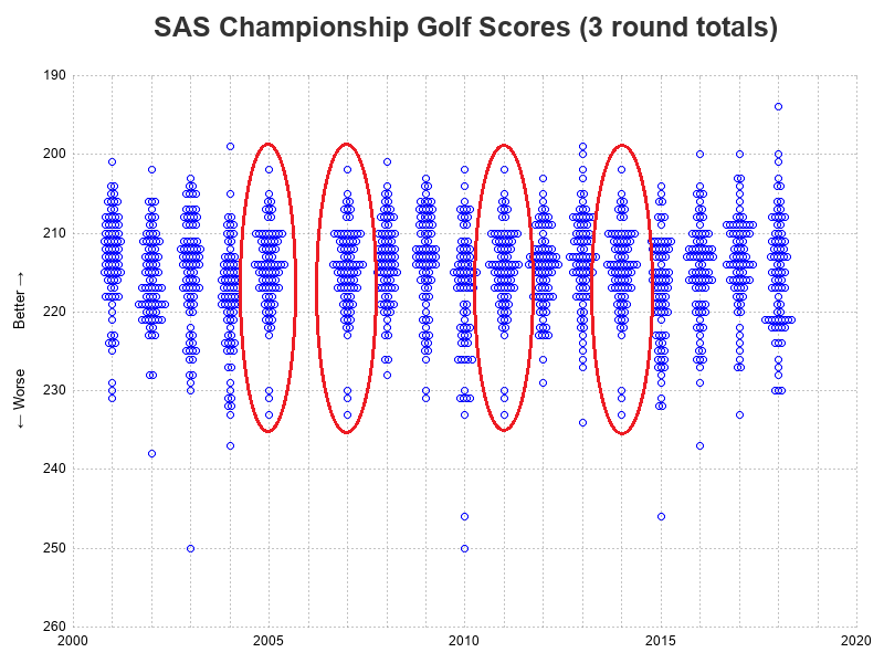
I went back to the PGA data pages and double-checked, and sure-enough they have the exact same data listed for 2005, 2007, 2011, and 2014. I guess I'll contact them and let them know that they seem to have a data problem!
Conclusions
Plotting your data can help you gain more insight, more easily. And if it's a really good plot, you can sometimes even identify data-integrity problems!


5 Comments
Big thanks to Mr_Claypole on the /r/golf reddit group for pointing out that 2011 was also a duplicate of the 2014 data (I've updated that with a red circle in my graph now).
https://www.saschampionship.com/history-of-champions/ has links to the correct data from each year, 2001-2015, inconsistently presented. I have no idea why they don't have links for 2016 or 2017, or any mention of Langer in 2018 at all.
Ahh! - Thanks data-meister!
Robert,
Nice analysis and great example of how "just" visualizing the data can lead to data quality issues that need to be addressed.
David
Pingback: Does plotting data give you the jitters? - Graphically Speaking