With all this sitting at a desk writing code, I have to do something to keep in shape. And for me, that something is paddling boats ... as fast as I can - and occasionally trying to race them. This past weekend I entered the race at Hunting Island, SC. And naturally, I decided to plot the results! Follow along, and you might learn some tricks to use when plotting data that gives you the jitters!
Race Details
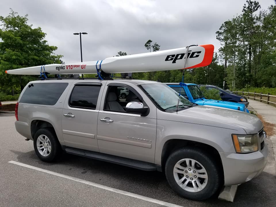
The race had categories for many kinds of boats, but most people were in some form of "racing kayak". For me, that was my surfski - a long, skinny, sit-on-top boat you power with a double-bladed paddle. Mine is the carbon-fiber version of the Epic V10 Sport. It's a fairly fast boat compared to a normal kayak, but as I showed in a previous blog post, when compared to other racing surfskis the V10 Sport is at the slower end of the scale (I chose stability over speed).
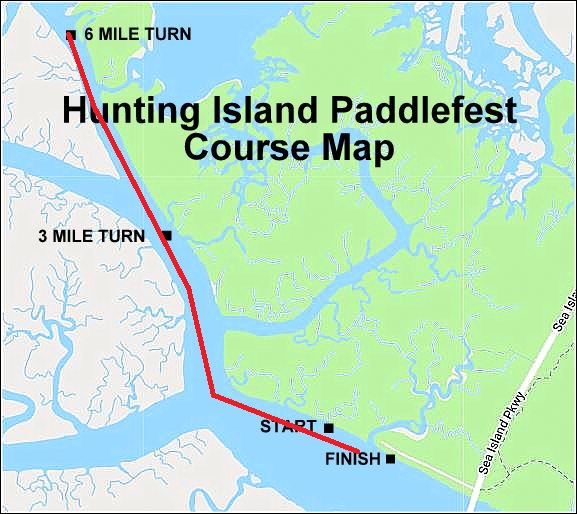
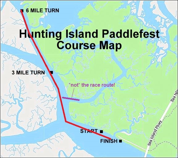
The event had both a 3-mile and a 6-mile race. 19 of us competed in the 6-mile version. As the map below shows, we started at the boat ramp, paddled up the channel 3 miles, turned around and paddled back. And since we were at the coast, we had tides and wind to contend with - the tides were coming in, and the wind was blowing out.
Results
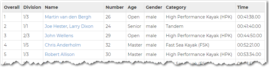
After the race, they posted the results in a table on the paddleguru website. Here's an example of what their table looks like.
I copy-n-pasted the table to a tab-delimited text file, and then used the following code to import the text into SAS:
data my_data;
length name division age gender category $100;
informat time hhmmss11.;
infile tempfile lrecl=250 pad firstobs=2 dlm='09'x;
input year overall division name bib_number age gender category time;
run;
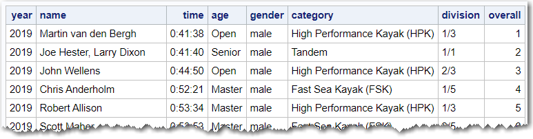
Here's what my SAS table looks like:
Basic Plot
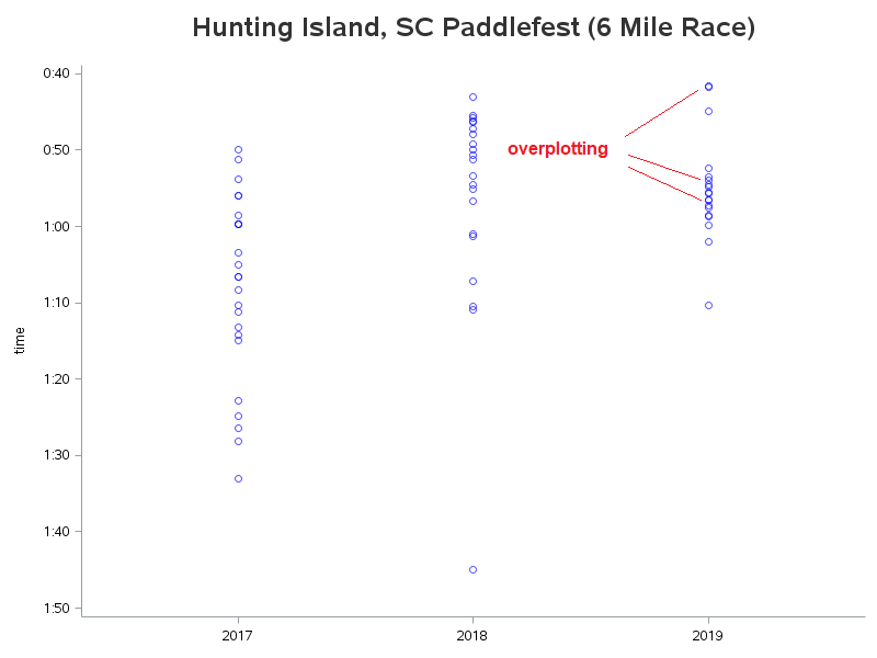
With just a few lines of code, I created a preliminary plot of the data. But if you look closely, you will notice that some of the racers had such similar times that their markers are plotted in essentially the same spot (ie, overplotting). I made the markers slightly transparent, so that the overplotted markers appear darker.
proc sgplot data=my_data;
format time time5.;
scatter x=year y=time / markerattrs=(color=blue size=6pt) transparency=.40;
xaxis display=(nolabel) offsetmin=.2 offsetmax=.2 values=(2017 to 2019 by 1);
yaxis reverse;
run;
Jittering
In the plot above, it's difficult to tell whether that fastest marker represents just one racer, or were there 2 (or more) racers battling nose-to-nose for the win! Therefore, rather than letting the markers overplot, we want to jitter them (apply slight offsets) so we can see each individual marker.
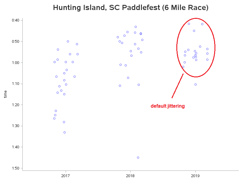
If I naively add the jitter option to the code, I no longer have the problem with the markers being stacked one on top of another (overplotting), but the jittering offsets are a bit random-looking, and not quite what I was wanting.
scatter x=year y=time / markerattrs=(color=blue size=6pt) transparency=.40 jitter;
Uniform Jittering
In a previous blog post, I shared a tip about setting the xaxis to discrete, and then using uniform jittering, so the jittering offsets are applied in a nice even manner in the horizontal direction. So let's try that here!
proc sgplot data=my_data noborder;
format time time5.;
scatter x=year y=time / markerattrs=(color=blue size=6pt) transparency=.40 jitter=uniform;
xaxis display=(nolabel) offsetmin=.2 offsetmax=.2
values=(2017 to 2019 by 1) type=discrete;
yaxis reverse;
run;
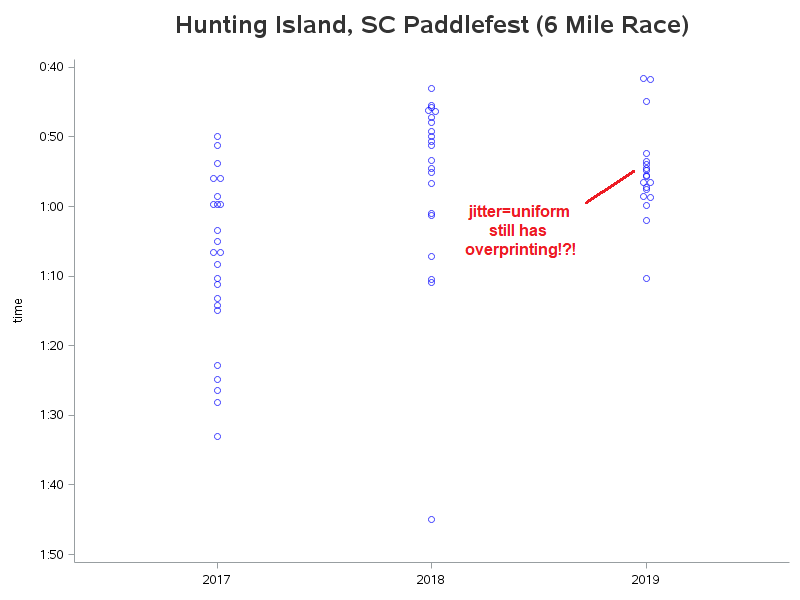
But I've still got overplotting! - Why didn't the trick I had previously used, work this time?!? In the previous blog, the data was golf scores, and when the plot markers were overprinting the golfers had exactly the same score. Whereas in this case, the values are race finish times, down to the second - and if race times aren't *exactly* the same, then they aren't jittered left/right, and you still get overplotting.
Rounded Uniform Jittering
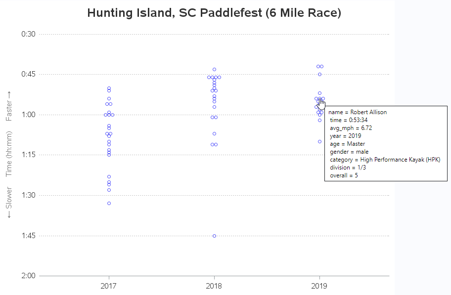
One trick to get around this problem is to round the race times to the nearest minute - that way the markers that round to the same minute will get uniform jittering applied. I add one line of code to calculate the rounded time in the data step that imports the data, and then I use that new variable (time_rounded) to plot the data. Now the jittering looks neat & orderly, and you can see the markers for all 19 racers.
data my_data;
length name division age gender category $100;
informat time hhmmss11.;
infile tempfile lrecl=250 pad firstobs=2 dlm='09'x;
input year overall division name bib_number age gender category time;
/* round to the nearest minute for uniform horizontal plot jittering */
time_rounded=round(time,'00:01't);
run;
proc sgplot data=my_data;
format time_rounded time5.;
scatter x=year y=time_rounded / markerattrs=(color=blue size=6pt) transparency=.40 jitter=uniform;
xaxis display=(nolabel) offsetmin=.2 offsetmax=.2
values=(2017 to 2019 by 1) type=discrete;
yaxis reverse;
run;

Final Graph
For the final graph, I add a few options such as a yaxis label and gridlines, and I the tip= option to specify custom mouse-over text for the plot markers. The default mouse-over text would have shown the rounded time (since that's the value being plotted), but I wanted to show the actual time. Click here to see the interactive version of the final graph, and click here to see the full SAS code.
ods escapechar='^';
proc sgplot data=my_data noborder;
format time_rounded time5.;
scatter x=year y=time_rounded / markerattrs=(color=blue size=6pt) transparency=.40 jitter=uniform
url=my_url tip=(name time avg_mph year age gender category division overall);
xaxis display=(nolabel)
values=(2017 to 2019 by 1) type=discrete
valueattrs=(color=gray33 size=11pt)
offsetmin=.2 offsetmax=.2;
yaxis display=(noline noticks)
label="^{unicode '2190'x} Slower Time (hh:mm) Faster ^{unicode '2192'x}"
labelattrs=(color=gray77 size=11pt)
values=('00:30:00't to '02:00:00't by '00:15:00't) reverse
valueattrs=(color=gray33 size=11pt)
offsetmin=0 offsexmax=0
grid gridattrs=(pattern=dot color=gray88);
run;
Data Storytelling
Sometimes a graph tells an interesting story ... and sometimes it only hints at an interesting story (and you have to find an old-timer who was actually there, to fill in the details!)
What's the story behind the gap in the race times? After the first 3 boats finished, there's about an 8 minute gap before the next boats crossed the finish line. Were these first 3 boats just that much faster than all the others? Well, there's an interesting story behind that! 🙂
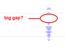
During most of the race, there were 10 boats in front of me, and 6 of them were in a very tight pack of competitive paddlers. In the home stretch, the lead paddler in that pack of 6 took a wrong turn, and the rest of the pack followed him (I guess they were focused on trying to catch him, and riding his wake, etc). I was a minute or so behind them, and therefore able to better see the "big picture". The left turn they took just "didn't look right" to me for the final turn around the bend to the finish line. And it also didn't jive with the distance my gps was telling me. But I still wasn't sure whether to follow my instinct (and keep going straight), or to follow the 6 paddlers that had turned.
What did I do? ... I got the attention of one of the safety boats from Beaufort Water Search and Rescue and asked them (who would have thought ... a guy actually asking directions!) And they confirmed that I should keep going straight. So I skipped that turn, and boogied on down and took the next turn, and crossed the finish line just ahead of the 6 guys who had taken taken a detour up the wrong channel.
That's why the graph has a 'gap' in it, and that's how I placed 5th overall. 🙂


3 Comments
Love your storytelling, Robert. Very engaging! Congratulations on taking 5th place in the race.
Thanks my friend (who also tells data stories!) 🙂
Hearing the story was almost as good as being there. Sounded like an exciting race. Your graphs are interesting. and well done. The surfski is sleek with a cool looking design, and I've never seen one like it. Thanks for sharing the pics and stories. Congratulations on your 5th place finish. Great life lesson about not "following the pack!"