Last year, a user asked about creating a "Turnip Plot" as used in this study of Caesarian Section Rates. Primarily, this is similar to a histogram on the y-axis for each unique value on the y-axis. A marker is drawn for each occurrence, starting from the center.
Back then, I had hoped this graph could be made using the SCATTER plot with the JITTER option. However, that plan did not work due to the way the jittered markers are compressed to fit in the space available. For an example, I created a data set of all Sedans, with an additional column called "AllType". This column has "All" for every car. Now, I created a scatter plot of this data as follows:
proc sgplot data=cars noautolegend noborder; scatter x=alltype y=mpg_city / jitter markerattrs=(size=9); xaxis display=(novalues noticks) label='Number of Cars with each Mileage'; yaxis display=(nolabel noline noticks) grid; run; |
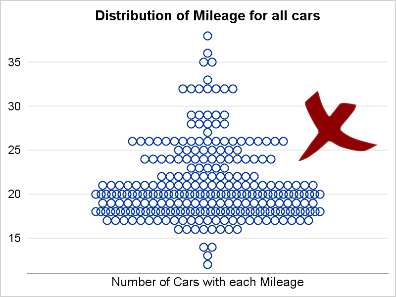
The plan mostly worked, except for the way the scatter plot squeezes in the markers that do not fit in the space available, But, it only squeezes the row that does not fit as for the row at Mileage=18 and 20. This distorts the visual perception of the distribution of the data as the row width is no longer proportional to the number of markers in the row. I have used Robert's idea to mark the graph above with a big "X" to indicate it may be misleading.
Due to this behavior, I had proposed a different solution as described in the article Scaled Turnip Plot.
In the meantime, we worked on this issue that resulted in a new feature, JITTER=UNIFORM, included with SAS 9.40m5, The default behavior remains the same. However, now, when you specify JITTER=UNIFORM, all the rows of the markers are proportionately scaled if necessary as shown below in the graph that uses JITTER=UNIFORM.
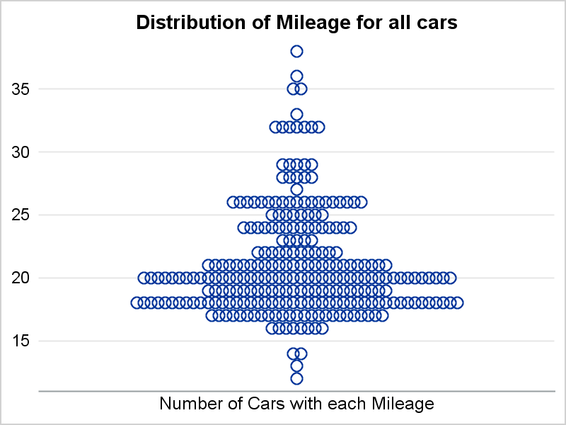
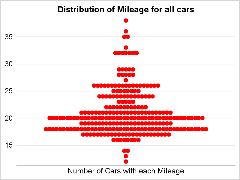
Now, width of each row of markers is proportional to the number of markers, providing a better feel for the distribution of the data. Next, let use see if we can reduce the clutter in the graph. The graph below uses FILLED markers, with JITTERWIDTH=1.
When markers are jittered, they are always placed next to each other. An appearance of spacing can be achieved by using FILLEDOUTLINED markers with white outlines as shown below. The graph below gets us close to the result we are hoping for, so I added the small "check" mark. The two graphs above also correctly represent the data.
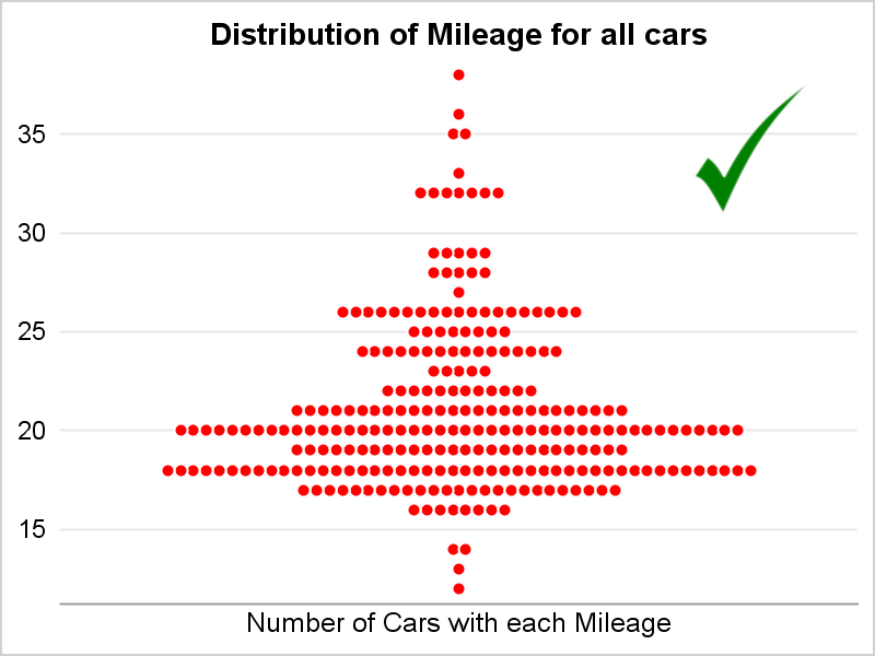
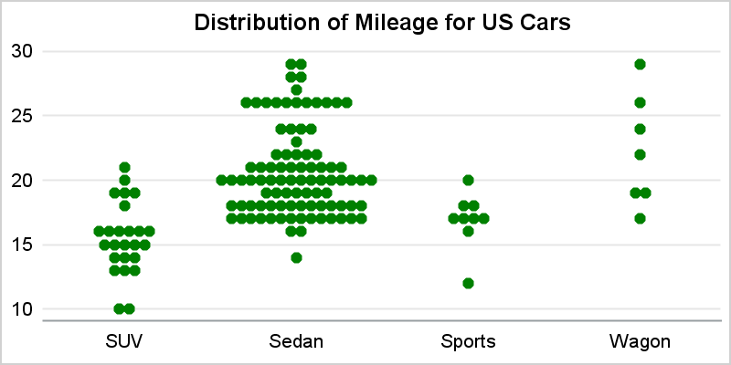
For the graph above, I included all the cars without classification by type to match the Caesarian Section Rates graph. However, the same graph can easily be created by "Type" based on the data, as shown below for all non-Hybrid types.
Full SAS 9.4M5 SGPLOT Code: UniformJitter


3 Comments
This plot appears to be a variation of the dot plot.
I suppose there are many versions of dot plots. Most common one often called the Cleveland Dot Plot usually displays the summarized response value by a classifier on the y-axis. This one does not summarize the data, but displays each observation. The observations are jittered if they overlap.
Pingback: SAS Championship (golf) - plotting the results - Graphically Speaking