A Turnip Graph displays the distribution of an analysis variable. The graph displays markers with the same (or close) y coordinate by displaying the markers spread out over the x-axis range in a symmetric pattern. Recently, a question was posted on the SAS Communities page regarding such a graph.
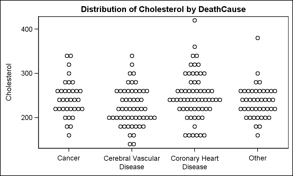 Here is an example of display of the distribution of the data using a Turnip Graph. In this example, the markers are "Binned" on the y-axis. All markers in each bin are displayed symmetrically in the x direction. The data requires the list of observations with same y value which are automatically displayed as a row of markers using the SCATTER plot with the JITTER option. Click on the graph for a higher resolution view.
SGPLOT code for Turnip Graph:
title 'Distribution of Cholesterol by DeathCause';
proc sgplot data=turnipScatter noautolegend;
scatter x=deathcause y=y / jitter;
xaxis display=(nolabel);
run;
One shortcoming for the graph above is that it does not scale well for moderately large data. The graph above was created for a data about 225 observations with 4 category values. I have intentionally reduced the data so it works for the graph above. The number of markers just barely fit the space available. As the observation count or number of categories increase, this method does not continue to provide good results. Other methods can be used to actually compute the (x, y) of each observation which requires much more work for a general solution.
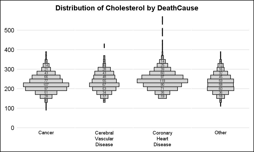 An alternate way which is relatively easy to build to view the same data is shown on the right. Instead of displaying each marker, the graph displays a "bin" that represents all the markers in the bin. All bins in the graph are scaled by the count in each bin so it is easy to see the relative distribution of the data. The observation count is displayed in the bin. Click on the graph for a higher resolution view.
As you can see, this graph scales very well for all kinds of data, with small or large observation counts and for different number of categories on the x-axis. To prepare the data, we run an SGPANEL graph with the HISTOGRAM statement using the SCALE=COUNT option and save the resulting data in a data set using the ODS OUTPUT statement. This saves the bins and the number of observations in each bin by category. We mirror the data by creating a "Min" column equal to the negative value of the "Count" column.
We use the SGPANEL Procedure with the HIGHLOW plot to display the distribution in a panel. We use a TEXT plot to display the bin counts and we turn off the cell headers and use a TEXT plot to display the categories at the bottom to make this look like a single cell graph. TEXT is better than an INSET since it can split the long values on white space.
SGPLOT code for the Scalable Turnip Graph:
title 'Distribution of Cholesterol by DeathCause';
proc sgpanel data=turnip noautolegend;
panelby deathcause / novarname layout=columnlattice columns=4 noborder noheader;
highlow y=y low=min high=max / type=bar barwidth=1
fillattrs=(color=lightgray) lineattrs=(color=black);
colaxis display=none;
rowaxis min=0 offsetmin=0.15 display=(noticks noline nolabel) grid;
 text y=y x=zero text=max / strip textattrs=(size=5);
text y=ylbl x=zero text=label / strip splitpolicy=split
position=bottom contributeoffsets=none;
run;
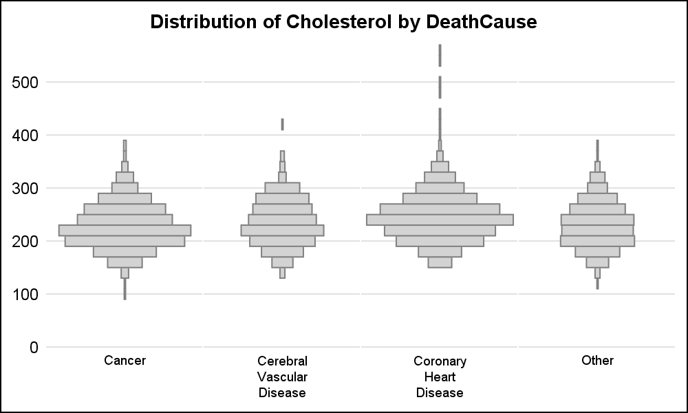
To view the relative distribution, bin counts are not really necessary. Alternative visuals are shown below. Full code for preparing the data and for creating the graph is linked below. I am tempted to call this the "Spark-Plug Graph" or a "Spinning Top" graph.
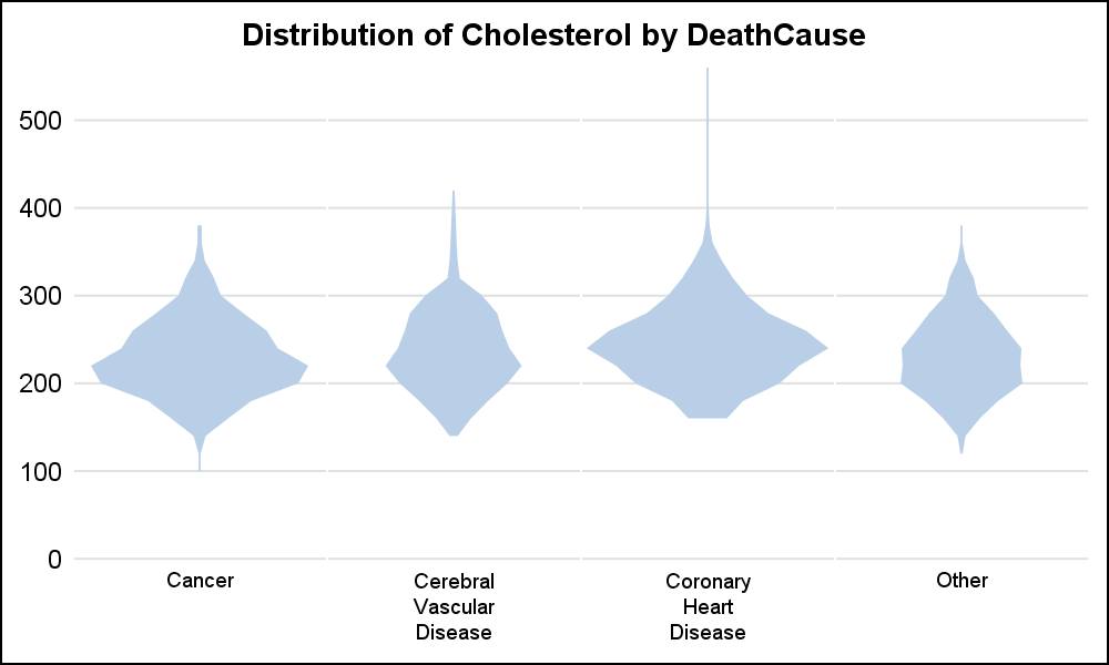 A "Violin Graph" can be created instead using the same data by using the BAND statement instead of HIGLOW.
Full code for Scalable Turnip Graph: Turnip


6 Comments
Very nice! I'm going to play with this on my own data.
I like the name "spinning top" graph. Three of the four depictions remind me of tops I had as a kid. Plus, it sounds more positive than a turnip.
The phrase 'turnip graph' originated with The Dartmouth Atlas of Health Care and has been used since the mid-late 1990s. It's original purpose was to graphically represent variation among 306 Hospital Referral Regions (HRRs) also developed by this group. The 'turnip graph' is still widely used in Atlas reports and publications. As Sanjay noted the graph works best with a small number of observations.
Thank you, Stephanie, for providing the context. The link I included does indeed go to the "Dartmouth Atlas" page. I think it is a great way to visualize the differences in the facilities, where the data will fit. My attempt was to provide an alternate that will work for varying data densities.
Is there any way to make these plots in SAS 9.3? Proc sgplot does not support the jitter option and sgpanel does not have the highlow statement in 9.3 as far as I can tell. Thanks!
Yes, there is as described in this article by Prashant: http://blogs.sas.com/content/graphicallyspeaking/2012/05/07/unbox-your-box-plots/. It does need some extra steps needed to jitter the markers yourself. Also, if you mouse over the values, you will see the jittered values, not the original value. At SAS 9.4, JITTER option does this work for you, and retains the original value in the tool tip.