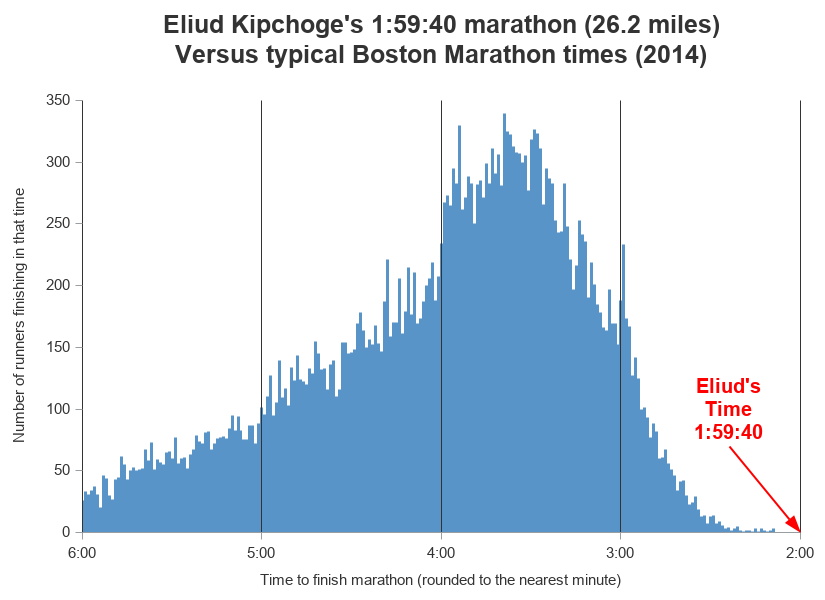
Eliud Kipchoge recently ran a marathon in under 2 hours. It was a special marathon where they had set up the best possible conditions to help him achieve this goal (such as swapping in pace-setting runners to block the wind for him), so it won't count as the world record - but nonetheless it was quite an accomplishment. And just how fast is a 2 hour marathon, compared to the time it usually takes athletes to run a marathon? ... I'm glad you asked. Let's graph some data and find out!
But first, to help get you in the mood for analyzing some marathon data, here's a picture of my friend Leah's son running a race. It will be interesting to see what this next generation of runners will accomplish, eh!?!

Data to Compare
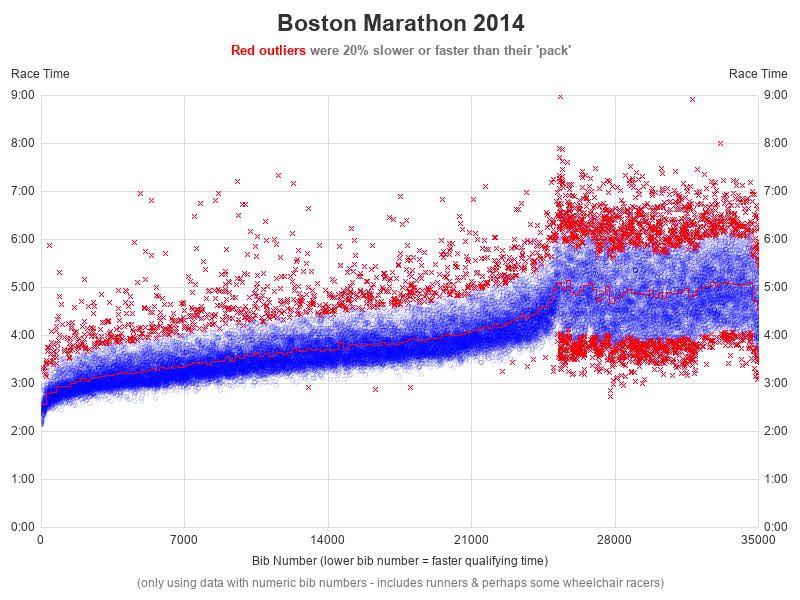
I just happened to have some data from the Boston Marathon that I had used in a previous blog post, so I decided to compare Eliud's time to that data. Note that the Boston Marathon times are fairly fast, as you have to meet high standards to be allowed to run in that race. Below is my previous graph. If we added Eliud's time, it would be a little below the bottom/left blue marker ... but I don't think that's a good way to show how much faster he is than everyone else, so I decided to start from scratch.
Reddit Histogram
A much better way to visualize the distribution of race-times is to use a histogram. And here's an example of a pretty good histogram that chartr posted on Reddit.
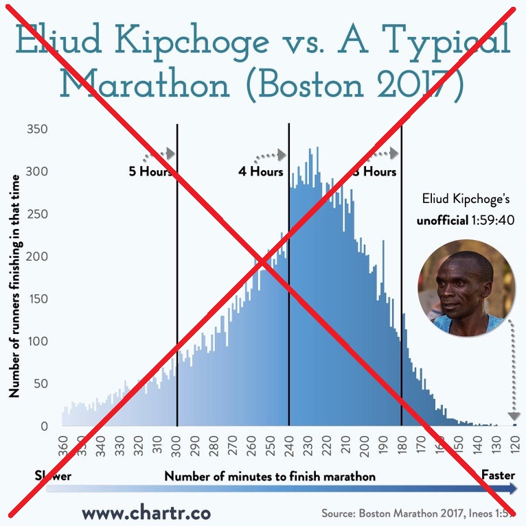
I like the way it's laid out, and it has a good look for a magazine graph. But I would prefer to de-clutter it a bit, and try to make it easier to read.
Histogram
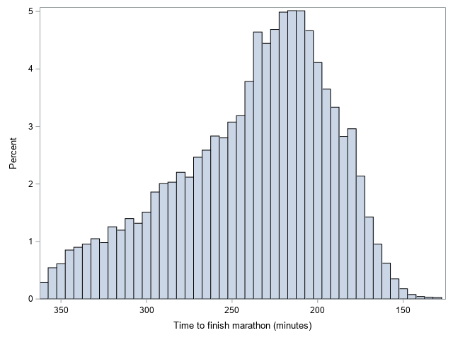
How can I make a similar graph in SAS? Well, one way is to use a Proc SGplot histogram. With the following minimal code, I can produce a pretty decent histogram of the data, laid out similarly to the chartr graph above.
proc sgplot data=my_data;
label official='Time to finish marathon (minutes)';
histogram official;
xaxis reverse;
run;
Needle Plot
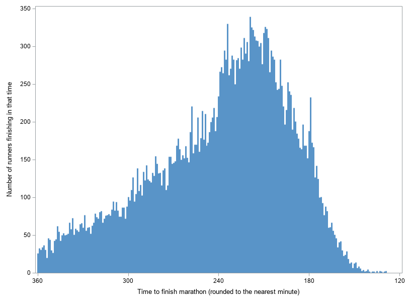
The above histogram is nice, but for this particular data I prefer the way each bar represented an individual minute in the original (chartr) graph. That's a lot of minutes to try to represent as individual bars in a traditional histogram ... I only have so many pixels to work with! So I decided to switch to using a needle plot instead. I rounded the race times to the nearest minute, and then used SQL to count the number of runners with each minute time. I then plotted the summarized data using a needle plot (I like thinking of needles as micro-bars).
data my_data; set my_data;
official_rounded=round(official);
run;
proc sql noprint;
create table plot_data as
select unique official_rounded, count(*) as count
from my_data
group by official_rounded;
quit; run;
proc sgplot data=plot_data ;
label count='Number of runners finishing in that time';
label official_rounded='Time to finish marathon (rounded to the nearest minute)';
needle x=official_rounded y=count / lineattrs=(thickness=3px color=cx5994c8);
xaxis values=(120 to 360 by 60) reverse;
yaxis display=(noline) values=(0 to 350 by 50);
run;
Final Graph
Now that I've got the basic graph, it's just a matter of adding a few final touches. Below is a summary list of those final touches (click here to see the complete SAS code):
- I convert the minutes to hours, so I can use the hhmm. time format along the bottom axis.
- I add reference lines at each hour.
- I annotate an arrow pointing to Eliud's time.
Conclusions
A histogram is a good way to see how much faster Eliud's time was than typical marathon times, and a needle plot is a good way to create a "high density histogram". A fancy histogram might be good to grab attention in a magazine article, but a nice clean/minimal graph is easier to read and comprehend quickly.


4 Comments
Hi Robert I really do not like the graph. unnatural with reversed time axis (slow to the left). The annotation of the time is good, but the data is impossible to see. I do not have a good suggestion though. Maybe use offset but that might elude somebody to think that a marathon can be run much faster.
Here's one thing that might help you 'see' the data values better ... the interactive version of the graph has HTML mouse-over text, so you can see the time & frequency count for each individual micro-bar: http://robslink.com/SAS/ods8/kipchoge_2hr_marathon.htm
Hi Robert,
Nice graph. Does SAS have a way to do a 3D needle plot? To expand this example, you might have time on the X axis, age on the Y axis and frequency as the Z height of the needle. You'd want to insert some space between the needles so that we could see the ones further back.
You could create such a graph with SAS' Proc G3D ... but I'm not a big fan of 3d graphs. https://support.sas.com/sassamples/graphgallery/PROC_G3D.html