Marathons seem to be popular these days, therefore I decided to dive into some data and find a way to apply analytics. You might find this interesting if you're a fan of marathons - or if you like seeing the details behind cool graphing techniques!
Before we get started, here's a picture to get you into the mood for this topic. My friend Sunil is an avid marathon runner, and in 2016 he decided to run 1 marathon each month for a year. This Tucson marathon was his December race, where he completed his 1-year challenge. Way to go Sunil!

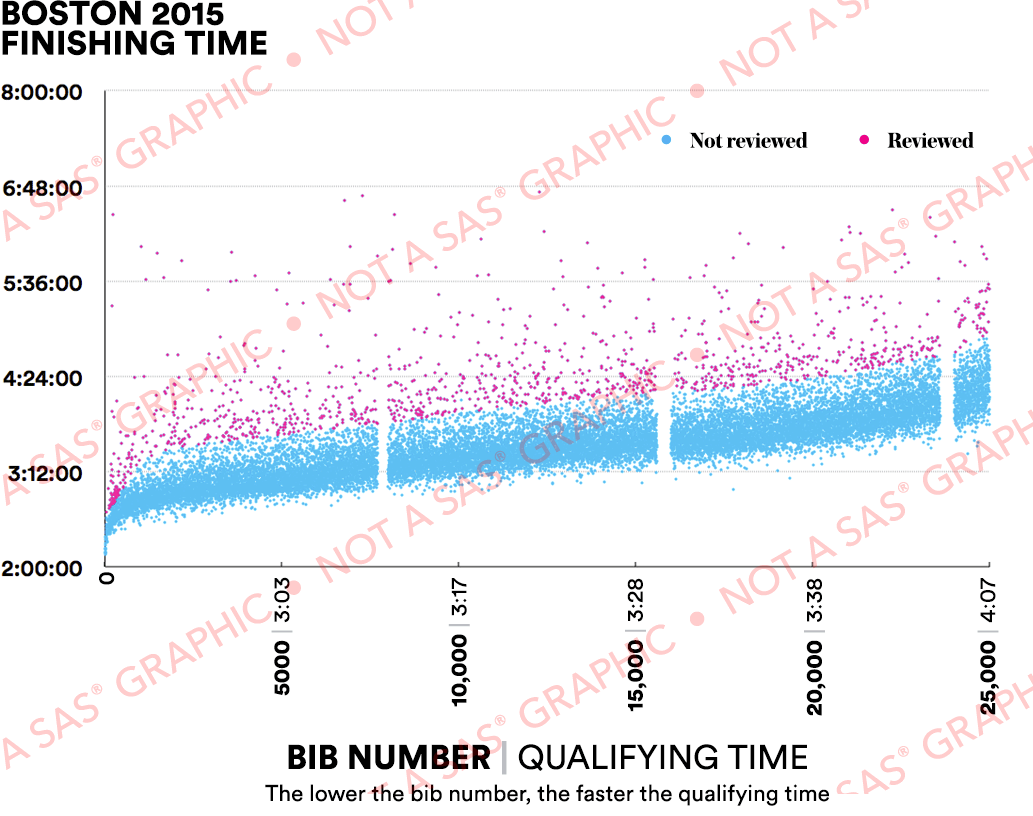
The Original Graph
Now, let's get going with the analysis. To get off to a fast start, I decided to check what graphs were already out there. I found a really interesting article about some of the analytics used to look for possible 'cheaters' in the Boston Marathon data. They had a graph that identified runners who ran the marathon 20+ minutes slower than their qualifying time. I decided to use their graph as the starting point for mine (and hopefully add a few enhancements along the way). Here's a screen-capture of the graph from their article:
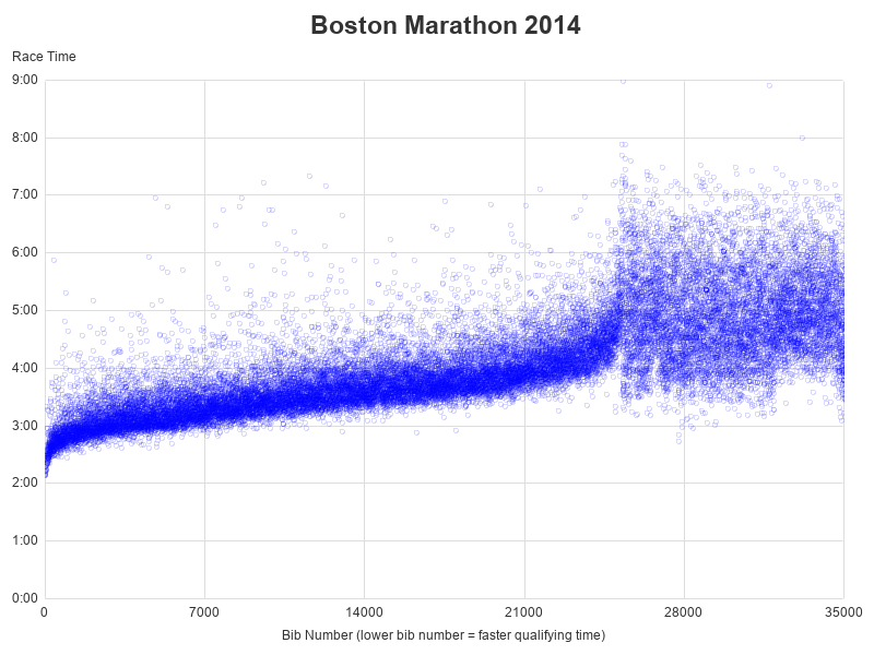
Simple Plot Markers
I found some Boston Marathon results data on Github, downloaded it, and imported it into SAS. I created my graph by starting simple, and adding more features one layer at a time. In my first iteration, I simply plotted each runner's time as a blue marker. One small enhancement over the original graph is that I made my blue markers transparent, so you can see where the markers are 'stacking up' (multiple markers in the same location).
proc sgplot data=plot_data noautolegend noborder;
format official time_avg mmss.;
scatter y=official x=bib_num / transparency=.85
markerattrs=(symbol=circle color=cx0000ff size=5pt);
yaxis display=(noline noticks) labelpos=top label='Race Time'
values=('00:00:00't to '00:09:00't by '00:01:00't) grid gridattrs=(color=graydd)
offsetmin=0 offsetmax=0;
xaxis display=(noline noticks) label='Bib Number (lower bib number = faster qualifying time)'
values=(0 to 35000 by 7000) grid gridattrs=(color=graydd)
offsetmin=0 offsetmax=0;
run;
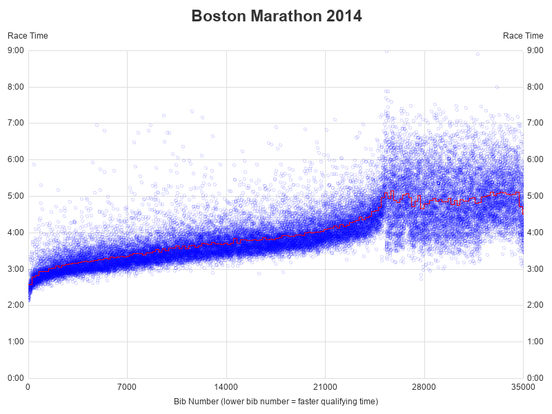
 Adding Average Line
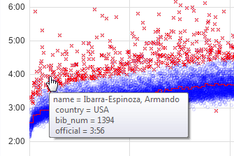
In the original graph, their pink dots represented runners who had a marathon time 20 minutes slower than their qualifying time. I didn't have the qualifying time data, therefore I needed to come up with an alternative. I decided to calculate the average time for each group of 200 sequential bib numbers, and then identify the runners who ran the marathon 20% slower than the average time for their group. Here's the code I used to calculate the groups, and the averages:
data plot_data; set race_lib.boston_marathon (where=(bib_num^=.));
obs_200=round(_n_/200);
run;
proc sql noprint;
create table plot_data as
select unique *, avg(official) as time_avg
from plot_data
group by year, obs_200
order by year descending, bib_num;
quit; run;
I then overlaid a red series line on the graph, to represent this average. Notice that I used the y2axis option, to add an axis on the right-hand side of the graph - this makes it easier to estimate the times for the slower runners, and is an improvement over the original graph.
series y=time_avg x=bib_num / y2axis lineattrs=(color=red);
y2axis display=(noline noticks) labelpos=top label='Race Time'
values=('00:00:00't to '00:09:00't by '00:01:00't) grid gridattrs=(color=graydd)
offsetmin=0 offsetmax=0;
Identifying Outliers
I then determine which runners ran the race more than 20% slower (or faster) than the average time for their group of 200 peers (with similar bib numbers).
data plot_data; set plot_data;
if (abs(official/time_avg-1))>.2 then outlier=official;
run;
And I show the outliers on the graph using the 'x' symbol as the plot marker:
scatter y=outlier x=bib_num / markerattrs=(symbol=x color=cxff0000 size=8pt);
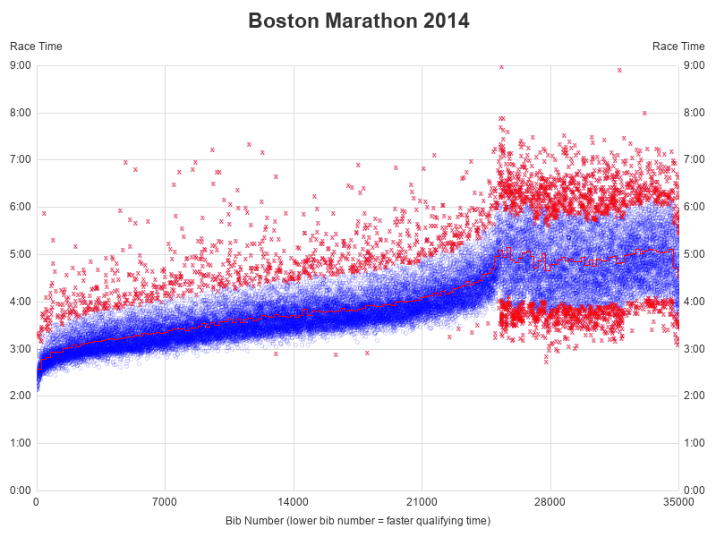
And here's one final enhancement in my graph, that wasn't in the original graph in the article. I added mouse-over text to the outlier (x) markers in my plot, to show the name/time/etc of the runner. Here's an example of the mouse-over text (of course, please don't assume this runner 'cheated' - I just picked this one at random to show some mouse-over text!)
scatter y=outlier x=bib_num / tip=(name country bib_num official)
markerattrs=(symbol=x color=cxff0000 size=8pt);
Here's the full code I used to create the graph, if you'd like to see all the details. And if you're one of my long-term blog readers, you might think you recognize these graphs ... and you might be right! These graphs are the ODS Graphics (sgplot) version of graphs that I had originally created using SAS/Graph (gplot) in one of my blog posts a few years ago!
Just for Fun
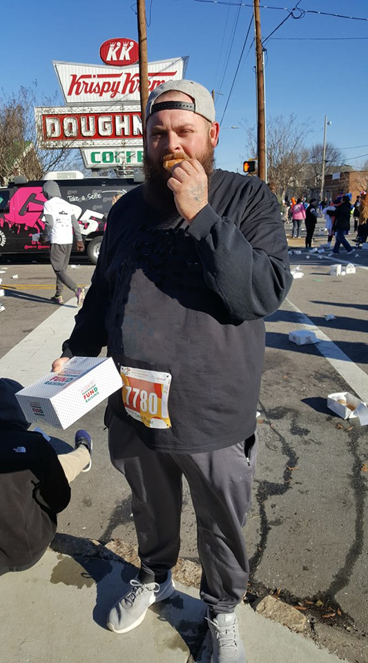
If you made it this far, I want to reward you with a 'fun' photo. It was tough deciding which of my friends' photos to include in the blog, and here's an "also ran" photo. This is my friend Ben - he wasn't running a marathon per-say, but instead was running in a famous charity fundraiser race - the Krispy Kreme Challenge. In this race, you run from the NCSU Belltower to the Krispy Kreme store, eat a dozen donuts, and run back. This race requires some true dedication and practice!


7 Comments
What do you think explains the jump in finish times starting at approximately bib number 26,000? I looked to see if qualifiers AND non-qualifiers receive a bib but could not locate that information. Boston used to be very strict about who/who does not receive a bib. I'm wondering if all of the bibbed runners tended to finish in less than the qualifying time and then the unwashed horde is simply counted as they finish without a bib.
I did find this...."So far, 23,074 runners have been accepted into the 2019 race. That left 7,384 runners, out of 30,458 who applied, shut out of registration, even though they did achieve the posted standards."
Good questions! I'm not familiar enough with these races/data to answer them, but perhaps some runners reading the blog might be able to shed some light on them.
There is also a lottery system to get in. I guess the higher bib numbers are assigned to those.
Ahh! - That would make sense, with the way the data looks!
There is not a lottery to get into the Boston Marathon. The vast number of participants have to achieve an age-group qualifying time or better. However, there are a certain number of Charity Slots available for those who can raise $5,000. Those are likely the runners in question.
Thanks for the info!
Pingback: Just how fast was Eliud's 2 hour marathon?!? - Graphically Speaking