You've probably heard of the stupid 'challenges' where people usually end up hurting themselves (cinnamon challenge, Carolina reaper pepper challenge, etc). I thought it might be more helpful to society to have a challenge that could actually help people, rather than hurting them! Therefore I came up with the Halloween candy challenge!
But first, here's a picture to get you into the mood. This is my friend Jennifer's daughter - every year she takes a similar picture with all her candy. (Now if we can add an annual graph to that tradition ... but I'm getting ahead of myself!)

The Challenge
For the Halloween Cancy Challenge, get your kids to do some kind of data analysis with their Halloween candy, and post it on social media. It could be any kind of data analysis! As simple as counting the pieces of candy they received, or as complicated as setting up a model to optimize their route to collect the largest amount of their favorite candies, in the shortest time. And it would be great if they can come up with my favorite - some kind of graph to go along with their analysis!
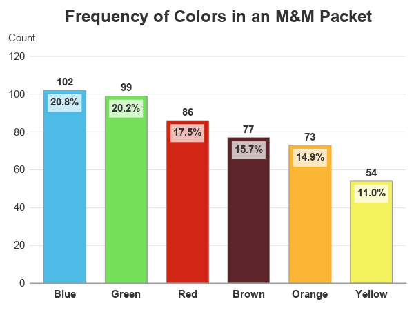
I'll start the ball rolling by re-visiting one of my old topics ... plotting a summary count of the number pieces of candy of each color in a packet of M&Ms. Last time I used SAS/Graph, but this time I'll be using the newer ODS Graphics.
My Data
Here's the data we'll be using:
data my_data;
length mnm_color $10;
input mnm_color Count;
datalines;
Blue 102
Green 99
Red 86
Orange 73
Yellow 54
Brown 77
;
run;
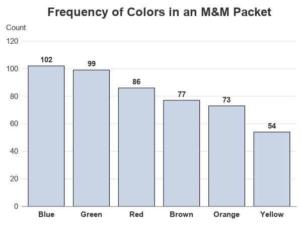
Basic Bar Chart
And we can create a basic bar chart using the following fairly minimal/straightforward code. I sort the data so the bars will be ordered from tallest to shortest. And because the data is already pre-summarized (one summary count per bar), I use vbarparm. Whereas if I had needed to sum the values I would have used vbar, which has a stat option (for example stat=sum).
proc sort data=my_data out=my_data;
by descending count;
run;
proc sgplot data=my_data noborder;
vbarparm category=mnm_color response=count /
datalabel=count datalabelattrs=(size=11pt color=gray33 weight=bold)
barwidth=0.80;
yaxis display=(noticks noline)
labelpos=top labelattrs=(size=11pt color=gray33)
values=(0 to 120 by 20)
valueattrs=(size=11pt color=gray33)
grid gridattrs=(color=graydd);
xaxis display=(nolabel noticks)
valueattrs=(size=11pt color=gray33 weight=bold);
run;
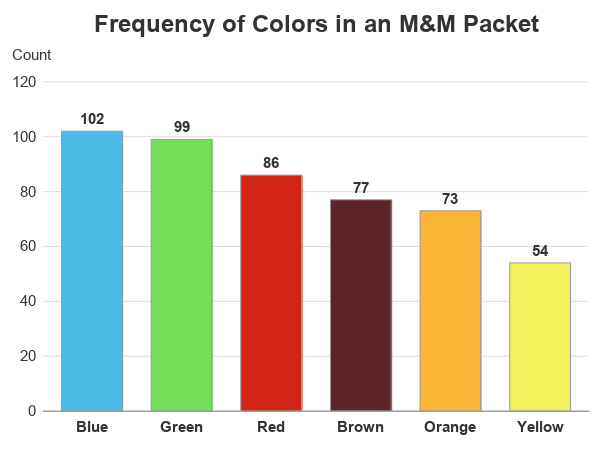
Adding Colors
Never one to let well enough along, I thought it might be helpful to add some color. Each bar is labeled with a color name, but wouldn't it be cool to have the bars colored like the M&Ms?!? I turn on colors by specifying a group= variable (group=mnm_color). If this was a one-time graph, where we wouldn't be changing the M&M counts (or the order of the data, etc), we could just hard-code the colors in a styleattrs datacolors list. But since the colors are important, and we want to guarantee that the correct color is assigned to each bar, I set up an attribute map. For example, the bar with a value of "Blue" will get the color "cx4cbbe6" (which happens to be a pleasant shade of M&M-ish blue).
One quirk - since I'm using group= to turn on colors, I also have to specify groupdisplay=cluster so sgplot knows it's not a stacked bar chart, in order to have the labels outside of the bars. A clustered bar chart containing 1 bar per segment visually looks the same as a stacked bar chart with one segment per bar ... but since we want the label outside, we have to call say the groups are clustered (a stacked bar chart would have the labels inside each bar segment).
data myattrs;
length value linecolor markercolor $100;
id="someid";
linecolor="gray99";
fillcolor="cx4cbbe6"; value="Blue"; output;
fillcolor="cx74e059"; value="Green"; output;
fillcolor="cxd22515"; value="Red"; output;
fillcolor="cxfbb635"; value="Orange"; output;
fillcolor="cxf4f25f"; value="Yellow"; output;
fillcolor="cx5d242a"; value="Brown"; output;
run;
proc sgplot data=my_data noborder noautolegend dattrmap=myattrs;
vbarparm category=mnm_color response=count /
group=mnm_color attrid=someid
datalabel=count datalabelattrs=(size=11pt color=gray33 weight=bold)
groupdisplay=cluster
barwidth=0.80;
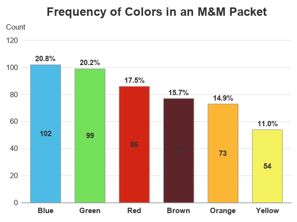
Adding Percent Labels
Labeling each bar with the count is useful, but I would also like to know the percent! Therefore let's add a second label. Using the options that are built-in to vbarparm, I can specify two labels using the datalabel= and the seglabel options. Since seglabel only shows the variable being plotted, I have to use that for the summary count. And since datalabel= lets me specify any variable in the dataset, I can use that for the percent value.
proc sql noprint;
create table my_data as
select unique *, count/sum(count) format=percent7.1 as calculated_percent
from my_data;
quit; run;
proc sgplot data=my_data noborder noautolegend dattrmap=myattrs;
vbarparm category=mnm_color response=count /
group=mnm_color attrid=someid
datalabel=calculated_percent datalabelattrs=(size=11pt color=gray33 weight=bold)
groupdisplay=cluster
seglabel seglabelattrs=(size=11pt color=gray33 weight=bold)
barwidth=0.80;
Making Labels More Readable
Hmm ... well, that was fairly easy, but it didn't produce quite the graph I was wanting. I want the frequency count on the outside, and the percent on the inside. And I also need to do something to make the value inside the brown bar show up better! Rather than using seglabel for the inside value, I can use a custom text statement plot, where I can specify any value I want, and I can also turn on the backlight, which helps dark text show up better against a dark background. And rather than placing the text in the middle of the bar, I can place it anywhere I want - such as near the top of the bar ... but not too near the top! (Note that I also have to specify yaxis offsetmin=0, or the text plot would place an axis offset gap under the bars, which we don't really want in a bar chart.)
data my_data; set my_data;
adjusted_position=count-3;
run;
proc sgplot data=my_data noborder noautolegend dattrmap=myattrs;
vbarparm category=mnm_color response=count /
group=mnm_color attrid=someid
datalabel=count datalabelattrs=(size=11pt color=gray33 weight=bold)
groupdisplay=cluster
barwidth=0.80;
text x=mnm_color y=adjusted_position text=calculated_percent /
strip position=bottom backlight=1.0
textattrs=(size=11pt color=gray33 weight=bold);
yaxis display=(noticks noline)
labelpos=top labelattrs=(size=11pt color=gray33)
values=(0 to 120 by 20) offsetmin=0
valueattrs=(size=11pt color=gray33)
grid gridattrs=(color=graydd);
xaxis display=(nolabel noticks)
valueattrs=(size=11pt color=gray33 weight=bold);
run;
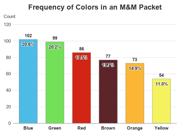
Making Labels Even More Readable!
Ahh! - Now that's what I wanted! ... Except it's still not quite perfect. The backlight helps me see the value on the brown bar a little better, but it's still not what I would call publication quality. It's readable, but it doesn't look great. Therefore let's try a slightly different technique. Rather than backlight, let's use backfill (this puts a rectangular colored box behind the text). I add a white rectangle behind the dark text so it will show up, but I also make the white slightly transparent, so it will blend in with the bars. These little touches are what makes the difference in a good graph, and a great graph! (Here's the full code, in case you'd like to experiment with it.)
proc sgplot data=my_data noborder noautolegend dattrmap=myattrs;
vbarparm category=mnm_color response=count /
group=mnm_color attrid=someid
datalabel=count datalabelattrs=(size=11pt color=gray33 weight=bold)
groupdisplay=cluster
barwidth=0.80;
text x=mnm_color y=adjusted_position text=calculated_percent /
strip position=bottom backfill fillattrs=(color=white transparency=.3)
textattrs=(size=11pt color=gray33 weight=bold);
Conclusions/Discussion
So, what do you think of the Halloween candy challenge? Do you think you can talk your kids into it? Do you have any ideas you might plant in their heads, and help them with (if needed)? Feel free to discuss in the comments section.
Who knows - this could help steer your kids into a lucrative/fulfilling data analysis career, so they won't have to live at home in their 30s! 🙂


7 Comments
That semi-transparent white box is lovely! Really appreciate that you've been posting more sgplot examples these past couple years. While I mostly make boring graphs, every once in a while I make one for a presentation that I try to make pretty, so it's nice to see what can be done.
Thanks!
I love your blogs Robert! I have looked at every single graph you've posted and it gives me inspiration to create such awesome, concise, and informative graphs. My favorite post is the Harvey Ball graph! Thanks again!
Thanks - glad to hear people are looking at them! 🙂
valuable information
Go from a good to great graph! Agree with Quentin with the text box transparency. Brilliant enhancement.
This post reminds me of a few years ago when my then Mr six did a hand-drawn colour bar chart on favourite colours. 🙂
Rob, I always use your graph resources to help me as a starting point since I am still relatively new to SAS (about 10 months old now). Thank you so much for sharing