I think it's time to replace my 2008 Prius. It has served me well, been basically maintenance-free, and gotten good gas mileage ... so, why not just get a newer Prius? Well, I've got the itch to get back into an SUV for my daily driver (I had a Bronco II, a CJ7, and a Cherokee in the past). I like that SUVs have the extra room, the ground clearance, 4wd, roof rack & towing capability, and a bit more oomph than the 110 horsepower Prius. But are there any SUVs that get decent gas mileage? ... Let's create some graphs to find out!
Before we get started, here's a picture of my 'extra' vehicle. It's a huge SUV, and does not get great MPG. It's perfect for hauling my DJ gear, and my 20ft+ racing boats. But I think it's too big & inefficient to use as my daily driver.

MPG Data
If we're going to consider MPG as a factor for choosing an SUV, where do you find MPG data? Fortunately there's a web site where you can download a csv file, and then import it into SAS (here's the code if you'd like to see the details).
Graphing Code
I wrote a bit of code to loop through all the different kinds of vehicles (using a 'by' statement), and create a graph for each one. For the most part it's just a regular scatter plot ... except I annotate a diagonal line (so you can easily see if there is much difference between city and highway MPG), and I also annotate some green reference lines so you can easily see which vehicles are above/below 30 MPG.
title1 c=gray33 h=12pt "#byval(class)";
proc sgplot data=plotdata nowall sganno=anno_diagonal;
label mpg_hwy='Highway';
label mpg_city='City mpg';
by order class2 class;
scatter y=mpg_hwy x=mpg_city /
markerattrs=(color=cx0000ff size=8pt) transparency=.5
tip=(long_string) tiplabel=('Data')
url=link;
yaxis labelpos=top display=(noticks) values=(0 to 60 by 10)
valueattrs=(color=gray33 size=9pt) labelattrs=(color=gray33 size=9pt)
grid gridattrs=(color=graydd) offsetmin=0 offsetmax=0;
xaxis display=(noticks) values=(0 to 60 by 10)
valueattrs=(color=gray33 size=9pt) labelattrs=(color=gray33 size=9pt)
grid gridattrs=(color=graydd) offsetmin=0 offsetmax=0;
run;
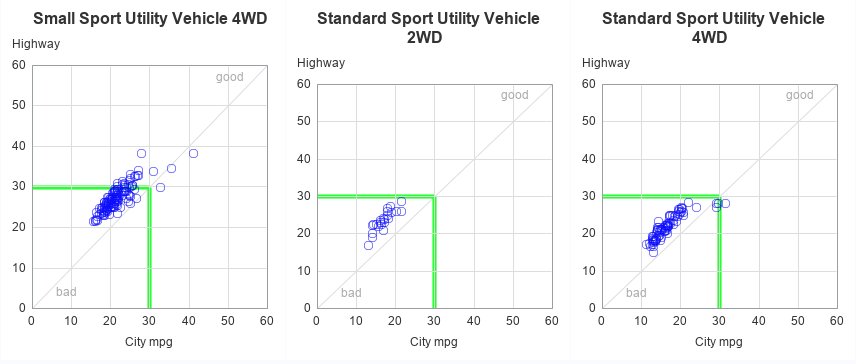
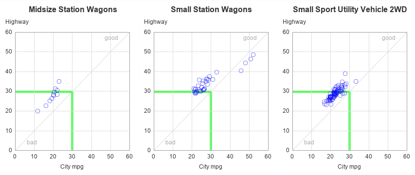
Graphs
Here's a screen capture of a few of the graphs. Click the image below to see the interactive version, where you can hover your mouse over the markers to see the vehicle make & model, and click the markers to jump to a table showing all the details. (The interactive version has all vehicles - not just SUVs.)
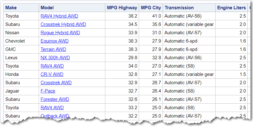
Tables
The graphs above show that these vehicles tend to have similar MPG. And therefore they overprint each other in the graph. Therefore it is often helpful to look at the data in a table. When you click the markers in the graphs, it drills-down to a table like the one below. You can then click the model in the table to launch a Google search for that vehicle.
Final Decision
What SUVs have I narrowed it down to? ... I'm leaning towards a Jeep Renegade or Grand Cherokee, or a Subaru Outback or Forester. And how did MPG play into my decision? I guess when it came down to it, I gave more weight to other factors, than I did to MPG. But at least now I know! 🙂


3 Comments
Heh Rob,
Have you been studying the MPG for a couple of years? I recall reading your article, "Prius isn't the highest-mpg hybrid in 2017!" https://blogs.sas.com/content/sastraining/2017/01/16/prius-isnt-the-highest-mpg-hybrid-in-2017/
Good to see data analysis helped in making your decision 😉
Cheers,
Michelle
Yep - I've been following this data for *many* years, and I re-generate my plots as the new data becomes available (different manufacturers release the data at different times for the upcoming year).
In this most recent round of graphs, I'm now using the new Proc SGplot, rather than Proc Gplot. 🙂
Robert - Look at JD Power IQS or VDS studies for another data point. Subarus last a long time (much like Honda nameplates).
https://www.jdpower.com/business/press-releases/2019-initial-quality-study-iqs
https://www.jdpower.com/business/press-releases/2019-us-vehicle-dependability-studyvds