Lately we've been hearing a lot about "record low unemployment" in the news. Being a data guy, I wanted to see it for myself. Follow along as I create some custom unemployment graphs from the official data for California and New York (two of our most populous states). Or, if you're not interested in the code - jump down to the last 2 graphs at the bottom!
Data
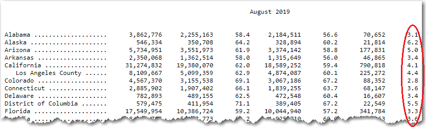
After a bit of checking around, I found a plain text file on the BLS website that contains the monthly unemployment data for each state. This data file contains a table for each month, and the seasonally adjusted values for the "unemployed percent of labor force" are in the right-most column. I wrote some SAS code to read in the data, and then I was ready to roll!
Preliminary Plot
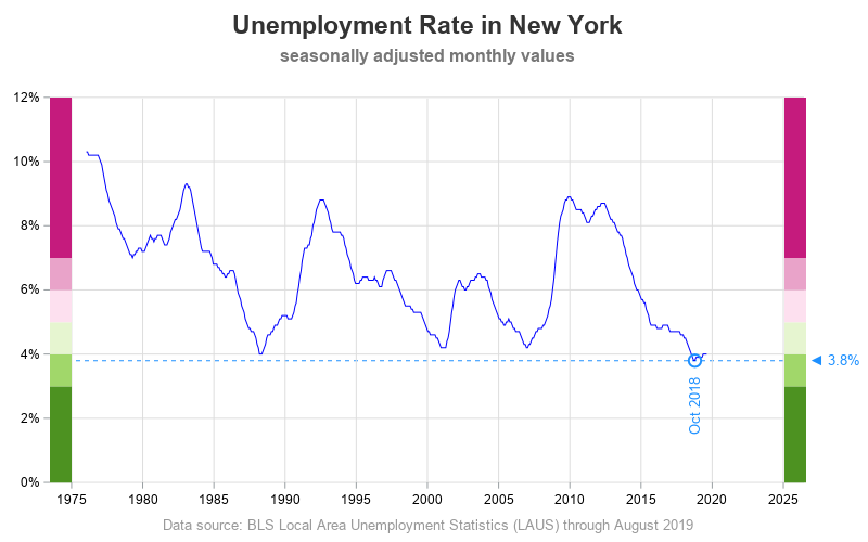
Let's start with New York. Here's a basic plot of the unemployment data, over time:
proc sgplot data=temp;
format date year4.;
series y=percent_unemployed x=date / lineattrs=(color=blue);
yaxis display=(nolabel noline);
xaxis display=(nolabel noline);
run;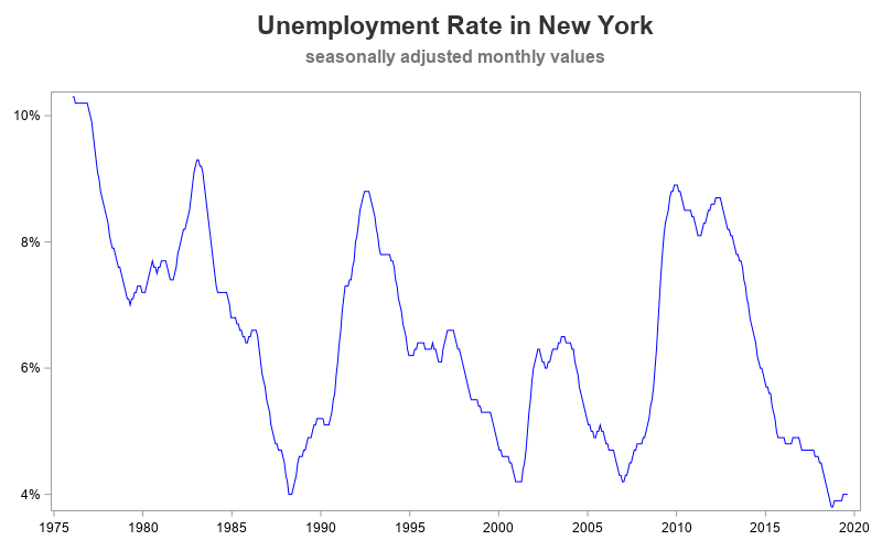
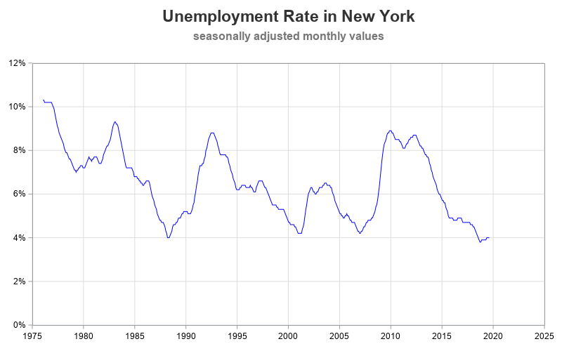
Enhanced Plot
The above graph is actually pretty decent. We could easily stop there, and have a pretty good understanding of the data. But since I'm a Graph Guy, my standards are pretty high, and there are a few enhancements I'd like to make to the graph. Since unemployment values could hypothetically go to zero, I like to extend the y-axis down to zero (using the yaxis min=0 option). I also turn on grid lines, so it is easier to visually follow along from the blue line to the axis values. I also eliminate the gap between the tick mark values and the axis line, by setting the offsetmin and offsetmax to zero.
proc sgplot data=temp;
format date year4.;
series y=percent_unemployed x=date / lineattrs=(color=blue);
yaxis display=(nolabel noline)
min=0 offsetmin=0 offsetmax=0 thresholdmax=1
grid gridattrs=(color=graydd);
xaxis display=(nolabel noline)
offsetmin=0 offsetmax=0
values=('01jan1975'd to '01jan2025'd by year5)
grid gridattrs=(color=graydd);
run;
Customized Plot
At this point, many people would let well enough alone, and be happy with the graph. But I'm not one of those people. I decided that I wanted to show visual ranges on the graph, to make it easy to see how far the blue line is above or below 4% unemployment. Therefore I wrote a bit of code to annotate those ranges as colored polygons.
data ranges;
input range range_min range_max;
datalines;
1 0 .03
2 .03 .04
3 .04 .05
4 .05 .06
5 .06 .07
6 .07 1.0
;
run;
data anno_ranges_left; set ranges;
length label $300 function x1space y1space display fillcolor layer $50;
if range=1 then fillcolor="&c1";
if range=2 then fillcolor="&c2";
if range=3 then fillcolor="&c3";
if range=4 then fillcolor="&c4";
if range=5 then fillcolor="&c5";
if range=6 then fillcolor="&c6";
function='polygon'; display="fill"; layer="front";
y1space='datavalue';
x1space='wallpercent'; x1=0; y1=range_min; output;
function='polycont';
x1space='datapercent'; x1=0; y1=range_min; output;
if range_max=1.0 then do;
y1space='wallpercent';
range_max=100;
end;
x1space='datapercent'; x1=0; y1=range_max; output;
x1space='wallpercent'; x1=0; y1=range_max; output;
run;
data anno_ranges_right; set anno_ranges_left;
x1=100;
run;
data anno_ranges; set anno_ranges_left anno_ranges_right;
run;
proc sgplot data=temp noborder nowall pad=(right=7pct) sganno=anno_ranges;
... and so on
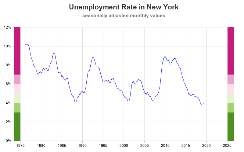
I was also interested in easily identifying the lowest unemployment value on the graph. Therefore I used annotate to draw a circle around the lowest values, labeled that circle with the date, drew a dashed reference line to the axes, and created a text label pointing to the dashed reference line (showing the unemployment value). This requires quite a bit of extra code, but a little extra time spent creating a graph can save a lot of time for all the users who view the graph.
proc sql noprint;
create table anno_lowest as select * from temp
having percent_unemployed=min(percent_unemployed);
quit; run;
/* annotate some things to help the user easily see the lowest value */
ods escapechar='^';
data anno_lowest; set anno_lowest;
length label $300 function x1space y1space anchor linecolor textcolor layer $50;
/* blue dashed reference line */
function='line'; linethickness=1; linecolor='dodgerblue'; linepattern='shortdash';
x1space='wallpercent'; y1space='datavalue';
x2space='wallpercent'; y2space='datavalue';
x1=0; y1=percent_unemployed;
x2=100; y2=y1;
layer="back"; /* be sure to use 'nowall' with this */
output;
/* blue arrow, pointing to the line */
function='text';
x1space='wallpercent'; y1space='datavalue';
x1=100; y1=percent_unemployed;
anchor='left';
textcolor="dodgerblue"; textsize=10; textweight='normal';
width=100; widthunit='percent';
label="^{unicode '25c4'x} "||trim(left(put(percent_unemployed,percent7.1)));
layer="front";
output;
/* date, rotated 90 degrees, under the lowest unemployment */
function='text';
x1space='datavalue'; y1space='datavalue';
x1=date; y1=percent_unemployed-.004;
anchor='right';
rotate=90;
label=trim(left(substr(month,1,3)))||' '||trim(left(year));
output;
/* circle marker, under lowest unemployment */
function='oval'; linethickness=2; linecolor='dodgerblue'; linepattern='solid';
height=11; width=11; heightunit='pixel'; widthunit='pixel'; anchor='center';
x1space='datavalue'; y1space='datavalue';
y1=percent_unemployed;
x1=date;
output;
run;
data anno_all; set anno_lowest anno_ranges anno_footnote;
run;
proc sgplot data=temp noborder nowall pad=(right=7pct) sganno=anno_all;
... and so on
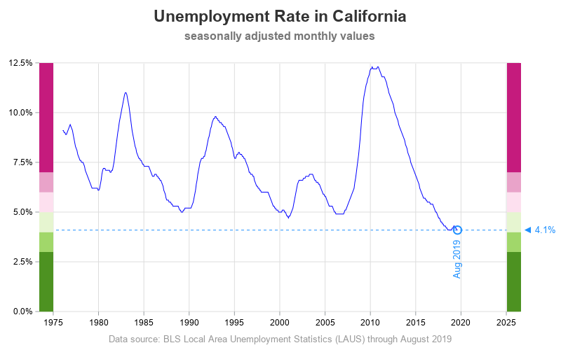
And re-using the same code, here is the plot for California:
Discussion
Are New York and California really at record-low unemployment?
What caused the high unemployment spikes in these graphs, and the current record-low unemployment?
What are some side-effects of extremely low unemployment? (both good, and bad)
What are some SAS SGplot features you could use (other than annotate), to accomplish similar customizations?
Feel free to discuss in the comments section!


