The Output Delivery System (ODS) Graphics procedures provide many options to give you control over the look of your output. However, there are times when your output does not look like you thought it would. 
This blog discusses how to solve some common output-related problems that we hear about in Technical Support.
All of the examples in this blog relate to creating scatter plots and bar charts from the same data set, SASHELP.CLASS. This data set, included in your SAS® installation, provides information about heights and ages for both male and female students.
Colors in the output are not as desired
Using the STYLEATTRS statement
The STYLEATTRS statement enables you to define attributes, such as color, for graphical elements.
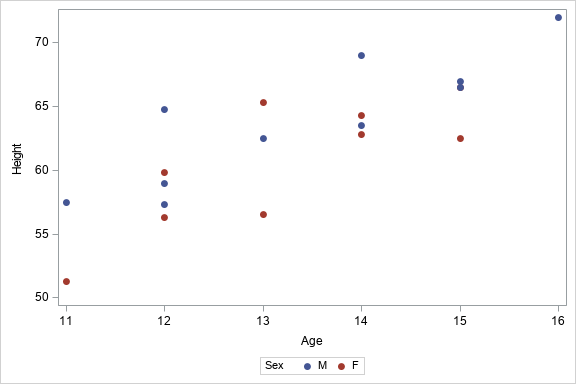
In the following SGPLOT procedure example, the STYLEATTRS statement defines the colors for the marker symbols on a scatter plot as either blue or pink:
proc sgplot data=sashelp.class; styleattrs datacolors=(blue pink); scatter x=age y=height / group=sex markerattrs=(symbol=circlefilled); run; |
However, after you submit the code, the resulting plot does not use the specified colors. Instead, you see blue and red:
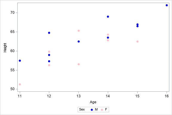
When defining colors for graphical elements, the DATACOLORS= option defines the colors for filled areas, and the DATACONTRASTCOLORS= option defines the colors for marker symbols and lines.
Because the scatter plot is creating marker symbols, you have to change the STYLEATTRS statement to use the DATACONTRASTCOLORS= option instead of the DATACOLORS= option. Here is the revised code:
proc sgplot data=sashelp.class; styleattrs datacontrastcolors=(blue pink); scatter x=age y=height / group=sex markerattrs=(symbol=circlefilled); run; |
Now, when you submit the updated code, the correct colors appear:
You can find more information about the STYLEATTRS statement in the STYLEATTRS section of the SAS® 9.4 ODS Graphics: Procedures Guide, Sixth Edition documentation.
Using an attribute map
An attribute map enables you to associate specific values for your plot GROUP= variable with specific graphical attributes.
The attribute map is defined in a data set that includes the following:
- an ID variable that contains the name of the attribute map definition
- a VALUE variable that contains the value of the plot statement GROUP= variable
- any other variables for the attributes that you want to define
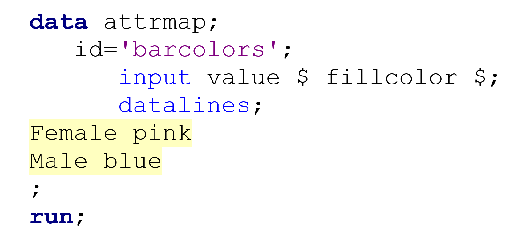
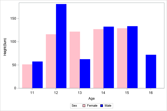
In the following example, the attribute map BARCOLORS is defined to associate the group value F with the color pink and the group value M with the color blue. Note that the FILLCOLOR variable is also used to define the colors for the bars of the bar chart.
data attrmap; id='barcolors'; input value $ fillcolor $; datalines; F pink M blue ; run; proc format; value $ genderfmt 'F'='Female' 'M'='Male'; run; proc sgplot data=sashelp.class dattrmap=attrmap; vbar age / response=height group=sex groupdisplay=cluster nooutline attrid=barcolors; format sex $genderfmt.; run; |
However, the output shows blue and red bars, instead of using the pink and blue values that you specified:
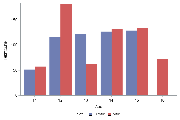
In this case, a format is defined to display the group values as Female and Male. The attribute map associates the group values of F and M with the pink and blue bar colors that you want, so the values do not match.
You need to change the attribute map VALUE variable so that it contains the formatted value of the GROUP= variable. Here is the first part of the code again, highlighted to show where it has changed:
With the updated values, the output now displays the correct colors:
You can find more information about attribute maps in the SG Attribute Maps section of the SAS® 9.4 ODS Graphics: Procedures Guide, Sixth Edition documentation.
Symbols in the output are not as desired
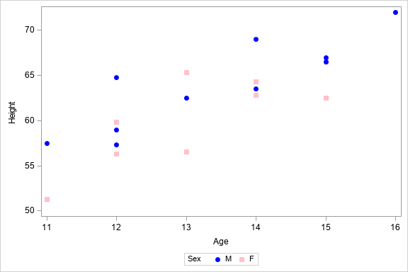
In the following PROC SGPLOT example, the STYLEATTRS statement defines the colors for the marker symbols on a scatter plot as either blue or pink. Also, the marker symbols should be either filled circles or filled squares:
ods html style=styles.htmlblue; proc sgplot data=sashelp.class; styleattrs datacontrastcolors=(blue pink) datasymbols=(circlefilled squarefilled); scatter x=age y=height / group=sex; run; |
You submit the code using the STYLES.HTMLBLUE style. The output shows all the symbols as circles, and none are squares:

The ATTRPRIORITY ODS Graphics option determines how attributes are cycled. The default value for the ATTRPRIORITY option is defined in the style that is being used.
The STYLES.HTMLBLUE style sets the default value COLOR for the ATTRPRIORITY option. This COLOR value cycles the symbols through your specified colors before the second symbol is generated.
You want to set the ATTRPRIORITY ODS Graphics option to NONE in an ODS GRAPHICS statement. That ODS GRAPHICS statement then prevents the symbols from cycling through the colors list:
ods graphics /attrpriority=none; ods html style=styles.htmlblue; proc sgplot data=sashelp.class; styleattrs datacontrastcolors=(blue pink) datasymbols=(circlefilled squarefilled); scatter x=age y=height / group=sex; run; |
In the updated output, squares are now seen in the correct color, pink:
You can read more about how attributes are cycled in the following blog post by Rick Wicklin:
Attrs, attrs, everywhere: The interaction between ATTRPRIORITY, CYCLEATTRS, and STYLEATTRS in ODS graphics
Annotation is not placed in the output as desired
Adding an oval
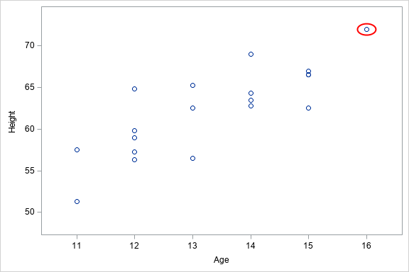
In this example, you want the resulting scatter plot to contain an oval around the circle that represents the tallest student:
proc sql; create table maxheight as select height, age from sashelp.class having height=max(height); quit; data anno; set maxheight; drawspace='datavalue'; function='oval'; x=age; y=height; width=6; height=6; linecolor='red'; run; proc sgplot data=sashelp.class sganno=anno; scatter x=age y=height; xaxis offsetmax=0.1 offsetmin=0.1; yaxis offsetmax=0.1 offsetmin=0.1; run; |
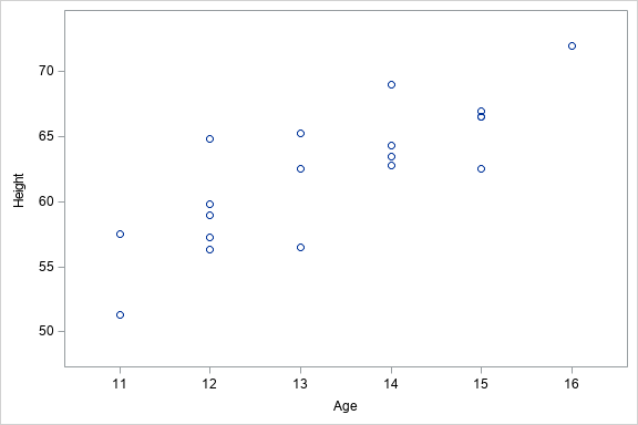
After you submit the code, you notice that the resulting plot does not include the oval:

If you have used annotation in SAS/GRAPH® software, you might be accustomed to using the X and Y variables in the annotation data set to indicate the location of the annotation. However, ODS Statistical Graphics (SG) annotation uses X1 and Y1 variables for the location of the annotation.
Therefore, you need to change the X and Y variables in the annotation data set to X1 and Y1 instead:
data anno; set maxheight; drawspace='datavalue'; function='oval'; x1=age; y1=height; width=6; height=6; linecolor='red'; run; |
In the next version of the scatter plot, the oval now appears:
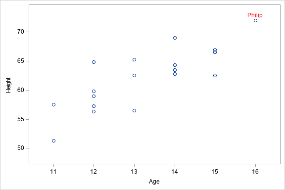
Adding a text label
In this example, you want to place a text label next to the circle that represents the tallest student.
proc sql; create table maxheight as select height, age, name from sashelp.class having height=max(height); quit; data anno; set maxheight; drawspace='datavalue'; function='label'; x1=age; y1=height; label=name; textsize=10; textcolor='red'; anchor='bottom'; run; proc sgplot data=sashelp.class sganno=anno; scatter x=age y=height; xaxis offsetmax=0.1 offsetmin=0.1; yaxis offsetmax=0.1 offsetmin=0.1; run; |
However, after you run this code, the output does not include the text label:
Again, if you are a SAS/GRAPH user, you might assume that the LABEL function can place text on a plot. However, ODS SG annotation needs to use the TEXT function instead.
In the previous DATA step, you need to change the FUNCTION variable so that it contains the value TEXT:
data anno; set maxheight; drawspace='datavalue'; function='text'; x1=age; y1=height; label=name; textsize=10; textcolor='red'; anchor='bottom'; run; |
After you revise the DATA step and resubmit your code, you then see that the text label appears where intended:
You can find more information about SG annotation in the SG Annotation section of the SAS® 9.4 ODS Graphics: Procedures Guide, Sixth Edition documentation.
Summary
These are just a few examples to demonstrate some of the common output-related problems that we hear about in Technical Support. If your graphical output does not appear as you wanted, consider the options that you are using and make sure that you are using the correct option.

1 Comment
This is very helpful information. Thanks for your presentation. Before reading, I knew about some of these techniques, but have learned some new techniques.