In a scatter plot that displays many points, it can be important to visualize the density of the points. Scatter plots (indeed, all plots that show individual markers) can suffer from overplotting, which means that the graph does not indicate how many observations are at a specific (x, y) location. You can overcome that problem by moving from a "point plot" to an "area plot" such as a heat map or a contour plot. These plots do a good job communicating density, but they typically do not show individual points, which can be a drawback if you are interested in displaying outliers.
This article shows the following four methods of visualizing the density of bivariate data:
- Use a heat map to visualize the density. The individual markers are not shown, but outliers are visible.
- Use a contour map to visualize the density. The individual markers are not shown.
- Use a scatter plot to show the markers. Use transparency to visualize the density of points.
- Use a scatter plot to show the markers. Use color to visualize the density of points.
The following SAS DATA step extracts data from the Sashelp.Heart data set and will be used to create all graphs. The data are measurements of the systolic blood pressure (the "top number") and cholesterol levels of 5,057 patients in a heart study. For convenience, the Systolic variable is renamed X and the Cholesterol variable is renamed Y:
data Have; set sashelp.Heart(keep=Systolic Cholesterol); rename Systolic=x Cholesterol=y; if cmiss(of _NUMERIC_)=0; /* keep only complete cases */ run; |
Use a heat map to visualize the density
The simplest way to visualize the density of bivariate data is to bin the data and use color to indicate the number of observations in each bin. I've written many articles about how to perform two-dimensional binning in SAS. However, if you only want to visualize the data, you can use the HEATMAP statement in PROC SGPLOT, which automatically bins the data and creates a heat map of the counts:
title "Use Heat Map to Show Density"; title2 "Individual Observations Are Not Shown"; proc sgplot data=Have; styleattrs wallcolor=verylightgray; heatmap x=x y=y; xaxis grid; yaxis grid; run; |
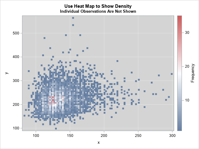
The graph shows that the region that has the highest density is near (x,y) = (125, 225). The pink and red rectangles in the graph contain 20 or more observations. The outliers in the graph are visible.
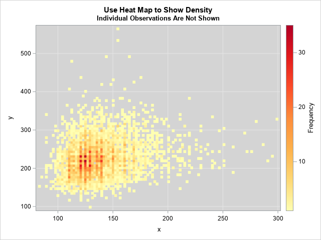
Because the default color ramp includes white as one of its colors, I changed the color of the background to light gray. You can use the COLORMODEL= option on the HEATMAP statement to define and use other color ramps. (For example, I used a yellow-orange-red color ramp for the image shown to the right. Click to enlarge.) I also used the default binning options for the heat map. You can use the NXBINS= and NYBINS= options to control the number of bins. Alternatively, you can use the XBINSIZE= and YBINSIZE= options to specify the size of the bins in data units.
For large data sets, the default number of bins might be too large. For most data, 200 bins in each direction shows the density on a fine scale, so you can use the options NXBINS=200 NYBINS=200. Of course, you can use smaller numbers (like 50) to visualize the density on a coarser scale.
Use a contour map to visualize the density
The previous graph is somewhat "chunky." That is because the heat map is a density estimate that is created by binning the data. The result depends on the bin size and the anchor locations. You can obtain a smoother estimate by using a kernel density estimate (KDE). In SAS, PROC KDE enables you to obtain a smooth density estimate. The procedure also creates a contour plot of the resulting density estimate, as shown in the following call:
title "Use Contour Map to Show Density"; title2 "Individual Observations Are Not Shown"; proc kde data=Have; bivar x y / bwm=0.25 ngrid=250 plots=contour; run; |
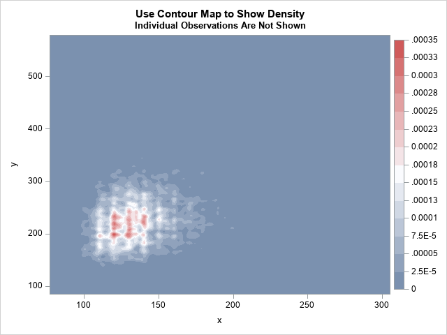
The graph shows the density estimate. Unfortunately, the units of density (proportion of data per square unit) are not intuitive. Notice that individual observations (including outliers) are not visible in the contour plot. To get very small "hot spots," I used the BWM=0.25 to select a small kernel bandwidth. (BWM stands for "bandwidth multiplier.) If you use the default value (BWM=1), you will get one large region of high density instead of several smaller regions. Similarly, the NGRID=250 option computes the KDE on a fine grid. You will probably need to play with the BWM= option to determine which value is best for your needs.
PROC KDE creates the contour plot with a default title, but you can use the ODS Graphics Editor to change the plot title.
Use a scatter plot and transparency to visualize the density
I've previously written about how to use a scatter plot and marker transparency to indicate density. The value for the transparency parameter depends on the data. You might have to experiment with several values (0.75, 0.8, 0.9, ...) until you find the right balance between showing individual observations and showing the density.
title "Use Transparency in a Scatter Plot"; title2 "Individual Observations Shown, but Faint"; proc sgplot data=Have; scatter x=x y=y / markerattrs=(symbol=CircleFilled) transparency=0.9; xaxis grid; yaxis grid; run; |
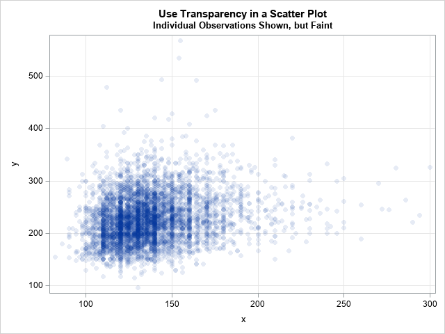
In the scatter plot, you can see that the many data values are rounded to multiples of 5 and 10. You can see clear striations at the values 110, 120, 130, 140, 150, and 160. Recall that the X variable is the systolic blood pressure for patients. Evidentially, there is a tendency to round these numbers to the nearest 5 or 10.
In this plot, you can see the individual outliers, but they are quite faint because the TRANSPARENCY= option is set to 0.9. If you increase the parameter further to 0.95 or higher, it becomes increasingly difficult to see the individual markers. Although you can see that the highest density region in near (x,y) = (125, 225), it is not clear how to associate a number to the density. Does a certain (x,y) value have 10 points overplotted? Or 20? Or 50? It's impossible to tell.
Use a scatter plot and color to visualize the density
The last method borrows ideas from each of the previous methods. I was motivated by some graphs I saw by Lukas Kremer and Simon Anders (2019). My implementation in SAS is quite different from their implementation in R, but their graphs provided the inspiration for my graphs. The idea is to draw a scatter plot where the individual markers are colored according to the density of the region. Kremer and Anders use a count of neighbors that are within a given distance from each point, which is an expensive computation. It occurred to me that you can use a density estimate instead. Because you can compute a KDE by using a fast Fourier transform, it is a much faster computation. In addition, the KDE procedure supports the SCORE statement, which provides a convenient way to associate a density value with every observation. This is implemented in the following statements:
title "Use Scatter Plot to Show Density"; title2 "Individual Observations Shown"; proc kde data=Have; bivar x y / bwm=0.25 ngrid=250 plots=none; score data=Have out=KDEOut(rename=(value1=x value2=y)); run; proc sort data=KDEOut; /* Optional: but a good idea */ by density; run; proc sgplot data=KDEOut; label x= y=; styleattrs wallcolor=verylightgray; scatter x=x y=y / colorresponse=density colormodel=ThreeColorRamp markerattrs=(symbol=CircleFilled); xaxis grid; yaxis grid; run; |
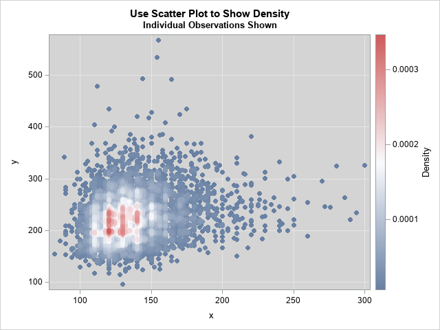
The graph is a fusion of the other three graphs. Visually, it looks very similar to the heat map. However, it uses colors based on a density scale (like the contour plot) and it plots individual markers (like the scatter plot).
Summary
In summary, this article shows four ways to visualize the density of bivariate data.
- The heat map provides a nice compromise between seeing the density and seeing outliers. As a bonus, the heat map shows the density in terms of counts per bin, which is an intuitive quantity.
- The contour plot of density does not show individual markers, which can be an advantage if you want to focus on the bulk of the data and ignore outliers. You can use the BWM= option to control the scale of the bandwidth parameter for estimating the density.
- The transparent scatter plot shows outliers but doesn't show the density very well.
- The colored scatter plot combines the strengths (and weaknesses) of the contour plot and the transparent scatter plot. By using colors to indicate density, the scatter plot is easier to interpret than the transparent scatter plot.
For most situations, I recommend the heat map, although I also like the scatter plot that assigns colors to markers based on density. What are your thoughts? Do you prefer one of these graphs? Or perhaps you prefer a different graph for visualizing the density of bivariate data? Leave a comment.

10 Comments
Can you show a sequential color model, such as light-to-dark? Those make more sense to me for low-to-high measures without a meaningful middle value.
I added a yellow-orange-red sequential ramp to the first example.
Of your alternatives, I like the scatterplot with color best. However, I think you get a more informative graph by specifying a longer list of custom colors, rather than relying on SAS's three color ramp. For example, specifying wallcolor=white and colormodel=(white gray darkgray black violet yellow orange green blue red) gives more detail than the example above. To me, though, using a vertical axis rather than color to represent density makes the results clearer. This is easy to do by plotting the KDE output with PROC G3D. Software that allows for rotation of three-way plots (x*y*density) is even more vivid.
Thanks for your useful blog.
I have used jitter (adding a small uniformly-distributed random value) and circles to show density where the points tend to cluster around discrete values, are not very dense and the precise position is not critical.
Thanks for sharing. The JITTER option was introduced in many SGPLOT statements (including the SCATTER statement) in SAS 9.4. That makes it easy to experiment to see whether jittering the data helps with overplotting. Jittering is especially effective for variables such as "Age" that are measured to the nearest integer. You can read about the arguments for and against jittering in the article "To jitter or not to jitter: That is the question."
Rick,
Thanks for this interesting post. It has relevance to a project I'm working on but I can't quite get there from here. "Here" is a dataset of observations of homogeneous Poisson events (meteor observations) on a grid of latitude longitude coordinates.. "There" is an estimate of the boundary of the region on the grid where the spatial distribution of observations approach Complete Spatial Randomness for a given alpha. I'm searching for an analytical approach through some combination of the SPP and KDE Procedures to compute the region of Complete Spatial Randomness. Thanks for any insights you can provide.
Happy 2020 New Year!
Gene
THat's an interesting question, but it is might not be well defined. Either a distribution is CSR or it isn't. I don't know what it means to "approach" CSR. For some thoughts about testing for CSR (which assumes that the area is KNOWN), see "Divide and Count: A test for spatial randomness."
Perhaps you are looking for a region in which the density of events is high, but that is a different question from CSR. For some thought on high-density regions, see "Compute highest density regions in SAS."
Thanks, Mr. Wicklin, for the prompt response. Although the process (meteor events) is Poisson, the spatial pattern of detection of meteors by our camera network may not be CSR due to limitations of range, sensitivity and sub-optimal aiming. A region within the entirety of the area of detections that can be shown to "approach CSR" is thought to be adequately monitored. The goal is to expand that area by adding additional cameras or optimizing the aimpoints of existing cameras in the network. I've read your post on computing highest density regions in SAS and that's certainly relevant to this problem. But I am looking not only for the region of highest density but whether that known region also can pass a test for "CSR-hood". Thanks again for taking time to consider my question.
Regards,
Gene
Hi Rick,
The contour plot indeed looks smoother than a heat map.
I understand Proc KDE calculates densities at a number of grid points specified by the ngrid option and you've written that the unit proportion of data per square unit.
What I don't understand is how the spaces between the grid points are filled in the actual plot?
Does SAS put filled squares at each grid point such that the plot is made up squares, sort of like a heatmap (and how does the contour plot in that case not look pixelated)?
Great blog by the way.
I don't have personal knowledge of the internal details of the contour plot, but I assume it is the same as for a 1-D kernel density: You estimate the density at a grid of points and linearly interpolate between the grid points. (In 2-D, this is called bilinear interpolation.) If you use a coarse grid, you ought to be able to see the interpolation on each cell. See the article "Bilinear interpolation in SAS."