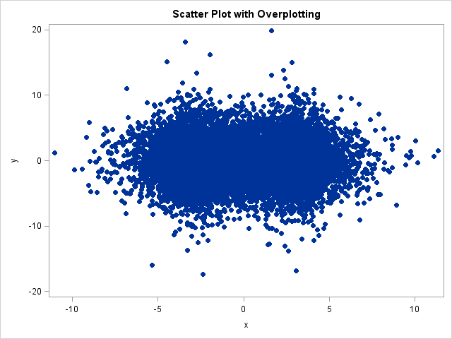
Do you have many points in your scatter plots that overlap each other? If so, your graph exhibits overplotting. Overplotting occurs when many points have similar coordinates. For example, the following scatter plot (which is produced by using the ODS statistical graphics procedure, SGPLOT) displays 12,000 points, many of which are plotted on top of each other.
/** 12,000 points; notice the overplotting **/ proc sgplot data=A; scatter x=x y=y / markerattrs=(symbol=CircleFilled); run; |

There are several ways to deal with overplotting. When the overplotting is caused because the data are rounded to a convenient unit (such as plot of height versus age), some analysts use jittering to reduce the overplotting. When the overplotting is caused by having too many data points, as in the previous scatter plot, you have to use an alternate approach.
One of the techniques I use is the "transparency trick" for visualizing scatter plots that suffer from a large amount of overplotting.
When a colleague recently came to me with a scatter plot that was dense with points, I suggested that he try the TRANSPARENCY= option in the SGPLOT procedure. This option enables you to specify a value between 0 and 1 that determines the transparency of the markers that are used in the scatter plot. A value of 0 indicates that all markers are opaque. As you increase the transparency factor, singleton markers fade away, whereas areas of the plot that have a high density of overlapping points remain dark.
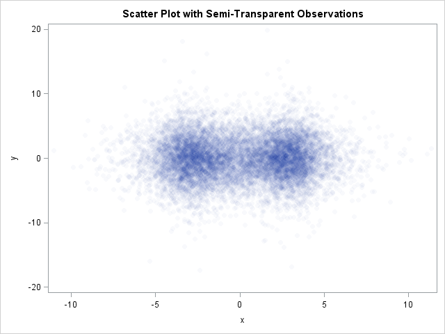
That one option makes a huge difference in the plot and enables you to visualize areas that have a high density of points. For example, the following statements display a scatter plot of the same data, but the markers are highly transparent:
/** use transparency **/
proc sgplot data=A;
scatter x=x y=y / markerattrs=(symbol=CircleFilled)
                  transparency=0.97;
run; |

The new scatter plot makes it easy to see that there is a high density of points near -3 and +3 on the horizontal axis. Consequently, a scatter plot with a large transparency factor is sometimes called the "poor man's density estimator."
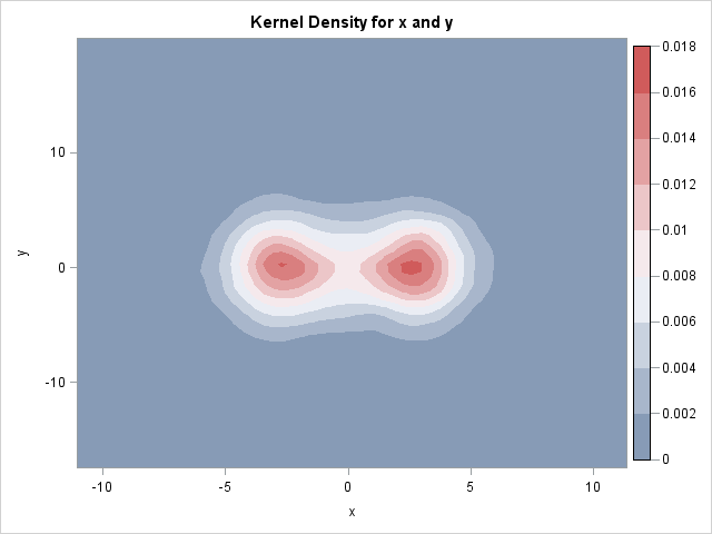
Of course, there is no real reason to use transparency to emulate density estimation, when there is a real density estimation procedure in SAS/STAT software. If you want to compute the density of the data, use the KDE procedure and request a contour plot of the data, as shown below:
proc kde data=A; bivar x y / plots=(contour); run; |


6 Comments
That transparency feature looks awesome! I didn't know SAS had this kind of capability until now.
Pingback: How to create a scatter plot with marginal histograms in SAS - The DO Loop
Pingback: Jittering to prevent overplotting in statistical graphics - The DO Loop
Pingback: Readers’ choice 2011: The DO Loop’s 10 most popular posts - The DO Loop
Pingback: Designing a quantile bin plot - The DO Loop
Pingback: 4 ways to visualize the density of bivariate data - The DO Loop