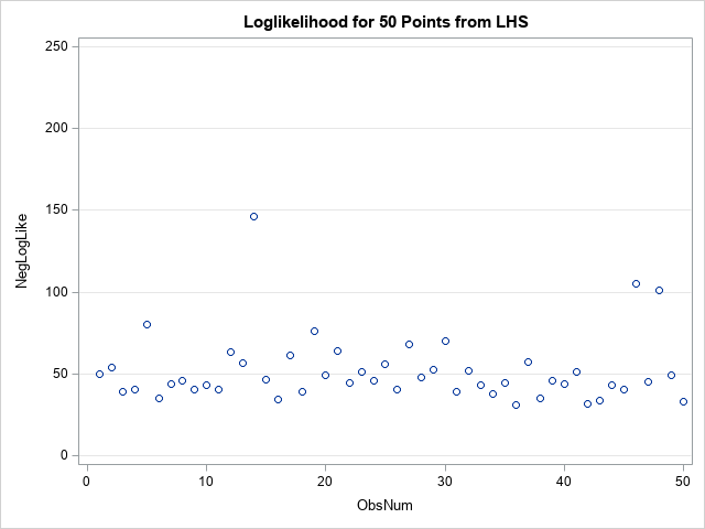
Slice, slice, baby! You've got to slice, slice, baby! When you fit a regression model that has multiple explanatory variables, it is a challenge to effectively visualize the predicted values. This article describes how to visualize the regression model by slicing the explanatory variables. In SAS, you can use the
Tag: Data Analysis
In a previous article, I showed how to use SAS to perform mean imputation. However, there are three problems with using mean-imputed variables in statistical analyses: Mean imputation reduces the variance of the imputed variables. Mean imputation shrinks standard errors, which invalidates most hypothesis tests and the calculation of confidence
Missing values present challenges for the statistical analyst and data scientist. Many modeling techniques (such as regression) exclude observations that contain missing values, which can reduce the sample size and reduce the power of a statistical analysis. Before you try to deal with missing values in an analysis (for example,
This article describes the advantages and disadvantages of principal component regression (PCR). This article also presents alternative techniques to PCR. In a previous article, I showed how to compute a principal component regression in SAS. Recall that principal component regression is a technique for handling near collinearities among the regression
In a previous article, I discussed the lines plot for multiple comparisons of means. Another graph that is frequently used for multiple comparisons is the diffogram, which indicates whether the pairwise differences between means of groups are statistically significant. This article discusses how to interpret a diffogram. Two related plots
Last week Warren Kuhfeld wrote about a graph called the "lines plot" that is produced by SAS/STAT procedures in SAS 9.4M5. (Notice that the "lines plot" has an 's'; it is not a line plot!) The lines plot is produced as part of an analysis that performs multiple comparisons of
Correlations between variables are typically displayed in a matrix. Because the correlation matrix is determined by the order of the variables, it is difficult to find the largest and smallest correlations, which is why analysts sometimes use colors to visualize the correlation matrix. Another visualization option is the pairwise correlation
If you perform a weighted statistical analysis, it can be useful to produce a statistical graph that also incorporates the weights. This article shows how to construct and interpret a weighted histogram in SAS. How to construct a weighted histogram Before constructing a weighted histogram, let's review the construction of
How can you specify weights for a statistical analysis? Hmmm, that's a "weighty" question! Many people on discussion forums ask "What is a weight variable?" and "How do you choose a weight for each observation?" This article gives a brief overview of weight variables in statistics and includes examples of
Pearson's correlation measures the linear association between two variables. Because the correlation is bounded between [-1, 1], the sampling distribution for highly correlated variables is highly skewed. Even for bivariate normal data, the skewness makes it challenging to estimate confidence intervals for the correlation, to run one-sample hypothesis tests ("Is
If you use SAS regression procedures, you are probably familiar with the "stars and bars" notation, which enables you to construct interaction effects in regression models. Although you can construct many regression models by using that classical notation, a friend recently reminded me that the EFFECT statement in SAS provides
Correlation is a fundamental statistical concept that measures the linear association between two variables. There are multiple ways to think about correlation: geometrically, algebraically, with matrices, with vectors, with regression, and more. To paraphrase the great songwriter Paul Simon, there must be 50 ways to view your correlation! But don't
A previous article discussed the mathematical properties of the singular value decomposition (SVD) and showed how to use the SVD subroutine in SAS/IML software. This article uses the SVD to construct a low-rank approximation to an image. Applications include image compression and denoising an image. Construct a grayscale image The
Visualizing the correlations between variables often provides insight into the relationships between variables. I've previously written about how to use a heat map to visualize a correlation matrix in SAS/IML, and Chris Hemedinger showed how to use Base SAS to visualize correlations between variables. Recently a SAS programmer asked how
When someone refers to the correlation between two variables, they are probably referring to the Pearson correlation, which is the standard statistic that is taught in elementary statistics courses. Elementary courses do not usually mention that there are other measures of correlation. Why would anyone want a different estimate of
Recently, I was asked whether SAS can perform a principal component analysis (PCA) that is robust to the presence of outliers in the data. A PCA requires a data matrix, an estimate for the center of the data, and an estimate for the variance/covariance of the variables. Classically, these estimates
Last week I blogged about the broken-stick problem in probability, which reminded me that the broken-stick model is one of the many techniques that have been proposed for choosing the number of principal components to retain during a principal component analysis. Recall that for a principal component analysis (PCA) of
Skewness is a measure of the asymmetry of a univariate distribution. I have previously shown how to compute the skewness for data distributions in SAS. The previous article computes Pearson's definition of skewness, which is based on the standardized third central moment of the data. Moment-based statistics are sensitive to
An important problem in machine learning is the "classification problem." In this supervised learning problem, you build a statistical model that predicts a set of categorical outcomes (responses) based on a set of input features (explanatory variables). You do this by training the model on data for which the outcomes
A SAS customer asked how to use SAS to conduct a Z test for the equality of two proportions. He was directed to the SAS Usage Note "Testing the equality of two or more proportions from independent samples." The note says to "specify the CHISQ option in the TABLES statement
Suppose you roll six identical six-sided dice. Chance are that you will see at least one repeated number. The probability that you will see six unique numbers is very small: only 6! / 6^6 ≈ 0.015. This example can be generalized. If you draw a random sample with replacement from
In a previous article, I showed two ways to define a log-likelihood function in SAS. This article shows two ways to compute maximum likelihood estimates (MLEs) in SAS: the nonlinear optimization subroutines in SAS/IML and the NLMIXED procedure in SAS/STAT. To illustrate these methods, I will use the same data
Maximum likelihood estimation (MLE) is a powerful statistical technique that uses optimization techniques to fit parametric models. The technique finds the parameters that are "most likely" to have produced the observed data. SAS provides many tools for nonlinear optimization, so often the hardest part of maximum likelihood is writing down
If you toss a coin 28 times, you would not be surprised to see three heads in a row, such as ...THHHTH.... But what about eight heads in a row? Would a sequence such as THHHHHHHHTH... be a rare event? This question popped into my head last weekend as I
According to Hyndman and Fan ("Sample Quantiles in Statistical Packages," TAS, 1996), there are nine definitions of sample quantiles that commonly appear in statistical software packages. Hyndman and Fan identify three definitions that are based on rounding and six methods that are based on linear interpolation. This blog post shows
In last week's article about the Flint water crisis, I computed the 90th percentile of a small data set. Although I didn't mention it, the value that I reported is different from the the 90th percentile that is reported in Significance magazine. That is not unusual. The data only had
The April 2017 issue of Significance magazine features a cover story by Robert Langkjaer-Bain about the Flint (Michigan) water crisis. For those who don't know, the Flint water crisis started in 2014 when the impoverished city began using the Flint River as a source of city water. The water was
Quick! What is the next term in the numerical sequence 1, 2, 1, 2, 3, 4, 5, 4, 3, 4, ...? If you said '3', then you must be an American history expert, because that sequence represents the number of living US presidents beginning with Washington's inauguration on 30APR1789 and
If a financial analyst says it is "likely" that a company will be profitable next year, what probability would you ascribe to that statement? If an intelligence report claims that there is "little chance" of a terrorist attack against an embassy, should the ambassador interpret this as a one-in-a-hundred chance,