Order matters. When you create a graph that has a categorical axis (such as a bar chart), it is important to consider the order in which the categories appear. Most software defaults to alphabetical order, which typically gives no insight into how the categories relate to each other.
Alphabetical order rarely adds any insight to the data visualization. For a one-dimensional graph (such as a bar chart) software often provides alternative orderings. For example, in SAS you can use the CATEGORYORDER= option to sort categories of a bar chart by frequency. PROC SGPLOT also supports the DISCRETEORDER= option on the XAXIS and YAXIS statements, which you can use to specify the order of the categories.
It is much harder to choose the order of variables for a two-dimensional display such as a heat map (for example, of a correlation matrix) or a matrix of scatter plots. Both of these displays are often improved by strategically choosing an order for the variables so that adjacent levels have similar properties. Catherine Hurley ("Clustering Visualizations of Multidimensional Data", JCGS, 2004) discusses several ways to choose a particular order for p variables from among the p! possible permutations. This article implements the single-link clustering technique for ordering variables. The same technique is applicable for ordering levels of a nominal categorical variable.
Order variables in two-dimensional displays
I first implemented the single-link clustering method in 2008, which was before I started writing this blog. Last week I remembered my decade-old SAS/IML program and decided to blog about it. This article discusses how to use the program; see Hurley's paper for details about how the program works.
To illustrate ordering a set of variables, the following program creates a heat map of the correlation matrix for variables from the Sashelp.Cars data set. The variables are characteristics of motor vehicles. The rows and columns of the matrix display the variables in alphabetical order. The (i,j)th cell of the heat map visualizes the correlation between the i_th and j_th variable:
proc iml; /* create correlation matric for variables in alphabetical order */ varNames = {'Cylinders' 'EngineSize' 'Horsepower' 'Invoice' 'Length' 'MPG_City' 'MPG_Highway' 'MSRP' 'Weight' 'Wheelbase'}; use Sashelp.Cars; read all var varNames into Y; close; corr = corr(Y); colors = palette("BrBg", 7); call HeatmapCont(corr) xvalues=varNames yvalues=varNames colorramp=colors range={-1.01 1.01} title="Correlation Matrix: Variables in Alphabetical Order"; |
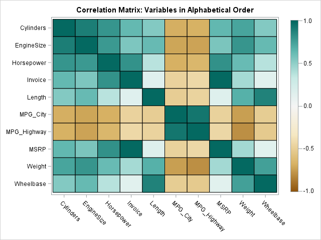
The heat map shows that the fuel economy variables (MPG_City and MPG_Highway) are negatively correlated with most other variables. The size of the vehicle and the power of the engine are positively correlated with each other. The correlations with the price variables (Invoice and MSRP) are small.
Although this 10 x 10 heat map visualizes all pairwise correlations, it is possible to permute the variables so that highly correlated variables are adjacent to each other. The single-link cluster method rearranges the variables by using a symmetric "merit matrix." The merit matrix can be a correlation matrix, a distance matrix, or some other matrix that indicates how the i_th category is related to the j_th category.The following statements assume that the SingleLinkFunction is stored in a module library. The statements load and call the SingleLinkCluster function. The "merit matrix" is the correlation matrix so the algorithm tries to put strongly positively correlated variables next to each other. The function returns a permutation of the indices. The permutation induces a new order on the variables. The correlation matrix for the new order is then displayed:
/* load the module for single-link clustering */ load module=(SingleLinkCluster); permutation = SingleLinkCluster( corr ); /* permutation of 1:p */ V = varNames[permutation]; /* new order for variables */ R = corr[permutation, permutation]; /* new order for matrix */ call HeatmapCont(R) xvalues=V yvalues=V colorramp=colors range={-1.01 1.01} title="Correlation: Variables in Clustered Order"; |
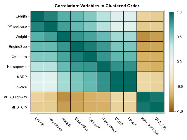
In this permuted matrix, the variables are ordered according to their pairwise correlation. For this example, the single-link cluster algorithm groups together the three "size" variables (Length, Wheelbase, and Weight), the three "power" variables (EngineSize, Cylinders, and Horsepower), the two "price" variables (MSRP and Invoice), and the two "fuel economy" variables (MPG_Highway and MPG_City). In this representation, strong positive correlations tend to be along the diagonal, as evidenced by the dark green colors near the matrix diagonal.
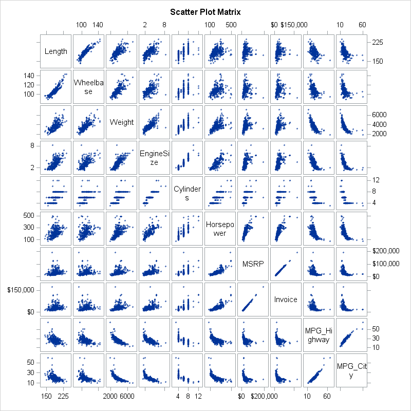
The same order is useful if you want to construct a huge scatter plot matrix for these variables. Pairs of variables that are "interesting" tend to appear near the diagonal. In this case, the definition of "interesting" is "highly correlated," but you could choose some other statistic to build the "merit matrix" that is used to cluster the variables. The scatter plot matrix is shown below. Click to enlarge.
Other merit matrices
I remembered Hurley's article while I was working on an article about homophily in married couples. Recall that homophily is the tendency for similar individuals to associate, or in this case to marry partners that have similar academic interests. My heat map used the data order for the disciplines, but I wondered whether the order could be improved by using single-link clustering. The data in the heat map are not symmetric, presumably because women and men using different criteria to choose their partners. However, you can construct the "average homophily matrix" in a natural way. If A is any square matrix then (A` + A)/2 is a symmetric matrix that averages the lower- and upper-triangular elements of A. The following image shows the "average homophily" matrix with the college majors ordered by clusters:
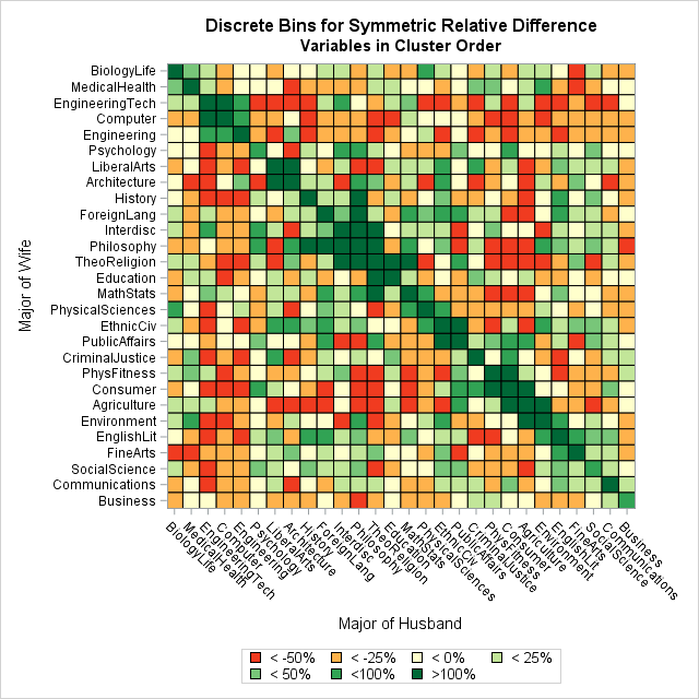
The heat map shows the "averaged data," but in a real study you would probably want to display the real data. You can see that green cells and red cells tend to occur in blocks and that most of the dark green cells are close to the diagonal. In particular, the order of adjacent majors on an axis gives information about affinity. For example, here are a few of the adjacent categories:
- Biology and Medical/Health
- Engineering tech, computers, and engineering
- Interdisciplinary studies, philosophy, and theology/religion
- Math/statistics and physical sciences
- Communications and business
Summary
In conclusion, when you create a graph that has a nominal categorical axis, you should consider whether the graph can be improved by ordering the categories. The default order, which is often alphabetical, makes it easy to locate a particular category, but there are other orders that use the data to reveal additional structure. This article uses the single-link cluster method, but Hurley (2004) mentions several other methods.
- Download the SAS/IML code that implements the single-link clustering method and stores the SingleLinkCluster function in a library.
- Download the SAS program that creates the graphs in this article.

4 Comments
Thank you, this is amazing. How do I make the clustered order heat map for Spearman's correlation instead of Pearsons?
Use the Spearman correlation matrix as the input matrix. For my example, you would change the line
corr = corr(Y);
to
corr = corr(Y, "spearman");
Pingback: The correlogram: Visualize correlations by fitting angles - The DO Loop
Pingback: Order two-dimensional vectors by using angles - The DO Loop