Visualizing the correlations between variables often provides insight into the relationships between variables. I've previously written about how to use a heat map to visualize a correlation matrix in SAS/IML, and Chris Hemedinger showed how to use Base SAS to visualize correlations between variables.
Recently a SAS programmer asked how to construct a bar chart that displays the pairwise correlations between variables. This visualization enables you to quickly identify pairs of variables that have large negative correlations, large positive correlations, and insignificant correlations.
In SAS, PROC CORR can computes the correlations between variables, which are stored in matrix form in the output data set. The following call to PROC CORR analyzes the correlations between all pairs of numeric variables in the Sashelp.Heart data set, which contains data for 5,209 patients in a medical study of heart disease. Because of missing values, some pairwise correlations use more observations than others.
ods exclude all; proc corr data=sashelp.Heart; /* pairwise correlation */ var _NUMERIC_; ods output PearsonCorr = Corr; /* write correlations, p-values, and sample sizes to data set */ run; ods exclude none; |
The CORR data set contains the correlation matrix, p-values, and samples sizes. The statistics are stored in "wide form," with few rows and many columns. As I previously discussed, you can use the HEATMAPCONT subroutine in SAS/IML to quickly visualize the correlation matrix:
proc iml; use Corr; read all var "Variable" into ColNames; /* get names of variables */ read all var (ColNames) into mCorr; /* matrix of correlations */ ProbNames = "P"+ColNames; /* variables for p-values are named PX, PY, PZ, etc */ read all var (ProbNames) into mProb; /* matrix of p-values */ close Corr; call HeatmapCont(mCorr) xvalues=ColNames yvalues=ColNames colorramp="ThreeColor" range={-1 1} title="Pairwise Correlation Matrix"; |
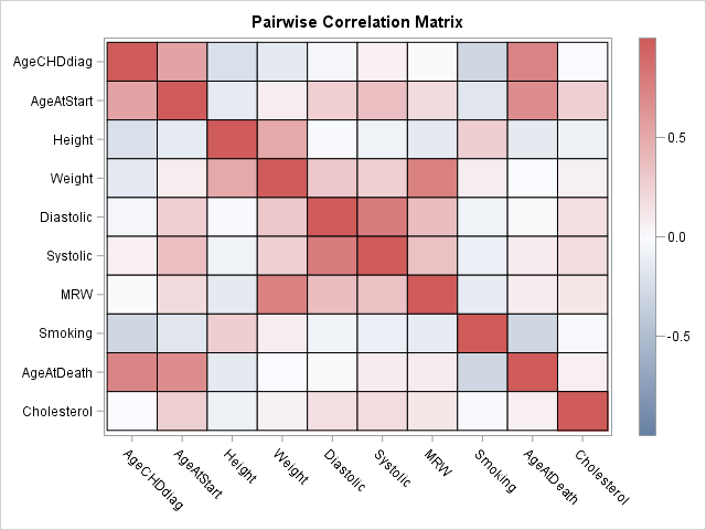
The heat map gives an overall impression of the correlations between variables, but it has some shortcomings. First, you can't determine the magnitudes of the correlations with much precision. Second, it is difficult to compare the relative sizes of correlations. For example, which is stronger: the correlation between systolic and diastolic blood pressure or the correlation between weight and MRW? (MRW is a body-weight index.)
These shortcomings are resolved if you present the pairwise correlations as a bar chart. To create a bar chart, it is necessary to convert the output into "long form." Each row in the new data set will represent a pairwise correlation. To identify the row, you should also create a new variable that identifies the two variables whose correlation is represented. Because the correlation matrix is symmetric and has 1 on the diagonal, the long-form data set only needs the statistics for the lower-triangular portion of the correlation matrix.
Let's extract the data in SAS/IML. The following statements construct a new ID variable that identifies each new row and extract the correlations and p-values for the lower-triangular elements. The statistics are written to a SAS data set called CorrPairs. (In Base SAS, you can transform the lower-triangular statistics by using the DATA step and arrays, similar to the approach in this SAS note; feel free to post your Base SAS code in the comments.)
numCols = ncol(mCorr); /* number of variables */ numPairs = numCols*(numCols-1) / 2; length = 2*nleng(ColNames) + 5; /* max length of new ID variable */ PairNames = j(NumPairs, 1, BlankStr(length)); i = 1; do row= 2 to numCols; /* construct the pairwise names */ do col = 1 to row-1; PairNames[i] = strip(ColNames[col]) + " vs. " + strip(ColNames[row]); i = i + 1; end; end; lowerIdx = loc(row(mCorr) > col(mCorr)); /* indices of lower-triangular elements */ Corr = mCorr[ lowerIdx ]; Prob = mProb[ lowerIdx ]; Significant = choose(Prob > 0.05, "No ", "Yes"); /* use alpha=0.05 signif level */ create CorrPairs var {"PairNames" "Corr" "Prob" "Significant"}; append; close; QUIT; |
You can use the HBAR statement in PROC SGPLOT to construct the bar chart. This bar chart contains 45 rows, so you need to make the graph tall and use a small font to fit all the labels without overlapping. The call to PROC SORT and the DISCRETEORDER=DATA option on the YAXIS statement ensure that the categories are displayed in order of increasing correlation.
proc sort data=CorrPairs; by Corr; run; ods graphics / width=600px height=800px; title "Pairwise Correlations"; proc sgplot data=CorrPairs; hbar PairNames / response=Corr group=Significant; refline 0 / axis=x; yaxis discreteorder=data display=(nolabel) labelattrs=(size=6pt) fitpolicy=none offsetmin=0.012 offsetmax=0.012 /* half of 1/k, where k=number of catgories */ colorbands=even colorbandsattrs=(color=gray transparency=0.9); xaxis grid display=(nolabel); keylegend / position=topright location=inside across=1; run; |
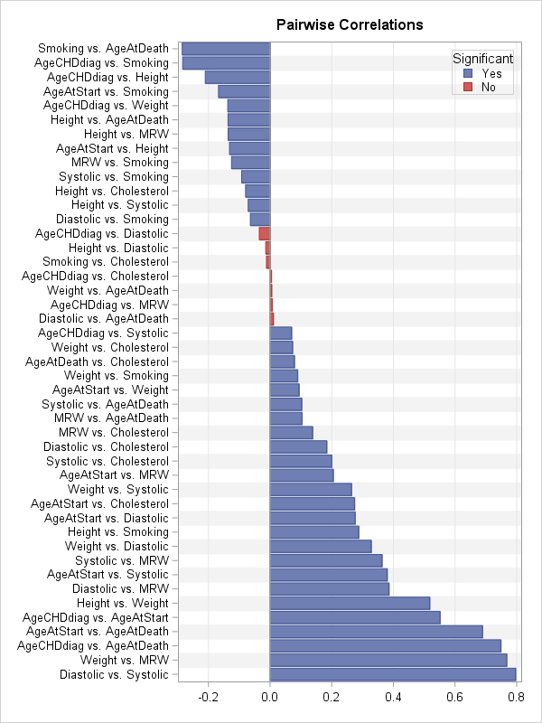
The bar chart (click to enlarge) enables you to see which pairs of variables are highly correlated (positively and negatively) and which have correlations that are not significantly different from 0. You can use additional colors or reference lines if you want to visually emphasize other features, such as the correlations that are larger than 0.25 in absolute value.
The bar chart is not perfect. This example, which analyzes 10 variables, is very tall with 45 rows. Among k variables there are k(k-1)/2 correlations, so the number of pairwise correlations (rows) increases quadratically with the number of variables. In practice, this chart would be unreasonably tall when there are 14 or 15 variables (about 100 rows).
Nevertheless, for 10 or fewer variables, a bar chart of the pairwise correlations provides an alternative visualization that has some advantages over a heat map of the correlation matrix. What do you think? Would this graph be useful in your work? Leave a comment.

2 Comments
Pingback: Use cosine similarity to make recommendations - The DO Loop
Pingback: 3 reasons to prefer a horizontal bar chart - The DO Loop