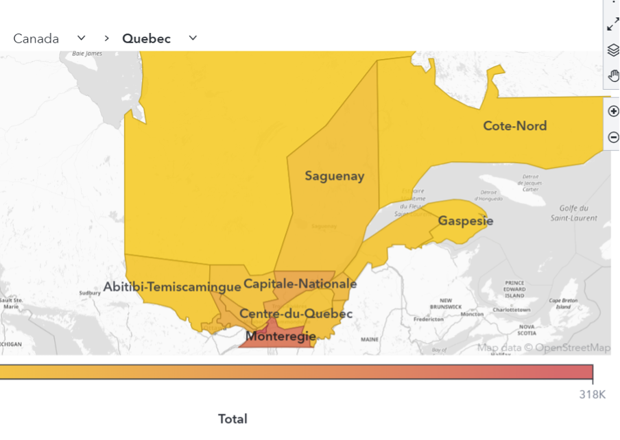
Learn how to create and visualize custom geographic regions in SAS Viya Visual Analytics, either by grouping existing map shapes or by uploading and configuring shapefiles to support regions with custom borders.

Learn how to create and visualize custom geographic regions in SAS Viya Visual Analytics, either by grouping existing map shapes or by uploading and configuring shapefiles to support regions with custom borders.
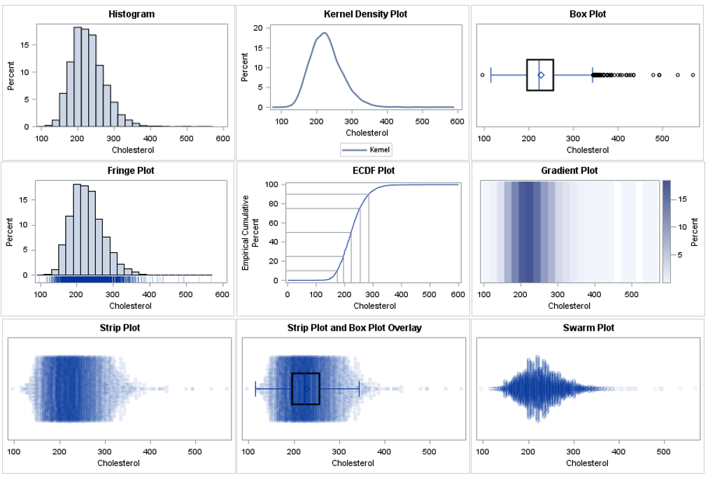
There are many ways to visualize the distribution of univariate data: histograms, kernel density estimates, box plots, and more. Visualizing a distribution leads to better insights than merely displaying statistics such as the sample mean, standard deviation, and quantiles. In fact, there are many well-known examples of data sets that
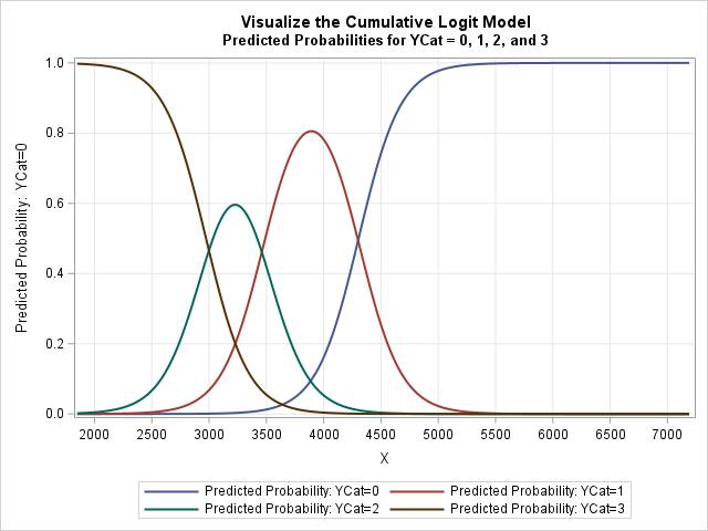
Many data analysts are familiar with logistic regression, where the response variable, Y, has two observed values, often represented as Y=0 and Y=1. The case Y=0 encodes that an event did not happen. For example, a patient did not experience some disease or did not die. The opposite case (Y=1)

El fraude en siniestros de autos es uno de los grandes retos para las aseguradoras. No siempre se trata de un reclamo aislado y evidente: en muchas ocasiones, se forman redes de personas y proveedores que actúan de manera coordinada para explotar vulnerabilidades en los procesos de indemnización. Los métodos
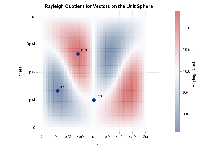
When I encounter a new function, I usually graph it to gain intuition about how the function transforms its inputs. Recently, I needed to use the Rayleigh quotient function, which is connected to the estimation of eigenvalues and eigenvectors for symmetric matrices. It has been several years since I last
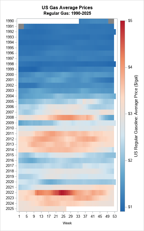
I follow several data visualization experts on social media. Sometimes, I see a graph that I struggle to interpret. When that happens, I ask myself whether there is a simpler and more effective way to visualize the data. Recently, I saw an example of using a "horizon plot" to visualize
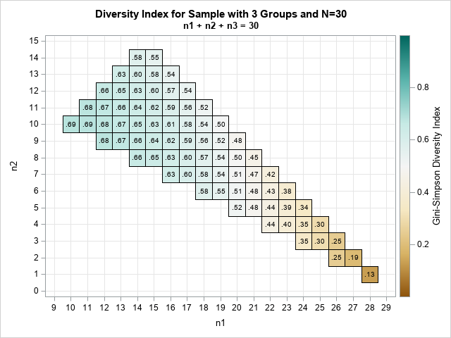
A previous article discusses the Gini-Simpson diversity index and how to compute it in SAS. Suppose you have a sample that contains R classes. (Classes are also called groups or categories.) Intuitively, the sample exhibits "high diversity" if the class sizes are approximately equal. The sample shows "low diversity" if

In a binomial regression model, the response variable is the proportion of successes for a given number of trials. In SAS regression procedures, you specify a binomial model by using the EVENTS/TRIALS syntax on the MODEL statement. Many analysts use the LOGISTIC or GENMOD procedures to fit binomial models. Visualizing
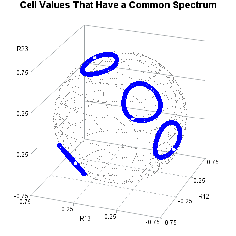
A colleague asked me an interesting question: Suppose you have a structured correlation matrix, such as a matrix that has a compound symmetric, banded, or an AR1(ρ) structure. If you generate a random correlation matrix that has the same eigenvalues as the structured matrix, does the random matrix have the
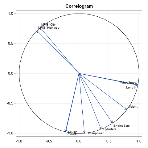
A common way to visualize the sample correlations between many numeric variables is to display a heat map that shows the Pearson correlation for each pair of variables, as shown in the image to the right. The correlation is a number in the range [-1, 1], where -1 indicated perfect

As part of this year's IEEE Visual Analytics Science and Technology (VAST) Challenge, a group of SAS data scientists puit SAS Viya and related machine learning tools to the ultimate test - to identify individuals in a complex fishing network. Excitedly, the team received the Honorable Mention Award for Breadth of Investigation!

SAS Visual Text Analytics can easily analyze similar words and phrases coming from various cultural heritage-related documents to construct a heritage wordbook that cultural workers can use to identify what relevant conservation technique to use on a structure/artifact.
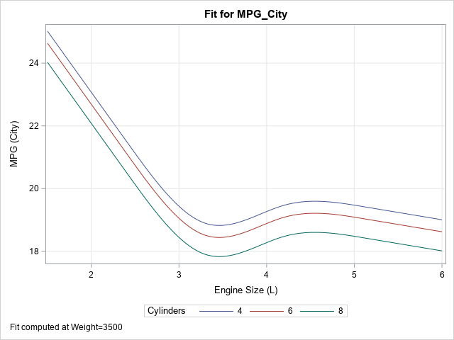
A SAS analyst read my previous article about visualizing the predicted values for a regression model that uses spline effects. Because the original explanatory variable does not appear in the model, the analyst had several questions: How do you score the model on new data? The previous example has only
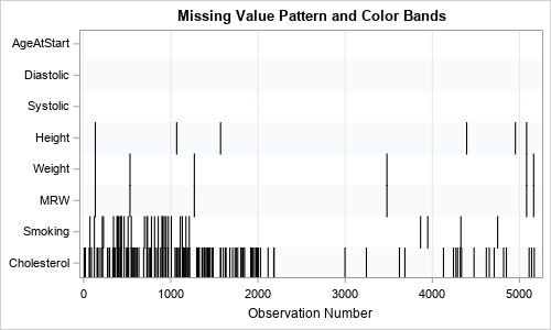
Years ago, I wrote an article that showed how to visualize patterns of missing data. During a recent data visualization talk, I discussed the program, which used a small number of SAS IML statements. An audience member asked whether it is possible to construct the same visualization by using only
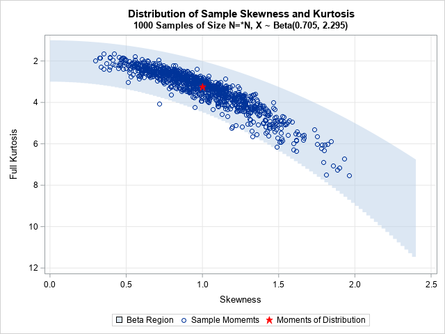
The moment-ratio diagram is a tool that is useful when choosing a distribution that models a sample of univariate data. As I show in my book (Simulating Data with SAS, Wicklin, 2013), you first plot the skewness and kurtosis of the sample on the moment-ratio diagram to see what common
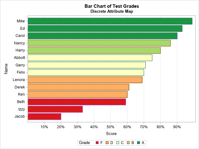
I sometimes see analysts overuse colors in statistical graphics. My rule of thumb is that you do not need to use color to represent a variable that is already represented in a graph. For example, it is redundant to use a continuous color ramp to represent the lengths of bars
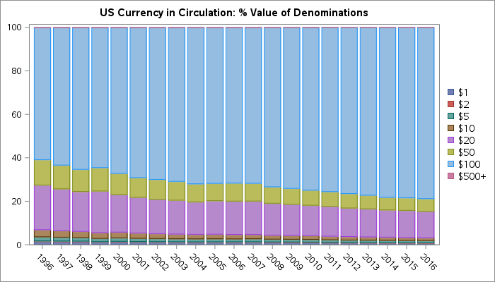
This phenomenon has been in the news recently, so I've updated this article that I originally published in 2017. The paper currency in circulation in the US is mostly $100 bills. And not just by a little bit -- these account for 34% of the notes by denomination and nearly

The cold of winter and holiday gatherings push people indoors, causing a surge in influenza hospitalizations. Years of above-normal temperatures in southern states bring a species of mosquito that carries malaria to the US. Declining childhood immunization rates threaten to allow previously eradicated diseases like measles to become endemic again.
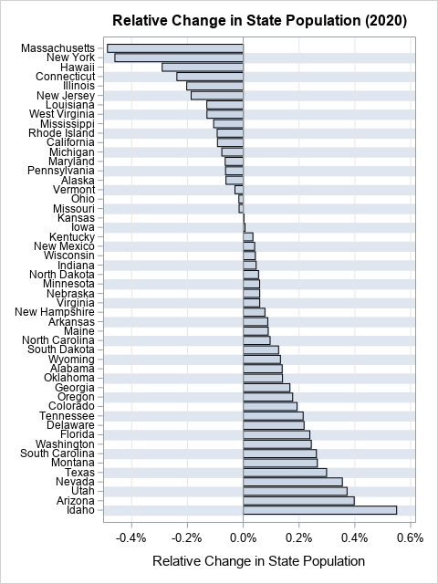
Plot rates, not counts. This maxim is often stated by data visualization experts, but often ignored by practitioners. You might also hear the related phrases "plot proportions" or "plot percentages," which mean the same thing but expresses the idea alliteratively. An example in a previous article about avoiding alphabetical ordering
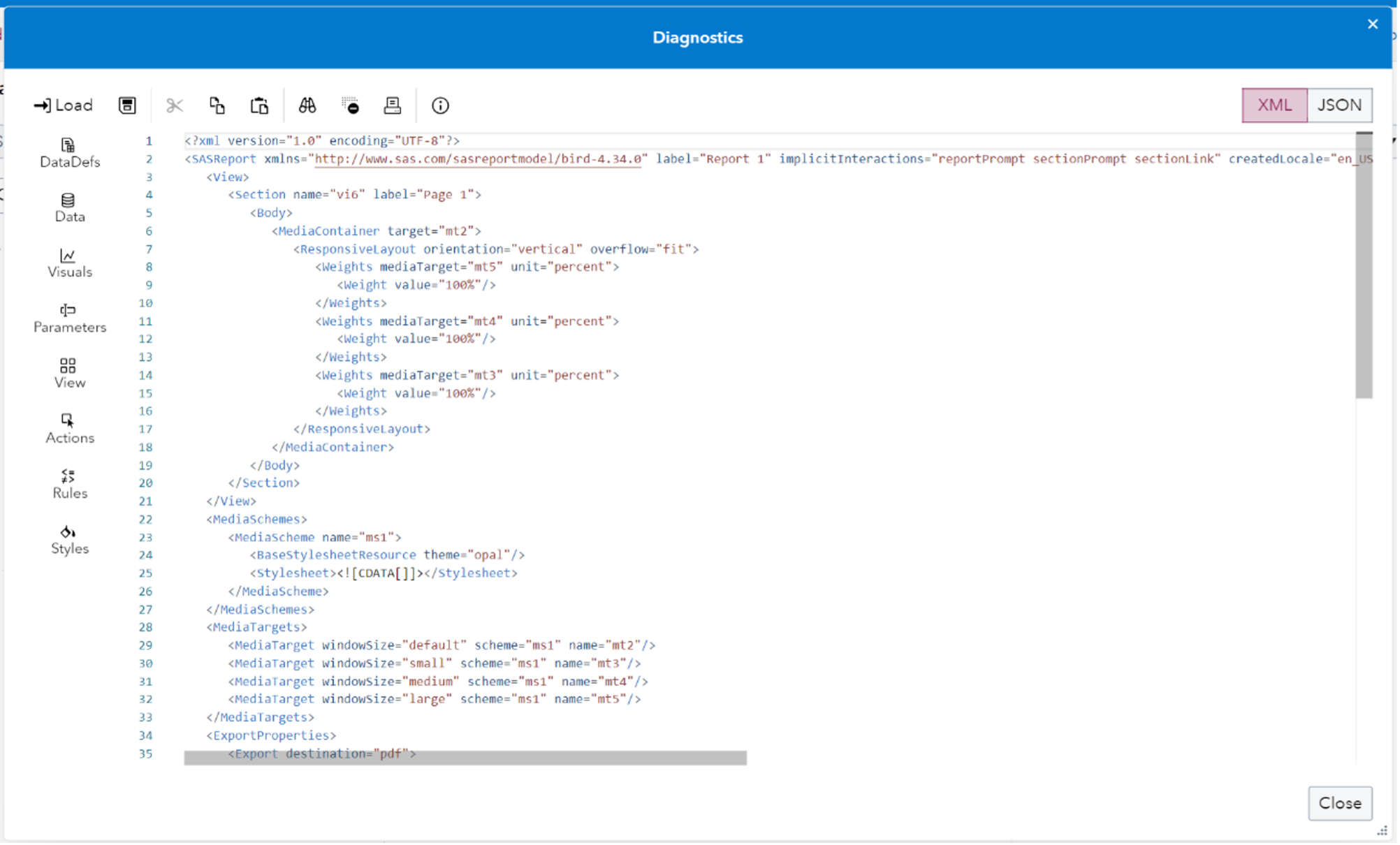
In SAS Viya 4 you can create Reports in SAS Visual Analytics that you may want to move around between machines. What if you want copy a report for example from a development environment folder to a production environment folder? You may want to work on the report in one system before putting it onto a final system and making it generally available. Or you may want to have a backup copy saved for recovery purposes. This blog post provides an updated description of how to easily save off SAS Visual Analytics report content to a file and easily move it between machines.
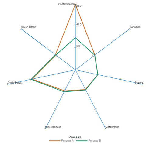
In the second of a two-part series, SAS' Cindy Wang reveals how to create a custom graph template in SAS Graph Builder that can be rendered as a radar chart in SAS Visual Analytics.
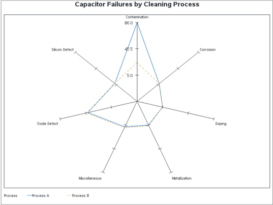
In the first of a two-part series, SAS' Cindy Wang shows you how to create a radar chart in SAS Visual Analytics using custom graph capabilities.
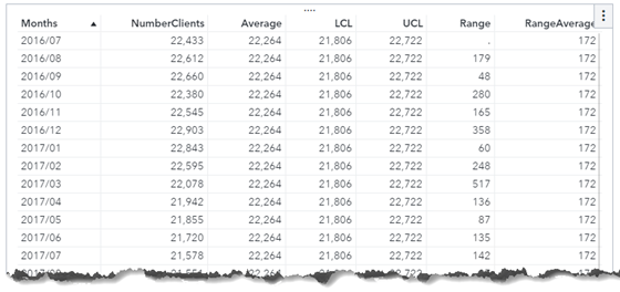
SAS' Cindy Wang, inspired by a SAS Support Community post, reveals how to perform dynamic calculations for an xmr control chart.
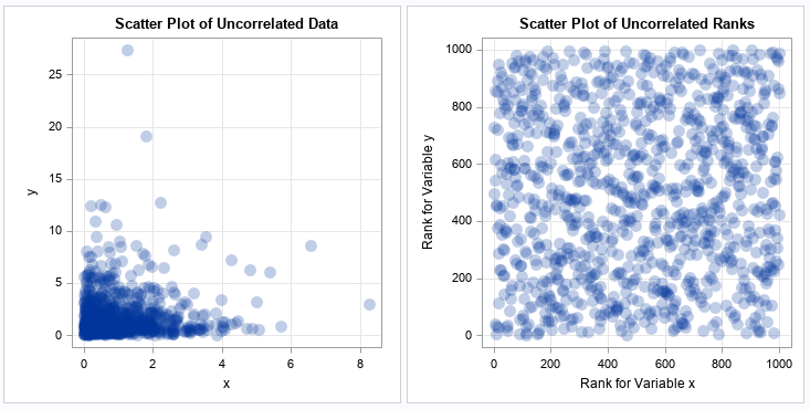
A previous article explains the Spearman rank correlation, which is a robust cousin to the more familiar Pearson correlation. I've also discussed why you might want to use rank correlation, and how to interpret the strength of a rank correlation. This article gives a short example that helps you to

Where do hammerhead sharks go at night? And perhaps more importantly, why? That's what Research Scientist and Professor Alex Hearn of the Galapagos Science Center hoped that a team of SAS analytics volunteers would be able to answer by analyzing data he's collected over nearly two decades. The project is
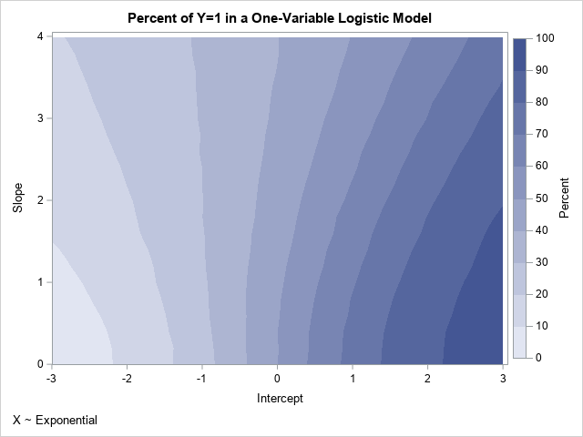
A previous article shows that you can use the Intercept parameter to control the ratio of events to nonevents in a simulation of data from a logistic regression model. If you decrease the intercept parameter, the probability of the event decreases; if you increase the intercept parameter, the probability of
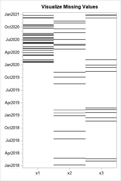
A SAS programmer asked how to create a graph that shows whether missing values in one variable are associated with certain values of another variable. For example, a patient who is supposed to monitor his blood glucose daily might have more missing measurements near holidays and in the summer months

In my previous blog Programmatically export a Visual Analytics report to PDF - SAS Users, I use the SAS Visual Analytics SDK to export a report to PDF, which is quite simple if we have basic knowledge with JavaScript programming. It works for both the latest version of SAS Viya
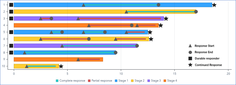
SAS' Cindy Wang shows you how to create a swimmer plot using SAS Visual Analytics.
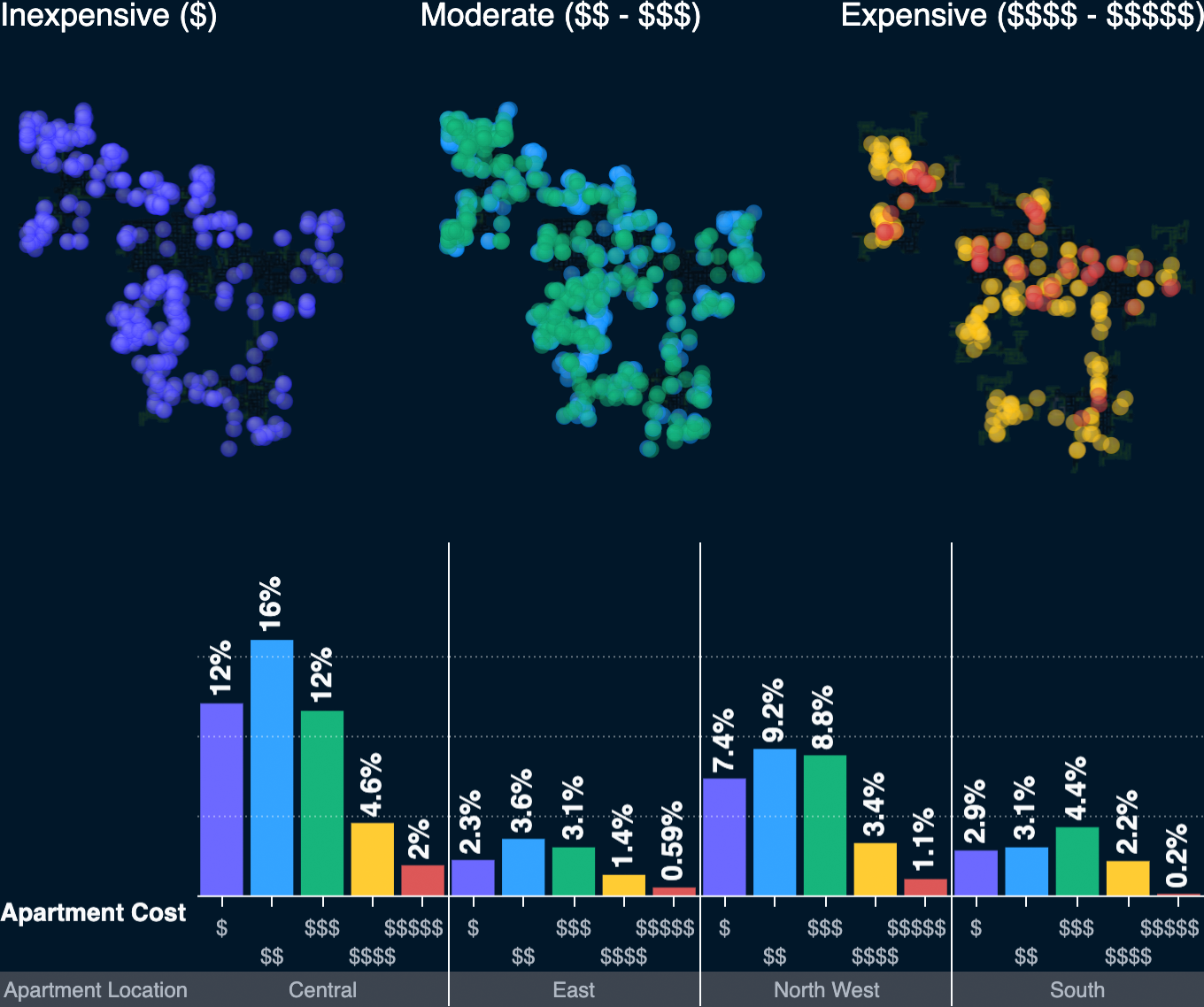
The IEEE Visual Analytics Science and Technology (VAST) Challenge provides a great opportunity to validate our software against real-world scenarios using complex data sets. Not only do we learn from these projects, but we also send feedback to our development teams to further improve product capabilities for customers.