One day I happened to see the SAS Support Community post How do I create an xmr control chart in VA 7.4. I like what the original poster, known as Noel88 in the community, said in a comment on the post: “The recent move to VA for reporting in our organisation has democratised the use of data. The ability to build reports locally that can be utilised and viewed nationally is driving some good change in how reporting is viewed and used and influences. Having views that don't come from the centre is making people think.” This is where SAS Visual Analytics has value for enterprise users.
In the meantime, I noticed Noel88 is asking how to easily perform dynamic calculations on a data series using SAS Visual Analytics 7.x. I think the support for easier dynamic calculations in SAS Visual Analytics is worthy of more attention, though it is now years later.
For VA 7.5, we have the RelativePeriod operator among other periodic aggregated operators, which enables users to perform dynamic calculations with period. And from VA 8.5 and later, we have added the AggregateCells operator along with other tabular aggregated operators that facilitates more on the dynamic calculations in tabular form.
In this post, let me use Noel88's data table to show how to perform the dynamic calculations for an xmr control chart. Thus, it will be easier for readers to compare the results from VA and Excel spreadsheet provided by Noel88. I am using VA 8.5, and believe they will work on later versions.
1. Load data in CAS
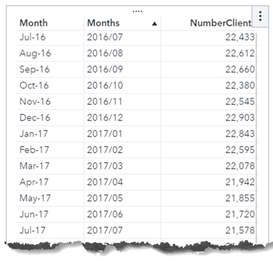
I copied the column A and B from Noel88's data table, and saved as a csv file. Import the data into CAS named as xmrdata, and prepare the data for calculations, i.e. change the column A (month) from String to Date item. The reason for this is, to prepare using the quick calculation of “Difference from previous period” and other period related ones, we need to have a date column in the table for periodic calculation.
So I create a new calculated item, called Months using the expression of
Parse(Concatenate('01-', 'Month'n), 'ANYDTDTE9.'), and set its format to YYYYMM(YYMM8.).
After this, showing the data of xmrdata in the list table, as below.
2. Dynamic calculations
Now with the above xmrdata, I am going to use the date column Months instead of the string column Month for dynamic calculation. Create the following calculated items one by one. To keep same format of calculations, I set the format for these calculated items as Comma(COMMA12.).
2.1 Average
Create the calculated item called Average, using the expression of Avg [_ForAll_] ('NumberClients'n).
The Average column will calculate the average of the column NumberClients over the period in the data set.
2.2 Range
Next is Range column, which calculate the absolute value of difference of the column NumberClients between one month and its previous month in the data set.
Create the calculated item called Range, using the expression of:
Abs((RelativePeriod(_Sum_, 'NumberClients'n,_IgnoreAllTimeFrameFilters_, 'Months'n, _Inferred_, 0, _Full_, {Date}) - RelativePeriod(_Sum_, 'NumberClients'n, _IgnoreAllTimeFrameFilters_, 'Months'n, _Inferred_, -1, _Full_, {Date}))).
That's a long expression for people. Good thing is, VA 8.5 and later provide an easy away to get this.
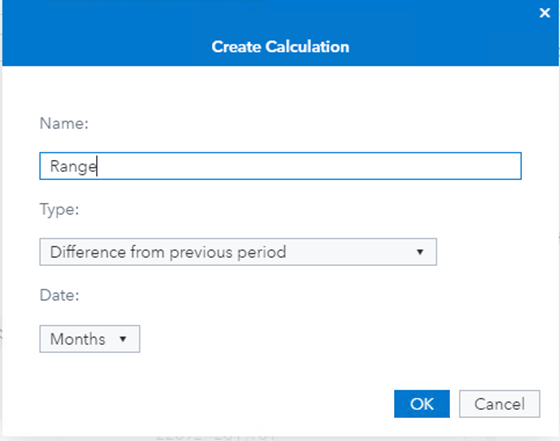
- In the data pane of Visual Analytics, select the data item 'NumberClients', and from its RMB menu select the 'New calculation...' menu item.
- We see following dialog as shown in the screenshot, and set the Name as 'Range', and Type as 'Difference from previous period‘, leaving the Date field as Months. Click OK button will create a calculated item called Range.
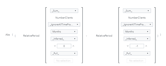
- From the Range's RMB menu, select the 'edit' menu item, the expression is (RelativePeriod(_Sum_, 'NumberClients'n,_IgnoreAllTimeFrameFilters_, 'Months'n, _Inferred_, 0, _Full_, {Date}) - RelativePeriod(_Sum_, 'NumberClients'n, _IgnoreAllTimeFrameFilters_, 'Months'n, _Inferred_, -1, _Full_, {Date})). Yet we still need to add the abs() operator to this item. In Text mode, add the abs() operator for the expression. Now we are done with creation of the calculated item Range.
If we view the Range expression in Visual mode, we get something like below screenshot.
2.3 RangeAverage
Now I get to the RangeAverage column, which calculate the average of the Range calculated above. This is actually to aggregate on an aggregated item(i.e. Range). Generally, such aggregation is not allowed for most aggregate operators in Visual Analytics but allowed for the AggregateCells operator. So, I'll use this operator in this calculation.
Create the calculated item called RangeAverage, using the expression of AggregateCells(_Average_, 'Range'n, default, CellIndex(start, 0), CellIndex(end, 0)). The first CellIndex has parameter set to (start, 0), and the second CellIndex has parameter set to (end, 0). They will calculate for all the column (Range) cells from start to end in the data set.
2.4 LCL & UCL
With Average and RangeAverage just created, I can easily create calculated items of LCL & UCL as given by Noel88 in his poster, respectively with expressions of 'Average'n - (2.66 * 'RangeAverage'n) and 'Average'n + (2.66 * 'RangeAverage'n).
3. Show the dynamic calculations in VA
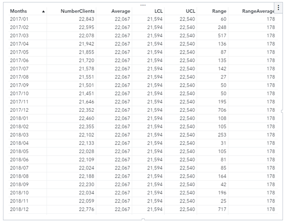
Drag a list table in Visual Analytics, and add the columns in the sequence of Months, NumberClients, Average, LCL, UCL, Range, RangeAverage. Now we get below table that exactly the same results as from the Excel spreadsheet in Noel88’s post.
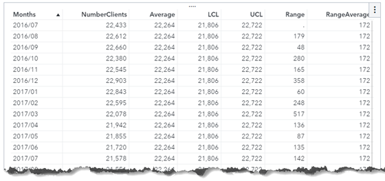
Even more, if we set a filter for the list table with the column Months, we can easily get the dynamic calculations for the data. For example, I set the filter with expression of ( 'Months'n BetweenInclusive('JAN2017'd, 'DEC2018'd) ), and got the following results on-the-fly.
4. Summary
Isn't that easy enough for dynamic calculations using SAS Visual Analytics? Give it a try right now. Or check more SAS Visual Analytics calculations by clicking the button below.
CHECK DOCUMENTATION NOW | SAS VISUAL ANALYTICS CALCULATIONS