In a binomial regression model, the response variable is the proportion of successes for a given number of trials. In SAS regression procedures, you specify a binomial model by using the EVENTS/TRIALS syntax on the MODEL statement. Many analysts use the LOGISTIC or GENMOD procedures to fit binomial models.
Visualizing a generalized linear regression model can be a challenge. Fortunately, SAS supports the EFFECTPLOT statement in PROC PLM and other procedures, which enables you to create effective visualizations with very little effort. I have previously written about how to use the EFFECTPLOT statement to visualize interaction effects and to visualize complex generalized linear models that have a linear or a binary response variable. This article discusses how to visualize a binomial regression model.
A binomial regression model
The documentation for the PROC GENMOD documentation includes a binomial regression model. The outcome of each experiment is the presence or absence of a positive response in a subject. Five drugs (labeled A through E) are tested for different levels of a continuous variable, x. The response variable is the number of responses, r, among the n subjects in each test group. The following DATA step defines the data:
data drug; input Drug$ x r n @@; /* empirical proportion is r/n */ datalines; A .1 1 10 A .23 2 12 A .67 1 9 B .2 3 13 B .3 4 15 B .45 5 16 B .78 5 13 C .04 0 10 C .15 0 11 C .56 1 12 C .7 2 12 D .34 5 10 D .6 5 9 D .7 8 10 E .2 12 20 E .34 15 20 E .56 13 15 E .8 17 20 ; |
The empirical probability of success for each group is the ratio r / n. You can use PROC GENMOD and the EVENTS/TRIALS syntax to model the probability of success as a function of x and the Drug type. The first time I ran PROC GENMOD, I use the PLOTS=ALL option, hoping to obtain a visualization of the model. I wanted to see a plot (sometimes called a sliced fit plot) that shows the x axis horizontally and the (empirical and predicted) probabilities of success vertically. I expected to see a plot that had five curves of predicted probabilities, one for each drug type.
Although the procedure produced many diagnostic plots and residual plots, it did not create the plot I wanted. Then I remembered that these kinds of plots are created by using the EFFECTPLOT statement, either in the procedure itself or by using PROC PLM on the saved model. Consequently, I used the following call to PROC GENMOD to obtain the graph I wanted:
/* use the EFFECTPLOT statement in PROC GENMOD to visualize the model */ title "Binomial Regression Model"; proc genmod data=drug; class Drug; model r/n = x Drug / dist=binomial link=logit; effectplot slicefit / obs; /* the EFFECTPLOT stmt in the PROC enables you to overlay the raw data */ run; |
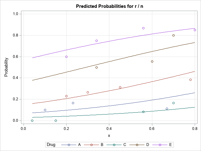
In the graph, the markers represent the empirical ratios, r/n, for each combination of x and Drug type. The curves show the predicted values of the model for each drug type as a function of x. If you can model your data by using PROC GENMOD or PROC LOGISTIC or some other procedure that supports the EFFECTPLOT statement, this is the easiest way to visualize the model.
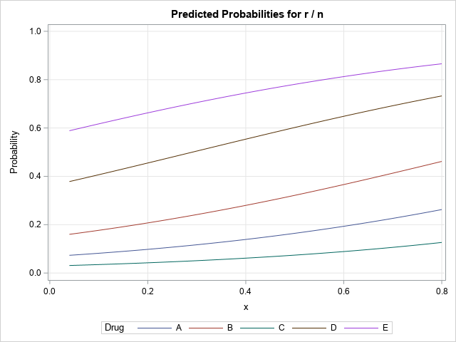
The EFFECTPLOT statement in PROC PLM
Not every SAS regression procedure supports the EFFECTPLOT statement. However, many support the STORE statement, which enables you to store information about the model to a special SAS file called an item store. You can then call PROC PLM to read the item store and to perform many post-fitting analyses and visualizations. The PLM procedure supports the EFFECTPLOT statement, so it, too, can create a visualization of a binomial regression model. However, the item store does not store the original data, only information about the regression model. Accordingly, the graph that PROC PLM creates cannot overlay the observed ratios on the plot of the predicted probabilities.
The following call to PROC GENMOD fits the same model and uses the STORE statement to save the model to an item store. A call to PRCO PLM reads the item store and creates a sliced fit plot for the model:
/* if a PROC doesn't support the EFFECTPLOT statement, use PROC PLM */ proc genmod data=drug; class Drug; model r/n = x Drug / dist=binomial link=logit; store GenModel; run; proc plm restore=GenModel; effectplot slicefit; /* plots on inverse link scale (ILINK) by default */ run; |
Score the model yourself and visualize the results
There is always a trade-off between ease-of-use and customization. If you like the default visualization (colors, titles, marker shapes, etc.), use the techniques in the previous section. However, sometimes you might want to customize the visualization. In that case, you might want to use PROC PLM to score the model on a custom set of values for the explanatory variable, then use PROC SGPLOT to visualize the model.
I have previously discussed how to use PLM to score a regression model on a uniform grid of values for a continuous covariate. The following DATA step defines a uniform grid of x values for each drug type. (If there are additional covariates in the model, the previous article discusses how to set them to a default value such as a mean or mode.) You can use the SCORE statement in PROC PLM to obtain predicted values at these values. If you want confidence intervals for the predicted values, you can use the LCLM and UCLM options. Finally, for models that have a nontrivial link function, use the ILINK function to obtain the predictions on the 'data scale.'
/* Another alternative is to score the model yourself. If you do not specify the number of trials, the log displays: NOTE: The Trials variable is absent from the scoring data set WORK.TEST. A constant value of 1 is assumed for scoring. The model does not use n, so you can set it to a default value or to a missing value. */ data Test; n = .; do Drug = 'A', 'B', 'C', 'D', 'E'; do x = 0.1 to 0.9 by 0.05; output; end; end; run; proc plm restore=GenModel; score data=Test predicted LCLM UCLM out=OutPred / ILINK ; /* score the Test data; output predictions */ run; |
The SCORE statement creates an output data set, OutPred, that contains the predicted values at each score location. You can merge the original data and the OutPred data set to combine the data and predicted values. You can then visualize the data and the predictions. For this example, I include confidence limits, too. Because the confidence bands overlap, I only show the predictions for three drug types.
data All; set drug OutPred; /* concatenate data and predictions */ prop = r/n; /* form the empirical proportions */ run; title "Predicted Probability from Binomial Model"; ods graphics / push AttrPriority=NONE; proc sgplot data=All; where Drug in ('B', 'C', 'E'); band x=x lower=LCLM upper=UCLM / group=Drug transparency=0.5; series x=x y=predicted / group=Drug; scatter x=x y=prop / group=Drug; label prop="Probability of Success"; xaxis grid; yaxis min=0 max=1 grid; run; ods graphics / pop; |

Notice that I added grid lines, a title, and a label for the Y axis. These kinds of modifications are easy when you score the data yourself and use PROC SGPLOT for the visualization. I also used a cool ODS GRAPHICS trick: you can use the PUSH and POP options to temporarily set the parameters used to render an ODS graphic.
Summary
The EFFECTPLOT statement in SAS enables you to visualize a wide range of regression models, including a binomial regression model. This article shows three examples:
- For procedures that support the EFFECTPLOT statement natively (for example, GENMOD and LOGISTIC), you can use the OBS option to overlay predicted values and empirical proportions.
- For other procedures, you can use the STORE statement to store information about the model and use the EFFECTPLOT statement in PROC PLM to visualize the model.
- To customize the visualization, use the SCORE statement in PROC PLM to manually score the model, then use PROC SGPLOT for the visualization.
