In part one of this two-part series, I generated the dataset CalData from the original sashelp.failure dataset and loaded it into CAS. Now I will describe how to create a custom graph template in SAS Graph Builder and render the radar chart in SAS Visual Analytics.
Creating the basic radar chart template
In SAS Graph Builder, drag and drop 3 vector plots and 2 scatter plots as the basic plots for this radar chart template.
- Vector plot 1: will be used to draw the spokes that radiated from the center of the chart; each spoke is associated with a level of the category variable ‘cause’.
- Vector plot 2: will be used to draw the short lines across the spokes; the three-layer short lines are spread on each spoke and can be reference values for data vertices.
- Vector plot 3: will be used to draw the closed polylines connecting data vertices on the spokes. The statistical values of the numeric variable ‘count’ for each ‘cause’ grouped by ‘process’ will be the value for data vertices.
- Scatter plot 1: Will be used to display the label of each spoke; the spoke label will be only shown at outer ending of the spoke.
- Scatter plot 2: Will be used to display the tick label of the short lines on the first spoke.
Set options for each basic plot
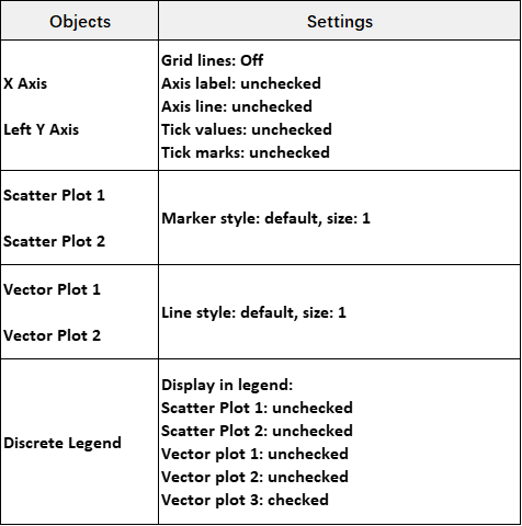
To make these basic plots work together for the radar chart template, we need to set the object options in SAS Graph Builder. These options include:
- For Scatter plot 1 and 2, set the marker size to 1;
- For Vector plot 1 and 2, set the line size to 1;
- For X Axis and Left Y Axis, turn off the grid line and the axis labels, axis lines, tick values, and tick marks.
- For discrete legend, only display the legend for Vector plot 3.
In Figure 1 below you'll see details of the options we set for the radar chart template:
Define data roles for each basic plot
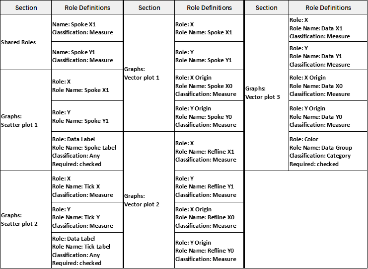
Let’s begin with 2 shared roles that will be used by Scatter plot 1 and Vector plot 1. In SAS Graph Builder, click the ‘Role definitions’ icon on the right side, and click ‘+ Add Role’ link under the ‘Shared Roles’ section. After selecting the ‘Role Name’ and ‘Classification’, click the OK button to finish the creation of the shared roles.
Next, we will define required roles for each Scatter plot and Vector plot similarly. In Figure 2 below you'll see the sections where these roles are defined in, and its definitions including the Role, Role Name and Classification, etc. Most of these roles are used to show the coordinates (x, y) values. Specially, the Spoke Label and Tick Label are for labels of spokes and labels of the short lines on the first spoke. Also, define the Data Group role that will be used as the Color role in Vector plot 3, which will be used to display the data with different color for each group.
Now we are done with the creation of the radar chart template. We can save the template, here I named it as ‘Radar chart’. I also put a copy of this template xml file here so you can load it directly in SAS Graph Builder.
Import the template and assign data roles in VA
In SAS Visual Analytics, import the template we just created. This can be done by clicking the Objects icon on the left pane and clicking the Object menu to choose the ‘Import custom graph...’ item. In the pop-up dialog, choose the ‘Radar chart’ from the folder saved in to complete the import.
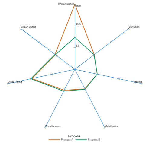
Now in the Objects pane, scroll down to find the imported ‘Radar chart’ and double click it. Next, we can assign the data roles accordingly. It has a bunch of data roles, and that's not a problem as the column names in the data set can be easily mapped to the role names. Only one exception, we will assign the column ‘Process’ to the 'Data Group' role, which is used to group the cause of failures.
Displaying the radar chart in VA
When the data role assignment is completed, we will see a radar chart is rendered. Not ideally to me, it’s using the default color settings for lines/markers in Visual Analytics. So I change the line/marker colors in the ‘Style’ section in the 'Options' pane. The colors from beginning are deep orange, deep green, dark yellow, deep blue, black, black. I also change the font in the ‘Style’ section to ‘Arial’. Now we see the radar chart in VA as shown in Figure 3 below:
Summary
SAS Visual Analytics supports custom graph templates, which adds the flexibility to create the chart you want.
Ready to build your own custom graph?
TRY IT NOW | BUILD A GRAPH TEMPLATE
3 Comments
Hi Cindy! How can we draw the circles to have the same look as the starcircles parameter of the proc gradar?
Hi Marco! I think to draw the circles as from the STARCIRCLES parameter of the proc GRADAR, we need to generate/prepare some data before some visualization can show the circles. It needs further calculation and coding, maybe worth writing a new post on this. Thanks.
Cindy, great article!! How can we draw the circles to have the same look as the starcircles parameter of the proc gradar?