There is a SAS Support Community article on how to draw radar charts in SAS Visual Analytics that used JavaScripts and a data-driven content object. Here I will present another approach to create a basic radar chart in VA using custom graph. The chart is similar to the overlaying radar chart created by PROC GRADAR as shown in SAS Help. I am going to illustrate how to achieve this with two posts: this one focuses on preparing the data for drawing the radar chart; the next post will show how to create the custom graph of a radar chart.
Before starting on data prep, let's first see what parts a radar chart consists of. Radar charts are sometimes also called star charts or spider charts. According to SAS Help on the GRADAR Procedure, a radar chart shows the relative frequency of data measures in quality control or market research problems. The statistical values are displayed along spokes that radiate from the center of the chart. The spokes start at the twelve o'clock position and go in a clockwise direction. There are short lines served like tick markers perpendicular to the spokes. These short lines show the frequency references of data measures. The chart vertices—the points where the statistical values of the numeric variable intersect the spokes—are based on the frequencies of the numeric variable at different levels of a category variable.
The radar chart example from GRADAR Procedure
Before data prepping, let’s see how PROC GRADAR renders the radar chart. It provides several statements to enable the output of drawing radar charts. Here are the codes drawing a radar chart with an overlay variable, which is used to show statistical values based upon its different values (i.e., by group).
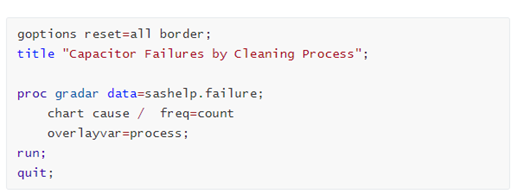
If we run above codes in SAS Studio, it will create a basic radar chart as below. Seven spokes show the causes of failures, and they are arranged around the clockwise direction starting from the twelve o'clock position. Their values come from the categorical variable ‘cause’ in the sashelp.failure dataset. Three short lines on each spoke serve as tick markers, with tick values shown on the first spoke. Two closed polylines show the statistical values of the count of failures on the vertices intersecting spokes. With the chart, we can easily know that the most dominant cause of failures in the dataset is from Contamination, with frequency of 86.0 from Process A.

Data preparation
Now let’s get to the data preparation part, and the prepped dataset will be invoked directly later in SAS Visual Analytics.
I will use the sashelp.failure dataset as in above PROC GRADAR example. The sashelp.failure data set records the causes of failures with two processes for five consecutive days, and the radar chart will show how each cause in the two processes contributes to the failures in frequency.
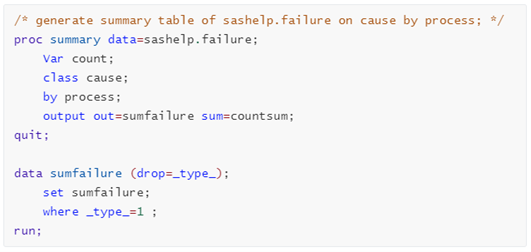
Generate the summary table
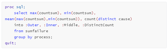
The radar chart will show the distinct cause of the category variable ‘cause’ in the dataset. To evenly distribute the causes on spokes around a circle in the output chart, first step is to generate the summary table for sashelp.failure on ‘cause’ by variable 'Process'. Below code will create such summary table with sum of ‘Count’ variable, and I named the summary table as sumfailure. What we need is only those data summarized by the ‘cause’ variable, thus set a where clause of _type_=1.
Calculate the data points values for the spokes endings
To draw the spokes, with their starting points at (0,0), we need to get the data points for each spoke ending. The calculation of these data points needs to call some geometric and trigonometric functions.
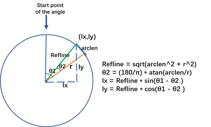
To refresh this knowledge, let’s see the following diagram. To calculate the coordinates for a spoke ending at certain degree, we will use sin() and cos() functions in data step. Such functions in SAS require parameters in radians, and we need to convert degrees to radians.
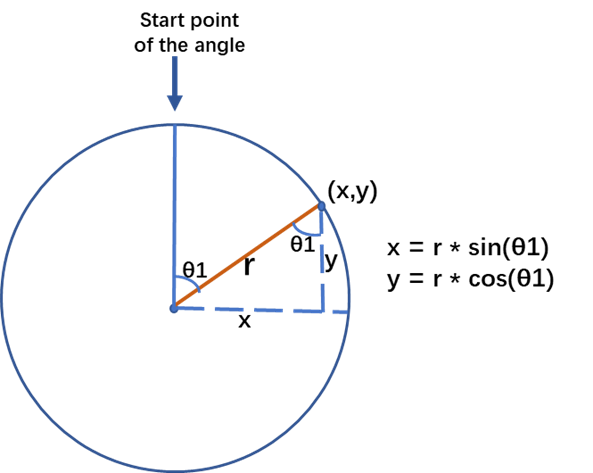
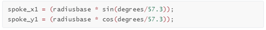
As we know, both radians and degrees in a sector are using units of angular as its measures. A round of a circle is comprised of 2π radians, which is the equivalent of 360° degrees. Therefore, the conversion from degrees to radians can be done by dividing the degrees value with 180/π, which is rounded to 57.3. For example, below snippet calculates the ending coordinates for a spoke whose radius equals to the value of 'radiusbase'.
Calculate the values for three layers of short lines
We see three layers of short lines in the example radar chart, and they give the maximum, average, and minimum summary frequencies respectively on the spokes. These values will be used when we calculate the positions of vertices and the tick labels on the first spoke at twelve o'clock position. In this example, the values are 86.0, 46.5, and 5.0 in the output chart.
Below snippets will return these frequency values, and also the distinct count of the variable ‘cause’ by group of ‘process’ in the dataset.
Calculate the data points values for the short lines endings
Perpendicular to each spoke, we need to draw some short lines that looks like tick markers. We will draw three layers of such short lines in this example.
As shown in below diagram, we need to have the length of the Refline to calculate the data points values for each short line endings. According to the Pythagorean theorem, calculate the length of Refline with certain radius and the specific length of the short line (the arclen in the diagram). In addition, with the arclen and radius value, we can calculate the degree θ2 from another right-angled triangle using the atan() function. This will help us to decide the angle used to calculate the coordinates of (lx, ly). Bear in mind, the atan() function returns radian and we need to convert from radians to degrees. This can be done by multiplying the radian value by 180/π, rounds to 57.3.
The calculation of the ending points for each short line will use sin() and cos() functions, with the angles of (θ1-θ2) and (θ1+θ2) respectively. Thus, the length of each short line will be double of the arclen in the diagram.
Adjust the length of radius in calculation
To calculate the coordinates of vertices for data points, we need to adjust the length of the base radius we used for the calculation. This is because the center of the spoke is at 0, while data points start at minimum value of frequency, i.e. 5.0 in this example; and end at maximum value of frequency, i.e. 86.0 here.
The snippet below calculates the adjusted radius used for data points intersecting the spokes.
![]()
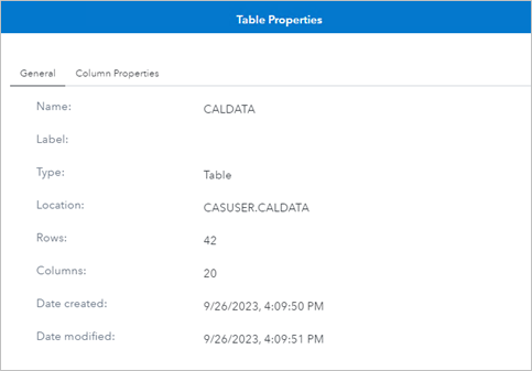
That's the main idea of the calculations. You may get the full codes of the data preparation on GitHub. The codes generate a dataset named CalData. Loaded it into CAS, and we see it has 20 columns and 42 rows as shown in the screenshot.
In Part 2, I use the generated dataset CalData and show how to draw the radar chart in SAS Visual Analytics using a custom graph.
READ PART 2 NOW | DRAWING A RADAR CHART WITH A CUSTOM GRAPH