A previous article explains the Spearman rank correlation, which is a robust cousin to the more familiar Pearson correlation. I've also discussed why you might want to use rank correlation, and how to interpret the strength of a rank correlation. This article gives a short example that helps you to visualize the Spearman rank correlation.
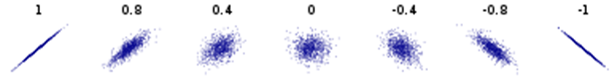
A common data visualization of the Pearson correlation is to display a scatter plot of two variables, X and Y. The scatter plot of X versus Y reveals the sign and magnitude of the Pearson correlation for these two variables. The scatter plot is especially useful when X and Y are bivariate normal. The following thumbnail images show the familiar shapes of bivariate normal data. The Pearson correlations are shown above each graph.
You can perform a similar visualization for the Spearman rank correlation. The key is this: The Spearman rank correlation between X and Y is exactly the Pearson correlation of the ranks of X and Y. Therefore, you can compute the ranks of each variable and plot the ranks against each other. (Tied values are handled by using the TIES=MEAN option.) The scatter plot of the ranked values reveals the sign and magnitude of the Spearman correlation of the original values.
Estimate the Pearson and Spearman correlation
Let's start by defining a small set of data. We will use two variables in the Sashelp.Cars data set. The Horsepower variable indicates the power that a vehicle's engine can produce; the MPG_City variable indicates the average miles per gallon of the vehicle in city driving. Since powerful engines tend to be gas guzzlers, we expect that the variables will be negatively correlated. We can use PROC CORR in SAS to display the estimated Pearson and Spearman correlations for the first 30 observations. For later use, I create a new character variable (LABL) that contains the (x,y) coordinates of each observation.
/* Helper macro: concatenate two numerical values into an ordered pair: %ConcatNum(x,y) ==> "(x,y)" */ %macro ConcatNum(s1,s2); catt("(", strip(put(&s1,BEST4.)), ",", strip(put(&s2,BEST4.)), ")"); %mend; %let DSName= Sashelp.Cars; %let XName = Horsepower; %let YName = MPG_City; data Sample; length labl $ 12; set &DSName(obs=30); labl = %ConcatNum(&XName, &YName); /* add label for (x,y) coordinates */ keep &Xname &YName labl; run; /* Compute PEARSON and SPEARMAN rank correlation by using PROC CORR in SAS. See https://blogs.sas.com/content/iml/2017/08/14/rank-correlation-sas.html */ proc corr data=Sample noprob nosimple PEARSON SPEARMAN; var &XName &YName; run; |
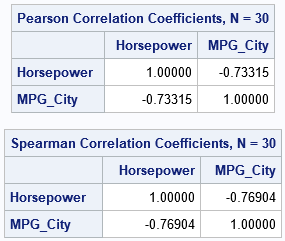
As expected, both statistics report that the variables are negatively correlated. Let's store the correlations in macro variables so that we can display the values in titles:
%let PCorr= -0.73; %let SCorr= -0.77; |
Visualize the Pearson correlation
As mentioned previously, it is easy to visualize the Pearson correlation: just create a scatter plot. If the variables are linearly related, the slope of the linear relationship gives the sign of the Pearson correlation. As shown in the earlier graph, strong correlations result in markers that are tightly grouped around a line. Let's create the scatter plot for these variables and label the markers by the coordinates of the ordered pairs:
title "Scatter Plot of Raw Values"; title2 "Pearson Corr = &PCorr"; proc sgplot data=Sample; scatter x=&XName y=&YName / markerattrs=(symbol=CircleFilled size=12) datalabel=labl datalabelattrs=(color=Gray); xaxis grid; yaxis grid; run; |
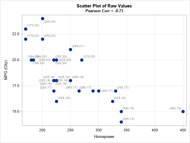
The graph (click to enlarge) shows that the markers are grouped. Furthermore, relative low values of X tend to be related to relatively high values in Y, and high values in X tend to be related to low values in Y. The labels show the (x,y) coordinates for each observation.
Visualize the Spearman rank correlation
How does this graph change for the Spearman rank correlation? As mentioned earlier, the Spearman correlation is the Pearson correlation of the ranks of the variables. Therefore, you can visualize the Spearman correlation by computing the ranks and plotting them against each other, as follows:
/* Compute the Spearman rank correlation "manually" by explicitly computing ranks */ /* First compute ranks; use average rank for ties */ proc rank data=Sample out=Ranks1 ties=mean; var &XName &YName; ranks RankX RankY; run; /* Compute PEARSON and SPEARMAN rank correlation by using PROC CORR in SAS */ data Ranks; length labl $ 12; set Ranks1; labl = %ConcatNum(RankX, RankY); /* add label for (x,y) coordinates */ run; title "Scatter Plot of Ranks"; title2 "Spearman Corr = &SCorr"; proc sgplot data=Ranks aspect=1; scatter x=RankX y=RankY / markerattrs=(symbol=CircleFilled size=12) datalabel=labl datalabelattrs=(color=Gray); xaxis grid; yaxis grid; run; |
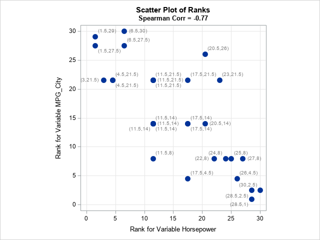
Click to enlarge the graph. Whereas the original (x,y) pairs had different scales, the ranks have the same scale. Therefore, you can use the ASPECT=1 option to plot the ranks in a square. If the markers are grouped close to the diagonal line, then the Spearman correlation is strongly positive. For these data, the markers are close to the anti-diagonal line, which indicates a strong negative correlation. If the markers appear to be positioned uniformly at random in the square, then the Spearman correlation is close to 0. For these data, most markers are close to the anti-diagonal line.
Notice that the average rank for each variable is displayed next to each marker. If there are no tied values, the ranks will be the integer values in [1, N], where N is the number of observations. If the lowest or highest values are shared by several observations, the range will be shorter because the tied values all get the same rank. For example, if three observations share the lowest value, the rank for those observations is (1+2+3)/3 = 2.
Visualize the ranks of uncorrelated data
For uncorrelated bivariate data, a scatter plot of the ranks displays markers that are random positioned in a square. This is true regardless of the distributions of X and Y. To illustrate this fact, the following DATA step randomly generates independent draws from an exponential and a lognormal distribution. Feel free to modify the program to select X and Y from ANY distribution!
/* generate uncorrelated data from ANY distributions */ data Uncorr; call streaminit(123); do i = 1 to 1000; x = rand("Expo"); y = rand("LogNormal"); output; end; run; proc rank data=Uncorr out=Ranks2 ties=mean; var x y; ranks RankX RankY; run; ods graphics / push width=360px height=360px; ods layout gridded advance=table columns=2 column_gutter=5px; title "Scatter Plot of Uncorrelated Data"; proc sgplot data=Uncorr aspect=1; scatter x=X y=Y / markerattrs=(symbol=CircleFilled size=12) transparency=0.75; xaxis grid; yaxis grid; run; title "Scatter Plot of Uncorrelated Ranks"; proc sgplot data=Ranks2 aspect=1; scatter x=RankX y=RankY / markerattrs=(symbol=CircleFilled size=12) transparency=0.75; xaxis grid; yaxis grid; run; ods layout end; ods graphics / pop; |
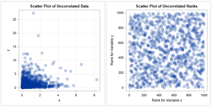
From the scatter plot of the original data, you cannot guess the Pearson correlation between the variables. However, from a scatter plot of the ranks, you can easily guess that the variables are uncorrelated. For uncorrelated data, the ranks should look like a random choice of approximately N values on the integer lattice [1,N] x [1,N]. Be aware that having many tied values will change the appearance. If there are K < N unique pairs of ranks, then there will be at most K marker positions on the integer lattice [1,N] x [1,N].
Summary
In summary, you can use a scatter plot of the ranks to visualize the Spearman rank correlation between two variables. Tied values should be assigned the average rank. If the data are correlated, the ranks will be close to the diagonal or anti-diagonal lines on the integer lattice [1,N] x [1,N], where N is the number of data points. If the data are uncorrelated, the pairs of ranks will be randomly positioned on the integer lattice.
