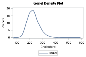
There are many ways to visualize the distribution of univariate data: histograms, kernel density estimates, box plots, and more. Visualizing a distribution leads to better insights than merely displaying statistics such as the sample mean, standard deviation, and quantiles. In fact, there are many well-known examples of data sets that have the same statistics but quite different distributions.
Recently, I saw a post on social media from Nicola Rennie that showed several ways to visualize a univariate data distribution. In this article, I use PROC SGPLOT in SAS to generate several popular visualizations.
You can overlay two or more of these methods. The most famous example is a kernel density estimate overlayed on a histogram. Another is a box plot added to a strip plot. You can also create a panel that combines two or more methods. That technique leads to violin plots, raincloud plots, and three-panel displays. In this article, I include only one overlay and one panel.
The nine plots in this article are:
- The histogram
- The kernel density estimate
- The box plot
- The fringe plot
- The empirical cumulative density (ECDF) plot
- The gradient plot
- The strip plot
- The strip plot with a box plot overlay
- The swarm plot
This article shows how to use SAS to create the first five plots. A second article shows how to create the remaining four graphs. You can download the SAS program that creates all graphs.
Example data
All examples use the same data: the Cholesterol of patients in the Sashelp.Heart data set. The following SAS macro variables specify the data set and variable. You can change these values to see the same graphs for other variables.
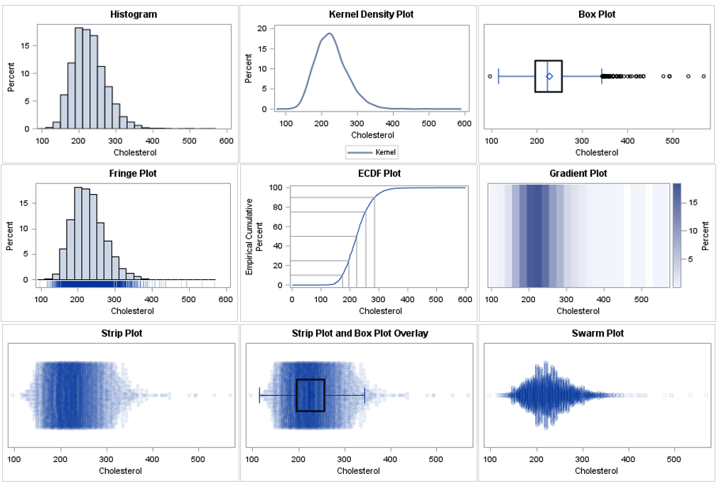
%let DSName = sashelp.heart; %let varName = Cholesterol; /* display descriptive statistics */ proc means ndec=1 data=&DSName N NMiss Mean Std Min Q1 Median Q3 Max; var &varName; run; |
There are 5057 non-missing cholesterol values. The values range from 96 to 568. The measured values are all integers, but the underlying variable is continuous.
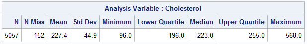
The histogram
The histogram is the most common visualization of a univariate distribution. It is a nonparametric estimate of density. SAS automatically selects a bin width and anchor location that is appropriate for the data and that leads to "nice numbers" on the horizontal axis. If necessary, you can override the default locations of bins. In SAS, you can create a histogram by using the HISTOGRAM statement in PROC UNIVARIATE or in PROC SGPLOT. Here is how to create a histogram in SAS:
title "Histogram"; proc sgplot data=&DSName; histogram &varName; * the default vertical scale is percent; run; |
From this graph, you can see that the distribution has positive skewness and positive kurtosis. (Positive kurtosis means that the distribution has fat tails.) There appear to be large outliers in the range [400, 600], but because the histogram bins data, you cannot see the specific values of any data.
The main advantage of the histogram is its ease of interpretation. You do not need specialized statistical knowledge to understand it. The main disadvantage is that it does not reveal individual data values.
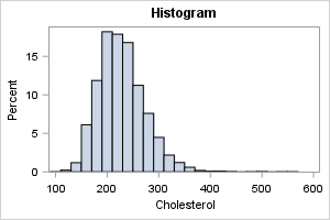
The kernel density estimate
The histogram is a piecewise-constant estimate of density. It has two parameters that affect its shape (bin width and the start point). You can think of the kernel density estimate (KDE) as a smoothed version of a histogram. The KDE has only one parameter (the kernel bandwidth). SAS automatically selects a kernel bandwidth, but you can override the automatic selection when necessary. In SAS, you can create a kernel density estimate by using the DENSITY statement PROC SGPLOT (or use PROC KDE). Here is how to create a kernel density estimate in SAS:
title "Kernel Density Plot"; proc sgplot data=&DSName; density &varName / type=kernel scale=percent; * default vertical scale is density ; run; |
The most obvious conclusion from this graph is that the distribution has a short tail on the left and a long tail on the right. Because the mean and standard deviation are strongly affected by extreme values, these statistics might not be the best choices to estimate the center and scale of the data. Like the histogram, the KDE does not reveal any specific values of the data.
The box plot
There are many articles online that describe how to interpret a box plot. The box plot (also called box-and-whisker plots) is a visual summary of the distribution that is based on the "five-number summary." The five-numbers that are visible in the box plot are the minimum value, the first quartile, the median, the third quartile, and the maximum value. Furthermore, the interquartile range (IQR) can be inferred and used as a measure of spread or scale. Most box plots also overlay a symbol for the mean value.
You can create a vertical box plot by using the VBOX statement. You can create a horizontal box plot by using the HBOX statement. There are several reasons to prefer horizontal box plots and car charts. Here is how to create a horizontal box plot in SAS:
title "Box and Whisker Plot"; proc sgplot data=&DSName; hbox &varName / lineattrs=(thickness=2) nofill; run; |
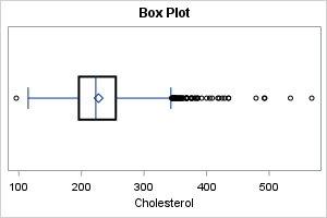
The central "box" of the box plot uses quantiles to reveal the main features of the distribution. The central line is the median value; the diamond-shaped marker is the mean value. The box plot also shows many data values. The ends of the whiskers are data values, as are the extreme outliers, which are plotted as markers that are outside the extent of the whiskers.
An advantage of the boxplot is that it uses robust statistics to present a schematic depiction of the central portion of the distribution. The fact that markers are used for extreme data values are both an advantage and a disadvantage. It is an advantage for small data sets and approximately normal data. If you have thousands of observations or data with long tails, the extreme markers will suffer from overplotting. In that case, you might prefer to overlay a box plot on a strip plot, as shown in a subsequent section.
The fringe plot
Nicola Rennie included a "barcode plot" among her visualizations. This is a plot that displays a vertical line at each data value. To counteract overplotting, the lines are sometimes semi-transparent. A "barcode plot" is not a term that I have used, but it seems the same as a fringe plot. In SAS, you can create this plot by using the FRINGE statement. Personally, I don't recommend showing the fringe plot by itself, but rather as part of panel where the top (main) panel shows a histogram, KDE, or box plot, and the lower panel (which is often smaller than the main panel) shows "ticks" to visualize the placement of the data values. Here is how to overlay a fringe plot and a histogram in SAS. The OFFSETMIN= option is used to extend the Y axis below Y=0. Thus, the tick marks (the "fringe") appear below the bars of the histogram:
title "Fringe Plot"; proc sgplot data=&DSName noautolegend; histogram &varName; fringe &varName / transparency=0.6; yaxis offsetmin=0.08; run; |
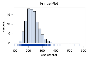
For smaller data sets, this overlay shows both the shape of the distribution (via the histogram) and the individual data values (via the fringe). For large data with many thousand points, the fringe plot suffers from overplotting.
The ECDF plot
The next plot is best used when the audience is statistically savvy. It is an empirical cumulative density plot (ECDF plot). It shows the proportion of observations that are less than or equal to x for each value of x in the data. In SAS, you can use the CDFPLOT statement in PROC UNIVARIATE to create an ECDF plot.
If I am creating the ECDF plot for myself or for a statistically sophisticated audience, I will use PROC UNIVARIATE directly. However, if I am creating the plot for a less sophisticated audience, I prefer to augment the ECDF with a set of "droplines" that show the values associated with the 10th, 25th, 50th, 75th, and 90th percentiles of the data. To do that, I use PROC UNIVARIATE to generate the plot, then use an ODS OUTPUT statement to write the data underlying the plot to a SAS data set. I can then use PROC SGPLOT to add the drop lines, as follows:
ods exclude all; * Delete this statement if you want to see the plot as created by PROC UNIVARIATE; /* use PROC UNIVARIATE to create the CDFPLOT, but use SGPLOT to visualize it and add droplines */ proc univariate data=&DSName noprint; var &varName; cdfplot &varName / vref=(10 25 50 75 90) statref=P 10 Q1 Q2 Q3 P 90; ods output cdfplot=ecdf; run; ods exclude none; title "ECDF Plot"; proc sgplot data=ECDF; series x=ECDFX y=ECDFY; dropline x=HRefValue y=VRefValue / dropto=both; yaxis values=(0 to 100 by 10); xaxis label="&varName"; run; |
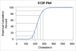
This visualization is effective when you want to ask questions about the probability of an event or value. The droplines connect data values for certain standard percentiles: the 10th, 25th, 50th, 75th, and 90th percentiles. Therefore, the graph enables you to quickly answer questions like the following:
- What proportion of patients have cholesterol values that are less than 200 mg/dL? (Answer: about 25%)
- The top 10% of cholesterol levels are larger than what value? (Answer: about 300)
Mathematically, this plot is the integral of the density function, which is why it is useful for answering questions about probabilities.
Summary
This article shows how to use SAS (primarily PROC SGPLOT) to create different visualizations of the distribution of data. The histogram, KDE, and ECDF plot are suitable for data of any size. The box plot and fringe plot are less useful for large data set because they show individual values and are therefore prone to overplotting. A second article shows how to create four additional visualizations. You can download the SAS program that generates all the graphs from GitHub.

6 Comments
Hey Rick,
Two cents if I may. ;-) Let me to advocate (just like Adrian Olszewski did in comment to Nicola's post) for one more way of visualisation.
The way I like to visualise a continuous univariate distribution in SAS is Rain Cloud plot which is a mix of the kernel density estimate,the box plot, and the swarm plot.
It is not directly available in SAS bat can be easily done with help of the %RainCloudPlot() macro I've described in the "Here Comes the Rain (Cloud Plot) Again" article (https://www.lexjansen.com/sesug/2025/109_Final_PDF.pdf)
I don;t know if I can add an image to the comment, but here is an example: https://github.com/SASPAC/baseplus/blob/main/baseplus_RainCloudPlot_Ex2b.png based on the SASHELP.CARS data set.
The %RainCloudPlot() is a part of the BasePlus package, and is available here: https://github.com/SASPAC/baseplus
All the best
Bart
Yes, and if you read my article you'll find that the third paragraph mentions the raincloud plot and links to one of your articles about it.
Thanks Rick! I didn't noticed that third paragraph. Shame on me.
Will pay more attention next time! :-) :-)
Pingback: Nine ways to visualize a continuous univariate distribution in SAS - Part 2 - The DO Loop
Very nice work, as always by Rick. Many tha!nks!
Pingback: Create and graph the ECDF function in SAS - The DO Loop