At a recent conference, I talked with a SAS customer who told me that he was using an R package to create a three-panel visualization of a distribution. Unfortunately, he couldn't remember the name of the package, and he has not returned my e-mails, so the purpose of today's article is to discuss some ideas related to this visualization and to solicit critiques of my implementation.
The customer wanted to create a paneled display in SAS that includes three graphs: a histogram, a box plot, and a normal quantile-quantile (Q-Q) plot. We sketched out an idea, and the plot at the left is my implementation of our sketch. (Click to enlarge.)
One question I asked was, "Do you want the usual Q-Q plot, or should we flip it?" The usual Q-Q plot is a scatter plot of the ordered data values (on the vertical axis) plotted against the corresponding quantiles of a normal distribution (on the horizontal axis). The purpose of a Q-Q plot is to see whether the points fall along a straight line, which would indicate that the data are normally distributed. I remarked that if we flip the plot so that the data values are displayed horizontally, then the histogram, boxplot, and Q-Q plot can all share a common horizontal axis. The customer said that this seemed like a good idea.
In SAS, you can create this kind of paneled layout by using the Graph Template Language (GTL) and the SGRENDER procedure.
A three-panel visualization of a data distribution #DataViz Share on XA GTL template for a three-panel display
When I returned from the conference, I created a GTL template that defines a three-panel display. The top panel, which occupies 50% of the height of the display, is a histogram of the data overlaid with a normal curve and a kernel density estimate. The second panel, which occupies 10% of the height, is a horizontal box plot. The third panel is a normal Q-Q plot, but is flipped so that the normal quantiles are plotted on the vertical axis. A diagonal reference line is added to the Q-Q plot. Normally distributed data should fall near the reference line.
The threepanel template takes five dynamic variables. The data and the normal quantiles are referenced by the dynamic variables _X and _QUANTILE, respectively. The title is supplied by using the _Title variable. Lastly, the parameter estimates for the normal curve that best fits the data are supplied by using the _mu and _sigma dynamic variables. The template definition follows:
/* define 'threepanel' template that displays a histogram, box plot, and Q-Q plot */ proc template; define statgraph threepanel; dynamic _X _QUANTILE _Title _mu _sigma; begingraph; entrytitle halign=center _Title; layout lattice / rowdatarange=data columndatarange=union columns=1 rowgutter=5 rowweights=(0.4 0.10 0.5); layout overlay; histogram _X / name='histogram' binaxis=false; densityplot _X / name='Normal' normal(); densityplot _X / name='Kernel' kernel() lineattrs=GraphData2(thickness=2 ); discretelegend 'Normal' 'Kernel' / border=true halign=right valign=top location=inside across=1; endlayout; layout overlay; boxplot y=_X / boxwidth=0.8 orient=horizontal; endlayout; layout overlay; scatterplot x=_X y=_QUANTILE; lineparm x=_mu y=0.0 slope=eval(1./_sigma) / extend=true clip=true; endlayout; columnaxes; columnaxis; endcolumnaxes; endlayout; endgraph; end; run; |
You can download the %ThreePanel macro, which creates a three-panel display for any variable in any data set. If you want to learn more about how to write GTL templates, I recommend the book Statistical Graphics in SAS: An Introduction to the Graph Template Language and the Statistical Graphics Procedures by my colleague, Warren Kuhfeld.
The macro calls PROC UNIVARIATE to compute the normal parameter estimates and the quantiles. That information is then used by PROC SGRENDER to create the plot according to the specifications in the threepanel template. The macro uses a cool trick: I get the data for the Q-Q plot by using an ODS OUTPUT statement on a graph that is created by PROC UNIVARIATE.
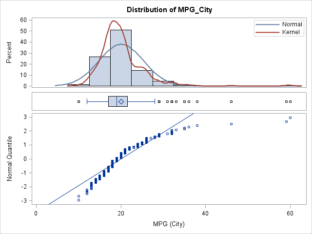
The image at the top of this post shows how the template renders the MPG_City variable in the Sashelp.Cars data set. The image was created as follows:
ods graphics on; %ThreePanel(Sashelp.Cars, MPG_City) |
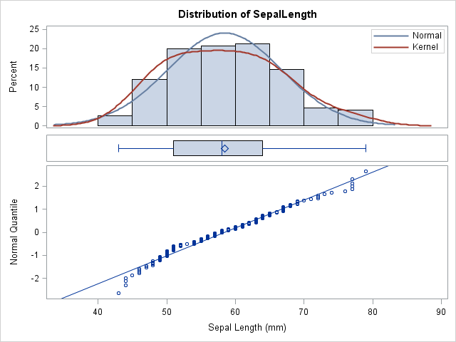
The MPG_City variable is not normally distributed, as is evident by looking at the poor fit of the data in the Q-Q plot (lower panel). In contrast, the distribution of the SepalLength variable in the Sashelp.Iris data set appears to be more normal, as shown below:
%ThreePanel(Sashelp.Iris, SepalLength) |
Discussion
What do you think? Try it out on your own data and let me know if you have suggestions to improve it. Is this a useful display? Leave a comment.

13 Comments
What a great idea and awesome visualization! I like the common horizontal axis for the 3 plots.
As you point out the MPG_City variable is clearly not normally distributed and I thought what may be useful is to include a legend with the results of the goodness-of-fit tests, perhaps in the bottom right corner of the Q-Q plot. This might be useful for situations where the variable is borderline normally distributed and saves the user having to run proc univariate with the normal option.
The text for the legend can be easily obtained from proc univariate (adding the normal option and then modifying your existing ods statement as:
ods output ParameterEstimates=_PE QQPlot=_QQ(keep=Quantile Data rename=(Data=&Var)) GoodnessOfFit=_GF;)
and then using the _GF table, the values of the variables, test and pValue can be used in the legend (probably as macro variables). But as I am not familiar with GTL I stopped there. :-) I assume that another discretelegend statement could be used in the proc template code?
As another thought, perhaps the skewness & kurtosis statistics could be added in the histogram legend too.
In any case, I think this is a useful display that I will be sharing with others. Thanks!
Thanks. All of those options are possible, although the graph might get a little cluttered. An alternative is to use ODS SELECT to display the GoodnessOfFit and Moments tables from the PROC UNIVARIATE output.
The idea of flipping Q-Q plot is great. Is that possible to add different color themes on the historgram, boxplot or QQ-plot? Seems proc univariate is not as flexible as proc sgplot to add colors to the graph or make the graphs bold for visualization purpose.
Yes, you can control the colors and attributes in each panel. In general, the procedures produce ODS graphics that are designed to enable you to understand the data. If you want to add bells and whistles for a presentation or report, PROC SGPLOT and the GTL give you that power.
Pingback: OMG Its a Box-Plot! | Making Information Visible
Pingback: OMG Its a Box-Plot! « OptimalHq
Great plot to sum up a distribution in one go. I would suggest to add some non-intrusive vertical reference lines in the lower QQ plot, to ease reading of the x-axis in the plots above it.
Is it possible to apply this concept to other types of graphs? I have 3 different Kaplan-Meier survival curve graphs that I want to incorporate into one paneled graph. The problem is that I can't just create the panel graph by strata because that isn't how I want to separate them. The example above is pretty much exactly what I'm looking for, just different graphs.
Of course. Just specify the relative proportions of the graphs by using the ROWWEIGHTS= option and put each plot that you want within the LAYOUT OVERLAY blocks. There have been many papers written about KM plots, most recently by Kuhfeld and So (2013).
Pingback: How much do New Yorkers tip taxi drivers? - The DO Loop
Pingback: Copy McCopyface and the new naming revolution - The SAS Dummy
I've created a SAS Studio custom task that produces this visualization using the code that Rick shared. If you're a SAS Studio user and you want a simple method to present this as a point-and-click task, check out this article about it on SAS Support Communities.
Pingback: Nine ways to visualize a continuous univariate distribution in SAS - The DO Loop