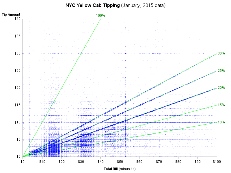
When I read Robert Allison's article about the cost of a taxi ride in New York City, I was struck by the scatter plot (shown at right; click to enlarge) that plots the tip amount against the total bill for 12 million taxi rides. The graph clearly reveals diagonal and horizontal trends in the data. The apparent "lines" in the scatter plot correspond to three kinds of riders:
- The horizontal lines correspond to riders who tip a set amount regardless of the fare amount. There are strong visible trends for $5, $10, $15, and $20. There are weaker trends at other whole-dollar amounts.
- The diagonal lines that pass through the origin are riders whose tip is a percentage of the fare. There are strong visible trends at 15%, 20%, 25%, and even 30%.
- The diagonal lines that slope down from the upper left are riders who give the driver a set amount and tell him to keep the change. There are clear lines in the full-sized graph for riders whose total bill (fare plus tip) was $20, $40, $50, $60, $70, and $100.
The graph made me wonder how much a typical New Yorker tips as a percentage of the bill.
How much do New Yorkers tip their taxi drivers? #Statistics Share on XTips and percentages
You can download the data from Robert Allison's post. This article analyzes the same 12 million records (from January, 2015) that Robert featured.
The first step is simply to use a SAS DATA step to compute the percentage of the tip. The following program uses a data VIEW to save disk space. You can then use PROC MEANS in Base SAS to compute percentiles for the tip amounts:
libname taxi "<path to data>"; data tax / view=tax; label tip_pct = "Tip Percent"; set taxi.ny_taxi_data_2015_01; where 0 < fare_amount <= 100 & 0 <= tip_amount <= 100; total_bill = total_amount - tip_amount ; tip_pct = tip_amount / total_bill; keep fare_amount tip_amount tip_pct total_bill; run; title "Tip as Percentage of Total Fare"; proc means data=tax P40 P50 P75 P90 P95 P99; var tip_pct; run; |
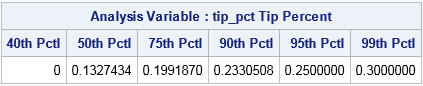
The output shows some surprising facts. According to these data on NYC Yellow Taxis:
- More than 40% of all riders do not tip.
- The median tip is 13.3% of the fare.
- Twenty-five percent of all riders tip 20% or more.
- Five percent of all riders tip 25% or more.
Edit: (03MAY2016) A reader notes in the comments that 40% of riders not tipping seems excessively high. He suggests that the data could be biased by a systematic underreporting of tips and suggests we need a better understanding of data collection process. I went to the "data dictionary" for this data and discovered that the tip_amount value "is automatically populated for credit card tips. Cash tips are not included.” Ah-hah! The reader is correct! There is a systematic bias in the data.
The distribution of tip percentages
You can use a histogram to show the distribution of tip percentages. The distribution has a long tail, so the following call to PROC UNIVARIATE truncates the distribution at 100%.
proc univariate data=tax(obs=1000000); format tip_pct PERCENT7.0; where tip_pct <= 1; var tip_pct; histogram tip_pct / endpoints=(0 to 1 by 0.05) statref=Q1 Median Q3 odstitle="Percent of Fare Left as Tip for NYC Yellow Taxis"; run; |
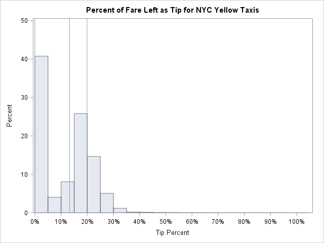
The histogram appears to be a mixture distribution. The first bar (about 41%) represents the riders who leave either no tip or a negligible tip. [Edit: Many of these are cash transactions for which the tip is not reported.] Then there is a "hump," which appears to be normally distributed, that represents riders who leave a tip that is between 5% and 40% of the fare. As you might expect, the mode of the hump is between 15% and 20%, which is the cultural norm in the US. The last part of the distribution is the long tail, which represents generous individuals whose tip is a substantial percentage of the fare.
The vertical lines show the 25th percentile (at 0%), the 50th percentile (at 13%), and the 75th percentile (at 20%).
Examining the central part of the distribution
The distribution of tips is dominated by the large proportion of taxi riders who do not tip. (Or, to be more cynical, the proportion of rides for which the reported tip is zero.) This section excludes the non-tippers and analyzes only those riders who leave a non-zero tip.
Let's repeat the analyses of the previous sections, but this time exclude the non-tippers. First, look at the quantiles. Notice the WHERE clause to exclude the non-tippers.
title "Tip Percentages Conditional on Tipping"; proc means data=tax Q1 Median Q3 P90 P95 P99; where tip_amount > 0; /* exclude non-tippers */ var tip_pct; run; |
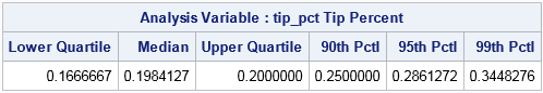
Ah! That's more like what I expected to see! For riders who leave a tip, the median and 75th percentiles are about 20%. About one in ten New Yorkers that leave a tip leave 25% or more.
Visualizing the distribution of tipping percentages among those who tip
For a final graph, let's visualize the distribution of non-zero tip amounts. I could draw the same histogram as before, but for fun I will use the three-panel visualization in SAS that I created a few years ago. In the three-panel visualization, a histogram is stacked in a column with a box plot and a normal quantile-quantile plot (Q-Q plot). Each panel reveals slightly different aspects of the distribution. You can download the %ThreePanel macro from my previous article. The following graph shows the three-panel visualization (click to enlarge) of one million tippers:
%ThreePanel(tax(obs=1000000 where=(tip_amount > 0 && tip_pct <= 1)), tip_pct); |
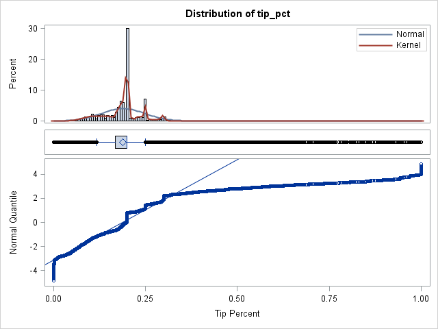
As compared to the previous histogram, this histogram uses a smaller bin width and therefore shows small-scale structure that was not previously apparent. The bumps in the histogram and kernel density estimate show that many riders tip 20%, 25%, and 30%. The box plot shows a relatively narrow interquartile range (the box) and a many riders whose tip percentages are well-above or well-below the median (the outliers).
Lastly, consider the Q-Q plot. If the points fall near the diagonal line, then the distribution is approximately normal. That is not the case here. The middle of the distribution falls somewhat near the diagonal line, but the tails do not. By the usual interpretation of a Q-Q plot, the lower- and upper tails of the distribution are decidedly nonnormal. The middle of the distribution is approximately normal, but the staircase structure of the Q-Q plot means that certain values are repeated many times (20%, 25%, and 30%).
I conjecture that the lower tail is from the "keep the change" riders who rounded the fare to a whole-dollar amount that was few pennies more than the fare. The upper tail is likely from generous riders who substantially rounded up the fare, perhaps paying $20 bill to cover a $13 fare.
In summary, a short analysis of 12 million New York taxi rides indicates that slightly more than 40% of riders do not leave any tip. [EDIT: This large percentage appears to be from cash transactions for which the tip amount is not collected.] A small percentage leave a tiny tip, but the bulk of the tippers leave tips in the 16% to 20% range. About 10% of riders leave as much as 25% or 30% for a tip, and a small number of riders leave tips that correspond to larger percentages.

11 Comments
Great analysis Rick... your curiosity and blog post has answered my own questions on Rob's chart :-)
A conducive example of your three-panel visualization plot! One of my favorite dataviz.
Are you sure the 40% apparently not tipping aren't just paying cash that isn't picked up in this data set? That would make more sense to me.
I report what the data say. I did not audit the accuracy of the data collection process. For example, if a dishonest driver reports "no tip" to his company to avoid income taxes and pockets the cash, that would show up as tip_amount=0 in the data even though the customer gave a tip.
You offer readers the opportunity to tweet 'more than 40% of New Yorkers do not tip their taxi driver' as if it is a fact. But the data does not say that. You infer it. Data analysis should never take place unless the data collection process is fully understood.
Well, it is a fact that the tip_amount is zero for 40.26% of the 12.7 million observations in this data set!
However, you raise an excellent point. I agree that analysts should always question the accuracy of the data. I agree that when an analyst discovers a surprising result he should learn more about the data collection process (or report the issue to the data collection team). After thinking about your comments I investigated further. I found a "data dictionary" for the data which states that the tip_amount field "is automatically populated for credit card tips. Cash tips are not included." So that solves the mystery. You are correct that there is a systematic bias in the data: cash tips are not reported.
I have deleted the "suggested tweet" that you objected to. Thanks for encouraging me to dig deeper.
That's great Rick, always good to solve mysteries! I must admit I had a look for the data source myself and struggled to get the clarity so I fully appreciate your efforts to get to the bottom of it. Really interesting analysis, thanks for sharing.
In China, almost nobody would pay tip to taxi drivers. I would surprise that so many NYC American(60%) would pay that. US Taxi drivers might win a good fortune from these tip.
Yes, tipping varies according to cultures. In addition to China, I've been told that tipping a taxi driver is not usually practiced in Argentenia and Turkey. In other countries, 10% or "keep the change" are more common than the huge 20% tip that is common in NYC.
People should tip data analysts. :-D
Pingback: What is a DATA step view and why is it important? - The DO Loop
the only population amoung 20 percent from 100 just gives a tip to the cab driver and I am also cab driver for five years in Melbourne.
now I got used to about the criteria of riders
anyways thanks a lot for the information
REGARDS
Amanda