There are many ways to visualize the distribution of univariate data. A previous article presents an overview and shows how to use SAS to create histograms, kernel density estimates, box plots, and cumulative distribution plots. This article continues the visualization journey, with an emphasis on dot plots and heat maps. These articles were inspired by a social media post from Nicola Rennie.
The plots in this article are:
- The gradient plot
- The strip plot
- The strip plot with a box plot overlay
- The swarm plot
The panel below shows all the visualizations. You can download the SAS program that creates all graphs.
Example data
All examples use the same data: the Cholesterol of patients in the Sashelp.Heart data set. The following SAS macro variables specify the data set and variable. You can change these values to view the same types of graphs for other data.
%let DSName = sashelp.heart; %let varName = Cholesterol; |
The plots in this article use the SCATTER and HEATMAP statements in PROC SPLOT. These statements require two variables. These statements can be useful for comparing distributions across multiple levels of a categorical variable. If you want to use the methods when there isn't a categorical variable, you can add a fake variable (_ID) to the data by creating a data view, as follows:
/* Add a fake _ID variable to the data */ data OneCategory / view=OneCategory; set &DSName(keep=&varName); _ID = 1; run; |
All graphs in this article use the OneCategory data view.
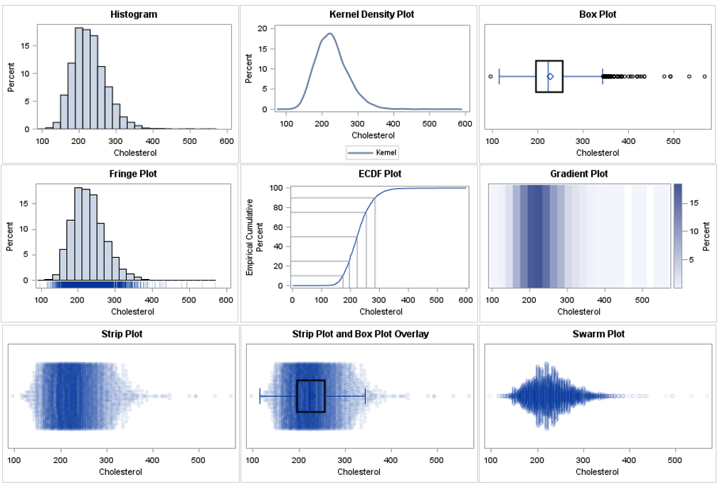
The gradient plot
The gradient plot is a heat map. It is equivalent to a histogram, but whereas the histogram uses the height of a bar to represent a count or percent, the gradient plot uses shades of a color ramp. You can use the HEATMAP statement to create a gradient plot. The COLORSTAT= option enables you to choose count (FREQ) or percentage (PCT) as the response quantity to visualize. You should use the DISCRETEY option to create a gradient plot when the _ID variable is numeric. The following example uses a single-hued light-to-dark color ramp, but you can use the COLORMODEL= option to use a different set of colors.
title "Gradient Plot"; proc sgplot data=OneCategory; heatmap x=&varName y=_ID / discretey colorstat=pct colormodel=TwoColorRamp; yaxis display=(nolabel noticks novalues); xaxis label="&varName"; run; |
The dark regions in the gradient plot show where the density of the data is greatest. The dark colors correspond to tall bars on the histogram. You can use the NXBINS= option to control the number of bins used to construct the gradient plot. If you are familiar with lasagna plots, the gradient plot is one strip of a lasagna plot.
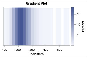
The strip plot
The strip plot is essentially a jittered scatter plot of the data, where the Y variable is a discrete classification variable (in this example, _ID). When you use the JITTER option, two or more observations that have the same value are offset or stacked. If the stack gets too high, the markers are positioned uniformly within an interval. To reduce the effect of overplotting, you should use the TRANSPARENCY= option. You should specify the TYPE=DISCRETE option on the YAXIS statement when the Y variable is discrete.
title "Strip Plot"; proc sgplot data=OneCategory noautolegend; scatter x=&varName y=_ID / jitter transparency=0.9 markerattrs=(symbol=CircleFilled); yaxis type=discrete display=(nolabel noticks novalues); run; |
The strip plot is similar to the gradient plot. Both show intervals of high density as darker regions. Whereas the gradient plot uses binning, the strip plot shows individual values. Thus, the strip plot enables you to see the values of the extreme observations.
Notice that the strip plot stacks the markers vertically. When there are only a few markers, the markers are stacked so that they do not overlap. However, if there are too many markers with the same value, the centers of the markers are placed on a regular grid. Thus, the height of the stack is the primary indicator of density, but after a stack reaches a certain height, the amount that the points overlap indicates the density.
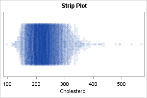
The strip plot and box plot overlay
A drawback of the strip plot is it doesn't reveal much about the shape of the distribution. It only shows the values. In contrast, a criticism of the box plot is that the box shows only quantiles of the distribution, which are related to the shape, but shows only the values in the tails. Consequently, many researchers like to combine the strip plot and the box plot.
I like to make the box plot thicker and darker than the default so that it shows up better. I also suggest using the NOOUTLIERS option to suppress the outliers on the box plot, since the strip plot already shows all observations.
title "Strip Plot with Box-and-Whisker Overlay"; proc sgplot data=OneCategory noautolegend; scatter x=&varName y=_ID / jitter transparency=0.9 markerattrs=(symbol=CircleFilled); yaxis type=discrete display=(nolabel noticks novalues); hbox &varName / category=_ID lineattrs=(thickness=2) medianattrs=(thickness=3) nofill nooutliers; run; |
This graph combines the advantages of the box plot and the strip plot. The box and whiskers show features related to the central location and the spread of the data. The markers show the density and the values in the tails of the data.
The swarm plot
The strip plot stacks the markers vertically until the stack reaches a certain height, then squeeze the markers into that space. There are several variations of the strip plot. One that is easy to create in SAS is the swarm plot in which the heights of the columns are proportional to the number of values in the column. Basically, the value that is repeated most often determines the tallest column of markers. The heights of the other columns are proportional to the tallest one. In SAS, you can use the JITTER=UNIFORM option to get this effect, as follows:
title "Swarm Plot"; proc sgplot data=OneCategory noautolegend; scatter x=&varName y=_ID / jitter=uniform transparency=0.9; yaxis type=discrete display=(nolabel noticks novalues); run; |
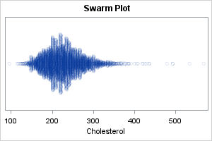
This plot (sometimes called a "dot plot" or a "proportional strip plot") is similar to a KDE that uses a very small kernel width. It is useful when the data contains many repeated values, and you want to see the values that are repeated the most.
This is a good place to mention a similar graph, which is called a beeswarm plot. In the beeswarm plot, no markers are allowed to overlap. Instead, markers spread out from the center and often are shifted away from their actual value to avoid overplotting. I do not recommend the beeswarm plot. As Leland Wilkinson stated, these plots create "a visual artifact... that misrepresents the structure of the data."
Other plots
There are other plots that you can use, but most are variations of the previous plot, or combine these plots by using overlays or panels. For example:
- A violin plot is essentially a kernel density plot. It is most often used to compare the distribution of multiple groups.
- A ridgeline plot (formerly called "joy plots") is essentially a panel of kernel density plots. It is most often used to compare the distribution of multiple groups. To save space, sometimes the plot is constructed as a partial overlay, to that the "top" of one KDE overlaps the bottom of another.
- A raincloud plot is essentially a panel that includes a kernel density plots, a strip plot, and a box plot.
Summary
This article is the second article in a two-part series that shows how to create and interpret nine common graphs for visualizing the distribution of univariate data. The first article discussed the histogram, kernel density plot, box plot, and CDF plot. This second article discusses a heat map and various kinds of dot plot. To generate the graphs in this second article, you need to add an ID variable that has a constant value. This enables you to use the HEATMAP and SCATTER statements in PROC SGPLOT, which require two variables.
You can download the complete SAS program that generates the graphs in both articles.
